|
Devr0s
|
 |
« on: October 05, 2014, 06:08:01 PM » |
|
== Update Oct 17 2015 == moving towards alpha release at some point. -PC online multiplayer game -This is a Sci-Fi setting, top down, pixelart -Nuclear Throne style combat -PVE and PVP -Sandbox elements -Exploration and crafting, building a base, customizing the look of it and placing interactive elements. If you have any interest you can follow on Twitter or keep an eye here as we will announce when you move from here over to the dev threads. Please comment about anything Follow here or Twitter https://twitter.com/TheMalidet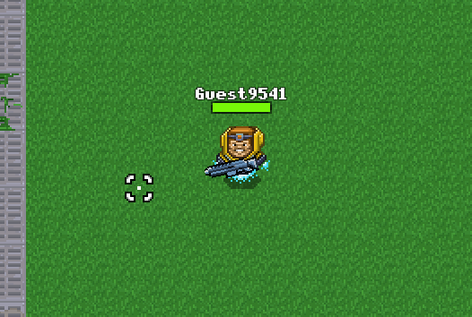 Here are the current player avatars we are using: 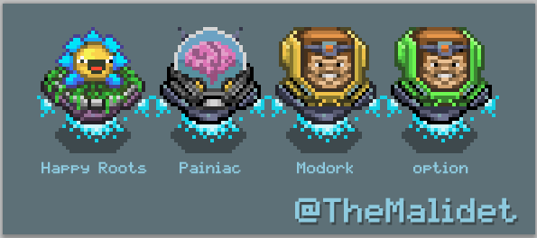     Homage to Krang -- KLANG   A couple weapons (one BFG)  Looking for some general art feedback. Screens are in-game showing a "room". There is also a player character hanging out (a little Modok with hover jets) near the bottom left. Please post any questions you may have! Image displayed below is default zoom (showing some tiles we have for alpha)  A quick lazy drawing to capture the theme of our game.  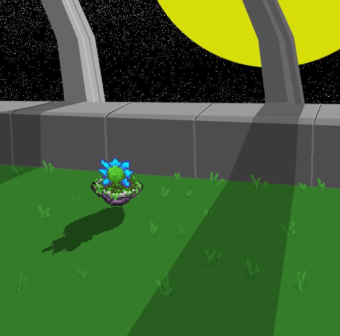 |
|
|
|
« Last Edit: October 17, 2015, 04:45:22 AM by Devr0s »
|
 Logged
|
|
|
|
|
Devr0s
|
|
« Reply #1 on: October 05, 2014, 06:13:17 PM » |
|
Here is a zoom of Mowdok;p  |
|
|
|
« Last Edit: October 09, 2015, 12:33:58 PM by Devr0s »
|
Logged
|
|
|
|
|
Miko Galvez
|
|
« Reply #2 on: October 08, 2014, 07:12:58 PM » |
|
Is that MODOK?
|
|
|
|
|
Logged
|
|
|
|
|
Devr0s
|
|
« Reply #3 on: October 11, 2014, 09:33:44 AM » |
|
Is that MODOK?
Haha, it was inspired by MODOK for sure, although I changed it a bit ;p Glad you recognized it! Beer! For some player character avatars I like to borrow from popular culture or reference some of the cooler stuff a lot of us like. |
|
|
|
|
Logged
|
|
|
|
|
Miko Galvez
|
|
« Reply #4 on: October 12, 2014, 07:13:11 PM » |
|
Well I really like it, can you give us a proper 1x scale of the shot? Honestly I'm not a huge fan of 32x32/64x64 games because the tiles become REALLY large and the charm is kind of lost because of this. Just look at the tiny room in the middle-bottom. I think if the player sprite moves inside that area, the huge wall tiles in front of it would block the sprite. I feel as if the walls are too tall. The artwork is pretty good but it looks too generic to me. There's nothing in the background I can identify it to make it YOUR game. Look at Super Bomberman 4 for example (this is the best Bomberman game on the SNES, if you don't have it yet you should definitely pick it up, it's in Japanese but you can understand it anyway) 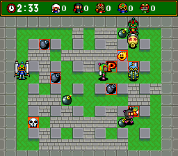 It's top down and the blocks don't necessarily block the characters but you can kind of feel the depth when playing. Also, the grass + brick walls and metal square columns help identify Bomberman. You're going to need something to make your game look less generic like some factory stage or something. Don't be afraid to go wild with designs.  Another game to look at which I HIGHLY recommend is Ball Bullet Gun for the same system, still in Japanese but playable. In this game, the walls are definitely higher and the depth is clear. The tall walls become transparent when sprites are behind them and the stages range from themes such as jungle, office, caves, etc. It's definitely a great game that you should pick up, I still have my copy of it. |
|
|
|
« Last Edit: October 17, 2014, 03:24:03 AM by Medevenx »
|
Logged
|
|
|
|
|
IHaveFaith
|
|
« Reply #5 on: October 18, 2014, 02:42:46 PM » |
|
Thanks for the feedback! We've discussed tile size and wall height/transparency before, but for now have settled on 32x32 with medium height walls (I'm the coder on the project btw).
I was pushing for 32x32. I didn't want us to become limited by the detail and variation that could be added to a tile. Don't get me wrong, I know there are amazing tilesets done with 24x24 or 16x16 even with limited palettes, but one of our goals is to have a ton of tiles and I thought it would be harder to create enough unique/differentiable tiles in less than 32x32.
We are testing a limited zoom feature to allow a few different tile sizes in game, based on scaling the 32x32 originals. This way the player can use whatever zoom level feels most comfortable.
As for wall heights. We tried simple 32x32 walls, but it didn't look too good in the game. We wanted to experiment with tall sprites and walls, but as you pointed out there was issues with tall walls obscuring tiles behind them. I haven't had the time to code in the transparency feature yet, and other features are higher on the priority list. For now, the less than two block high walls are a compromise... (sorry Devr0s). I'm sure that when I get around to implementing a walk-behind transparency, we will revisit this and test out really tall walls! A lot of stuff is still changing and we are just trying to find what works best and will be the most fun to play with.
As for the great examples you gave. Bomberman definitely has a unique and recognizable esthetic! I never got to play it but heard about it a lot from friends (I always thought it was weird that it needed an unofficial 4 way controller adapter). Cunningly defeating opponents with traps is something I would like to eventually incorporate into our game, so this was a doubly good example.
|
|
|
|
|
Logged
|
|
|
|
|
Devr0s
|
|
« Reply #6 on: October 23, 2014, 06:35:09 AM » |
|
== edit removed old post ==
|
|
|
|
« Last Edit: August 30, 2015, 02:07:18 PM by Devr0s »
|
Logged
|
|
|
|
|
Devr0s
|
|
« Reply #7 on: October 26, 2014, 05:42:58 PM » |
|
== edit removed old post ==
|
|
|
|
« Last Edit: August 30, 2015, 02:07:30 PM by Devr0s »
|
Logged
|
|
|
|
|
Miko Galvez
|
|
« Reply #8 on: October 26, 2014, 06:14:31 PM » |
|
I don't understand, what is multi-placeable sprites? Anyway, I feel as if the holes in the ground and the yellow and black paint around it makes it look flat don't you think? It looks top-down in perspective.
|
|
|
|
|
Logged
|
|
|
|
|
Devr0s
|
|
« Reply #9 on: October 26, 2014, 07:00:49 PM » |
|
== edit removed old post ==
|
|
|
|
« Last Edit: August 30, 2015, 02:07:54 PM by Devr0s »
|
Logged
|
|
|
|
|
Devr0s
|
|
« Reply #10 on: November 02, 2014, 08:00:16 PM » |
|
== edit removed old post ==
|
|
|
|
« Last Edit: August 30, 2015, 02:08:11 PM by Devr0s »
|
Logged
|
|
|
|
|
Devr0s
|
|
« Reply #11 on: November 04, 2014, 03:59:41 PM » |
|
== edit Aug 30th - OLD shot but left in for process == Another attempt, this time the green set on the top right side of the map. We've done away with any overlap of the tops of wall tiles and made all wall pieces fit into 32x32 (bottom top and middle). Dark purple set on the top left and bottom right are the older walls with overlap. Those were 32x48. Its definitely easier to fit everything into 32x32 and also more intuitive for placing. The orange set on the bottom left are ancient and will be removed. My brain is fried. LARGE  |
|
|
|
« Last Edit: August 30, 2015, 02:09:20 PM by Devr0s »
|
Logged
|
|
|
|
|
Devr0s
|
|
« Reply #12 on: November 26, 2014, 06:22:53 PM » |
|
OK. New update. For now we are going with fitting the walls in two 32x32 pieces (top and bottom) with no overlap. Here is a shot with a second player sprite and some decayed versions of the sci-fi theme map tiles so you can make a ruined area. Let us know what you think!  Also a new player sprite (in addition to Modok, we will have lots of player sprites to choose from)  |
|
|
|
|
Logged
|
|
|
|
|
Devr0s
|
|
« Reply #13 on: November 28, 2014, 09:27:39 PM » |
|
Here is the new teleport pad art. Hope you like:  |
|
|
|
|
Logged
|
|
|
|
|
s-spooky g-g-ghosts
|
|
« Reply #14 on: November 29, 2014, 04:39:15 AM » |
|
Much better. I'm not a fan of either of the wall colors, but in general the new version is way cooler.
|
|
|
|
|
Logged
|
|
|
|
|
Devr0s
|
|
« Reply #15 on: November 29, 2014, 06:52:04 PM » |
|
Much better. I'm not a fan of either of the wall colors, but in general the new version is way cooler.
Awesome thanks! Ya, currently only the green is in the game, but will probably replace that color as well soon. Also they will have a little more shape and detail. The idea is that you will have a clean and a decayed version of each theme so you can choose what type of experience to create.  |
|
|
|
|
Logged
|
|
|
|
|
Devr0s
|
|
« Reply #16 on: January 11, 2015, 09:06:23 AM » |
|
Does this look OK? Made a 16px overlap for wall tops to increase immersion. Pretty sure we will stick to this. 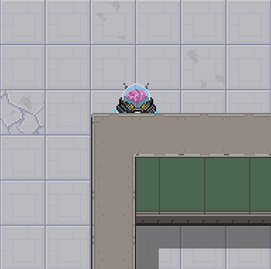 |
|
|
|
|
Logged
|
|
|
|
|
Devr0s
|
|
« Reply #17 on: January 11, 2015, 11:17:43 PM » |
|
A player sprite for our less violent players. We have combat (shooting so far) but if you are not into that you can turn it off in your own maps. Or you can be violent and have a happy sprite!  We give you choice! Thoughts? 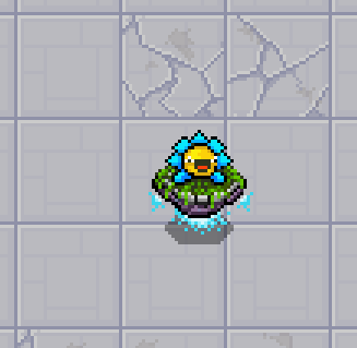 |
|
|
|
|
Logged
|
|
|
|
|
Devr0s
|
|
« Reply #18 on: January 12, 2015, 01:05:49 PM » |
|
The working name is Happy Roots, anyone have a name they think would be cool? Update on the flower guy, the black outlining on the flower was harsh so I used a colour instead. 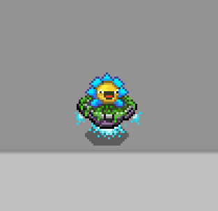 |
|
|
|
|
Logged
|
|
|
|
|
Devr0s
|
|
« Reply #19 on: January 18, 2015, 06:58:15 PM » |
|
== edit Aug 30 but left for process -- added thickness to current floor tiles so they dont look so flat like these == Alright, attempting some grass tiles. Probably going to go with these for beta, although the detail tiles like flowers etc will need a little more shape to them. Any suggestions on the grass or anything else so far? The floor still feels a bit flat to me, might try to pop it a bit by giving more height to the front edge. 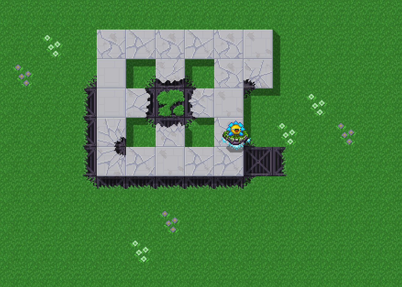 |
|
|
|
« Last Edit: August 30, 2015, 02:10:28 PM by Devr0s »
|
Logged
|
|
|
|
|
 Developer
