|
JobLeonard
|
 |
« Reply #300 on: May 26, 2016, 12:43:26 AM » |
|
UI is super-important! (totally unbiased interaction designer here) However, UI is not visual design. There's overlap, but visual design comes later, once you know the interaction flow and expectations of the user and have to get the communication of these things right. I think you probably want to create some mood boards at this stage but not put in too much effort otherwise. (In this context, mood boards are collages of (unrelated) images that have an overal visual aesthetic that communicates the feeling of what the final visual UI should communicate) In fact I would argue that in a perfect world (unlimited budget/time/colleagues) the flow of interaction, based on what the user wants to do, is the thing that should be researched and quasi-established first, using workshops with the target audience. Only then should things get implemented, constantly being retested, redesigned and adjusted. But hey, teefal worked with Alan Kay, and has shown the kinds of workshops you do with children, so I'm probably preaching to the choir here. Still, there's different styles of "low-effort" placeholder UI. One thing you could go for is a more "sketchy", wiggly, hand-drawn look - it's what I often use in wireframes so people don't mistake it for the final product. Compare the looks of these two wireframing tools: Justinmind and Balsamiq.  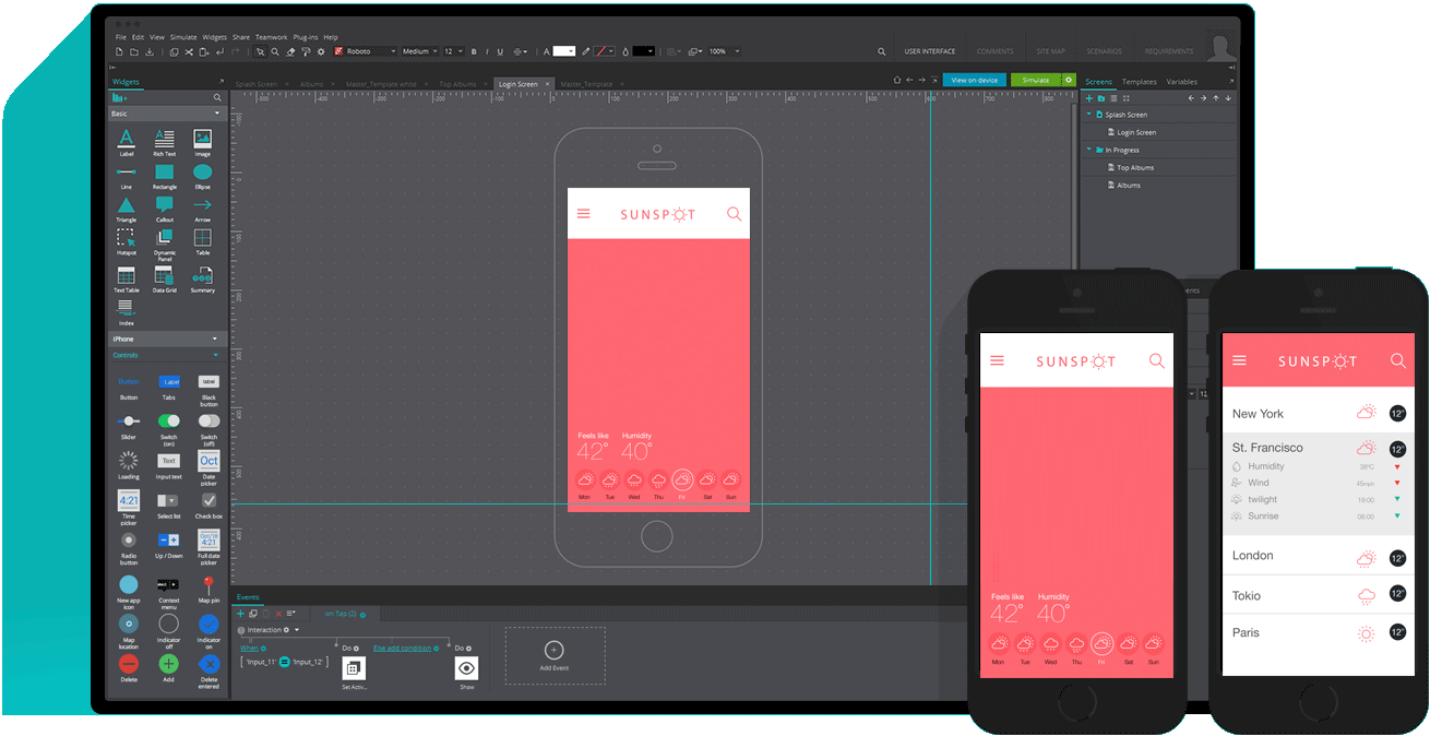 Both are meant to create placeholders, and the graphics represent that. However, one is Comic Sans (ok, more like Fantasque Sans or Comic Neue), and the other Helvetica. It communicates different expectations and values. It also fits with your earlier assessment of not wanting to communicate "this is the one right way" - you don't want the interface to look too "formal" As a call-back to Prinsessa's comment about consistency in design, here's a thought: what if the interface of Tidepool looked like it was designed in Tidepool?One example of a game that really does the "casual computer drawing" look well is runman: .. although the MS-paint aesthetic has been stylized into it's own consistent look too (bright colours, thick black outlines, smileys everywhere), so there's a trade-off there as well. In general kid-friendly visual design without talking down to them is a hard sweet spot to hit; many "kids" games feel like the UI equivalent of when adult show hosts dress up in colourful adult-sized kids clothes and wear a baseball cap backwards in an attempt to look kid-friendly but actually ending up more like... Then there's etoys, which I also often use as an example, but... I I know who I'm talking to here so no need to bring that up  |
|
|
|
« Last Edit: May 26, 2016, 12:50:43 AM by JobLeonard »
|
 Logged
|
|
|
|
|
teefal
|
|
« Reply #301 on: May 26, 2016, 05:14:27 AM » |
|
Thanks JobLeonard, this is all great stuff. You should watch my teardown of the Etoys interface. I chose not to make it public because it's brutal. Those were fights I never won. Balsamiq is a good look in itself (beyond the prototyping use). I've seen some kid-focused stuff use the sketch look, though it's easier to extend the age range if you use professional illustrators drawing in a young style, like Scribblenauts.  I've used a more earthy, analog approach with own illustrator on our company websites.  You may recognize the style from the Squeakland site, which we did in 2007.  I repurposed some of Isabelle's illos for the Kickstarter with an eye to using her style for the interface. I still like her pastel analog look after 15 years, which says something. She's become more of a success over the years than when I first found her, so I may not be able to afford her  |
|
|
|
« Last Edit: May 26, 2016, 06:53:38 AM by teefal »
|
Logged
|
|
|
|
|
teefal
|
|
« Reply #302 on: May 26, 2016, 06:16:12 AM » |
|
|
|
|
|
|
Logged
|
|
|
|
|
teefal
|
|
« Reply #303 on: May 26, 2016, 06:18:01 AM » |
|
Of these, the director is the least suitable to task, being too complicated for kids to use. For now, it's a nuts & bolts programming interface that will largely get replaced by the natural language interface. Think of it as expert mode. Also, its design is the most fluid at this point from a UX standpoint. A great example of why I didn't pay someone up front.
(and yes, I did round those floats after this screenshot)
|
|
|
|
« Last Edit: May 26, 2016, 06:30:12 AM by teefal »
|
Logged
|
|
|
|
|
teefal
|
|
« Reply #304 on: May 26, 2016, 06:41:46 AM » |
|
One last thought. The Tidepool UI visual design is a trickier task than it might seem. Since I have little control over the in-game content, the UI visuals need to both harmonize with amateur drawings and look distinct from them. Using crayola as the content color palette helps here, since UI colors can be close but different.
Another thought is that I don't want to compete with the in-game content. Scribblenaut's UI looks the way it does because they made *all* the visuals. Making a playful UI that seems more appealing than kid content may not be the way to go. Perhaps having the UI be bland is a better idea ... you see past it to the content, which is the real show.
The question is, do we want Tidepool to have a distinctive look? Or is this in some way stealing focus from players?
(of course you want the UI to be professional and non-cliche, but there's a value to a helvetica approach, since it blends with so many things.)
|
|
|
|
|
Logged
|
|
|
|
|
teefal
|
|
« Reply #305 on: May 26, 2016, 06:56:29 AM » |
|
One more thought. Watching the RunMan video I thought how absolutely simple and effective it would be to use parallax horizon images to convey style and movement in Tidepool. Yes, a bit harder because it's a 3D world, but faraway mountains and clouds could add style while still being distinct from user content.
Of course, people have suggested clouds before, but I've held off because more realistic terrain is the goal of Milestone 6. Distant fun images would be mere hours of work though.
|
|
|
|
|
Logged
|
|
|
|
|
JobLeonard
|
|
« Reply #306 on: May 26, 2016, 10:08:22 AM » |
|
Another thought is that I don't want to compete with the in-game content. Scribblenaut's UI looks the way it does because they made *all* the visuals. Making a playful UI that seems more appealing than kid content may not be the way to go. Perhaps having the UI be bland is a better idea ... you see past it to the content, which is the real show. While this is a good point, the other extreme is Le Corbusier's Plan Voisin from 1925, where he wanted to tear down the heart of Paris and replace it with this:  Mind you, this was back when nobody had ever experiencedp the depressing influences that bland, purely functional concrete building blocks have on people. Le Corbusier honestly believed that "a house is a factory for living" and that the functional, gray concrete blocks would provide "blank canvases for people to project their own imagination on". Very utopian, very idealistic, very much unfettered by how human minds work in reality. What I'm getting at is yes, the interface should get out of the way, and yes, it should not steal attention away from the main action. But we are not divinely inspired people who can make great art from nothing, our direct environment is crucial in how it inspires us, and I for one do not believe that a flat design is without baggage of its own. There are always expectations and interpretations, and as a result the user is always nudged towards some course of action. Don't mistake "not motivated to do anything" for not being nudged! Because that leads to interface suburbia. |
|
|
|
« Last Edit: May 27, 2016, 01:13:13 PM by JobLeonard »
|
Logged
|
|
|
|
|
teefal
|
|
« Reply #307 on: May 27, 2016, 12:57:15 PM » |
|
Great point, well made. Time to open up the design book and make something that surprises me. |
|
|
|
|
Logged
|
|
|
|
|
teefal
|
|
« Reply #308 on: August 01, 2016, 05:04:29 AM » |
|
Starting now the push to finish Tidepool Alpha 4 after two months away. We begin with 214 signups, 57 players, and 652 play sessions.
|
|
|
|
|
Logged
|
|
|
|
|
teefal
|
|
« Reply #309 on: August 01, 2016, 06:51:28 AM » |
|
Goal for Tidepool's next school year is 360 subscriptions/mo or 3240 total by end of May, which gets us to gold and pays off project costs. We can reach this goal if 3% of the 100k schools we contact in the next 6 months lead to at least one subscription. Three out of a hundred. Another pct point brings us to break-even for a full year. Thereafter we need to maintain that 4230 subs/year through renewals or new subs. Every percentage point beyond that is an extra $25k gross sales, which can be used for hiring and community outreach.
|
|
|
|
|
Logged
|
|
|
|
|
JobLeonard
|
|
« Reply #310 on: August 01, 2016, 09:51:22 AM » |
|
I already replied to you on twitter, but it's great to see that you're back!  |
|
|
|
|
Logged
|
|
|
|
|
teefal
|
|
« Reply #311 on: August 01, 2016, 10:22:12 AM » |
|
Thanks JL. Needed a little time to cool my jets and hang with my family. We played a lot of games over the last two months. The house is in better shape too
|
|
|
|
|
Logged
|
|
|
|
|
quantumpotato
|
|
« Reply #312 on: August 01, 2016, 01:31:55 PM » |
|
Goal for Tidepool's next school year is 360 subscriptions/mo or 3240 total by end of May, which gets us to gold and pays off project costs. We can reach this goal if 3% of the 100k schools we contact in the next 6 months lead to at least one subscription. Three out of a hundred. Another pct point brings us to break-even for a full year. Thereafter we need to maintain that 4230 subs/year through renewals or new subs. Every percentage point beyond that is an extra $25k gross sales, which can be used for hiring and community outreach.
Good luck! I've heard through teachers that they are often reticient in adopting new technologies but once you get a few onboard, the rest will want it to stay competitive. There may be organizations that can connect you to multiple schools. I'd recommend talking to https://www.mozilla.org/en-US/grants/. |
|
|
|
|
Logged
|
|
|
|
|
teefal
|
|
« Reply #313 on: August 02, 2016, 04:44:31 AM » |
|
Thanks quantum. Not sure if Mozilla requires a non-profit or not, that's what disqualifies us from most. I also ran an ed-tech nonprofit, so I'm familiar with the grant thing, though haven't seen this one by Mozilla.
Might be a good fit for our web HTML5 port (which happens next spring in the schedule).
|
|
|
|
|
Logged
|
|
|
|
|
oahda
|
|
« Reply #314 on: August 02, 2016, 05:10:42 AM » |
|
Time sure flies by. Welcome back again, and best of luck. c:
|
|
|
|
|
Logged
|
|
|
|
|
teefal
|
|
« Reply #315 on: September 22, 2016, 06:44:10 AM » |
|
Guess what folks, I’m out of work! This may be a good thing. Tidepool’s had a stalled summer, with no progress in four months. Instead I’ve focused on client work, earning money in hopes of someday raising my original Kickstarter goal: the three months I need to finish. As summer ends, my fate has changed. My biggest client can no longer afford me. I have no current source of income, which while scary is not unusual. I’ve been here many times, always finding the next gig in about two months. My Tidepool savings give us that at least. With a tight budget, I’m free to work on Tidepool in October and November. I still need a third month to finish. With maxed cards and no Christmas presents, we need $4488 to get through December, which I believe I can raise by then. So as Summer turns to Fall, I commit myself now to a Winter Solstice beta. On that day, you’ll explore a Tidepool world with realistic terrain that mirrors our own Earth. You’ll code your creations by chatting with them in natural language. You’ll collaborate with other players to build story worlds together. Happy Equinox everyone. Here we go. (please contribute) |
|
|
|
« Last Edit: September 29, 2016, 04:04:42 AM by teefal »
|
Logged
|
|
|
|
|
teefal
|
|
« Reply #316 on: September 24, 2016, 07:39:44 AM » |
|
Just finished the last of countless Tidepool detailed time estimates ... 460 hours to finish, which brings total time to an even 3000 hours.
That 460 breaks down to 330 coding hours, 70 sales hours, and 60 playtesting hours. All in the next 14 weeks, before New Year's Eve.
|
|
|
|
|
Logged
|
|
|
|
|
JobLeonard
|
|
« Reply #317 on: September 24, 2016, 08:04:50 AM » |
|
I'll donate, but I also don't really have time to play so no need for the rewards. Is that ok with you?
|
|
|
|
|
Logged
|
|
|
|
|
teefal
|
|
« Reply #318 on: September 29, 2016, 04:06:04 AM » |
|
Of course JobLeonard. Just seeing your responses here is reward enough.
|
|
|
|
|
Logged
|
|
|
|
|
|
|
 Community
