Welcome, Guest. Please login or register.

Login with username, password and session length

 
Advanced search

1411433 Posts in 69363 Topics- by 58418 Members - Latest Member: Pix_RolleR

April 20, 2024, 06:57:45 AM

Need hosting? Check out Digital Ocean
(more details in this thread)
TIGSource ForumsCommunityDevLogsLeilani's Island
Pages: 1 ... 49 50 [51] 52 53 ... 67
Print
Author Topic: Leilani's Island  (Read 410230 times)
JobLeonard
Level 10
*****


View Profile
« Reply #1000 on: October 31, 2019, 12:02:14 PM »

Quote
It seems like the chevrons may be more confusing than helpful, especially if most of these platforms are able to turn either way.
I think you got a point there, but that can also be addressed by having an early bit of level design that can only be passed if you go in both directions. Which might be a good idea anyway
Logged
Ishi
Pixelhead
Level 10
******


coffee&coding


View Profile WWW
« Reply #1001 on: November 01, 2019, 10:04:39 AM »

In the last gif, the chevrons should be pointing downwards, because there is no possible action for Leilani to make the chevron texture 'scroll upwards', and make the platform move to the right (in this picture)?  Huh?

The chevrons here are pointing upwards simply because there's an opposite version that moves the other way (with different threading on the screw part):


Is there a benefit to using the chevrons vs. just using alternating lines or another design? It seems like the chevrons may be more confusing than helpful, especially if most of these platforms are able to turn either way.

I think you might be right. I like how the chevrons look, and I think they help to indicate that the platform can rotate. But they do cause confusion once you start to think about it - do I roll in the direction the chevrons are pointing, or do I make it spin in the direction of the chevrons? But then which way will the platform move if I do that?

It might be best to change the pattern to diagonal stripes, which match the direction of the screw threads.
Logged

oahda
Level 10
*****


View Profile
« Reply #1002 on: November 01, 2019, 10:08:14 AM »

Have to agree, diagonal stripes are probably better. But hey, I learnt a new word, chevron!
Logged

Ishi
Pixelhead
Level 10
******


coffee&coding


View Profile WWW
« Reply #1003 on: November 01, 2019, 11:08:51 AM »

Stripes, plus a more chunky design for the screw threads.


Have to agree, diagonal stripes are probably better. But hey, I learnt a new word, chevron!

It's a useful word*!

*for situations involving chevrons
Logged

QOG
Level 3
***


View Profile WWW
« Reply #1004 on: November 01, 2019, 11:47:41 AM »

I thought the prior version looked fine, but the new graphics look fantastic. Love the way you've given such a simple pattern a feeling of depth.
Logged
mindless
Level 0
**


View Profile
« Reply #1005 on: November 02, 2019, 10:45:50 AM »

I also thought the chevrons looked great, but the diagonal stripes look very good and can still give a sense of which direction the player is supposed to move to turn the platform initially. And the new screw threads look great!
Logged
oahda
Level 10
*****


View Profile
« Reply #1006 on: November 02, 2019, 03:27:48 PM »

Looks great! And the new screw threads add so much!
Logged

JobLeonard
Level 10
*****


View Profile
« Reply #1007 on: November 03, 2019, 05:49:26 AM »

I bet some jerk could calculate and check if the spin of the platforms actually adds up to the threading speed in the background... but I'm not going to be that jerk
Logged
Ishi
Pixelhead
Level 10
******


coffee&coding


View Profile WWW
« Reply #1008 on: November 03, 2019, 10:57:10 AM »

I bet some jerk could calculate and check if the spin of the platforms actually adds up to the threading speed in the background... but I'm not going to be that jerk

I don't need to do calculations to tell you they don't, because the horizontal and vertical ones don't even move at the same speed despite having the same size threads Cheesy

Wait, am I being a jerk to myself now?
Logged

Ishi
Pixelhead
Level 10
******


coffee&coding


View Profile WWW
« Reply #1009 on: November 03, 2019, 07:22:35 PM »

Aside from the rotating platform changes I've been up to other stuff this week too!
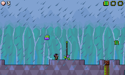
Rainy Mountain level

I've been working on this level, including new background art and tileset. It's the rainy level that I mentioned when I first talked about the waterfalls mechanic.


The waterfalls themselves have also had a visual improvement. Darkening the colour of them, but then adding the lighter edge colour, has made them feel much more solid, I think.

The rain effect is simply two scrolling layers of repeating tiles. The faster layer, with bigger raindrops, is in front of everything. The slower layer, with smaller raindrops, goes behind the scenery and entities.

This level also features 'lighting' - in my game this just means that a colour is applied to everything, in this case everything is tinted blue. However, some things don't get tinted, such as the waterfall edges, making them look brighter. It's simple but quite effective when used sparingly. This is the same lighting effect that is used at the beginning of the Factory levels when the lights are turning on.

I've blocked out around half of the level so far, but it's all an early first pass.

Checkpoint Quality of Life Improvements

Working on this level inspired me to make some improvements to the game's checkpoint system. Firstly I'll explain how checkpoints are generally used in the game, which I don't think I've discussed before.

Checkpoint placement

A typical level has between 1 and 3 checkpoints.

  • Post-intro checkpoint: Many levels have a single-screen intro area. For example this includes the area outside the factory door where Leilani has to use a battery to open the door. After getting through this area, an automatic checkpoint is triggered so the player doesn't have to replay it if they die. Typically these single screens are very light on gameplay and wouldn't be interesting to replay.
  • Mid-way checkpoint: The classic checkpoint around halfway through a level.
  • Secret checkpoint: Some levels have secret exits. Some of those secret exits are in sub-areas of the level which themselves are quite long, and typically more challenging than the main route through the level. The secret sub-area itself may also be challenging or tricky to access in the first place. In these cases I put a checkpoint in the sub-area, so the player can try to beat the hard secret section without having to replay any of the normal level route again.

This is the checkpoint usage pattern I've settled into over the course of making levels. There's at least one current exception to this where a level has no checkpoints at all, so it's not strict rules.

Checkpoints and Chips

Each level has three collectable computer chips. If you die, you can lose chips you have collected. However reaching a checkpoint locks the chip so you won't lose it upon dying and returning to the checkpoint.

A typical level will either have one chip before the mid-way checkpoint and two after, or two before the checkpoint and one after.

Factory levels will always have all three chips before the mid-way checkpoint. The second half of each factory level is intended to be a shorter, challenging section, with plenty of potential for showing off and taking shortcuts, that the player can try to master if they have to replay it after dying on the boss. These level sections will also try to teach little things such as how to damage the upcoming boss, so there's value in having the player replay it if they struggle on the boss fight. By placing all three chips before the checkpoint, the player doesn't have to worry about re-collecting chips each time they die on the boss, which should remove some frustration from the situation.

A New Checkpoint-Chip Combination

For the new rainy level I ended up designing an optional sub-area containing one of the chips. It's an underground vertical area where it's quite easy to take damage or die if you're careless. I like it, but I had the feeling that it was a little long for an optional area, considering the player could die after completing it and lose the progress.

I came up with this idea:

  • The optional area should contain the second chip.
  • The optional area is accessed *after* the mid-way checkpoint.
  • When you leave the optional area, it brings you back out *before* the mid-way checkpoint.
  • Passing back through the mid-way checkpoint would lock the new chip in place.

This level structure would mean that players tackling the optional area would get a checkpoint on both sides of it. But on the other hand the level won't be cluttered with more than the usual number of checkpoints.

The new behaviour here is the idea of re-activating a checkpoint. Previously, touching a checkpoint you'd already activated would have done nothing. Now, it'll check if new chips have been collected, and re-lock them.

Here's a quick example of it in action, with some very WIP level layout. I just put the third chip after the checkpoint as a test.


In addition to allowing the new situation to work nicely, it also means cautious players could backtrack to the checkpoint after collecting a chip, if the level allows it, in order to safeguard it. I don't have a problem with this 'exploit', and I'd be surprised if many players bothered to do it.

Persistent Checkpoints

After making this checkpoint tweak I then felt inspired to make some larger tweaks to checkpoint behaviour that I'd been thinking about recently. This essentially boils down to making checkpoints persistent.

Checkpoints were only a temporary progress marker but not part of the save game, and were lost if you exited the level or quit the game. The new flow is more player-friendly!

Here's the normal flow for loading a saved game, and starting the next level:


While playing the level, you reach the mid-way checkpoint:


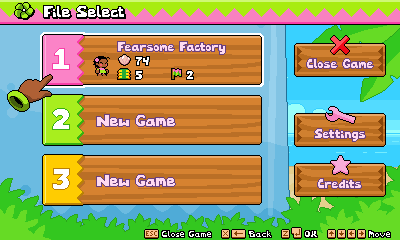
At this point you can now freely close the game. Next time you come back, the checkpoint marker is shown on the save file. Loading the file will take you straight back into gameplay, bypassing the world map:


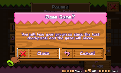
I updated some of the popup dialog text to cover this situation when you're exiting or quitting a level:


If you quit the level (rather than closing the whole game) you can mooch around on the world map and then go back into the level to resume from the checkpoint, if you like. The checkpoint icon is shown next to the level name, and I also put a little checkpoint pinwheel on the level marker itself:


Please excuse the rough looking world map! This is just a placeholder map for now, one that's easy for me to add new levels into, as there's no scenery to worry about.

Thanks for reading!
Logged

Basil
Level 0
**


Starting more projects than I can finish


View Profile WWW
« Reply #1010 on: November 04, 2019, 01:13:28 AM »

Awesome! Really digging the atmosphere of the rainy level. All of these subtle features make the game all the more user-friendly. Are any coral reef levels planned, or at least sections of levels?
Logged
JobLeonard
Level 10
*****


View Profile
« Reply #1011 on: November 04, 2019, 02:12:58 AM »

I also love the punching animation in the menu selection, I don't think I've noticed that before!
Logged
oahda
Level 10
*****


View Profile
« Reply #1012 on: November 04, 2019, 02:42:01 AM »

That update was a great read! Seems like some good systems. I like checkpoints. Gomez I like the tinting system too. Great way to do a lot with a little. Adds much more variation without coming up with a whole complex real lighting system, and looks great! And I love me a good waterfall.
Logged

Zorg
Level 9
****


View Profile
« Reply #1013 on: November 06, 2019, 12:33:40 AM »

Stripes, plus a more chunky design for the screw threads.


Great solution!  Hand Thumbs Up Left Shocked Hand Thumbs Up Right
Logged
linebyline
Level 0
**


View Profile
« Reply #1014 on: November 06, 2019, 10:33:44 AM »

We can't see anything but the edge of those rotating platforms anyway, so who's to say there's not some kind of gear/bearing system inside to account for the difference between rotation speed and movement speed? Wink

I've been lurking in this thread for literal years, and I have loved watching this game keep getting better. You keep adding elements that are already fine, then going back and adding layer after layer of polish that takes them to the next level. For instance, those rotating platforms already looked good, but after just a couple simple tweaks, now they look amazing!

I'm a big fan of your checkpoint system. Allowing the user to backtrack to the checkpoint to save acquired chips, if desired, is a great idea. So is making the HUD display which chips have been saved at a checkpoint and which haven't. Probably wouldn't be a bad idea to have the checkpoint itself indicate somehow that it can be interacted with again once you pick up another chip, though. If it's doing that now, it's subtle enough that I missed it.

Really, I like your checkpoint system in general. Part of me thought at first that your departures from tradition were undermining the point of lives/checkpoints in general, but I think that's just nostalgia/inertia talking. I mean, you do still get knocked back to the last checkpoint, sans any unsaved chips, so it's not like death is meaningless.

I especially appreciate that players can quit the game and still resume from the last checkpoint. We shouldn't be punished for waning to put down the game an get back to our lives, after all! I remember struggling with the final boss of Freedom Planet and just leaving the game open for days so I didn't have to replay the whole final level and the first two phases of the boss. Same with Shovel Knight on the 3DS: I would leave it in sleep mode on the charger so I could always resume from my last checkpoint instead of turning it off and having to start the level over. Being able to resume after a checkpoint even after turning off the game is an innovation long overdue.
Logged
Ishi
Pixelhead
Level 10
******


coffee&coding


View Profile WWW
« Reply #1015 on: November 06, 2019, 08:15:03 PM »

Are any coral reef levels planned, or at least sections of levels?

Hmm not at the moment. It could be really nice to get a pretty coral reef in the game somewhere, although it might be hard given the lack of underwater levels. Will keep it in mind though!

I especially appreciate that players can quit the game and still resume from the last checkpoint. We shouldn't be punished for waning to put down the game an get back to our lives, after all! I remember struggling with the final boss of Freedom Planet and just leaving the game open for days so I didn't have to replay the whole final level and the first two phases of the boss. Same with Shovel Knight on the 3DS: I would leave it in sleep mode on the charger so I could always resume from my last checkpoint instead of turning it off and having to start the level over. Being able to resume after a checkpoint even after turning off the game is an innovation long overdue.

Thanks for your stalking over the years! Grin I recently got burned by the saving on a replay of Sonic Mania - I closed the game after beating Act 1 of a zone and it didn't let me continue from Act 2, instead putting me back at the start of Act 1. I'm definitely into respecting the player's time and varying lifestyles where possible!
Logged

vanillacyborg
Level 0
*


View Profile
« Reply #1016 on: November 11, 2019, 08:21:13 AM »

Also lurking the thread, almost since the beginning! Thank you so much for all the design details you share here (a lot of great stuff, and definitely the best examples I've seen on how to use Tiled). The game keeps getting better and better with each update, and it looked already gorgeous years ago! Coffee
Logged
Ishi
Pixelhead
Level 10
******


coffee&coding


View Profile WWW
« Reply #1017 on: November 11, 2019, 10:24:29 PM »

Also lurking the thread, almost since the beginning! Thank you so much for all the design details you share here (a lot of great stuff, and definitely the best examples I've seen on how to use Tiled). The game keeps getting better and better with each update, and it looked already gorgeous years ago! Coffee

Thank you! Coffee

UI / Game Flow Polish

This week I was in the mood to keep taking a break from level design. As a natural follow-up to the checkpoint changes, I did a polish pass over some of the general game flow, as well as fixing up some bits of UI. A lot of this seems like things that would typically wait until the very end of development, but I'm enjoying getting it done early!

I did a ton of tiny fixes and tweaks, but I'll cover some of the bigger changes below!

Escape To Exit

Previously, exiting the game was a bit awkward. The Escape key opened up the pause menu, and then pressing Escape again opened a prompt to exit the level / island map / game, depending where you were. However, pressing Escape a third time would then close the prompt.

There are arguments for this being sensible. The game provides a binding for a "Back" input (X key, or B on an Xbox controller by default). The Escape key is treated as a special case "Quit" input, that can't be rebound. Most of the time it does the same as the "Back" input, such as closing dialogs. In this case though, since it was already a special case that Escape opens the dialog, I feel like pressing Escape again should continue the exit flow rather than backing out of the dialog.

Here it is in action. The only thing I'm doing here is pressing the Escape key 11 times.


I clearly labelled the button in the popup dialog with the Escape key prompt. Pressing Escape will highlight the button if it's not currently highlighted, or will press the button if it's already highlighted. On occasions where I want to exit a level or get back to the main menu, I find that this flow feels pretty nice.

Note: The "Quit" input also maps to the Back button on a 360 controller. So controller users also benefit from this simple flow for exiting out of things.


Exit Shortcuts

In addition to the above, there are also shortcuts on the pause menu to instantly exit back to the File Select screen or close the game entirely. The "Close Game" button was already there; I've added the "Exit to File Select" button as convenience. The tooltips on these buttons are also new.


I'm aware that the majority of players won't need these kind of shortcuts - I'd hope most players will just load into a game and enjoy playing. But I want the game to be low friction for people who do want to mess around in it, for example potential speedrunners who want it to be easy to back out and load a different file.

Pausing in Style

This next one is inspired by Luigi's Mansion 3. It's a very polished game (with the exception of unskippable cutscenes before bosses...  Angry ) and I was impressed to see that they had gone to the effort of restyling the settings menu (like this and this) depending on where you accessed it from.

The Challenge Mode in Leilani's Island has a distinct style of UI. The challenges are accessed through computer terminals installed on the island by Kuila. The UI used for the challenge level select and for popups at the end of the challenge has a computery-styled purple and yellow theme. It was quite jarring to see this UI on the way into the challenge level, but then be presented with the normal wooden-themed pause menu if you paused the game.

Now, pausing during a challenge level uses a more thematically appropriate style of UI. Smiley The yellow versions of the icons were a bit rushed and I'll probably go back and polish them at some point.


Control Settings Feedback

A simple one. While rebinding controls, you are prevented from binding different inputs to the same key. When you try to do this, it now flashes the existing binding red. For example if trying to bind Grab to the same key as Roll, they will both flash red.


It's a little tweak that helps to indicate where the issue lies.

Corrupt Data

If save data can't be read, I think it's nice for the player to be informed about it, rather than the game just pretending there was no problem.

I already had support for this on the File Select screen - but I improved the popup that appears when you select the corrupt file.


I also added support for dealing with corrupt settings files. These notifications will now appear if necessary between the title screen and the File Select screen.


Preventing Naughty Button Presses

I did a pass through the various menus of the game and prevented any instances of "naughty" button presses I could find. By this I mean places where spamming inputs could press multiple buttons and get the UI into weird states. For example, after pressing "Resume" on the pause menu, it was possible to use the mouse to quickly open the settings menu while the "Resume" button was still animating. Then the game would unpause but the settings menu would be drawn on top of it... not nice.

New Game

One final bit of polish. I always planned to make the selection of "New Game" a bit more of an event, but wasn't sure what to do with it. With this comment in my head...

I also love the punching animation in the menu selection, I don't think I've noticed that before!

... I was inspired to make more use of it.

Logged

oahda
Level 10
*****


View Profile
« Reply #1018 on: November 11, 2019, 11:45:44 PM »

All of this is so pretty and satisfying!
Logged

JobLeonard
Level 10
*****


View Profile
« Reply #1019 on: November 12, 2019, 02:55:32 AM »

Also lurking the thread, almost since the beginning! Thank you so much for all the design details you share here (a lot of great stuff, and definitely the best examples I've seen on how to use Tiled). The game keeps getting better and better with each update, and it looked already gorgeous years ago! Coffee

Thank you! Coffee

UI / Game Flow Polish

This week I was in the mood to keep taking a break from level design. As a natural follow-up to the checkpoint changes, I did a polish pass over some of the general game flow, as well as fixing up some bits of UI. A lot of this seems like things that would typically wait until the very end of development, but I'm enjoying getting it done early!

I did a ton of tiny fixes and tweaks, but I'll cover some of the bigger changes below!

Escape To Exit

Previously, exiting the game was a bit awkward. The Escape key opened up the pause menu, and then pressing Escape again opened a prompt to exit the level / island map / game, depending where you were. However, pressing Escape a third time would then close the prompt.

There are arguments for this being sensible. The game provides a binding for a "Back" input (X key, or B on an Xbox controller by default). The Escape key is treated as a special case "Quit" input, that can't be rebound. Most of the time it does the same as the "Back" input, such as closing dialogs. In this case though, since it was already a special case that Escape opens the dialog, I feel like pressing Escape again should continue the exit flow rather than backing out of the dialog.

Here it is in action. The only thing I'm doing here is pressing the Escape key 11 times.


I clearly labelled the button in the popup dialog with the Escape key prompt. Pressing Escape will highlight the button if it's not currently highlighted, or will press the button if it's already highlighted. On occasions where I want to exit a level or get back to the main menu, I find that this flow feels pretty nice.

Note: The "Quit" input also maps to the Back button on a 360 controller. So controller users also benefit from this simple flow for exiting out of things.


Exit Shortcuts

In addition to the above, there are also shortcuts on the pause menu to instantly exit back to the File Select screen or close the game entirely. The "Close Game" button was already there; I've added the "Exit to File Select" button as convenience. The tooltips on these buttons are also new.


I'm aware that the majority of players won't need these kind of shortcuts - I'd hope most players will just load into a game and enjoy playing. But I want the game to be low friction for people who do want to mess around in it, for example potential speedrunners who want it to be easy to back out and load a different file.

Pausing in Style

This next one is inspired by Luigi's Mansion 3. It's a very polished game (with the exception of unskippable cutscenes before bosses...  Angry ) and I was impressed to see that they had gone to the effort of restyling the settings menu (like this and this) depending on where you accessed it from.

The Challenge Mode in Leilani's Island has a distinct style of UI. The challenges are accessed through computer terminals installed on the island by Kuila. The UI used for the challenge level select and for popups at the end of the challenge has a computery-styled purple and yellow theme. It was quite jarring to see this UI on the way into the challenge level, but then be presented with the normal wooden-themed pause menu if you paused the game.

Now, pausing during a challenge level uses a more thematically appropriate style of UI. Smiley The yellow versions of the icons were a bit rushed and I'll probably go back and polish them at some point.


Control Settings Feedback

A simple one. While rebinding controls, you are prevented from binding different inputs to the same key. When you try to do this, it now flashes the existing binding red. For example if trying to bind Grab to the same key as Roll, they will both flash red.


It's a little tweak that helps to indicate where the issue lies.

Corrupt Data

If save data can't be read, I think it's nice for the player to be informed about it, rather than the game just pretending there was no problem.

I already had support for this on the File Select screen - but I improved the popup that appears when you select the corrupt file.


I also added support for dealing with corrupt settings files. These notifications will now appear if necessary between the title screen and the File Select screen.


Preventing Naughty Button Presses

I did a pass through the various menus of the game and prevented any instances of "naughty" button presses I could find. By this I mean places where spamming inputs could press multiple buttons and get the UI into weird states. For example, after pressing "Resume" on the pause menu, it was possible to use the mouse to quickly open the settings menu while the "Resume" button was still animating. Then the game would unpause but the settings menu would be drawn on top of it... not nice.

New Game

One final bit of polish. I always planned to make the selection of "New Game" a bit more of an event, but wasn't sure what to do with it. With this comment in my head...

I also love the punching animation in the menu selection, I don't think I've noticed that before!

... I was inspired to make more use of it.


All of this is so pretty and satisfying!

^^^^
« Last Edit: November 12, 2019, 03:38:58 AM by JobLeonard » Logged
Pages: 1 ... 49 50 [51] 52 53 ... 67
Print
Jump to:  

Theme orange-lt created by panic