Welcome, Guest. Please login or register.

Login with username, password and session length

 
Advanced search

1411512 Posts in 69376 Topics- by 58430 Members - Latest Member: Jesse Webb

April 26, 2024, 03:40:41 PM

Need hosting? Check out Digital Ocean
(more details in this thread)
TIGSource ForumsCommunityDevLogsLeilani's Island
Pages: 1 ... 60 61 [62] 63 64 ... 67
Print
Author Topic: Leilani's Island  (Read 411848 times)
JobLeonard
Level 10
*****


View Profile
« Reply #1220 on: August 22, 2020, 02:07:25 AM »

The left-to-right movement of the platforms feels much more natural, especially since you're also moving left-to-right as a player (it might be fun to have an unlockable "mirror mode" where all the levels have to be played right-to-left Tongue)

Did you also ask how your players felt about the level? Having the right difficulty level is a tricky thing to navigate, and maybe losing once in a while was part of the fun after all
Logged
oahda
Level 10
*****


View Profile
« Reply #1221 on: August 22, 2020, 03:55:36 AM »

Great seeing this playthrough, looks and sounds gorgeous and seems to play really well. Feels like a Nintendo game in pretty much every aspect! Cheesy

(BTW, in case you haven't noticed, the platform is in front of the spikes but behind the wire mesh, I would expect it to be behind the spikes too?)
Logged

Ishi
Pixelhead
Level 10
******


coffee&coding


View Profile WWW
« Reply #1222 on: August 22, 2020, 07:12:04 AM »

Did you also ask how your players felt about the level? Having the right difficulty level is a tricky thing to navigate, and maybe losing once in a while was part of the fun after all

One person did say they felt the level was too tough. It is important not to totally flip flop and sanitise the entire level, it's definitely a difficult thing to get right! The changes I've made only smooth things out where I felt they were unfair - there's lots of challenge still left in the level, so hopefully I am finding that balance.

I think the occasional difficulty spike gives a game some character so I don't want everything to be perfect. Imagine Sonic 2 without that rising water section of Chemical Plant zone!

(BTW, in case you haven't noticed, the platform is in front of the spikes but behind the wire mesh, I would expect it to be behind the spikes too?)

I had noticed, but now someone's mentioned it I feel the need to fix it! The layering of things is a little awkward in places. Spikes are always drawn behind the scenery tiles, and the platform is also made of scenery tiles, so that's why the spikes go behind it. I could do a special case for the spikes here and put them on a different layer. I'll add it to the list and see if it happens Smiley
Logged

vdapps
Level 5
*****


Head against wall since 2013


View Profile WWW
« Reply #1223 on: August 22, 2020, 07:38:20 AM »

Just came here to see new nitty-gritty-cutie animated gif-s. Kiss Love your perseverance, one of the longest devlog-s around here, with ever-consistent progress. Can't wait for Steam release, have it wishlisted.
Logged

mindless
Level 0
**


View Profile
« Reply #1224 on: August 27, 2020, 06:07:37 AM »

For the first power up, why would the player even want to unblock the waterfall? It looks pretty easy to get the power up while leaving the waterfall blocked. Did any of your play testers just not hit those two middle blocks?
Logged
Ishi
Pixelhead
Level 10
******


coffee&coding


View Profile WWW
« Reply #1225 on: August 29, 2020, 12:04:18 PM »

For the first power up, why would the player even want to unblock the waterfall? It looks pretty easy to get the power up while leaving the waterfall blocked. Did any of your play testers just not hit those two middle blocks?

They don't have to unblock the waterfall at all. The first time through, curious players can experiment with it if they want, they will probably expect the waterfall to be unblocked when the block is destroyed and can have the satisfaction of being correct. Alternatively players not paying attention to the waterfall can break the blocks and get poison in the face Evil It's early enough in the level that there's very little to lose if it happens to kill someone. On repeat plays at least now there's the fast path to the powerup through the middle which encourages the waterfall to be unblocked.

But at the end of the day it's just a bit of filler before the main challenges of the level.
Logged

Ishi
Pixelhead
Level 10
******


coffee&coding


View Profile WWW
« Reply #1226 on: August 29, 2020, 12:25:33 PM »

This week I did a variety of additions and polish, continuing to address playtest feedback.

IndieDevHour - New challenge level

I was able to add a whole new challenge level during Indie Dev Hour. It's intended to be the first challenge level in the game - it requires very little skills other than holding the roll button and jumping at the right time, with shells to indicate the correct path. The hope is that this is a friendly introduction to challenge mode, and an easy challenge to earn the gold medal on in no more than a few attempts.


It was satisfying to get a whole challenge level made in one hour. It may need future tweaks but I think it's fairly solid.

Speedrun Challenge Ending

Speedrun-type challenges such as this new one end when the player reaches a checkpoint flag. Previously (see the gif above) the timer didn't end for a while after reaching the checkpoint, which would feel unfair if you lost the gold medal because of this. The timer now stops ticking as soon as the checkpoint is touched.


Challenge Level Difficulty Icons

Each challenge level has one of four icons that vaguely represents its difficulty. For example, the blue, yellow, and orange icons here:


Old

I added some visual detail to these to make them more colour-blind friendly, and it also helps to generally indicate the range of difficulty levels. (There's also a red/3-bar difficulty icon that's not shown here.)


New

Chip Display When Replaying Levels

Each main level has three computer chips to find. When you replay a level, the chips you previously collected are shown in the world as grey rather than green. This was reflected in the HUD in the top right of the screen, where the slots for the chips were grey if you had previously found them.


Old

As well as not being colour-blind friendly, this is just generally unclear. The visual difference is slim so it's not surprisingly that it was hard to understand.

I've changed it so that the HUD now simply shows the chip slots fully filled if you've previously collected it, so it's more obvious which ones have already been found before. The chip in the game world is still grey, and now has also had the white glow around it removed to make it more obvious that it's already been collected before.


New

Animation for Losing Chips

Previously when dying, there was some UI animation showing the shells that were lost, but the lost chips simply disappeared.


Old

The chips now have an animation too so it's clearer what has happened.


New

World Map Checkpoint Chips Display

When you exit a level part way through, your checkpoint is saved and you can return there. Previously there was no way of seeing which chips you had collected at that checkpoint. I've now added this little bubble above the checkpoint icon at the bottom of the screen to show the chip status.


New

Combined Arrow Keys Icon

Following on from the previous work I did to make input icons smarter, if movement on keyboard is bound to the four arrow keys then the icon will now be condensed into a single icon:


Old


New

I find this little icon quite satisfying to look at for some reason Smiley

World Map View Mode

Finally, the world map now has a view mode! I loved this option in games when I was a kid, especially if you could browse around the world map at the start of a game and anticipate all the different locations that are coming up. There's not much to see on the Leilani world map yet - it's just a placeholder layout with little scenery that's easy to modify as I continue to add levels. Some day I'll get around to making it all look nice again.

Logged

JobLeonard
Level 10
*****


View Profile
« Reply #1227 on: August 29, 2020, 01:05:58 PM »

> I added some visual detail to these to make them more colour-blind friendly

 Kiss Kiss Kiss Kiss Kiss
Logged
Ishi
Pixelhead
Level 10
******


coffee&coding


View Profile WWW
« Reply #1228 on: August 29, 2020, 01:30:06 PM »

> I added some visual detail to these to make them more colour-blind friendly

 Kiss Kiss Kiss Kiss Kiss

Grin It's an ongoing task to recognise previous non-colour-blind-friendly design choices I made and fix them!
Logged

Eyon
Level 3
***


View Profile WWW
« Reply #1229 on: August 29, 2020, 01:45:53 PM »

Waw, what an impressive amount of sedign improvement to make the experience better!
 Coffee Coffee Coffee :gentleman:That's super
Logged

Mobile strategy game in the browser: https://eyon.itch.io/agentsxmonsters
Twitter: https://twitter.com/Eyon_Patrick
Ishi
Pixelhead
Level 10
******


coffee&coding


View Profile WWW
« Reply #1230 on: September 13, 2020, 10:41:39 AM »

Just a quick update today so the devlog isn't too quiet! I've had a busy couple of weeks so didn't get around to writing a post last week.

I don't have too much to show - I've been hard at work with continued polish on the game, a variety of tweaks and bug fixes (and more bug fixes for the new bugs introduced by the other bug fixes Smiley ). I've finished my new build of the game which I'll be giving to some friends for playtesting who are new to the game.

My plan now is to make a big push at adding content - I want to make a decent effort to avoid feature creep and just bulk out the game a bit! This will include new boss fights and a good number of new levels.

For now here are some gifs that I posted on twitter - I once again used Indie Dev Hour to focus on making a new challenge level, which I spent some time finishing off later in the week.

Wall Jump Challenge Level

The idea was to make a survival level involving constant wall-jumping. Here's the basic setup of the level. I tried having the walls on either side move at different speeds so the player can use them to move up and down the level.


And here I tried adding some basic obstacles to dodge. It was really hard even with a simple, repeating pattern of mines!


Thanks to someone's suggestion I settled on focusing it on collecting shells rather than pure survival. I also made the walls move at the same speeds as it makes the whole thing a bit more predictable and easier. The level now has a hand-placed pattern of shells to collect and mines to dodge.

Logged

JobLeonard
Level 10
*****


View Profile
« Reply #1231 on: September 13, 2020, 12:14:34 PM »

Those look like some hard-core challenges. Also good practice for in-game I think, I wonder if speedrunners would use them to get better at their timings?
Logged
vdapps
Level 5
*****


Head against wall since 2013


View Profile WWW
« Reply #1232 on: September 14, 2020, 12:48:02 PM »

Hopefully, I'll not break my Xbox controller when I'll play it. WTF
Logged

Ishi
Pixelhead
Level 10
******


coffee&coding


View Profile WWW
« Reply #1233 on: September 14, 2020, 03:46:58 PM »

Also good practice for in-game I think

That's my hope Smiley The challenge levels are a nice place to push the player to master these moves a bit more, with quick restarts and minimal penalties for failure. Later on when the player encounters harder situations in normal levels or secret areas they may be better prepared!

It's also nice for me to be able to create set ups like the one here, that make for an interesting challenge but would be really hard to fit into the flow of a real level. And hopefully this provides variety for the player too.
Logged

oahda
Level 10
*****


View Profile
« Reply #1234 on: September 15, 2020, 01:33:00 AM »

Great showcase of what seems to be very tight controls too!
Logged

Bones
Level 10
*****


3 Months Sober


View Profile WWW
« Reply #1235 on: September 15, 2020, 10:31:32 PM »

Holy crap. Your game is oozing juicyness. Very nice work, controls look tight.
Logged

Sit down and relax,
Keeping focus on your breath,
This may take a while.

Ishi
Pixelhead
Level 10
******


coffee&coding


View Profile WWW
« Reply #1236 on: September 25, 2020, 06:52:36 PM »

New Boss!

Last Friday I started work on a new boss fight. One week later it's actually nearly complete - though currently missing the intro cutscene and various bits of visual polish. I'm pretty happy with that. This fight is intended to be the second one in the game.

I'm not showing anything other than the first boss for now. The boss fights feel like something that should be kept fresh. So instead, here's an example of the game's first boss that was previously shown in this devlog:


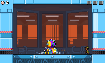
My previous plan was that the 1st and 3rd bosses would be variations on tanks such as this one, while the 2nd and 4th bosses would be somewhat different. I've made a rare decision to cut back / simplify things for the sake of time, and make all of the bosses variations of tanks. This allows me to re-use way more of the structure of the fight and makes bosses way quicker to add - that's why I've been able to make the majority of the latest boss in around a week! Rest assured I'm still making the effort to add variety to the fights to avoid them feeling like rehashes.

I said I won't show other bosses for now, but below is a sneak peek of a new projectile made for the latest boss.

Multiple Collision bodies per entity

Previously I went into some detail about how the collision works in the game (I know I still need to properly finish that series of posts off Embarrassed ). As explained in that post each entity had a single rectangular collision body that was used both for collision detection against solid collision such as walls and floors, and also for collision detection with other entities.

I did a bit of refactoring to split this single collision body into two! Entities can now choose to define separate collision bodies for moving and for colliding with other entities.


Shown here, these poison projectiles have their Movement body drawn as an orange rectangle - this behaves the same as before and allows them to collide with the floor. This rectangle is quite large and made it very easy for the projectile to collide with Leilani. Collisions felt unfair as it was very sensitive.

The projectile now has a new Collision body - drawn as a purple rectangle. Leilani will only be hurt by this collision body and not the orange one.

This seems like a pretty obvious feature and I'm surprised I haven't really needed it until now!

True Widescreen

Finally, I began work on a nice improvement to the game's presentation - I've increased the resolution from 400x240 to 424x240! The game has been through various resolutions over its lifetime and I truly hope this is the last one. Cheesy

I chose 400x240 because at the time I had a vague idea of "imagine if you could play this on a 3DS". That idea is pretty irrelevant these days. You can see in this old image that when the game was scaled up to 1920x1080 it would have big borders down the sides.

I was inspired by my excitement at playing Mario Sunshine in 16:9 widescreen (and my disappointment in Mario 64 not getting the same treatment) to finally target a 16:9 aspect ratio for Leilani, too. It'll be nice for the majority of players who have 16:9 monitors to see the game fill their whole screen.

Here's a comparison of the old (top) and new (bottom) sizes:


The screen used to be 25 tiles wide and is now 26.5 - an extra 0.75 tiles on either side of the screen. Some areas will handle this just fine; otherwise will need to be manually tweaked to adjust the camera boundaries and maybe add new scenery where appropriate. In the area shown above I adjusted the camera to show more on the left hand side to balance the composition of the area out a bit.

I'll slowly chip away at these various adjustments to level layouts (and also to UI, which mostly works fine but has a couple of issues) when I feel like it.

Finally here are screenshots of how the game looks in the various display modes on a 1080p screen. Click the images for full size! I may have shown these modes off before but it's worth reviewing them with the new screen size.

Fit to Screen (default)


This mode fills the screen as much as possible without distorting the aspect ratio.

Well, that's the idea anyway! I've actually done a sneaky thing allowed it to distort the aspect ratio by very small amounts if it allows the image to fill the whole screen. The game's output at 424x240 can be scaled up by 4.5x to a size of 1908x1080. This would leave 6-pixel-wide borders on either side of the screen, so I decided to allow it to stretch the image the remaining 12 pixels, less than a 1% difference in width but pleasingly fills the screen.

Pixel Perfect

This mode scales the image up to the biggest integer size that will fit on the screen. On a 1080p screen that's 4x. The rest of the screen can optionally be filled in with a lovely border. The border can be selected manually, or can automatically be chosen to match the current level's theme Smiley


Flat CRT

A classic scanline filter. This also has the same scale adjustment as the Fit to Screen mode to allow the image to fill the entire screen.


Curved CRT

My favourite mode Smiley


Thanks for reading Coffee
Logged

oahda
Level 10
*****


View Profile
« Reply #1237 on: September 26, 2020, 01:17:04 AM »

Hard to come up with more to say than that as usual this update is impressive and everything you showed is looking so good! Cheesy

Also I really want to find a way into that orange room behind the boss room to look for secrets. Ninja Making the window section curved and showing what's behind does so much to add a sense of depth!
Logged

JobLeonard
Level 10
*****


View Profile
« Reply #1238 on: September 26, 2020, 04:56:32 AM »

Nice! Speaking of CRT shaders, have you seen Timothy Lottes' versions? They're the closest thing I've ever seen to capturing that "subpixel phosphor glow" that makes certain types of pixel art look so much better on CRTs

Original shader: https://www.shadertoy.com/view/XsjSzR

Newer, optimized version: https://www.shadertoy.com/view/MtSfRK
Logged
Ishi
Pixelhead
Level 10
******


coffee&coding


View Profile WWW
« Reply #1239 on: October 03, 2020, 11:07:39 PM »

Nice! Speaking of CRT shaders, have you seen Timothy Lottes' versions? They're the closest thing I've ever seen to capturing that "subpixel phosphor glow" that makes certain types of pixel art look so much better on CRTs

Original shader: https://www.shadertoy.com/view/XsjSzR

Newer, optimized version: https://www.shadertoy.com/view/MtSfRK


Oops, I meant to reply to this sooner! Those look really nice. I could probably tinker with this effect for ages but should avoid doing so Cheesy I'm quite happy with the balance I've currently got between looking like a CRT while still being fairly clean to look at.
Logged

Pages: 1 ... 60 61 [62] 63 64 ... 67
Print
Jump to:  

Theme orange-lt created by panic