Plasticware
Level 1


|
 |
« Reply #20 on: March 10, 2009, 01:02:51 PM » |
|
Thanks for all the feedback, guys! That nurikabe guy rocks, I love him. He could double as something to give you a boost up to higher places  Lookin' cool. I love robots, so this is a win. I actually hadn't considered the player climbing on top of him. Maybe! Although, considering how much his head moves when he walks... What a deliciously phallic sprite!  Damn it, Freud! very good progress so far. Your latest one, yurigabe i think is charming. Somehow i would love to see some steam/smole coming of the top of it. I'm sorry he remind me top much of a chimney :D Maybe he could use smoke cloud to escape. Like a squid with their ink.
Smoke might be nice, but I'm sort of trying to keep this guy a little on the simpler side. The nurikabe is looking awesome. He could double as something to give you a boost up to higher places Maybe when you beat him he falls over to make a bridge? I was actually already planning on making him fall over when defeated, crushing enemies behind him, but I hadn't considered the bridge idea. Interesting... Oh, and update, why not. Here's the title screen, still very much a work in progress. 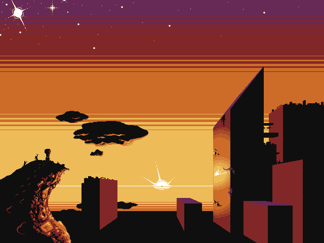 Cliff kinda looks like crap, but it'll do for now? I mean, you can still tell it's a cliff, right? Ignore the green and red pixels in the sun. |
|
|
|
|
 Logged
|
|
|
|
|
Gainsworthy
|
|
« Reply #21 on: March 10, 2009, 05:19:44 PM » |
|
AAAAAAAAH! AAAAAAAAAAAAAAAH! AAAAAAAAAAAAAH!
Even in WIP form, that is gorgeous. The sky, the clouds, the ruined buildings. And I like that cliff.
The firstpost sprites are also rather sweet. Looking good, Plasticware!
|
|
|
|
|
Logged
|
|
|
|
|
Kneecaps
|
|
« Reply #22 on: March 10, 2009, 05:47:38 PM » |
|
Oh my god that cliff is so awesome. That building with the sun reflect-y face is going to have more perspective lines on the lit-up face, right? |
|
|
|
|
Logged
|
|
|
|
Plasticware
Level 1
|
|
« Reply #23 on: March 10, 2009, 06:45:32 PM » |
|
That building with the sun reflect-y face is going to have more perspective lines on the lit-up face, right? ...? Sorry, but I don't know what you mean. You mean the horizontal dithering I have in the sky? I just didn't feel like redoing that on the building, especially since the building and sky would sort of blend together. Different dithering technique, why not? I enjoy being inconsistent. Oh, yeah, and I'll be adding reflections to some of the other buildings too. Might have to add in more buildings and other details as well - looks kind of empty. This thing's a long way from finished. |
|
|
|
|
Logged
|
|
|
|
|
Eclipse
|
|
« Reply #24 on: March 17, 2009, 06:20:55 AM » |
|
actually the cliff is the only thing i really like, looks awesome
|
|
|
|
|
Logged
|
<Powergloved_Andy> I once fapped to Dora the Explorer
|
|
|
Iamthejuggler
Level 6

|
|
« Reply #25 on: March 18, 2009, 03:42:33 AM » |
|
Whilst that does look great, the angle of the building's roof is creating a really awkward tangent with the perspective. The perspective is also inconsistent between that building and the others. In fact the perspective on the buildings are all a bit off, which is pretty noticeable given their very regular shapes and lined up layout. I love the sky and the cliffs.
|
|
|
|
|
Logged
|
|
|
|
Plasticware
Level 1
|
|
« Reply #26 on: March 18, 2009, 04:16:00 PM » |
|
Perspective's off? I used the two colored pixels in the sun as the vanishing point for everything, so it should be pretty consistent. Hmm. I don't see it - sorry. Might just be because I'm used to seeing it that way after working with it for so long.
Also, everyone seems to like the cliff. I guess that's a keeper.
|
|
|
|
|
Logged
|
|
|
|
Iamthejuggler
Level 6
|
|
« Reply #27 on: March 19, 2009, 01:18:16 AM » |
|
Actually you're right ... that's weird. I think maybe it was that sloping roof (which still has that awkward tangent, but nm) that was throwing my eye off. Either that or I am just really tired these days!
|
|
|
|
|
Logged
|
|
|
|
|
SaintXi
|
|
« Reply #28 on: March 19, 2009, 05:49:27 AM » |
|
What kind of action is there going to be? Shooting/fighting/jumping/puzzles? I love the look of the sprites - hope the gameplay is as good :D
|
|
|
|
|
Logged
|
|
|
|
Plasticware
Level 1
|
|
« Reply #29 on: March 31, 2009, 02:28:29 PM » |
|
I'm still working on this. I swear! Here's a new enemy I just finished (sort of). It started off with this sketch. My first WIP was this: 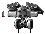 Sort of getting there, right? Here's my most recent WIP - just about done, I suppose. He might still need some more red on him, though. 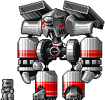 ...So yeah. |
|
|
|
|
Logged
|
|
|
|
|
Ego_Shiner
|
|
« Reply #30 on: March 31, 2009, 03:46:15 PM » |
|
You kind of overdid the shiny shading thing but otherwise its beautiful.
|
|
|
|
|
Logged
|
Lo
|
|
|
|
mokesmoe
|
|
« Reply #31 on: March 31, 2009, 05:19:53 PM » |
|
I think more people should over-do shiny shading.
I really like this robot, especially how he has giant hands and feet, but tiny arms and legs.
You should make more ridiculously big and shiny robots!
|
|
|
|
|
Logged
|
|
|
|
|
Pigbuster
|
|
« Reply #32 on: March 31, 2009, 06:23:20 PM » |
|
Very nice, though it's kinda weird how there're shadows on the highlights.  I want to see these guys in motion, now. |
|
|
|
« Last Edit: March 31, 2009, 06:26:27 PM by Pigbuster »
|
Logged
|
|
|
|
|
andy wolff
|
|
« Reply #33 on: March 31, 2009, 06:25:06 PM » |
|
those sprites are really great.
the title screen is really amazing. it has a great mood
|
|
|
|
|
Logged
|
|
|
|
Plasticware
Level 1
|
|
« Reply #34 on: March 31, 2009, 06:47:55 PM » |
|
Very nice, though it's kinda weird how there're shadows on the highlights. Ah! Thanks; I knew something seemed off. This is exactly the kind of thing I need feedback for - I would never have noticed that myself. Thanks to everyone else as well! And who doesn't like shiny? |
|
|
|
|
Logged
|
|
|
|
|
Ego_Shiner
|
|
« Reply #35 on: March 31, 2009, 08:09:54 PM » |
|
Hey, I love shiny, I just think you overdid it. It's very distracting.
|
|
|
|
|
Logged
|
Lo
|
|
|
|
SaintXi
|
|
« Reply #36 on: April 01, 2009, 12:09:06 AM » |
|
It looks to me more like rough/scratched/brushed metal effect than lots of highlights. It makes a change from smooth chrome, and suits a battle robot.
I like all the little details behind the hulking armour plates.
|
|
|
|
|
Logged
|
|
|
|
|
Griff
|
|
« Reply #37 on: April 02, 2009, 06:11:36 PM » |
|
Wow, really awesome sprite work. The second level boss is killer! The title screen looks sweet too. When will we see some of this stuff in game?
|
|
|
|
|
Logged
|
|
|
|
|
 Community
