|
Yami
|
 |
« Reply #80 on: February 19, 2009, 10:46:39 AM » |
|
It's better to be simple than too busy...
|
|
|
|
|
 Logged
|
|
|
|
null & void
Level 1


|
|
« Reply #81 on: February 19, 2009, 02:59:00 PM » |
|
About the moon thing, I think it's just the color of the background. It's a bright, sunny yellow with loads of contrast on shadows, whereas moonlight is usually silvery blue and very soft. Fix that and I think no one would mistake the moon for anything else.
|
|
|
|
|
Logged
|
|
|
|
|
godsavant
Guest
|
|
« Reply #82 on: February 19, 2009, 03:53:22 PM » |
|
Maybe it don't have to be a full moon? If it was just half a circle everyone would get it immediately.
That works well, I never thought of it.   About the moon thing, I think it's just the color of the background. It's a bright, sunny yellow with loads of contrast on shadows, whereas moonlight is usually silvery blue and very soft. Fix that and I think no one would mistake the moon for anything else.
I never meant that the stage was sight at nighttime...  It's still in the heat of day, but if you've ever been to the desert (or been outside in the afternoon on a cloudless day), you can see the desert during the daytime. I'm not a believer of showing the sun pictures, since doing so would mean adding lens flare in order to remain faithful to Death Worm.  |
|
|
|
|
Logged
|
|
|
|
|
shig
Guest
|
|
« Reply #83 on: February 19, 2009, 04:16:24 PM » |
|
If it's not night yet, then the moon should be a lot smaller, I think.
|
|
|
|
|
Logged
|
|
|
|
|
Soulliard
|
|
« Reply #84 on: February 19, 2009, 07:55:33 PM » |
|
I think the moon is too misleading. People will think it's night.
|
|
|
|
|
Logged
|
|
|
|
null & void
Level 1
|
|
« Reply #85 on: February 19, 2009, 09:13:46 PM » |
|
Maybe make the sky significantly brighter, shrink the moon, etc.
|
|
|
|
|
Logged
|
|
|
|
|
JLJac
|
|
« Reply #86 on: February 20, 2009, 12:34:56 AM » |
|
I think we still have a lot of work to do on the sky. It should be slightly brighter at the horizon, and also I think the moon would look better with a few gradients. 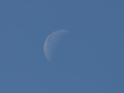 Google for "daytime moon" and you will get some inspiration. People know a daytime moon from a nighttime one when they see them, and the one we have now somehow communicates night. I think I'll try an edit  |
|
|
|
|
Logged
|
|
|
|
|
JLJac
|
|
« Reply #87 on: February 20, 2009, 01:24:04 AM » |
|
So I toned down the moon and made it smaller. Also I added some details to the platforms, and added a gradient to the sky.  I fixed the shadows from the platform, they were strecthing to what seemed to be several kilometers into the background, messing with the perspective. I made them a bit shorter. |
|
|
|
|
Logged
|
|
|
|
|
Fuzz
Guest
|
|
« Reply #88 on: February 20, 2009, 01:28:10 AM » |
|
So I toned down the moon and made it smaller. Also I added some details to the platforms, and added a gradient to the sky. I fixed the shadows from the platform, they were strecthing to what seemed to be several kilometers into the background, messing with the perspective. I made them a bit shorter. The moon is a nice touch. Good job! |
|
|
|
|
Logged
|
|
|
|
|
William Broom
|
|
« Reply #89 on: February 20, 2009, 01:40:30 AM » |
|
That looks really awesome, JLJac. I think it could still be improved though. The sky still seems too dark, and combined with the moon makes it ambiguous whether it's supposed to be day or night.
|
|
|
|
|
Logged
|
|
|
|
|
Valter
|
|
« Reply #90 on: February 20, 2009, 04:16:09 AM » |
|
The other option could be making the sky even darker, and then making the moon brighter. This could be a pretty cool night-time level.
|
|
|
|
|
Logged
|
|
|
|
null & void
Level 1
|
|
« Reply #91 on: February 20, 2009, 06:16:27 AM » |
|
Nikolai and William both have excellent suggestions, but it really should be one or the other. Right now it's a strange mixture of mid-afternoon sunshine and morning twilight that just confuses everyone.
|
|
|
|
|
Logged
|
|
|
|
|
Fuzz
Guest
|
|
« Reply #92 on: February 20, 2009, 12:34:33 PM » |
|
The other option could be making the sky even darker, and then making the moon brighter. This could be a pretty cool night-time level.
That could work well, especially seeing as there is a nighttime mode in the game. |
|
|
|
|
Logged
|
|
|
|
|
Soulliard
|
|
« Reply #93 on: February 20, 2009, 01:18:51 PM » |
|
Not really. It's still day, but everything is silhouetted when you're underground.
|
|
|
|
|
Logged
|
|
|
|
|
Fuzz
Guest
|
|
« Reply #94 on: February 20, 2009, 01:46:09 PM » |
|
Not really. It's still day, but everything is silhouetted when you're underground.
Uh...maybe that's only in the two player mod. I'm not sure. |
|
|
|
|
Logged
|
|
|
|
|
JLJac
|
|
« Reply #95 on: February 21, 2009, 01:08:21 AM » |
|
No, it's called dark mode or something. It's there to add some kind of "realism" making you unable to see what's above the surface when you are below it. Deathworm always plays at daytime from what I know, and I think we should keep it that way. Still the sky is pretty dark in the game:  Also, when looking for the pic, I came across this: http://en.wikipedia.org/wiki/Mongolian_Death_Worm |
|
|
|
|
Logged
|
|
|
|
null & void
Level 1
|
|
« Reply #96 on: February 21, 2009, 02:54:41 AM » |
|
The sky may be dark but it has a very pronounced gradient. I'd try adding that, the gradient you added is nearly invisible.
|
|
|
|
|
Logged
|
|
|
|
|
JLJac
|
|
« Reply #97 on: February 21, 2009, 05:07:27 AM » |
|
The sky may be dark but it has a very pronounced gradient. I'll try adding that, the gradient you added is nearly invisible.
Fix'd...? |
|
|
|
|
Logged
|
|
|
|
null & void
Level 1
|
|
« Reply #98 on: February 21, 2009, 05:40:29 AM » |
|
Eeeee no. I'd, as in "I would," as in "if I were in you or godsavant's position." I've talked myself into a corner as it is with "oh, I'm gonna work on this now," and a project of my own to do on top of it. I'm currently nitpicking at Cabadath's movelist, working on his portrait, learning Blender and playing with an email I mean to send to Daniel Remar soon about the remix thing.
And after this I'm still going to be busy: trying my hand at GML again, probably starting the remix work, learning to sprite full characters, modelling stuff for Qlippoth and proofreading/writing for a friend's platformer/Guitar Hero/wtf?! game about robot cowboys from space fighting zombie Nazi werewolves controlled by Russian Samurai aliens and an emo kid. (No, I'm not making any of that up.)
Anyway, as much as I'd like to lessen your workload I'm 100% overloaded myself right now. I'm sorry about the off-topic rant, but I wanted you to know I wasn't just being an asshole and telling you to do it yourself. I've got myself in a nice big hole filled with nothing but work. While it (and the forum) keeps me occupied, it also keeps me from taking on any more requests, or even just suggestions. I'm really sorry, I'd help otherwise.
|
|
|
|
|
Logged
|
|
|
|
|
Μarkham
|
|
« Reply #99 on: February 21, 2009, 11:06:47 AM » |
|
Why do people try use the "it's such-and-such way in the actual game" argument? If the sky gradient were lighter, you wouldn't no longer be able to tell what game it was from. It's usually a dumb idea to sacrifice artistic quality for some kind of obscure accuracy. I mean, the ground in the level looks almost nothing like the ground in the actual game, does it?
Sorry if I'm blowing things out of proportion, but I keep seeing this kind of thing pop up in this project's threads.
|
|
|
|
|
Logged
|
|
|
|
|
 Community
