Welcome, Guest. Please login or register.

Login with username, password and session length

 
Advanced search

1411502 Posts in 69373 Topics- by 58429 Members - Latest Member: Alternalo

April 25, 2024, 03:11:55 PM

Need hosting? Check out Digital Ocean
(more details in this thread)
TIGSource ForumsDeveloperArtWorkshopHelp with background art
Pages: [1]
Print
Author Topic: Help with background art  (Read 4526 times)
Kinmoku
Level 0
*


View Profile WWW
« on: May 12, 2015, 12:37:55 AM »

Hi guys! I've posted a couple of pictures below that I'm working on for my visual novel game. I don't usually ask for critique, but I feel like I'm missing something here, like flair, life or cool aesthetics. I'm really happy with the character art so far, but the backgrounds seem kinda behind... I can't put my finger on it! I used to do backgrounds and landscapes a lot when I was younger (non digital stuff) but now I'm trying to do it digitally, I'm really struggling.

My process: Perspective grid ---> Rough composition ---> Line Art ---> Block colour ---> Shading ---> Highlights and Fine details ---> Finishing Light Effects

Thanks in advance Smiley


(NB: The posters are currently blank as I am looking for illustrations to add. If you're interested, please let me know!)

Logged
illuminatedspace
Level 0
**


View Profile WWW
« Reply #1 on: May 19, 2015, 08:27:24 PM »

Wow. I think these look really great. I can totally see them as a visual novel back drop. You have all these cute little touches like stuff on the floor and the Christmas lights.
There is this overall kind of flatness to the drawings, which, for this purpose I don't think is necessarily a bad thing. A way that you could make it look less flat is by pushing the contrast on your lighting, possibly.

I really think they look nice though.

I might be interested in making some graphics for you. What is your visual novel about?
Logged

IonForceStudio
Level 0
***


View Profile WWW
« Reply #2 on: June 07, 2015, 10:54:40 AM »

@Kinmoku, are you alive? Smiley

There pictures are amazing for me.
Could you tell more about how did you make it? Can you describe technique and tools?
Logged

ryansumo
Level 5
*****


View Profile WWW
« Reply #3 on: June 09, 2015, 06:32:25 PM »

These seem okay to me.  With the outdoors BG maybe you could highlight the perspective by making the foreground a little more saturated and sharp and adding some more atmospheric perspective in the area where the buildings are.
Logged

Jad
Level 8
***


Bomb Boy


View Profile WWW
« Reply #4 on: June 11, 2015, 01:13:13 AM »

there's too much softness and not enough darkness to distinguish itself from the light.

I think you should draw harder shadows and smooth them out as a later measure - the way the folds on the bed are smooth shaded is just more dirty and smudgy than something that creates a sense of physicality and depth.

... I'm sorry for the lackluster feedback - I'd love to actually show what I'm thinking about visually as I think that would show what I mean more clearly. Anyways, the perspective is very sound.

Maybe try to work in grayscale? Make color contrast not matter at all and focus on values, as either a pre step before colorizing or just practive to get a better sense for values.

Values are important!
Logged
denzgd
Level 1
*


View Profile WWW
« Reply #5 on: July 02, 2015, 06:57:28 PM »

there's too much softness and not enough darkness to distinguish itself from the light.

There is this overall kind of flatness to the drawings, which, for this purpose I don't think is necessarily a bad thing. A way that you could make it look less flat is by pushing the contrast on your lighting, possibly.

Basically, this is the problem. Your pictures are getting more out of the light than the shadows. But a good picture relies on both light and shadows to show depth. Just for the heck of it, I threw it into GIMP, and messed with a few settings. Each of the following images took only a few seconds to change.

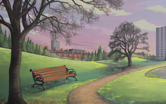
With lower brightness and more saturation:


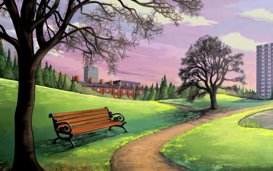
With just lower brightness:


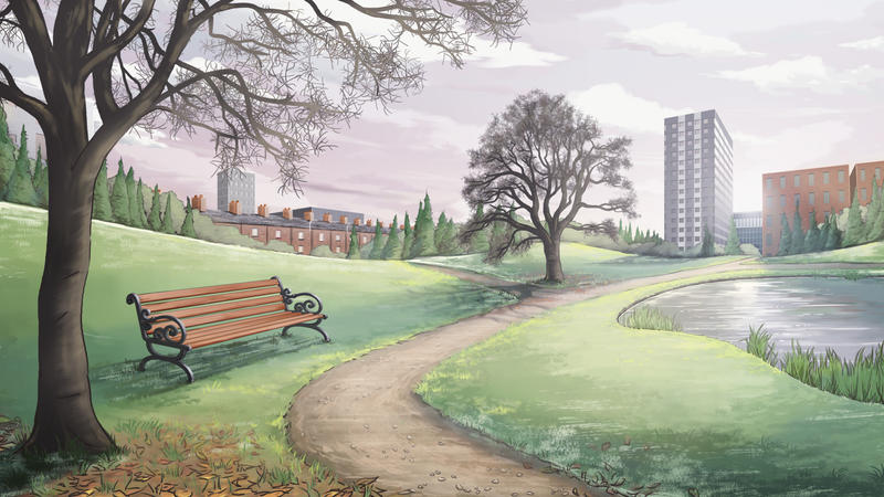
With lower brightness and higher contrast:
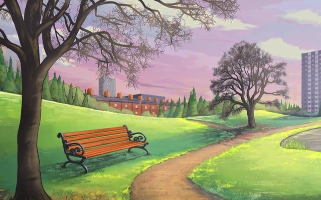

The original:


I'm assuming you wanted to go for a more "winter" look, initially, so maybe you'd want to use less saturation. But my point is, you can get substantial differences from tweaking just a few settings, and you really don't have to change anything about the way you're drawing it.

By the way, do consider using PNG format for your images instead of JPG. With PNG, you don't get the image compression, so you won't have stray pixels reducing the quality of the image.

Hope I helped!
Logged

Pages: [1]
Print
Jump to:  

Theme orange-lt created by panic