|
sanwayzar
|
 |
« Reply #3640 on: November 20, 2016, 03:35:53 PM » |
|
|
|
|
|
|
 Logged
|
|
|
|
|
klamp
|
|
« Reply #3641 on: December 21, 2016, 03:41:35 AM » |
|
|
|
|
|
|
Logged
|
|
|
|
|
kinnas
|
|
« Reply #3642 on: December 21, 2016, 05:04:08 AM » |
|
aw that bunny, I wouldn't mind having it sit on my desk. I suppose you can print the rest of it and make the flagpole out of actual wire / metal? Or y'know, make her hold a cocktail parasol
|
|
|
|
|
Logged
|
|
|
|
|
|
|
|
|
kinnas
|
|
« Reply #3645 on: February 14, 2017, 03:08:08 AM » |
|
Dude your values are all over the place, it would work a lot better if you went over and unified the thing into a consistent silhouette with internal value and temperature groupings, right now it reads like a Pollock painting. You got random sploshes of light and dark sitting next to each other, random bits of warm and cold. There's no rhyme or rhythm, only random noise.
|
|
|
|
|
Logged
|
|
|
|
|
McMutton
|
|
« Reply #3646 on: February 15, 2017, 08:16:43 AM » |
|
I feel you. Could it be alleviated by fixing up just the textures, or is it the silhouette as a whole, as well?
|
|
|
|
|
Logged
|
|
|
|
|
Bad_Dude 2017
|
|
« Reply #3647 on: February 15, 2017, 09:35:24 AM » |
|
 I decided to give it a quick try with multiply brush, so its all brown and too dark for an ingame model. I guess lack of color unity is the main problem, 255 blue hair orbs, brown belt and blue-yellow pants are the main offender. The easiest way is to make character be based on 2 opposite/complementary colors and not have them exceed 2-3 so i just picked up cyan to oppose pink. |
|
|
|
|
Logged
|
|
|
|
|
McMutton
|
|
« Reply #3648 on: February 15, 2017, 08:39:29 PM » |
|
Yeah. I think the main issue is that I'm building up an old design in a way that doesn't mesh well with itself. That original design worked best as-is, and not with bits of armor slapped on.
It's a bit awkward after yelling out that I'm done redesigning, but I'll probably work her again from the ground up instead of trying to reuse bits of old design.
|
|
|
|
|
Logged
|
|
|
|
|
BomberTREE
|
|
« Reply #3649 on: February 18, 2017, 01:05:20 PM » |
|
It's a bit awkward after yelling out that I'm done redesigning, but I'll probably work her again from the ground up instead of trying to reuse bits of old design. Keep at it, you're always busting out new work so you're allowed to yell whatever you want   About the character's color, I like the darker/higher contrast armor repaint because it seems to almost make the materials she's wearing look more hardened and metallic. When it comes to the cloth, preference plays it's part and I happen to prefer darker colors because it allows light that you do paint to feel stronger and reveal details in a realistic fashion where otherwise you may not have been able to. (For example, the repainted cloth on her waste looks almost rose'like and works because light is doing it's job by bouncing about on the wavey surface, and reveals interesting shapes and crevices.) Good work and keep it going McMutton  |
|
|
|
« Last Edit: February 18, 2017, 01:29:09 PM by BomberTREE »
|
Logged
|
|
|
|
|
xix
|
|
« Reply #3650 on: February 18, 2017, 05:17:23 PM » |
|
|
|
|
|
|
Logged
|
|
|
|
|
McMutton
|
|
« Reply #3651 on: February 22, 2017, 10:24:55 AM » |
|
I feel much better about this one:   It was good to get some feedback for once- I never would've realized that other design was pretty terrible without it. |
|
|
|
|
Logged
|
|
|
|
|
ProgramGamer
|
|
« Reply #3652 on: February 22, 2017, 05:10:20 PM » |
|
|
|
|
|
|
Logged
|
|
|
|
|
Bad_Dude 2017
|
|
« Reply #3653 on: February 23, 2017, 12:28:42 AM » |
|
i like it more, but those pants still grab too much attention, maybe tone down the gold
|
|
|
|
|
Logged
|
|
|
|
|
BomberTREE
|
|
« Reply #3654 on: February 23, 2017, 04:11:12 PM » |
|
Wow McMutton, that was fast  I like the addition of plate on the chest and hips, along with the gold trimmed areas throughout! The armor feels much more like a hard metal than the softer plastic look it had previously Her upper body is a bit smaller than the lower body since you removed the shoulder plates, which to me looks stylish af. I especially like the color variance and shapes from the back view, that dark red  In an attempt to find things worth touching up, I imagine the back of the plates could have some other texture to them besides the flat gradient, but it'd only be noticeable if the character was viewed from behind often. Great job, keep it up |
|
|
|
« Last Edit: February 23, 2017, 04:25:07 PM by BomberTREE »
|
Logged
|
|
|
|
|
benhosac.art
|
|
« Reply #3655 on: March 01, 2017, 02:25:51 PM » |
|
|
|
|
|
|
Logged
|
|
|
|
swordofkings128
Level 6


|
|
« Reply #3656 on: March 26, 2017, 10:29:51 PM » |
|
Here's some stuff unrelated to my game I've made recently:   Album artwork for an EP by Quicksand-T, it can be heard at https://firstkings.bandcamp.com/album/geneslizz-epAnd I got a bit distracted a couple days ago and took another stab at modeling faces... Part Jimmy Neutron, part Reboot:  Another thing in the spirit of Reboot, some kind of techno goddess...  I would love to spend a lot more time practicing faces but there aren't visible humans in Frog Days so that will be on the back burner for awhile... |
|
|
|
|
Logged
|
|
|
|
|
AutumnPioneer
|
|
« Reply #3657 on: March 30, 2017, 12:43:12 PM » |
|
I just finished this piece. It's not for a game but i'd love to hear feedback!  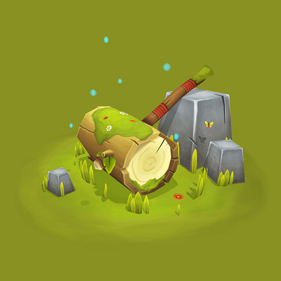 Sketchfab link for a 3D view: https://skfb.ly/6pnBG |
|
|
|
|
Logged
|
|
|
|
|
BomberTREE
|
|
« Reply #3658 on: April 01, 2017, 01:09:47 PM » |
|
@Applefat.GOVI like the colors, but the transparent bits seem a little off but maybe that's because they're emitting more bloom than light and shadows. @huggmachineGood texture work, the contrast is solid throughout the entire model Does he have a beard or like jaw scars? @swordofkings128Oh man, your work reminds me of the artsy late night cartoons that I would see on tv as a kid I understand what I'm looking at but it's off enough from it's real life counter part anatomically, texturally, and lighting wise just enough that it makes me slightly uncomfortable  (Plus the GENESLIZZ EP is helping this effect) Keep doing you EDIT: the uncanny valley @AutumnPioneerCool simple brush strokes for the wood detail. Nice highlights on the edges of the geometry and details I like where the handle is poking out of the top of the wooden head, and the portions where the outer bark broken off and revealing the whiter inside. I would kind of like to see more detail on the vegetation growing on the hammer because at the moment it almost resembles a goo or slime! (Especially when zoomed out at more of a game resolution, but since it's not for a game then no worries there.)
|
|
|
|
« Last Edit: August 04, 2017, 10:27:14 AM by BomberTREE »
|
Logged
|
|
|
|
|
AutumnPioneer
|
|
« Reply #3659 on: April 01, 2017, 05:00:36 PM » |
|
@AutumnPioneerCool simple brush strokes for the wood detail. Nice highlights on the edges of the geometry and details I like where the handle is poking out of the top of the wooden head, and the portions where the outer bark broken off and revealing the whiter inside. I would kind of like to see more detail on the vegetation growing on the hammer because at the moment it almost resembles a goo or slime! (Especially when zoomed out at more of a game resolution, but since it's not for a game then no worries there.) I agree, this was my first attempt at painting moss, so i think i should have taken more references and made it better. Hopefully wasn't too bad for a first try!! |
|
|
|
|
Logged
|
|
|
|
|
 Developer
