|
I_smell
|
 |
« on: March 01, 2016, 06:42:02 AM » |
|
Hello friends! I'm working on a turn-based tactics game with a casual snooker interface.[ Here's the first video I posted] It's been many years since I made a development log on TigSource. I don't have a lot of time to work on my own games any more, so I've created a project that doesn't have a lot of art or code, and mostly survives on design work. I only have a couple of hours after 6pm or on weekends, as I'm treating this as strictly a hobby project for me to enjoy designing and developing games again. I'm aiming for a game where you take turns making tactical decisions; like X-COM, Advance Wars, Hearthstone or Pokemon. I've always appreciated design that was broadly understandable, clean and user-friendly, so I've designed my tactics game inside of this one-button snooker, or mini-golf or Angry Birds style interface. I think this design could easily work in single-player or multiplayer on a phone, web-browser, Steam, PlayStation or futuristic AR visor. GameYou are the red team. You have up to 3 balls on the table. They all have 100 health. Deal damage to the purple team to defeat them. Unit Types Here's an example of different unit types in the game. The large one on the left has more health and does more damage. The small one on the right does less damage, BUT he gets to take a turn more frequently. That might not sound very useful, but the backbone of this game is the ricochet mechanic. If you ricochet a team-mate into an enemy, instead of hitting them in one shot, you'll do 150% of that unit's base damage. So if you have things set up right, you can use the small units to simply ricochet the big powerful units around.  In the video above, you might see me bring in a unit with a triangle face. He's a special type who does only 10 damage when he hits directly. HOWEVER: If you can land within a close radius (the light-coloured circle) of your opponent, you will STEAL THEM! You'll convert the enemy to your team, at the cost of some health. I steal two purple units at the end of the video. There's also a snowflake ball- this freezes enemies, upsetting their turn order and allowing you to leap ahead. The electrified balls with an X on them simply sit still and damage whoever hits them! I'll be thinking about other unit types in the future, but really I'd like to keep this game within a very manageable scope. Other Game Systems You also have a deck of 3 balls at the side of the board. You can bring one in when a team-mate explodes.  You might notice that the right side of the board is red, and the left side is purple. These are team defense zones. If a red ball is in the red zone, it will take half damage from any collision. Same for the other team. Try to keep them out of their defensive zone, and keep your own units safely within theirs.  What is the gray bar at the bottom? That is the timer bar. In a lot of turn-based tactics games, each player will take 1 turn each to move all their units. In this game, each unit is constantly ticking down to their own individual turn. With this system, you can freeze specific units and leap-frog them. I can also play with timers, like how the smaller balls reset to only 75% of the way down the bar. This means they get to move more frequently. In a special bonus; if you have only one ball left on the field, it's timer will tick down faster. Meaning that you might be able to rush ahead in a panic and score a lucky comeback. Boy I wonder if there's a way to take advantage of this bonus???  Did you notice the circle in the middle? It's bigger here. That's a base you can capture. Spend time sitting on the base until it's completely filled with your colour, and you win the match instantly!  What are the squiggly white lines at the top and bottom of the board? In this match, those walls are electrified, and will deal damage if you use them. Try to knock enemies into them instead. This is a modifier, and the majority of matches might not have electrified walls. In this match, I've activated an air-strike. This is a donut-shaped ring around the centre. It deals a huge 40 damage to anyone touching it when it detonates. If you watch the white diamond on the timer bar, you'll see that it detonates quite frequently. Try using it to your advantage. I'll talk more later.That's the core of the game. It'll have a different name, and some much nicer artwork later. Maybe there'll be a couple characters, and some nice fun sound effects. For now, the focus of this project is to nail down a good, concrete design of a game in my spare time outside of work. You can take a look at my youtube channel if you'd like to see some of the early builds. I did take a very long break since I started, as I spent my free time on a different project for most of 2015. There's a lot more to talk about in the build I have now, and a couple more features to add. I'll talk about it, and post a test build, as things roll up into a finished game. Hope this seems good! |
|
|
|
« Last Edit: June 26, 2017, 01:17:50 AM by I_smell »
|
 Logged
|
|
|
|
|
I_smell
|
 |
« Reply #1 on: March 18, 2016, 07:10:11 AM » |
|
Recently I've been putting together a little campaign of levels that will hopefully teach new players about the game interface, and how to play it. I've been trying to avoid text pop-ups, basically heeding this advice. However, with this being a kind of numbers-reliant game, I'm gonna have to spell out what you're doing at some point. So I made about 3 levels, and none of them pause or have any text. Then this pops up:  I'm not really happy with this, because it absolutely does pause everything and block the game. So then I hit on this idea; it's a turn-based game, so things are gonna be paused all the time anyway. What if I put these hints around the edges of the screen, and the text would just flow out as you made turns? 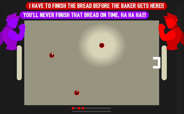 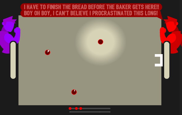 ...It's nice that I don't have to stop what I'm doing and bash A A A A A until the talking heads disappear, but this still feels a bit intrusive and distracting to me playing the game. I do not want to ZOOM OUT to show this stuff either, the game table is the star of the show here. Some of this UI is also obscuring the game table, and that part might be very important to someone at some time. One problem with squeezing things up against the edges of the screen is that it doesn't show on some people's monitors. Console certification (if it ever comes to that) also forbids you from touching it within an inch, so I'd like to avoid it. ACTUALLY- Thinking out loud, maybe I could have the enemies execute whatever strategy I'm trying to communicate in their first turn. So I could orchestrate that the enemies will execute a ricochet for +50% bonus damage. Will people notice and understand that? |
|
|
|
« Last Edit: March 18, 2016, 07:31:23 AM by I_smell »
|
Logged
|
|
|
|
|
I_smell
|
|
« Reply #2 on: April 06, 2016, 05:25:10 AM » |
|
So one thing I'd really like to do in this game is have a bit of a natural, breathing environment. I played Hearthstone about 6 months ago, and it was an important game to play, because it's a simple card-game interface with a lot packed into it. In Hearthstone, when you place down a powerful card, it kicks up this big whiff of dust from the table. Specks and pieces shatter and fly around when you attack the opponent directly, and there's basically a lot of wind and sand kicking up to add visual impact and direction to your choices. It helps guide you through how the game's going, and also turns up the volume on the events of the match like a commentator or crowd would. There is also a crowd, they do a lot with audio. So I'd be really happy if I had some grass, or sand, or snow, or water to move around when you take shots. It's been very difficult for me to come up with some convincing grass that achieves what I want it to. Even though I said I wouldn't dump all of my spare time into drawing artwork, I'm ashamed to say that I let myself go a bit on the table art.  This grass ambiently flows and moves with the wind, although it's not very convincing right now. It's also randomly generated, here's a slightly different field:  and here's a late afternoon scene:  Here's an earlier version, where I used different textures and variables Here's an earlier version, where I used different textures and variables. I hope that having different times of day, maybe some different intensities of wind, rain and snow, might all add up to a game with a bit more visual variety than my current Battle Snooker prototype. I should really stop playing with the grass and get back to finishing off features though. |
|
|
|
|
Logged
|
|
|
|
|
I_smell
|
|
« Reply #3 on: April 23, 2016, 06:26:14 AM » |
|
Today's update:
I did a lot to the background art, and added sound.
I spent some time planning out 5 introductory levels, but I actually realized that if I improve the interface artwork and sound, I could do with a lot less tutorializing and get you into the game a lot faster. For example: have a unique sound play when you trigger a ricochet bonus, and give that ball a white trail. Or have a sound play when you roll into the base that you can capture. If I can keep the player up to speed on what's happening in-game with ambient notes like this, they'll be more likely to just notice what's happening themselves without me spelling it out in text.
I also spent some time shifting to that new dialogue interface that I showed above, but I'll continue working on a more intuitive interface before I really nail down how important talking-heads will be.
Recently I've been checking out Clash Royale, a very popular mobile game, and it blows my mind how little tutorializing they have. They basically leave you to figure out the entire game, it's very cool.
|
|
|
|
« Last Edit: April 23, 2016, 08:01:59 AM by I_smell »
|
Logged
|
|
|
|
|
I_smell
|
|
« Reply #4 on: May 17, 2016, 08:17:47 AM » |
|
Here's an example of the enemy who freezes, just cos I haven't updated in a while:
|
|
|
|
|
Logged
|
|
|
|
|
I_smell
|
|
« Reply #5 on: May 26, 2016, 01:57:07 AM » |
|
Update: I've now learned a bit more maths, and the Thief unit AI is completely deadly: He stops at just the right distance to capture you EVERY TIME  the idea of spinning a globe around, and unlocking levels around a fictional, exciting world map-- but now that I've had a chance to sleep on it, maybe it should just be a normal menu instead :I Oh- and many UI changes, all the time, here's an example: The balls used to turn black when they were about to blow up. That meant that you actually couldn't see which team colour was dieing. Very stupid, in hindsight. Now their "face" actually gets smaller before they blow up instead, so you can definitely see which team colour they are. Today, I'm moving all of my levels from a disorganized pile of ifs and buts to a directory of xml files. Very technical update, but what it means is that I can more intelligently store stuff like names, locations, your high-score, whether or not this level is available, unlocked and optional... lots of stuff. It also means I can start saving and uploading levels as a player. Possibly to the Steam Workshop? Who knows!!! Maybe later I can save and upload my own designed UNITS to the Steam Workshop, wouldn't that be pretty cool? |
|
|
|
|
Logged
|
|
|
|
|
EvilDingo
|
|
« Reply #6 on: May 27, 2016, 03:52:14 AM » |
|
I wasn't sold on this at first. I couldn't appreciate the design until I watched the videos. Now I love it. I think it would be best as a mobile game though. It's the perfect aesthetic for mobile. Touch and draw to set the power and direction is intuitive and the levels seem nice and short. I liked the world map!
|
|
|
|
|
Logged
|
|
|
|
|
I_smell
|
|
« Reply #7 on: May 27, 2016, 05:24:15 AM » |
|
Thanks! I designed this to work suitably as a mobile game, or web game, but hopefully will come out interesting and pretty enough for Steam or Xbox players to give it a shot too. FIRST COMMENT 3 MONTHS IN!!! Looks like I got a real hit on my hands here  |
|
|
|
|
Logged
|
|
|
|
|
I_smell
|
|
« Reply #8 on: May 31, 2016, 10:59:08 AM » |
|
I don't know if anyone's interested in this, so I'm sorry if I'm just spamming, but here's my design process on the level select screen that I worked on today. I closed Unity and opened Flash. This is my preferred drawing software, I've used it since I was 14. I set the aspect ratio to my monitor, and try to only use different shades to denote focus, not get distracted colouring it in.  My first idea looks like a snowboarding game, haha! I skewed the menu options up and to the right, because I worked on SpeedRunners for 3 years and old habits die hard. One problem with this layout might be that the list is finite, so what if I have 60 levels? I didn't fit enough game information on this screen, but it is very neatly divided between MENU on the left, and INFO on the right... so that came out well. The character is a person with their arms folded, with a circle made of circles for hair. I do wanna just go with the flow and put a lot of circles in the UI to keep the game's existing identity growing.  I went back to making the globe a part of the navigation. Also now we've got characters yelling flavour text, which is something I definitely want. I made the level preview bigger and closer to the navigation, because thumbnails are easier to recognize than flicking through strings of text. Here's what's bad about this layout: Is it a menu? Where's level 1, 2 and 3? Do I go right to advance to the next option, or down? It's nice that the QUIT icon is in the top-right to better reflect the customs of software design, but how do I get there?  The globe takes a back seat in this iteration, and I've added a score counter to the level name. I definitely want to track your score on each level and daily challenge. The name pins to the globe-point very well, and brings those to concepts snugly together. We're dividing the screen now between LEVEL INFO on the left, and FLAVOUR TEXT on the right. Even though the characters will give you a good impression of which units your about to face, it's quite loose and really they're just for personality and fun... so are they too big in this iteration? and is that text in the bottom-right supposed to be the charactrer talking, or the designer talking? 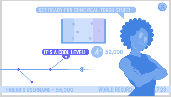 This is the final iteration I'll make for today. You can progress through these levels by flicking left and right, we can see your progress through them, which ones are optional and which ones are new, the level name, thumbnail, score and flavour text are all neatly tied together... You can see that the most important asset is in the middle of the screen, and pieces get less important as they radiate outward. I think displaying your friends' score and world record in a news-ticker along the bottom helps it feel like it's being updated live. This is something I noticed in iterating on the awesome STREAMING NOW widget on the title screen on SpeedRunners. I hope it's not to distracting- but just distracting enough I could even use this screen for generating a random match, daily challenge and maybe previewing online games in a lobby if I just remove the timeline! We're not navigating a globe any more, or moving around a giant Mario World map, or running around a castle jumping into paintings... but it's very functional, and I can be proud of that. Can this expand to flick through 50+ levels? If I added an expanded level set a month later, would people find it? These are questions I'll tackle next time I have a free afternoon. |
|
|
|
|
Logged
|
|
|
|
|
I_smell
|
|
« Reply #9 on: June 10, 2016, 06:23:00 AM » |
|
This week I worked on the level select:  ...Yeah I'm using Advance Wars assets, they're placeholder. The other stuff is fairly close to real, though. Today I took a crack at actually implementing Score:  Why is there a high-score and a grade on each level? Why is there a high-score and a grade on each level?A scary thing about making a linear single-player game is that people are gonna stop playing when they get to the end. This might not work out, because typically you'll design a single-player campaign to be as long as it is fresh. When you've stopped introducing game elements, most people want to start wrapping things up. HOWEVER: Tough nuts like X-Com, Street Fighter, Devil May Cry or Bayonetta have deep systems with more to explore than the sum of their parts. Having an imperfect GRADE lets players know that there's more to find, without letting them know exactly what. It's a call to play more creatively and explore the mechanics or work up the skill ladder. The SCORE determines your grade, but it's much more granular. Which means it's more fit to be compared to other scores. I'm hoping it'll be a nice way to incite competition between friends and strangers without ever engaging in a multiplayer game... Although I hope they do that too! We can also see the world-record tick up point-by-point over time, so we can all get a sense of how the hive-mind community is doing, and where we sit on the grand scale of what's ABSOLUTELY possible in the game. How do I determine SCORE?I'm actually not very experienced with this, but here goes: Points are not rewarded for doing specific tricks in a match, like teammate ricochets or bank shots. That would just encourage skilled players to play in a convoluted way that lines up with my vision for what's cool- and that's a finite, shallow goal. That doesn't encourage creative, exploratory play at all. Instead, I set a WAGER at the start of a match: 10,000 points + (Number of enemy balls x 1,000). Then your SCORE, if you beat the level, is that wager minus Number of Turns You Took x 700. Plus the amount of health you ended the match with x 10 (Maximum health for each ball being 100). Plus the amount of health in your deck, which you decided to keep in your deck, x 12. Choosing only to weight your score based on the beginning and end of a match -HOPEFULLY- means that people will do whatever they can come up with to deal heavy damage in few turns, retaining all health. Your GRADE is basically your final score divided by that original wager. If you kept it at 100% or higher, that's an S rank. 90% is an A. 80% is a B, then C, and anything below 60% is a D. A lot of games rank your skill by giving you 1, 2 or 3 stars at the end of a level; like Angry Birds or Kingdom Rush. The only difference I can come up with between a grade and a number of stars is how people think about them instinctively from experience: Stars are collectibles, and can be stored up and cashed in. Maybe you'll need to spend them later- so it'll be less trouble to scoop them all up while you're here, than to hit a locked door later. A grade is a certificate that you're given. You don't take the test again immediately, you just accept that you passed with a C and move on. Maybe later you'll take another look just to acknowledge that you're improving. I guess what I'm saying is that a grade feels more like a reflection of your intrinsic progress, instead of hoovering up extrinsic trinkets. I'm still not sure if this is good! It seems to work in the early levels. I'd like if an S-rank were achievable on every level in the final game. We'll see. |
|
|
|
|
Logged
|
|
|
|
|
EvilDingo
|
|
« Reply #10 on: June 12, 2016, 12:32:18 AM » |
|
A scary thing about making a linear single-player game is that people are gonna stop playing when they get to the end. This might not work out, because typically you'll design a single-player campaign to be as long as it is fresh. When you've stopped introducing game elements, most people want to start wrapping things up. Great point. This is a huge deal with mobile titles. Having an open ended game is a great way to have a lot of replayability. Competitive players pretty much require a leaderboard to stay engaged. A linear game with an ending, at least if it doesn't have a huge reservoir of levels, will do comparatively poorly even if it's a great game. |
|
|
|
|
Logged
|
|
|
|
Selkcip
Level 1


|
|
« Reply #11 on: June 12, 2016, 01:07:33 AM » |
|
This is a really neat solution to adding a skill requirement to turn based combat. RNG turn based combat is pretty boring to me since it's just choosing the best move over and over, but making the combat itself a game like puzzle fighter makes it a lot more engaging.
|
|
|
|
|
Logged
|
|
|
|
|
I_smell
|
|
« Reply #12 on: June 14, 2016, 12:09:23 PM » |
|
Thank you! Yeah I can guarantee there are no random numbers in here. There's a randomized daily challenge match, but that's as close as I get. and thanks EvilDingo, I'm really happy somebody's reading my breakdown on scores and grades. Here's an update for this week:  This new unit is a mobile factory. He/she spits out a small support ball instead of taking a turn. This unit started off as the SPLITTER. They'd split into two smaller units when they hit an enemy. That gets complicated, though; at what angle do they split? What if they do it while moving really slowly and end up occupying the same space? What does that idea ACTUALLY ADD to my strategic decisions? When I came up with the idea of firing a dummy, I felt a lot better about it. The role of this enemy is to multiply and overwhelm you over time, so now they can achieve that in a way that's much less complicated. For a long time, you would fire a dummy and then fire yourself. I thought this was great, it was so powerful to take 2 moves at once. The enemy was very challenging, which I enjoyed! I had to remove the 2nd shot though, because it was such a massive sum of damage all at once, it just aint funny when somebody really cracks how to use it. Instead, I turned up the frequency that it would fire a new unit, strengthening it's role as a source of overwhelming numbers. As an added bonus, it's one of the only units that can't actually fire itself, which is an interesting vulnerability.  I came up with an interesting solution for effects in the game, by the way:  This is a 256x256 PNG. Shades of gray, from black to white, act like an animation timeline from 0 to 1 second... or 0 to 30 seconds, or whatever you feel like stretching it to. Let's say it makes black pixels visible at 1 second, grey pixels visible at 5 seconds, and very light pixels visible at 10 seconds. Working on SpeedRunners, I would hand in these massive sprite sheets with sprite sprite sprite sprite sprite of animation frames for daft things like a big circle, or a little splash, or a puff of smoke. I'm quite happy to have come up with something so small and neat. Here's another bonus: If you look at particle and trail effects in Street Fighter, you'll notice that they animate at a very choppy and staggered framerate when the game goes slow-motion, but these little effects can be played at ANY speed no problem! I also use this colour ramp to tell the effect how to animate colours, which is also a very small PNG:  With this method, I can make effects animations that might otherwise be 50 or 60 frames of hand-drawn work! This one is the splash you can see when two balls collide:  I also used this method on my explosion:  I can't wait to see what else it could be useful for, but I'm quite busy actually working on the game. Speaking of which- this has been kind of a grace period where I've not been too busy at work, but I'm really about to plunge my gross uneducated hands into porting and certification. I'll actually be directly responsible for game code again on small projects at tinyBuild, so I'll be much too busy cleaning up after myself and apologizing to make solid progress on BAT SNOOK. Oh well! |
|
|
|
|
Logged
|
|
|
|
|
I_smell
|
|
« Reply #13 on: July 08, 2016, 09:37:22 AM » |
|
Here's a playable build!The game's chugging along with plenty of levels and placeholder Advance Wars characters, so I might as well put it out there for people to try. Please give it a download, and let me know if you found it too boring, too confusing, slow, weird, or bad! I would love to go in and change things.
|
|
|
|
« Last Edit: July 22, 2016, 09:03:25 AM by I_smell »
|
Logged
|
|
|
|
|
I_smell
|
|
« Reply #14 on: July 17, 2016, 06:54:18 AM » |
|
Man I'm glad I'm making this as a hobby and not my job, cos if people were this disinterested while a whole company was on the line I'd be really stressed out!  The linear progression of levels is cool, I'm happy with where it's at. I'm almost feature-complete here, it's just about time to start making all those characters and artwork! Feels very weird though, I've been holding back on it for so long that I have some anxiety on biting the bullet and working on style. My goal with this project was to push style and flair BACK, behind more structured design work and code... so is it really time to polish things up, or am I jumping the gun? Speaking of design, there are two more unit types I'd consider creating, but I'm just not 100% sure. So I'm doing some on-paper design here; I was telling my girlfriend about why I don't want a vampire unit, and she came up with the idea of a Jesus-ball who would save everyone else at the cost of his own life-points. I was very happy about the concept, but thinking it through I'm a bit hesitant: Martyr Heals team-mates within it's radius at the cost of it's own health. Puts every ball within it's radius into Defense too! (taking half damage). Does minimal damage on actually hitting someone directly. 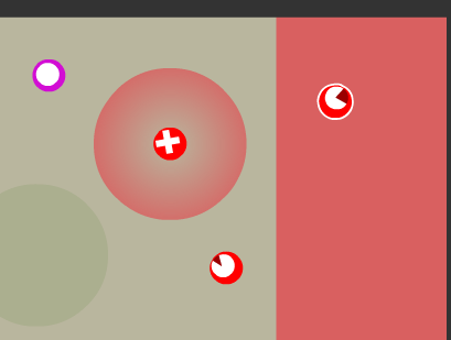 Things I like: Deciding who to heal / defend is an interesting choice. Would add a small defensive zone to maps without defensive zones. Elongates the life and usefulness of every other unit. Healing gives more than it takes, so you could cancel out the drain by having two Martyrs heal each other, and both benefit. Can heal two units at once, for the price of healing one. Planning ahead for this would lead to a great health boost for your team! Enemies could also take advantage and drain health from YOUR Martyr. Vice-versa too. The Thief ball spends his own health to steal other units, so this would be a good team-up. The Factory gets more dangerous the longer it stays out there, so that's another good team-up. Things I don't like: Why would you use one Thief/Factory and one Martyr instead of just two thieves? You'd get your desired attack out more frequently if you just used two of the same unit. It would make matches take even longer. Having only this unit left on the table is a sad and anti-climactic ending. He can't damage anyone! ...Really not sure if it's worth working on. Here's another one I came up with myself: Toxic-ball Leaves a trail of toxic slime wherever it goes. Slime damages units that roll through it, and creates friction in their roll so they can't reach as far. Your team-mates are fine though! Inhibited by distance- this unit can't roll very far, otherwise he'd be much too powerful. 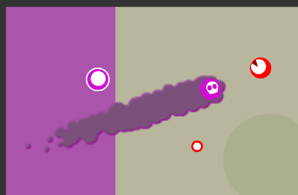 Things I like: Gives you ownership over parts of the map. You could make the base in the center toxic, make your defensive zone toxic, or make the enemy's defensive zone toxic. Carry out long-term strategies. Make a toxic wall, and then try to continuously rebound your units back behind it after attacking! Things I don't like: Makes the map even more cluttered and hard for new players to read. Introduces new game pieces to teach and be understood, what is toxic slime, how does it work, etc. Not much depth beyond it's primary function. Doesn't interact with other units in many interesting ways. ...So I'm not sure if I should add more content or start colouring in, and this is paralyzing me for a sec. |
|
|
|
|
Logged
|
|
|
|
|
I_smell
|
|
« Reply #15 on: July 22, 2016, 02:31:59 PM » |
|
Not much BS work at all these days, there are some real deadlines comin up at work-work. Here's a quick mockup I managed to sneak in today though: 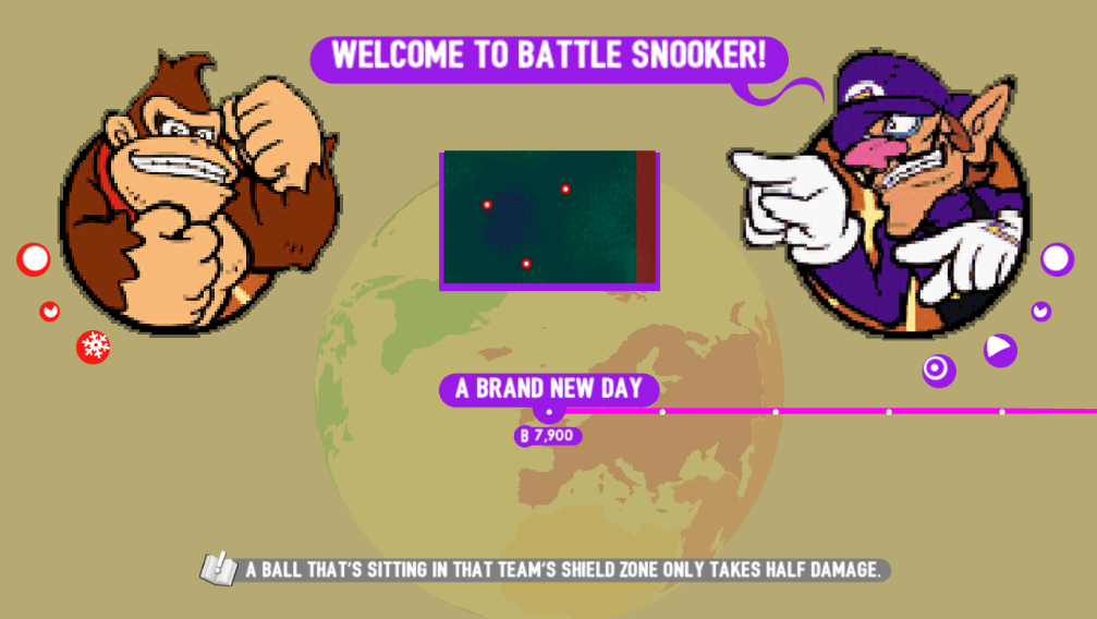 These sprites are from Mario Hoops 3-on-3 for the Nintendo DS. The idea is that my current match screen shows your upcoming enemy character... but it's not clear that that's who it is. It might better communicate that a match was starting if it looked more like a versus screen. I also had a problem where I was telling you that you unlocked a new unit in your inventory... but what the heck is your inventory, right? With this new design, I get to show your current ball choice and also your enemy's. This really ties the enemy characters to their signature units, which I wasn't doing before, and gives an even better preview of the upcoming match. One more thing: All of this info is even more helpful when I re-use this on the Multiplayer lobby screen! One downside to organizing things into these two compact widgets is that I was looking forward to drawing my big proud character art for each character. I imagined them being tall and stylish, not squat and bulky :/ Well... it's a good thing I'm doing all this paper design before diving into the artwork, cos at least I don't have to throw my own characters in the bin. |
|
|
|
|
Logged
|
|
|
|
|
I_smell
|
|
« Reply #16 on: September 15, 2016, 01:19:41 AM » |
|
Hey gang! I haven't updated for a while cos it's been very busy at work, we're porting games to consoles and there are some very important deadlines. Coding update: I have re-vamped the "Daily Challenge". It now generates 7 levels with increasing complexity, and unlocks one each day of the week. If you're playing on Wednesday, you should beat Monday, beat Tuesday, beat today, and then wait for Thursday's level to be delivered. The leaderboard will be the total of all your scores up til Sunday. So if you're 600 points behind a friend on Thursday, you still have a chance to beat them!! Artwork update??? I've officially started thinking about artwork. I said from the beginning I wouldn't get distracted by art, but now I think it's about time to wrap things up. For this concept art, I'm only thinking about rendering style. Concept art should help you answer some questions before you enter production. Like so: - Should the characters have black outlines?
No, it's difficult to keep uniform scale with line art in games and I don't want to worry about that. - How many different colours is too many?
I want to aim for a maximum of 4 colours in a character portrait, so they can double as printed promotional artwork later. - How much is too much fidelity of detail?
The game has a very clean UI, and could potentially be on small screens, so I want large basic shapes that read well, and shouldn't put more detail into a square inch than the rest of the game would. - What is too little detail? Should there be shadows, hard shadows or gradual shading? Should these characters be tall and lean, have big heads, big eyes, Charlie Brown dots for eyes?
I dunno, let's find out!
Remember: We are concepting RENDERING here, NOT CHARACTERS. So I rounded up some reference art for a few minutes to give me an idea of what to try:  And just splashing around, here's my first test: 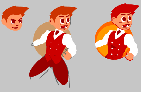 I like the colours and the shapes, but it's TOO clean. This makes me think of a facebook game or mobile game from a few years ago, and I don't like how inoffensive it is. The game lacks character right now, and I don't think this adds much to be interested in. I don't think I could show a very wide range of personalities when things are this clean either. These are my first characters who I DON'T plan to animate, so I do have the liberty to spend more time on a portrait than I did in SpeedRunners. I should stretch out a bit more. After a few other attempts, here's something completely different:  Wow okay. So one thing I got a bit better at was defining a character that looks like they've got things to talk about. This guy looks a bit more potentially dangerous or funny or interesting, so that's good. I don't like how ill-defined everything is, I think it's too smudgy. Pretty weak lines, and I think it's too dark. Most of the contrast is happening low down and the face is a blur- which is the opposite of what I should do to communicate personality and identity. Proportionally, his head is about 15% of the image, while if you look at my Super Mario Hoops 3-on-3 Basketball placeholder art: they put great focus on heads and faces. So I definitely need to try again. By the way, this pose is stolen from a photo of The Fonz, from Happy Days. I tried again: 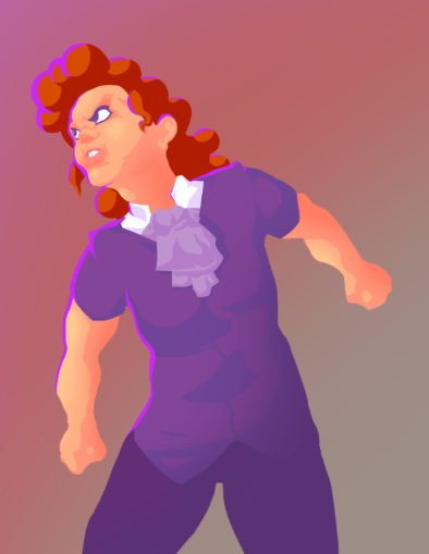 This is one that I liked. I like the colour balance, it really draws you up to the face. I used one-colour hard shadows, and then did one layer of more ambient light and shade. The skin turns a bit more yellow when it gets light, and a bit more red when it gets dark, which helps the game stay colourful. I think proportions could still be tweaked a bit, this is still a bit too tall to squish into a game interface... maybe I should draw from the stomach upwards. I love this character pose, it makes me laugh, and I actually really like the outline on the eyes which was a complete fluke. Oh and I decided to include a highlight down one side to help strengthen the character silhouette. I felt like I was missing some definition from the line art. I started to think about what kind of characters I want to show, and I should aim to tell a story from a photo, because there's not going to be a lot of explicit narrative here. Sometimes you strike a connection just from seeing a person, or they just have evidence painted on their face that they've been through the same trials you have. Sometimes people are funny without jokes. I think each of the characters in Seinfeld tell a story at first sight, and in this next piece of concept art I decided to use Tuco from The Good, The Bad and The Ugly as a base for someone with powerful identity in a face:  This is very similar to the last one, it's rendered almost exactly the same way. The proportions of the character are now almost 40% head, and MOST of that head is a face. My girlfriend just told me that looks weird, but I'm not sure yet, I think I like it. It feels like South Park to me, which I don't mind. I think there's a lot of harmony in the colours and I like it. I'm a bit nervous as to whether or not the shadows make it feel too high-fidelity, or if I should blanket him in more broad light. If you look at my Advance Wars 2 placeholder art, they do use a bit of shading, but very sparingly, and almost none on the face. I think I like the shadows on my previous test more. I think the prop works, and I like how snugly he fits in the circle. That just means he fills a box really well, and will make for an easy UI element for me to use and play around with. So this was my journey through some potentialities of how characters could look, and I'm still not finished! It's been painfully slow working on this, because I've been opening the game in 3 or 4 hour blocks on Sundays and that's all D: After this it'll be actual character concepting, then making the assets, maybe funnin' up the game board and in-game elements, then the game's ddddooooooooone? Music too, I'll need to figure out music. |
|
|
|
|
Logged
|
|
|
|
|
I_smell
|
|
« Reply #17 on: June 26, 2017, 01:17:07 AM » |
|
Hello friends. I clearly abandoned this project last year, because I was sitting down and making character art in drips of one hour every few days, and it was very uncomfortable and frustrating. Today, in 2017, I've decided it's really stupid of me to have such a finished game project sitting on my hard drive, wistfully remembering the times I used to make games. So why don't I really knuckle down and polish it off? Coding Update: After porting other peoples' games to many different boxes over the passed year, I've really learned a thing or two about organizing a project, and optimization. Coming back to my old code was pretty hilarious, so I've started USING VERSION-CONTROL, DELETING UNUSED CODE and JUST BEING NORMAL. I remember I was really adamant about doing everything in raw maths and numbers before, completely banning myself from using built-in physics functions and hit-detection. My logic was: if I don't know how to code a snooker game, I better not go around calling myself a programmer. In the interest of getting a project finished, making everything a lot more readable and even have a smoother game, I've decided to just get on the highway with everyone else and do things the easy way. Design and UI Update: I've decided I'm not adding any more features; I really am aiming to finish and release the game. Here's some iteration when I looked at my Level Select after 9 months: 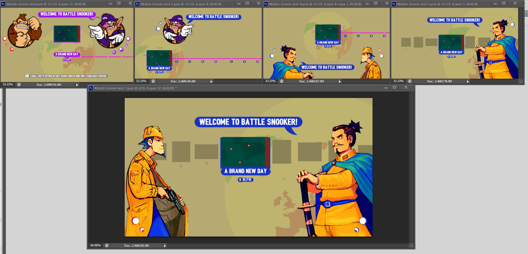 The old screen was such a confetti-bomb of information, I tried to minimize more and more, asking what this screen truly needed to show and how I could show it in the fewest, most common-sense pieces. I went back to old-faithful, using Advance Wars characters as stand-ins for my own. Squashing a person down into a circle just felt contrived. It felt MORE suffocating, even though the artwork took up LESS space. I wanted to air-out the menu like an old rug. I wanted to drop the player-character on the left because it just doesn't give you any information to see your own man in EVERY LEVEL. I remembered later, though, that I am also recycling this screen for a multiplayer lobby, and a daily generated single-player match. In those contexts, playing as different colours, characters and using different units actually would have to be represented for both teams. I decided the pips that represent each level are a superfluous addition to the language of the interface. It would be more consolidated if the levels were their own thumbnails, like on Youtube or Netflix. That way it might feel more natural to glide through them, instead of new artwork popping in and out every time you nudge forward. The planet background took more of a backseat. It's purely decoration, so it belongs in the distant, distant background. Character and Artwork update: I'm diving into making the real, final characters for the game now. If I have one for each new type of unit introduced, I should end up with about 6. I've decided the main character and tutorial-voice will be male-female twins. They can switch seats whenever you tap the portrait in-game. I figured it was a nice, in-world way to flip genders, and I like using siblings or twins as a character trait. As I discussed before, I like characters that are not 100% likable, confident or morally good. I seem to get worse and worse at drawing every year, but I've found it helps for me to draw people doing twisty, bad faces. It alleviates the starting insecurity that my characters are hollow, bland nobodies. This was my first day coming back to game art, and it was a bit more abstract and Nickeloden-looking than I wanted: 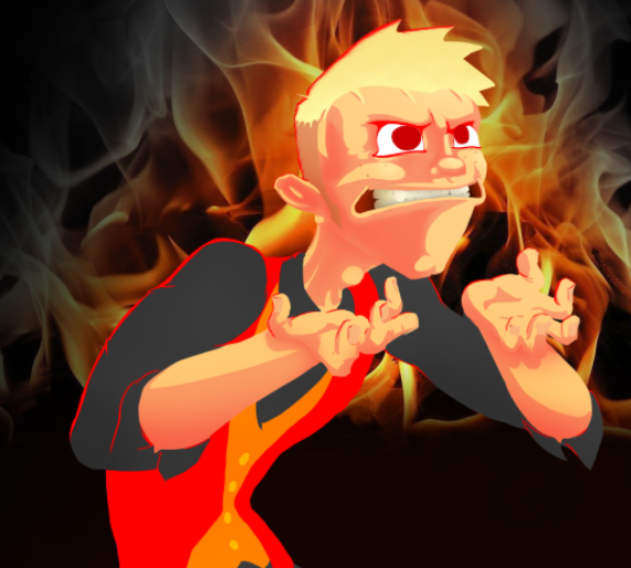 I do like this short-fuse, hot-headed little-brother personality though. I'm dieing to blend from dark hair roots to bleached tips, but I just can't draw it. Using that, and the Mad-Magazine ears, unfashionable sideburns, sporadic drooping hairs and one tooth that's mysteriously whiter than the others, it does build a frayed, uncool, trying identity that I'm attracted to. This is Elaine, from Seinfeld, feeling uncomfortable about saying "spongeworthy". Then given a new hairstyle 16 times and dressed up like a casino croupier. 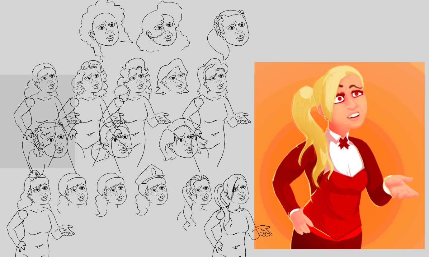 I finally found a haircut I liked, but this character doesn't feel like they could command units. I talk a big game about having a variety of personalities, but when I look at this girl I just don't see much motivation or opportunity for good material. 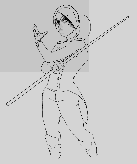 I decided to try something else with costumes, and push it more towards Civil War generals. 200 years ago, high-ranking uniforms were very colourful and decorative. I’ve also had this idea for a really long time that I’d like characters to have these giant pool cues that double as a pointing stick- I thought it would be a good identifying signature for the game, but in practice it just limits the kinds of poses I can have and, in other sketches, I found that I was trying to hide them. Shortly after this sketch I started drifting into bondage territory, and then steered away from it. I like the really deep eyes on this character. I think it could lead to the Napoleon-complex I saw in my male character sketch, so I’ll retain some details and smooth her out from here. 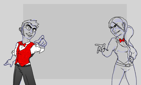 I could write pages and pages about the road I went down in character concepting, but long-story-short this is what I have today and I think it’s a good spot. They look like uncouth, abrasive 20-somethings in classy eveningwear and I think I’ll get a lot of mileage out of that in the long-run. I’ll give them both one more pass to make them look more like twins and just decide what’s too ugly to be a protagonist and what’s too attractive to be interesting, for both of them. In the next post I’ll show final character stuff, reveal my lazy-ass process, say some really insensitive things about designing uncool people, talk about why I almost gave every character a cigarette, and show an addition I made to the in-game UI. |
|
|
|
|
Logged
|
|
|
|
|
I_smell
|
|
« Reply #18 on: July 02, 2017, 12:56:21 AM » |
|
Character check-in: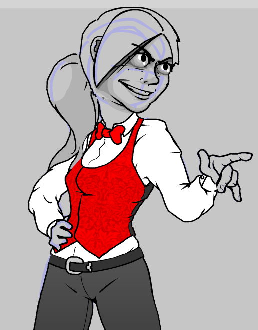 I drew one more layer on this character for colour and depth. Now you can see she still has the deep, skeleton eyes of a killer. I put a mole on her face for half a sec, but I think most people actually associate that with being a cute perk, so I moved it to the more awkward spot on her neck. I like the story it tells, that someone would put up with that for so long that they're over the insecurity of hiding it. If I drew this character 10 years younger, she would be wearing her hair down. 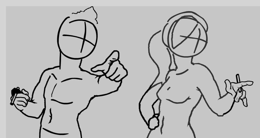 On that note, I did at some point give these guys a cigarette. It was on a day that I wanted them to be more uncool (sorry, smokers). I was aiming the chain them to an old mistake they made as teenagers, or seem bad at kicking their own comforts. That's a normal human thing, but it turned out people looked straight through the characters and just assumed I thought smoking was cool. I did a lot of similar things with concepting the male protagonist here, giving him evidence of an old eyebrow-piercing, outdated sideburns, an old tattoo of a shamrock that's starting to fade into a green blob, but all of these backfired-teenager-ideas I put on him just look like me trying badly to draw a cool guy!! It turns out I can't pull off a lot of the really down-to-earth stuff I come up with, but I'll keep it on the shelf for later anyway. I'll talk a bit about my process for concepting characters aswel.I'm about to start concepting a character who lives on a unique combat mechanic: Their units do not take damage unless you ricochet a mate into them for bonus damage. Direct hits do NOTHING. At first I just drew an extra-strong and intimidating man, but that was so boring I didn't even finish. Digging into this concept a bit more, I balance him out by only giving him access to BASIC units. No freezing, stealing or anything fancy. Furthermore, he does NOT DO any extra damage, he's less "strong" and more "resilient". So I thought about drawing a face that looks like it's really weathered a storm. Maybe someone who somehow stuck around, and didn't progress. 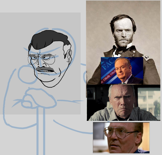 Sitting down with a crutch and a big fat turkey-neck does evoke a sedimentary bed-rock person, so that's good. I pulled together some pieces from different people here, and it emerged that this character should probably be old. That's okay, because it's a space I'm not exploring with the other characters. HOWEVER~~ His old, fat cantankerous body here isn't very intimidating. I wanted to try the character again, pushing the things I liked and ditching the things I didn't. So I searched again for people with weathered, craggy, resilient faces who were intimidating BECAUSE OF their diamond-hard endurance.  Instead of pulling his skin down, I pulled his bone structure downwards to make this long, sunken face. Instead of leaning on a cane now, he's digging this old commemorative sword into the ground. It's a person who's a lot more spooky, who's probably living on some scary tales. I guess I upgraded from right-wing republican to all-out imperialist Demon Headmaster. 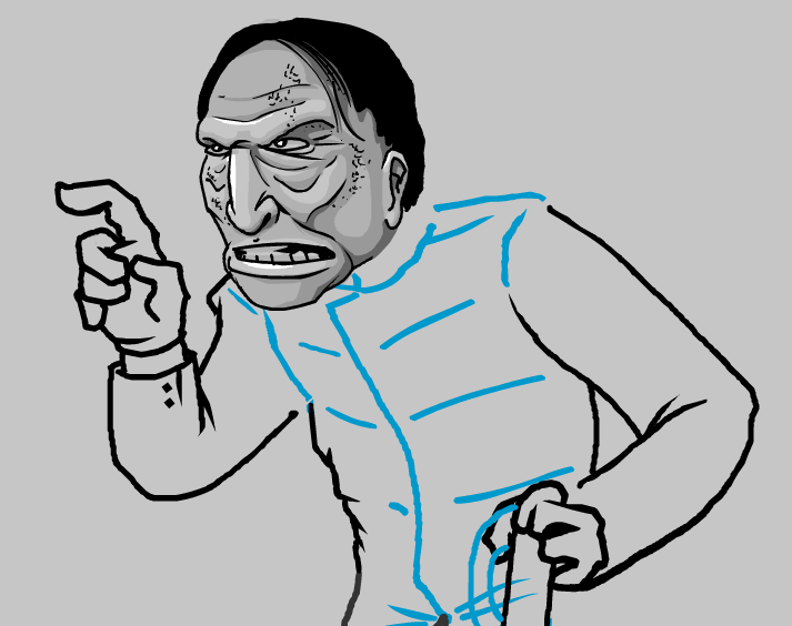 I came back the next day and really kicked the shit out of his face to double-down on the concept. There is a line, though, at some point he starts to look less like a haggard old neighbor, and more like a gross monster. So I might dial it back.  So most characters start off as a few communicative faces and photos blended together. Then I push the parts I think are adding to what I'm aiming for, and mute the parts that aren't. Next I think I'll take on a character that converts units from your side, so characters from here on will likely be a bit more nice-looking.
|
|
|
|
|
Logged
|
|
|
|
|
I_smell
|
|
« Reply #19 on: July 28, 2017, 05:35:10 AM » |
|
Boy, working on a game in your spare time goes pretty slow ): I would post the new character, but I'm not very confident about it today, so here's a different update: First thing you might notice is my new background art. Like a lot of the artwork in this game, these trees are mostly code. They move with the wind, and they're rendered using that effects-shader I was talking about in a previous post.. Their geometry right now is a couple spheres sitting on-top of each other like a snowman, but I think you can tell, so I may have to actually open up some modelling software and make a cone. They're moving on a combination of a couple sine-waves and some noise right now, but actually I think I will re-visit this animation later. Believe it or not, I only figured out how to use the function "Mathf.PerlinNoise()" halfway through making these. The rocks on the side of the table look like junk, they're placeholder.  (this gif is a 10-minute edit I made right after recording the video) The other update on display here is the toxic-slime ball. It's basically what I said it was before. Really surprised at the kind of gameplay it opens up, though. I heard a designer on Diablo 3 last week say that everyone would pitch him enemy ideas, and they all got really creative, but dozens of these ideas just boiled down to 'You Have To Hit THIS GUY First! Because if not, blah blah blah'. You really have to pull the player into making NEW DECISIONS and DOING SOMETHING ELSE if you're going to add an enemy or new units. I've definitely fell short on that a couple times without noticing, but I hope it's not too much. I'm happy that the slime-ball does feel like a fresh kind of gameplay. Did you notice the new UI widget that pops up in the top-left? It's a recap of what happened during the turn, in-case you're still foggy on damage numbers.I'm clearly desperate to not pop up damage numbers over the actual match, so I HOPE this is a useful solution for people. I got the idea from playing Hearthstone and notice that they also have a column of little widgets to remind you of what's happening. I'm not sure exactly how to display this. If you leave it running, it stacks down the whole screen. Left for too long, the information blurs together into one big turn, which is not useful, but it's antithetical to the purpose if it refreshes too often. I've decided to wipe the list clean each time you make a turn, and the previous turn was the enemy. Character work is getting done aswel. If I spend one weekend on vacation though, and the next weekend going out, then progress on the game stands still for 3 weeks. Bummer! |
|
|
|
|
Logged
|
|
|
|
|
 Community
