|
TheGrandHero
|
 |
« Reply #20 on: May 02, 2016, 10:22:30 AM » |
|
I plastered the display as a texture over a simple 3d model of a screen. Here's what it looks like using the shader: The emulated NTSC artifacts are probably a little strong here, but it's a pretty good measure of what the game's display is capable of. The screen is a little rounder than people might care for, though earlier sets did tend to be rounder all over than the newer tube sets that came along later in the 90's and early 2000's. I might ship the game with multiple screen models and let the player choose which one they want. If I have time, I could even model the rest of the TV to go with it, but I'm not sure it's worth the trouble. And, again, the screen effect will be completely optional. You'll be able to turn it off if you want and play with modern super-crisp pixels if you want to. |
|
|
|
|
 Logged
|
|
|
|
swordofkings128
Level 6


|
|
« Reply #21 on: May 02, 2016, 03:40:03 PM » |
|
Those screen effects are nice, but wow I just wanted to say that the gif you showed of characters following you was amazing! I love games with caterpillar systems(well, that's what it was called in the rpgmaker scene anyawy! Not sure if there's an official name for party characters following you)
I'm also excited you're using actual tiles and working so closely to hardware restrictions of the time. Can't wait to see more! Question, though I might have missed this, but will you be able to see enemies before fighting them or is it random encounters?
|
|
|
|
|
Logged
|
|
|
|
|
TheGrandHero
|
|
« Reply #22 on: May 02, 2016, 04:10:11 PM » |
|
I love games with caterpillar systems(well, that's what it was called in the rpgmaker scene anyawy! Not sure if there's an official name for party characters following you) I really like it when a game acknowledges your party members outside of battle, so I made sure to design the game's world system so that I could have some followers without outright breaking the limitations of the era. I also really want the game's areas to feel like a living world, so expect NPCs that do more than randomly shamble aimlessly around. They won't have complex paths or schedules like Majora's Mask or anything; most of them will be standing in place or maybe occasionally have a simple route. But ideally they won't just be stuck in your standard "stand still" graphics. They'll be in simple animations of things like doing laundry or chopping wood or working repairs and such. Question, though I might have missed this, but will you be able to see enemies before fighting them or is it random encounters?
In the first Another Star, as you walked around the map, an exclamation point icon would appear above the hero's head. You could press a button to accept the encounter, or you could just ignore it and keep exploring. Occasionally a red double exclamation point icon appears and then you had to press the button to accept it or else you'd get ambushed. Another Star 2 will use this same system, although there's some tweaks I'd like to make to it. |
|
|
|
|
Logged
|
|
|
|
|
gunswordfist
|
|
« Reply #23 on: May 17, 2016, 09:44:05 PM » |
|
I like what I see. Will follow.
|
|
|
|
|
Logged
|
Indie games I have purchased:
Spelunky
Shoot 1UP
|
|
|
|
PsySal
|
|
« Reply #24 on: May 17, 2016, 10:22:20 PM » |
|
This is lovely  Just wanted tosay that I really enjoy reading your dev log, here. |
|
|
|
|
Logged
|
|
|
|
|
Gamedragon
Guest
|
|
« Reply #25 on: May 17, 2016, 10:58:24 PM » |
|
Question, though I might have missed this, but will you be able to see enemies before fighting them or is it random encounters?
In the first Another Star, as you walked around the map, an exclamation point icon would appear above the hero's head. You could press a button to accept the encounter, or you could just ignore it and keep exploring. Occasionally a red double exclamation point icon appears and then you had to press the button to accept it or else you'd get ambushed. Another Star 2 will use this same system, although there's some tweaks I'd like to make to it. I like that system. Random encounters can get really annoying but you seem to have a good way of getting around that irritation. |
|
|
|
|
Logged
|
|
|
|
izuiki
TIGBaby

|
 |
« Reply #26 on: June 15, 2016, 08:01:11 AM » |
|
[Kinda late to the party, I know.] Even with everything you pointed out about Another Star I may be one of the few people out there who actually has been enjoying everything about this game. From the design, the music, the characters. Yeah you could've done something "better" but for me at least it's right up my alley and I hope more people can appreciate the game for what it is because it's a damn good one.
|
|
|
|
|
Logged
|
|
|
|
|
TheGrandHero
|
|
« Reply #27 on: June 27, 2016, 11:03:05 AM » |
|
Dev Log #6
Words on a Screen First off, a huge THANK YOU to everyone who has commented on the project thus far. I'm happy that you're enjoying watching the game's progress, and I hope that you're looking forward to when it's released, even though that's still so far off. Anyway, computer Role Playing games have changed a lot over the years, and to this day there still tends to be a rather large chasm between what defines "western" and "eastern" style RPGs. But despite all their differences—whether it be battle systems, character mechanics, or art styles—there's always been one thing that virtually every RPG ever made has in common: Text. Lots of text. Loads and loads of it. For early RPGs, both on consoles and home computers, this was a bit of a problem. Today we can fit entire movies on our phones without a second thought, but just a few decades ago space was so limited that just finding the room for dialog was a major development hurdle in and of itself. The original Another Star emulated this by keeping character interactions short and to the point, often with intentionally stilted lines to recreate the feel of the era, even though the storyline as a whole contained an obscene amount of text compared to an actual 8-bit console game. Another Star's text files combined together add up to over 400 kilobytes, which is larger than most NES carts. Even with some decent compression, there's no way a game from that era would have as much text as Another Star. Another Star 2 will likely have even more text than its predecessor. But I'd actually like to lean away from the original game's dialog style and have the characters speak a little more naturally. However, I still want to keep the pace up, so don't expect a visual novel. Persona this is not. Like an actual 8-bit game, both Another Star and Another Star 2's fonts require part of the character table. Here's what Another Star 2's font currently looks like, as seen in a debug overlay. 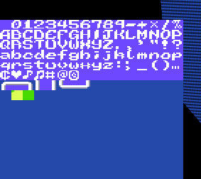 The quick brown fox... Notice that the font alone takes up almost half of the character table for the background, leaving fewer characters for actual map tiles. This was a very real problem that console games often ran in to. It's part of the reason many games that only needed a little text would just make do with capital letters and not include any lower case ones. This is the solution that the original Another Star used to stick to its own 256 tile limit. 8-bit console RPGs of the era, which were usually made in Japan, couldn't settle for this though, as they needed more than the English Latin alphabet's mere 26 characters in order to manage a single set of kana. Because Another Star 2 is allowed to change between tile sets at will, I don't forsee this being too big of a problem. As seen in the mockups I've done, the area maps are more detailed than the original game, but they aren't meant to look quite as advanced as, say, the late SNES games that most "classic style" pixel art game prefer to emulate, such as Seiken Densetsu 3, Final Fantasy 6, or Terranigma. If it does become a problem, I suppose I can always steal a "cheat" from some of the later NES games: they had a special chip on the cartridge that would let the game switch between character sets between scanlines. Some lines would display the map graphics, while others could display the text and interface. Granted, this was possible because the NES has no VRAM and thus all the graphics memory was on the carts themselves, but I'm sure I could cook up some excuse if I absolutely have to. (Or just admit that I would be cheating and live with it.) You'll notice in all the mockups I've done that character graphics tend to be quite prominent, most notably in the form of character portraits for dialog instead of the speaker's name. I want players to be attached to the characters of this game, and it's hard to make that attachment in such a visual medium as video games when all you have to go on is a name on a screen and an itty-bitty mash of pixels. Originally I intended the portraits to be static, but I wanted the characters to be very expressive in-game. Here's what they look like right now in-game. 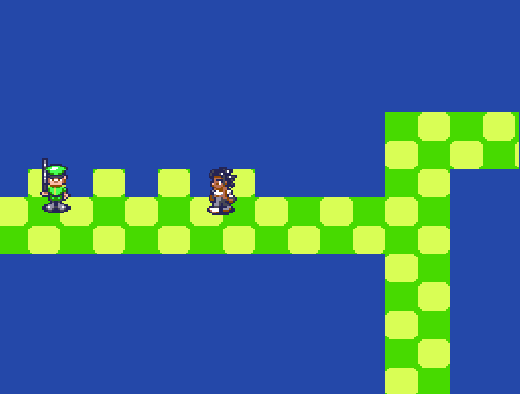 Notice that the portrait has its own unique palette. This is done by switching palettes mid-scanline. Having a flapping mouth and blinking eyes was very rare for the time, but a handful of games did use them. Still, note that not only does the mouth flap, but the entire jaw moves. It's really fairly detailed for a little 32×48 pixel graphic. The room needed to store all the portrait graphics, their layouts, and their animation data is a bit much on its own, not to mention the fact the graphics have to be streamed to VRAM each frame in addition to everything that's still going on with the map graphics. Not impossible, perhaps, but it borders on the implausible. However, when deciding on whether to go this route or not, I had to remind myself of the first rule of Another Star 2: "Another Star 2 is not actually an 8-bit game." I believe having animated portraits makes the game more engaging, and as long as they're not over-animated I don't see them clashing with the art style, so I erred on the side of inauthenticity for the sake of making a good game. Anyway, as a bonus, here's what the portrait look like when viewed in the current iteration of the screen shader. 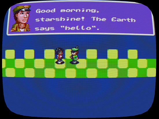 In-game, the jagged, uneven lines flicker like on a real display. It's meant to look like the console is coming in through a cheap RF adapter, but better settings will be available in the final game. I plan for a high-quality option that emulates a computer CRT instead of a television. There will also probably be a few different screen shapes to let you customize how much of the picture is chopped off by overscan, and how round the display is. |
|
|
|
|
Logged
|
|
|
|
|
PsySal
|
|
« Reply #28 on: September 15, 2016, 03:19:49 PM » |
|
Game looks really lovely and I love the concept of the Vision Game System. Thanks for putting so much work into your dev blog, too!
|
|
|
|
|
Logged
|
|
|
|
|
TheGrandHero
|
|
« Reply #29 on: December 02, 2016, 11:05:46 AM » |
|
Dev Log #7
Enemies Approach It's been a long time since I've posted a status update on this project. Sorry about that. I've been meaning to for quite awhile now, but life has been fickle lately. I'd also been working on another, shorter project that just didn't pan out, so Another Star 2 has been on the back burner for a little while. Still, there's quite a bit to cover. The most recent thing I'd been working on is the battle system. This being an RPG, getting it in working order would be a huge leap forward on the project. You may remember one of the very first mock-up images I ever did of the game. 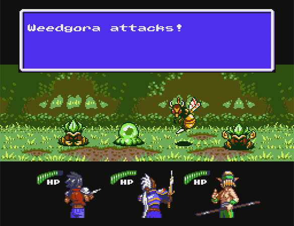 This is the thing that inspired me to work on this game. Here's the battle background from that image, recreated in the engine: 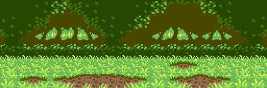 I made the grass much more lush and less scratchy. Each battle background (or "arena", as the game refers to it internally) is only allotted 54 total 8×8 pixel characters to work with, and they have to be arranged into 32 tiles that are 2×2 characters each, although there is some mirroring allowed. These tiles are then fitted into the final layout. In addition, each arena has a unique 10 color palette to work with (the other six colors are reserved for other things, like the window graphics).  It's quite limiting. Maybe too limiting?... But a battle background is just eye candy for the most part. The two most important things in an RPG battle are the enemies, and the party members, so that's what I dove into next. Because I'm still trying to stay try to tile limitations for the most part, I decided to begin with the largest party member first to make sure they would fit. 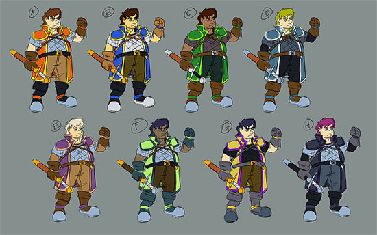 An overview of possible palettes for the character's design. Which is your favorite? What would you change? I'll be using the initial red design for the character, at least for now. 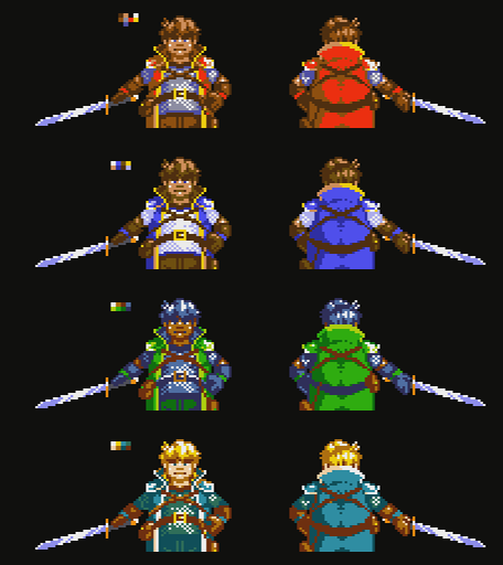 Trying out the first four possible palettes in pixel art. The party member graphics are a bit weird. Instead of being "sprites", they're actually made up of background tiles. There are 90 total 8×8 pixel characters in the background character table reserved for the party, and there are three party members at any one given time. Thus each one gets 30 characters, which are all streamed (and each party member is updated on different frames to simulate the fact there wouldn't be enough CPU power or bandwidth to update all 90 tiles in one frame). They also get an additional four characters each in the form of sprites that can overlay the background, the idea being that weapons would be unique sprites and can be changed out depending on a party member's equipment. And since the party is located beneath the battle arena and enemies on screen, that means I can do a palette change between scanlines and give each character their own unique half-palette of eight colors. You'll notice that this is getting a bit complex. And I'm not sure that's a good thing... 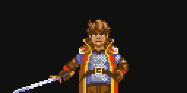 His hair is probably moving a little too much. When awaiting orders at the beginning of each round, the party members face the player. This was important to me, so that you can see their faces often. In the original Another Star, each character tended to be really samey. In this game, I really want each personality to shine and stand out on their own, both in the way they look and act in the story, and in the way they play in the game. Having their backs to the player all the time in battle makes them harder to connect with, I think.  He's a big character, so fitting him in 34 tiles is not easy. Each party member is updated every six frames. That's only 10 frames per second, but does emulate the graphics-limited look of the era. On the other hand it's also a bit sluggish for things like this attack here. Enemies, on the other hand, work a lot differently, and are actually much simpler. Almost all the sprite character table is free for use by enemies, but the party members would already be hogging all the bandwidth of the console with their streaming which means the enemies need to have all their graphics loaded into memory at all times. Still, bigger enemies can use up more room, and smaller, simpler enemies can use less, so long as all the enemies together in a given battle don't go over the limit. I began with the most basic, iconic enemy from the first game: a "weedgora".  Can I refer a design from a three year old indie game that hardly anybody played as "nostalgic"? The original Another Star was pretty typical of the 8-bit era. You usually had big, colorful enemy graphics, but they didn't move or animate to save on cartridge space. Another Star 2, on the other hand, has vibrant enemies that animate and can scurry about. Mr. Weedgora here, for example, shuffles from side to side while he idles. Like party members, enemies also get a unique half-palette, but there can only be two half-palettes at a time so some enemies in a battle will have to share them (all other colors are used by the background and interface). I'm also toying with the idea of enemies having palette swaps that are only cosmetic. For example, our weedgora friend here might have bright green foliage in the bountiful grasslands, but on the dry steppes of the world his leaves might be a more subdued yellow, even though his stats have not changed. This could also make palette sharing between enemies more fluid and easier to work with.  Weapons have not quite been implemented yet, and our sole party member is taking up all three slots. So here we are, with the initial framework of a battle system in place. However, one of the last things I worked on was something I got stuck at, and I even knew I would get stuck at for some time. And that's how it would look when the player goes to issue their orders for the round. The characters and enemies are already taking up so much of the character tables that there's really not any room left for any other iconography. Here were two alternate styles I toyed with, using just text.  Option 1.  Option 2. There's too many options to fit on the screen at one time, so I need some way to let the player know that there's more they can do, but both of these seem more messy than anything else. As it is, I'm really straining the limits of the original "rules" that I came up with. It's looking like something might have to give. Either I need to change how party members and enemies work on-screen, or I need to go back and reconsider the limitations I came up with. Trying to do both will likely result in a much weaker game. |
|
|
|
|
Logged
|
|
|
|
|
Enagic
|
|
« Reply #30 on: December 02, 2016, 11:18:46 AM » |
|
Incredible artstyle. Really polished, and that nostalgic feeling is lovely and greatly acomplished!
Definitely looking forward for this. Great work, and good luck with this project too
Also, I never heard of the first title, but it looks pretty well. How well did it go?
|
|
|
|
|
Logged
|
|
|
|
|
TheGrandHero
|
|
« Reply #31 on: December 02, 2016, 11:26:13 AM » |
|
Also, I never heard of the first title, but it looks pretty well. How well did it go? Not counting the IndieRoyale bundle that Desura never paid me for  it's sold under 1,000 copies since its release about three years ago now. And the vast majority of those have been during Steam sales. |
|
|
|
|
Logged
|
|
|
|
|
TheGrandHero
|
|
« Reply #32 on: January 16, 2017, 07:41:47 AM » |
|
Dev Log #8
A Different Path It's been a little over a year now since I started work on Another Star 2. While I haven't been working on the game all during that time, it has been dreadfully slow going and I have very little to show for all the work I've poured in thus far. Part of the problem can be traced to my tendency to overthink things, but the largest hindrance has been the way the game was being developed. I really wanted a game that was true to the era, but in doing so I broke the project's own prime directive: Another Star 2 is not actually an 8-bit game.Granted, there was something enjoyable about the way I was originally going about it. Other than the actual game code, everything was packed together in a "ROM" file. You could even open it up in a ROM editor like YY-CHR to see the raw tile data. But I was trying a little too hard to make a ROM and not enough time making a game. Some graphics were be compressed while others weren't, depending on whether they needed to be streamed or could be preloaded. The animation system for party members in battle was completely different from the one used for enemies, and both were nothing like the one used for character sprites in the field! Yes, this was how devs fit games on cartridges back in the day, but every time I wanted to add something new I was programming it from scratch simply to pretend I was making a game in the late 1980s. After coming back to the project recently following a several month absence, I realized that I was holding myself back and decided to do what I should have done from the beginning: work on a game, not on a pretend pseudo-emulator. This meant chunking the entire original code base, and all the nice tools I'd made for the game thus far (although a good chunk of the code is being salvaged, so I'm not starting over entirely from scratch). After a few weeks of work, I'm roughly back to where I was before. Still, I wanted the game to be able to play around with cool 8-bit era toys like palette swapping, which isn't really a thing on modern hardware. Thankfully, modern hardware has something else that old systems didn't have: programmable shaders. Here is how the display device "sees" Another Star 2: 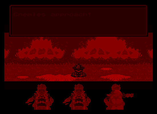 Another Star 2 is a Virtual Boy game now. Surprise! But the player never sees this. The game continually updates a look-up texture containing a number of unique sixteen color palettes. Each sprite tells the shader which palette it wants to use, and then the shader can check the level of red in the input image and know right away which palette entry to replace it with. It ends up looking more like this:  I disabled the CRT screen filter for both these to make it clearer what's going on. The old ROM Architect tool I was making has been shelved, but I still needed something for converting images to a palette format and then animating them, so now I have the more boringly named As2Tool. 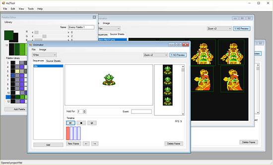 A lot of As2Tool is just repurposed ROM Architect code. In this new incarnation of the engine, there's no way to track or enforce little things like tile limits or streaming bandwidth. But maybe that's not such a bad thing. I can concentrate on making the characters look good and animate fluidly instead of forcing everything into a box. That doesn't mean I plan to deviate entirely from my original plan. This is still meant to be an ode to the late 8-bit era, so multi-layer parallax scrolling, partial opacity, and super-fluid animation are still off-limits. This new approach also opens up the possibility of throwing in a couple of TurboGrafx CD or Sega CD style full-screen animated-pixel-art cut scenes. Yeah, the TurboGrafx 16 is supposed to be my speed limit, but I won't get pulled over if I just go five miles over the limit... right? |
|
|
|
|
Logged
|
|
|
|
|
Pixel Noise
|
|
« Reply #33 on: January 16, 2017, 08:18:01 AM » |
|
Having just seen this for the first time, and reading over the devlog, it sounds somewhat like you've fallen into the same trap you wanted to avoid after your first game; limiting yourself and the game too much, to a point where it will detract rather than enhance the overall outcome.
Glad you haven't lost too much time/progress with your revamp - I'd recommend really easing up your restrictions for now, and just seeing where it takes you. Or at the least - any time you need to make a restrictive decision, ask yourself whether it will actually make the game better? This looks like it could be great, if you do it "right"!
Initially, I was going to comment on the sound - but your plans for that may have changed as well by now. Just wanted to throw out a recommendation for a VST - Impact Soundworks "Super Audio Cart". It's an incredibly detailed sampling of a number of early consoles, including the SMS and the Famicom. This has become our go to VST for any retro tracks we do. It can probably get you the exact sound you're looking for, with very minimal hassle. (I'm assuming you're doing your own sound, from how detailed your plans for it were?)
|
|
|
|
|
Logged
|
|
|
|
|
TheGrandHero
|
|
« Reply #34 on: January 16, 2017, 09:46:51 AM » |
|
Having just seen this for the first time, and reading over the devlog, it sounds somewhat like you've fallen into the same trap you wanted to avoid after your first game; limiting yourself and the game too much, to a point where it will detract rather than enhance the overall outcome. It can be a fine line sometimes. If you restrict yourself too much, you can seriously hold the game back. But on the other hand, if you let up too much then it's easy to get carried away with feature creep and redoing things over and over again because they're not "perfect" yet. Initially, I was going to comment on the sound - but your plans for that may have changed as well by now. Just wanted to throw out a recommendation for a VST - Impact Soundworks "Super Audio Cart". It's an incredibly detailed sampling of a number of early consoles, including the SMS and the Famicom. This has become our go to VST for any retro tracks we do. It can probably get you the exact sound you're looking for, with very minimal hassle. (I'm assuming you're doing your own sound, from how detailed your plans for it were?) I'm not familiar with Super Audio Cart; thanks for the recommendation. I don't think it's quite what I want for this project, but I'll definitely have to remember it for the future. The original Another Star used a combination of a simple freeware VST plugin that simulates the Japanese Sega Master System's FM chip (YM2413), and actual samples from the chip. For Another Star 2, at this point I'm still planning to use real-time generated FM synthesis, in part because I'd like to be able to play with some musical effects that might change depending on what's going on on-screen. I've programmed a few different software FM synth prototypes in C# and C++ over the past few years (see below), so it's not something I haven't done before, but it's a question of how clean I can get it to sound, how reliable I can get it to run on older hardware and laptops, and how much time I want to devote to doing so. I may end up going with prerecorded OGGs again like the first game, but only time will tell. At this point I'm trying not to worry too much about the sound. I don't want to get caught up and distratect composing a bunch of stuff before I even have any "real" gameplay. |
|
|
|
|
Logged
|
|
|
|
|
HoffmanIV
Guest
|
|
« Reply #35 on: January 16, 2017, 10:50:50 AM » |
|
This looks great! I really appreciate the dedication you have to hardware limitations as that really lends a sense of authenticity to the game.
Gotta add to the dialogue about sound design: I can also vouch for Super Audio Cart as well, which is really great for imitating (but not emulating) the sounds of Sega Genesis, TG-16 etc. Failing that (because of prohibitive cost), ALYJAMES' FMdrive is an excellent vst which I can highly recommend. I realize you're not quite at that point yet but you've got a lot of options at your disposal without having to go too old-school and revert to composition in VGM:MM or Deflemask.
|
|
|
|
|
Logged
|
|
|
|
|
TheGrandHero
|
|
« Reply #36 on: January 31, 2017, 11:06:06 AM » |
|
Dev Log #9
The Battle Interface Early RPGs, whether released on consoles or the personal computers of the day, had very simple interfaces. This was common across all genres, of course. RAM was severely limited, especially on consoles, so there was only so much room to store data and graphics. But this was harder on some genres, like RPGs and strategy games, than it was on others. Sometimes important information had to be remembered because there just wasn't enough room to keep it on screen. Other times, the games left out important information altogether and you had to keep the manual and a bunch of fold-out charts on hand if you wanted any chance at making sense of it all. These early RPGs are perhaps most famous for their simple text menu, usually consisting of the classic Fight/Spell/Run/Item combo. The original Another Star followed this tradition practically to the letter. 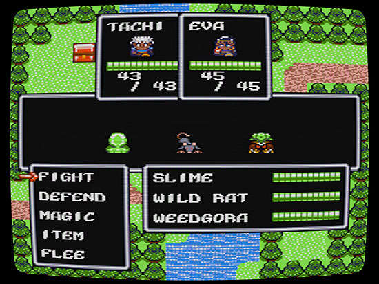 Command? This screenshot is from the game's original release. Notice how much focus is put on the interface elements themselves. The party is squished in up at the top, enemies are barely a blip on the screen, and most of the screen space is dedicated to menus and numbers. A little over a year after the game first came out, I did a new version for the game's release on Steam. This new version included brand new graphics for all the enemies. 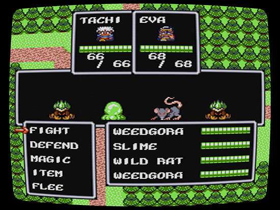 The Version 3 Steam release. The enemies are bigger and more distinct here, it's true, but many of the same issues remain. Now, it's not necessarily a bad setup. You can only make text so small on an 8-bit system without getting into serious VRAM issues, and this interface packs in a lot of information that most RPGs didn't even bother with, like details about the enemies' current HP and health bars for the player's party members to help them better visualize how their party is holding up. But for Another Star 2, as you've seen from past mockups, I really want more focus put on the graphics themselves. I want the enemies to be big and detailed. I want the backgrounds to really give a sense of the game's setting. I want the party members to be recognizable and relatable—I want them to face the player when they're receiving their orders instead of always standing with their backs to the camera, so that the player knows what they look like and can actually get attached to them. This is really asking a lot of an "8-bit game", but it's not entirely without precedent. 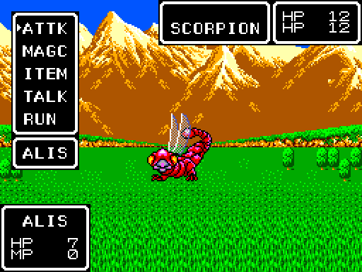 Contrary to what some think, Another Star wasn't named after this game. Phantasy Star was a late Sega Master System game. Notice how bright and colorful the background is, and how it takes up the full screen. The enemies were even animated when they attacked, although they could only ever manage to fit a single enemy on the screen at a time. This game really pushed what the console was capable of. However, by giving more priority to the graphics, I'm left with less room to assign to the interface. I used mockups to try and solve this problem by seeing what I could move around or reorganize. I wrote about the process in more detail here before I even began actual work on the game, but to summarize, I began by simply recreating the interface to the first game. 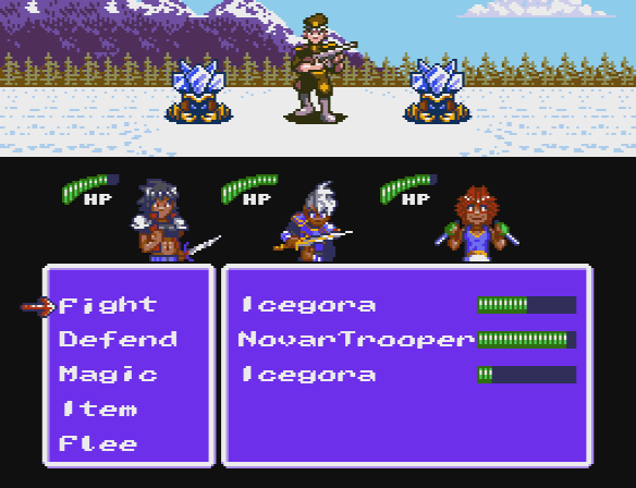 No room for the characters' names, see? This would work, in theory, but it's awfully cramped. The bottom 8 pixels of the characters would be covered by the menu whenever it comes up, though that's not too big a loss. But on a real television, the trooper's head would be hidden under the overscan, and there's meant to be even bigger enemies still. The interface had to be made smaller. After several iterations, I came up with this mockup: 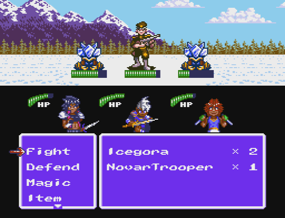 Still quite tight, but much more breathing room. By shrinking the window-based interface elements down sixteen pixels and moving the HP bars up to the enemies themselves, not only does everything feel less cramped but parts of the interface now feel a little more connected to what they're meant to represent. Still, there was the problem of the menu itself. Another Star had five battle commands, not four. One of them had to be pushed off the end, indicated by the down arrow letting the playing know there's more they can do. But that seemed sub-optimal. That arrow is pretty small. Would the player always realize at a glance that there were more options? Forgetting "flee" might not be a big deal 99% of the time, but Another Star 2 is set to have at least one new battle command, so what else might get lost in the shuffle? It seemed there must be a better way. I put this all on the back burner for a long time, but now I'm working on getting the battle system up and running, so it finally came time to confront the issue head-on. My first attempt, pictured here in-game: 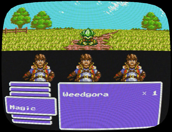 Finally, an actual screenshot. The cursor hadn't been implemented yet, but it was going to point to the selected option, making it more obvious that it was an option. And since you could only see one of the options at a time, the layered windows should have communicated pretty well that there was more you could do. But it seemed so clunky, especially since I really need to keep the 8 pixel tile above each letter of text reserved for languages that need diacritics (you'll see this often in Japanese RPGs on the NES; it's how they implemented the dakuten for their kana characters). I thought about adding a little animated icon for the current selection to liven it up a little, but I was already out of VRAM tiles for the scene. Then came the engine reboot I talked about in the last dev log entry, at which point the tile limit became more of a suggestion than a hard-and-fast rule enforced by limitations of the engine itself. So I decided to do a mock up of what it might look like if I went all-in with icons.  I did make sure to leave text so that you don't have to guess what the highlighted icon means. I hated it almost immediately. It didn't feel very 8-bitish to me at all. On the NES and Master System, text was used for everything it possibly could be. The letters were already taking up precious space in VRAM. Why waste them? Extensive iconography was rare even into the 16-bit console era and beyond. Mainstream Final Fantasy wouldn't even get a visible HP bar until the PlayStation 2 came around! But the mock-up got a pretty good response when I previewed it on Twitter, and after sleeping on it, it did kind of grow on me. I decided to try implementing it in the game just to see how it'd look for real. The custom As2Tool application I wrote to help make the game has an animation tool that standardizes all animated graphics in the game, cutting down on the amount of graphics-related stuff I have to hard code in the engine. The tool is very simple and somewhat primitive, but it ended up being fairly flexible and allows a single frame of animation to have multiple elements, so... well, suddenly it was very easy and fast to make things look however I wanted them to. Maybe I got a little carried away, even? 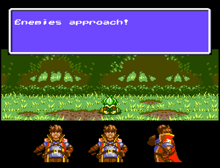 It's alive! Apologies for the poor quality of the GIF, but this is actual footage from the game. Granted the characters are stuck on arbitrary loops right now for testing, but look at how alive the whole thing feels! Another Star 2 is supposed to carry on the torch of Another Star's fast-paced battle system. It's supposed to feel snappy and energetic! Look at how the screen flicks down to focus on the party when it's time to give orders. Look at how the clash of swords sends sparks flying. It's meant to keep you pumped and eager for battle! It actually turned out better than I'd imagined it. It doesn't look like an NES or Master System game interface at all, but having tasted from this particular chalice, I'm not sure I can go back to the old ways... In the next dev blog I plan to dig a little deeper into the inner workings of the battle system itself. There's a lot I'm not ready to reveal yet because it's so early and so much can change between now and release, but there's some interesting changes planned in comparison to how things worked in the first game. |
|
|
|
|
Logged
|
|
|
|
|
Pixel Noise
|
|
« Reply #37 on: January 31, 2017, 01:45:56 PM » |
|
I think the icons are a good way to go, honestly. Some games DID use them, over text; most notably, off the top of my head was Lufia. I remember actually being really confused by it at first, because I was so used to blatant text menus. But those icons are one of the (many) things I loved about Lufia.
And I think this is another case of the staying TOO true to old limitations vs. effective modernization argument. It still looks pretty retro - but those icons in the last gif are pretty slick. The animations you have going on with them are a really nice touch.
|
|
|
|
|
Logged
|
|
|
|
|
Superb Joe
|
|
« Reply #38 on: January 31, 2017, 01:55:06 PM » |
|
your game looks better and your job is immeasurably improved when not consumed by walking an invisible tight rope that ultimately will only have this level of thought given to it once, by you, and never by the players. it still maintains the authenticity you strive for. i pissed on a horse once.
|
|
|
|
|
Logged
|
|
|
|
|
TheGrandHero
|
|
« Reply #39 on: January 31, 2017, 02:50:18 PM » |
|
I think the icons are a good way to go, honestly. Some games DID use them, over text; most notably, off the top of my head was Lufia. I remember actually being really confused by it at first, because I was so used to blatant text menus. But those icons are one of the (many) things I loved about Lufia. Super Mario RPG also used icons (sort of), as does pretty much anything Camelot Software Planning has ever done. However, that's getting into the 16-bit era and beyond. I honestly can't think of any NES or Master System game that's used them for commands specifically. Only possible example I can think of is the old Koei strategy games that used icons for resources and stats, because there was no way you were going to fit as much stuff on screen as they needed otherwise. (Wait, on second thought, there is one game. Shingen the Ruler used icons on the territory management screen. Very poorly, unfortunately...) There's a certain clean simplicity that a plain text menu gives that the game looses with an item interface. But I think everyone is right about it being the right direction; the animation on the icons really bring the screen to life. |
|
|
|
|
Logged
|
|
|
|
|
 Community
