Bricabrac
Level 2

Fail again. Fail better.

|
 |
« Reply #100 on: August 19, 2017, 01:01:38 PM » |
|
Mini-rant: Personally (and maybe I'm an out-of-touch, style-less amateur, but) I found some of the "bad" images in the guide kinda nice (like the "oversaturated" images). I've always liked bright colors that others find jarring my whole life, though, and actually I wondered if I'm slightly color-blind. *shrug* I can feel you, I love games like Space Funeral or OFF with very bright and exaggerated colors. I think the most important part when breaking rules is just to always stay consistent - there's a great difference between a game that is intentionally very bright and one that is bright because the artist doesn't know a thing about color theory, and the difference usually shows. I think your game is breaking rules in the right way  |
|
|
|
|
 Logged
|
Selling Sunlight - Wandering Merchant RPG |
|
|
|
foofter
|
|
« Reply #101 on: August 20, 2017, 08:10:18 AM » |
|
Mini-rant: Personally (and maybe I'm an out-of-touch, style-less amateur, but) I found some of the "bad" images in the guide kinda nice (like the "oversaturated" images). I've always liked bright colors that others find jarring my whole life, though, and actually I wondered if I'm slightly color-blind. *shrug* I can feel you, I love games like Space Funeral or OFF with very bright and exaggerated colors. I think the most important part when breaking rules is just to always stay consistent - there's a great difference between a game that is intentionally very bright and one that is bright because the artist doesn't know a thing about color theory, and the difference usually shows. I think your game is breaking rules in the right way Yay, thanks! That's good to hear.  |
|
|
|
|
Logged
|
|
|
|
|
foofter
|
|
« Reply #102 on: August 21, 2017, 06:36:28 AM » |
|
Here are the portraits for Tifa:   and Drizzy:   And I fixed up Foofter from old:  to new:  Do you think it's an improvement? |
|
|
|
|
Logged
|
|
|
|
Bricabrac
Level 2
Fail again. Fail better.
|
|
« Reply #103 on: August 21, 2017, 07:45:46 AM » |
|
Do you think it's an improvement? Absolutely yes! |
|
|
|
|
Logged
|
Selling Sunlight - Wandering Merchant RPG |
|
|
|
foofter
|
|
« Reply #104 on: August 21, 2017, 08:11:21 AM » |
|
Do you think it's an improvement? Absolutely yes! Then how about.... THIS?!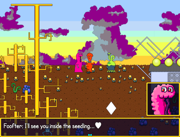 ORRRR ORRRR this? 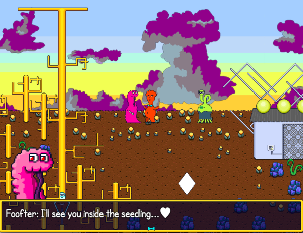 I actually like unframed better, but I made all the portraits to fit in a square, so some are chopped off at the top and would look odd without a frame... |
|
|
|
|
Logged
|
|
|
|
|
Josh Bossie
|
|
« Reply #105 on: August 21, 2017, 02:21:12 PM » |
|
I like unframed as well, but your backgrounds are so colorful and busy that it's not as easy to pick out
Maybe a very slight and mostly transparent background? Like the box from screen 1, but without the border
|
|
|
|
|
Logged
|
|
|
|
|
foofter
|
|
« Reply #106 on: August 22, 2017, 01:12:25 AM » |
|
I like unframed as well, but your backgrounds are so colorful and busy that it's not as easy to pick out
Maybe a very slight and mostly transparent background? Like the box from screen 1, but without the border
I think the key for dealing with the busyness is really dark backgrounds. I was gonna try to sneak it into the message window by making them kinda attached...? I actually kinda like it: 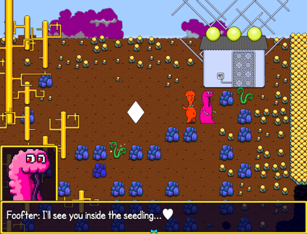 And here's the borderless version but it feels kinda off to me:  |
|
|
|
|
Logged
|
|
|
|
|
Stricle
|
|
« Reply #107 on: August 22, 2017, 04:56:42 AM » |
|
I like the first one with the border too.
|
|
|
|
|
Logged
|
|
|
|
|
foofter
|
|
« Reply #108 on: August 22, 2017, 05:05:43 AM » |
|
I like the first one with the border too.
Cool. I just had a crazy idea of how to do it better, so I'll add it later if I can get it working. Here are the last three monsters (of the playable main ones, at least): Q:   Tenty:   Jelly Pot:   And the full cast...  I just need to make a second Foofter face...and then a third face for all monsters! And now I wanna do portraits for all the secondary characters, too. But that's extra polish! |
|
|
|
|
Logged
|
|
|
|
|
foofter
|
|
« Reply #109 on: August 22, 2017, 05:44:56 AM » |
|
Okay, I got something I'm happy with! How's.... THIS!? VOILA! 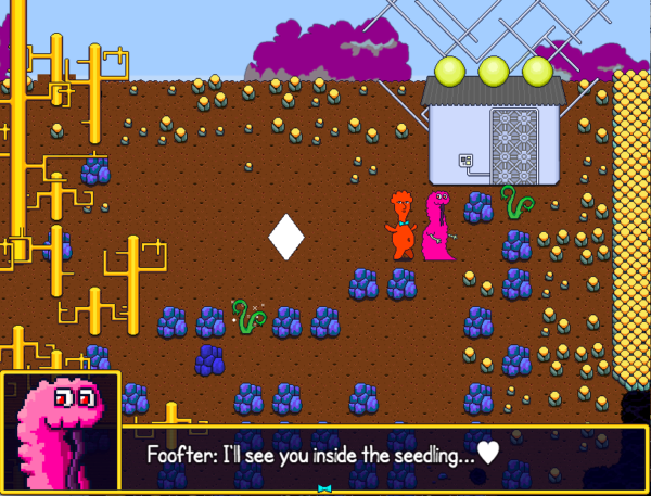 Now I just have to adjust all text in the game to fit in the smaller space! (I was trying to have everything fit on one line without any run-ons....) VOILA! |
|
|
|
|
Logged
|
|
|
|
|
Artifice Machine
Guest
|
|
« Reply #110 on: August 22, 2017, 10:04:23 AM » |
|
For extra text space, the names could possibly fit on the right of the portrait/above the text box.
|
|
|
|
|
Logged
|
|
|
|
|
foofter
|
|
« Reply #111 on: August 22, 2017, 10:37:57 AM » |
|
For extra text space, the names could possibly fit on the right of the portrait/above the text box.
I'm gonna try that but I'm afraid it's gonna get even more busy...  I was also considering NO names...?!! If you see their face, you don't really need a name, right? Until it comes time to choose who is going to talk...but if the choices are in order by who is in the group then it could maybe work...? |
|
|
|
|
Logged
|
|
|
|
vitorlanna
Level 1
|
|
« Reply #112 on: August 22, 2017, 10:49:21 AM » |
|
The name could also be below the portrait...
And maybe the portraits could also appear when it's time to choose who's going to talk? Choosing by portrait might be easier than remembering all the names, but harder to implement...
|
|
|
|
|
Logged
|
|
|
|
|
foofter
|
|
« Reply #113 on: August 22, 2017, 11:25:52 AM » |
|
The name could also be below the portrait...
Yea, I was thinking I could add the name into the portrait in a cool way somehow. And maybe the portraits could also appear when it's time to choose who's going to talk? Choosing by portrait might be easier than remembering all the names, but harder to implement...
I thought that, too, but I think near impossible in RPG Maker. Would be really cool in another game, though! I love the non-verbal visual aspect of it! |
|
|
|
|
Logged
|
|
|
|
|
Josh Bossie
|
|
« Reply #114 on: August 22, 2017, 01:37:10 PM » |
|
Okay, I got something I'm happy with! How's.... THIS!? VOILA! Now I just have to adjust all text in the game to fit in the smaller space! (I was trying to have everything fit on one line without any run-ons....) VOILA! aha! I love it. Has the added bonus of looking like the text is coming from the portrait / speaker |
|
|
|
|
Logged
|
|
|
|
|
foofter
|
|
« Reply #115 on: August 22, 2017, 01:45:41 PM » |
|
aha! I love it. Has the added bonus of looking like the text is coming from the portrait / speaker
Thanks! I'm gonna take out all the names in the message windows now, and either have none or put them elsewhere. Leaning towards none...!? |
|
|
|
|
Logged
|
|
|
|
|
Sebastian_Nigro
|
|
« Reply #116 on: August 22, 2017, 02:33:45 PM » |
|
Just came across this. Looks very unique and while I'm still not entirely sure about the overall appearance... I think this game stands on its own. Good work!
|
|
|
|
|
Logged
|
|
|
|
|
foofter
|
|
« Reply #117 on: August 22, 2017, 02:42:36 PM » |
|
Just came across this. Looks very unique and while I'm still not entirely sure about the overall appearance... I think this game stands on its own. Good work!
Thanks, that's good to hear! |
|
|
|
|
Logged
|
|
|
|
|
JindrichP
|
|
« Reply #118 on: August 23, 2017, 11:25:21 AM » |
|
You are keeping making it better and better. Nice work is done here. :-) From what you have posted in regard of dialogue boxes, I must be honest, I liked a bit more a version solely without anything around. It could solve your problem with shorter text if you just added a long gradient all around: head could be visible and text could be long. Something like this - maybe?  |
|
|
|
« Last Edit: August 23, 2017, 12:37:07 PM by JindrichP »
|
Logged
|
|
|
|
|
foofter
|
|
« Reply #119 on: August 23, 2017, 12:33:19 PM » |
|
You are keeping making it better and better. Nice work is done here. :-) From what you have posted in regard of dialogue boxes, I must be honest, I liked a bit more a version solely without anything around. It could solve your problem with shorter text if you just added a long gradient all around: head could be visible and text could be long. Something like this - maybe?  Hey, your image isn't showing up, unfortunately. You mean no borders at all on either the portrait or the message window itself? I'm not sure what you mean about solving the shorter text problem - could you explain more? |
|
|
|
|
Logged
|
|
|
|
|
 Community
