Welcome, Guest. Please login or register.

Login with username, password and session length

 
Advanced search

1411492 Posts in 69371 Topics- by 58428 Members - Latest Member: shelton786

April 25, 2024, 05:11:22 AM

Need hosting? Check out Digital Ocean
(more details in this thread)
TIGSource ForumsDeveloperArt (Moderator: JWK5)Help Me Improve Vector Card Art!
Pages: [1]
Print
Author Topic: Help Me Improve Vector Card Art!  (Read 1894 times)
11clock
Level 1
*


View Profile WWW
« on: September 04, 2016, 02:38:13 PM »

Below is what the art for my card game looks like. I am going for abstraction but was told this looks too plain and place-holdery.


I would like suggestions on improving this art. I am using Inkscape. No filters and masks, since they are not supported by my SVG renderer.

An ingame image of my card game:

https://i.gyazo.com/c61446c7b4d09b3398950c0cfa8a7798.png

Art is inspired by the card game Reigns: http://store.steampowered.com/app/474750/
Logged

Cobralad
Cowardly Baby
Level 10
*****


View Profile
« Reply #1 on: September 05, 2016, 12:28:25 AM »

I tried removing undies white but then i also reversed colors

Logged
AmauryH
Level 0
**


View Profile WWW
« Reply #2 on: September 05, 2016, 05:53:38 AM »

Hi,

And what about a subtle shadow on the cards ?


Logged
Vilanat
Level 0
**


View Profile
« Reply #3 on: September 05, 2016, 01:40:01 PM »

You could try working with triangles to have the skeletons more sinister and maybe add some shading.


I also like AmaruryH shading in the middle card.
Logged
mischa
Level 0
**


View Profile WWW
« Reply #4 on: September 06, 2016, 04:13:17 AM »

Upload the other cards too. not just the skull cards. It'll make it easier to think of a suitable style
Logged
Zorg
Level 9
****


View Profile
« Reply #5 on: September 06, 2016, 04:40:59 AM »


Forget color for the moment and try to improve the shapes. I think the head shape is too regular, thus a bit boring, and might lead to a placeholder look.

But if you have a whole set of cards in the same level of abstraction, even very simple forms may form a coherent image and look good.
Logged
Sustrato
Level 1
*


It's a good day to die.


View Profile
« Reply #6 on: October 19, 2016, 01:04:08 PM »

First off, I like how your general skull shape coincides with the stick people on the cards. They need some work, but that's a nice symmetry to try and keep.

Zorg has a point about the shapes being potentially uninteresting, but I think it can work as a blocky style if you increase interest elsewhere. The triangle eyes look really good; they draw interest to the lower part of the face, which is counterweighted by the bulk of the forehead. The teeth on the outside of the skull help to anchor and balance it, too.

For the shadows, just keep in mind the shape of the skull and what perspective you want to imply.

On a side note, I think you should reduce the cut on the corners of the cards. That's a pretty significant area, far more than you'd see on a real-life card. Unless you're pulling some Battlestar Galactica sh!t.

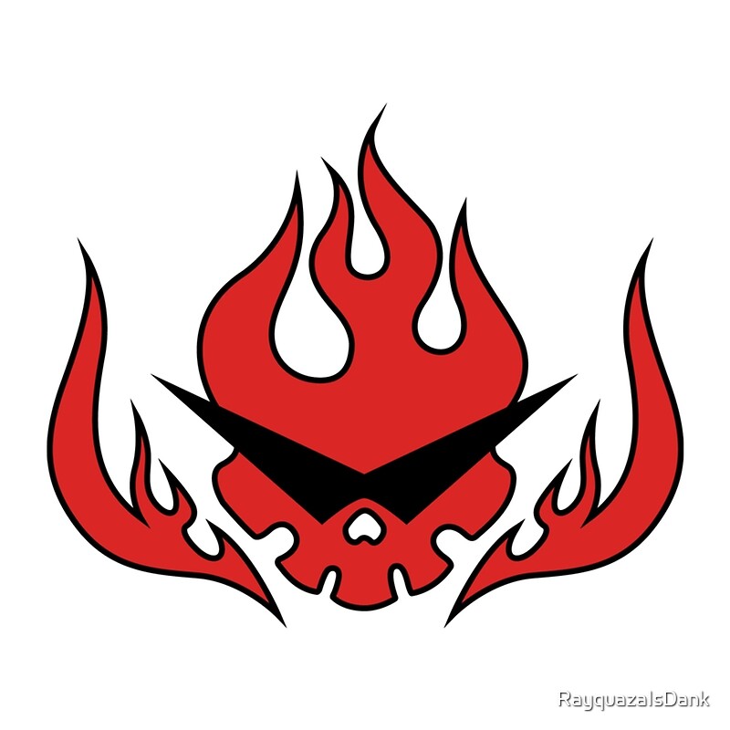
I'm gonna end with throwing two iconic skull designs in here. Also check out Halo ODST's Superintendent and the Titan games by Puppydog Studios, they are similar and may inspire you.


Logged

Pages: [1]
Print
Jump to:  

Theme orange-lt created by panic