|
quantumpotato
|
 |
« on: October 01, 2016, 03:03:18 PM » |
|
I'm looking for reference points on good art that doesn't distract from the gameplay too much. What are your favorite visual SHMUP styles?
Do you prefer a detailed ship drawn out or something simpler? Do you prefer to see your hitbox visually or not?
Do you like bullets that pulse in a rhythm or are static? Bullets that are pointed, circular, capsule?
Are bullets with a colored highlight easier to see or unicolor bullets against a single color background?
Looking for examples that would appeal to a modern gaming audience as opposed to Galaga.
|
|
|
|
|
 Logged
|
|
|
|
|
alvarop
|
|
« Reply #1 on: October 07, 2016, 05:45:40 PM » |
|
I mean, Ikaruga is pretty much the gold standard I think. Jamestown also looks amazing, but Mecha Ritz does too.
These three games have very different art styles, but the core of it all is that everything is easily readable and the graphics never hinder the gameplay.
The bullets are the protagonists of bullet hells. They need to be front and center, clear as possible and never be hidden by some fancy graphical thingie.
|
|
|
|
|
Logged
|
|
|
|
|
|
|
quantumpotato
|
|
« Reply #3 on: October 07, 2016, 06:38:55 PM » |
|
I love the laser gushes in DoDonPachi, thanks for sharing! Detailed..
Never seen Mecha Ritz - I like how the bullets animate, keeps your eye focused on them! Great point about the protagonist..
I'm seeing tracers, bright or dark center sections with an expanded shape of the same geometry and opposite brightness wrapped around these bullets.
|
|
|
|
|
Logged
|
|
|
|
|
Diabetes Forecast
Guest
|
|
« Reply #4 on: October 13, 2016, 12:34:32 PM » |
|
The one I can almost always recommend wholeheartedly is Rayforce. the game is one of the prettiest of the 2D shooters, and has some of the best use of parallax layer/'mode 7' control that I've seen. the whole game is built around it, and some of the later stages are baffling that it's a purely 2D arcade board. Taito knew their shit back in the day.
|
|
|
|
|
Logged
|
|
|
|
|
AnaGuillenFdez
|
|
« Reply #5 on: October 13, 2016, 02:18:53 PM » |
|
I don't use to play Shmups, but the Touhou Project games seem to be really popular. Some of the Touhou games have a bit crappy art while others from the same series have better art, but what I find interesting is how the Touhou universe managed to have a great fanbase lolis. I think that Touhou's character design is something to be considered. And I somehow see this beautiful too. |
|
|
|
|
Logged
|
|
|
|
|
quantumpotato
|
|
« Reply #6 on: October 13, 2016, 04:48:11 PM » |
|
Aha. Rayforce is alternating the colors of their spherical bullets. Oblong bullets oscillate in position slightly.
Touhou has the center highlighted and uses geometric patterns to achieve beauty.
|
|
|
|
|
Logged
|
|
|
|
|
|
|
Eskema
|
|
« Reply #8 on: October 18, 2016, 12:17:37 AM » |
|
If 3d is not an issue here, then FullBlast looks nice and clean. Sorry for the shameless promo  |
|
|
|
|
Logged
|
Senior developer
|
|
|
|
Diabetes Forecast
Guest
|
|
« Reply #9 on: October 22, 2016, 04:23:39 PM » |
|
If 3d is not an issue here, then FullBlast looks nice and clean. Sorry for the shameless promo if only it weren't depressingly boring |
|
|
|
|
Logged
|
|
|
|
|
quantumpotato
|
|
« Reply #10 on: October 25, 2016, 10:50:34 AM » |
|
If 3d is not an issue here, then FullBlast looks nice and clean. Sorry for the shameless promo I like the high contrast between ships & background. 1942, I think, has a bright blue water background & white clouds that makes it hard to see bullets & ships. |
|
|
|
|
Logged
|
|
|
|
|
|
|
quantumpotato
|
|
« Reply #12 on: October 27, 2016, 03:46:13 PM » |
|
That dark red background in the bottom left looks great, thanks for sharing!
|
|
|
|
|
Logged
|
|
|
|
|
JWK5
|
|
« Reply #13 on: November 05, 2016, 06:11:51 AM » |
|
|
|
|
|
|
Logged
|
My Art Tutorials: Here"Today is victory over yourself of yesterday, tomorrow is victory over lesser men." - Miyamoto Musashi |
|
|
|
quantumpotato
|
|
« Reply #14 on: November 19, 2016, 09:30:13 PM » |
|
Haven't seen bullets like that before, ty!
|
|
|
|
|
Logged
|
|
|
|
|
|
|
quantumpotato
|
|
« Reply #16 on: November 20, 2016, 06:15:52 PM » |
|
Huh, interesting color scheme there! Bright orange and red squares on a dark blue bg..
|
|
|
|
|
Logged
|
|
|
|
|
michaelplzno
|
|
« Reply #17 on: November 21, 2016, 10:28:08 AM » |
|
I liked the look of Tumiki Fighters. It has a cool style to look like toy blocks which is effective but simple. 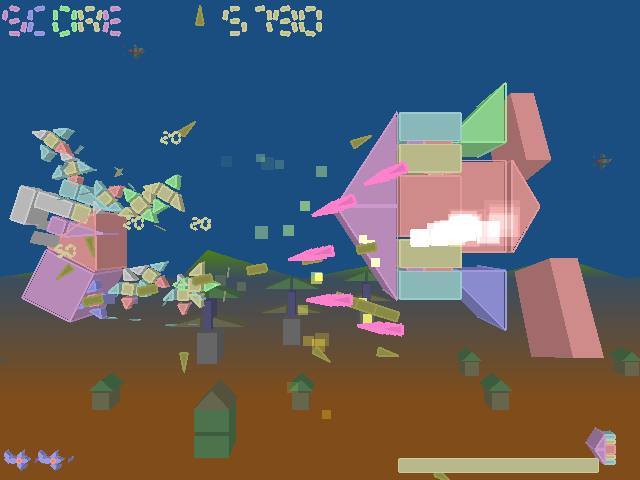 |
|
|
|
|
Logged
|
|
|
|
|
absolute8
|
|
« Reply #18 on: November 21, 2016, 12:35:51 PM » |
|
How about you look at games that aren't SHmups and consider what they would look like if they were.
Like, what if SMW or Megaman were SHMUPS?
Make a shmup that doesn't involve jets, robots or magical people.
Is there a steam punk shmup?
How about one with shitty cave men created flying apparatus?
|
|
|
|
« Last Edit: November 22, 2016, 09:02:02 AM by absolute8 »
|
Logged
|
|
|
|
|
maruki
|
|
« Reply #19 on: November 22, 2016, 08:55:04 AM » |
|
Not sure if I think this because it was my first SHMUP, but I think Parity Shot is pretty interesting, specially concerning the bosses' design.
|
|
|
|
|
Logged
|
|
|
|
|
 Developer
