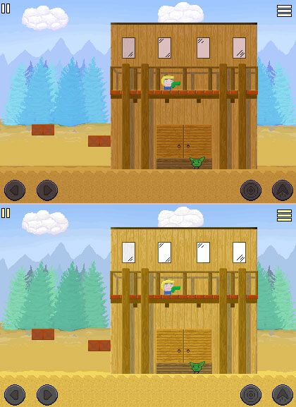
Hi, I did a very quick paintover of your image to illustrate some points that I think might help. Your current color palette has a tendency to make all the elements bleed into each other, meaning I can't tell which is the foreground and background very easily. So what I did was color the background a little bluer and lighter to "push it back" and colored the foreground a little redder and darker to "make it pop". This is a very quick paintover so the colors aren't perfect but I hope you can see how it distinguishes foreground from background and makes it easier for the players to focus on what's important.
Similarly I actually disagree with removing the outline on the character as it makes the character blend in too well with the background. You want the character to stand out because that's what the player is looking at. If the black outline seems too harsh then try colored outlines. Hope that helps!
 Developer
