Golds
Loves Juno
Level 10

Juno sucks


|
 |
« on: October 11, 2007, 01:38:10 AM » |
|
Why does box packaging in the USA suck? I was looking at the Orange Box website. Very clean design. Nice san serif type -- Helvetica? And then I saw this:  Yikes! With the green and black-orange gradients and cheap font? Another good example-- Japan and Europe: USA: USA: What gives? It seems like there's some marketing rule for US games that states, "if it doesn't have a prerendered 3d character on the front, some gradient masks, and really gaudy type, it just won't stand out from the crowd". But Nintendo doesn't hire lousy designers, and they have the best selling games! And look at companies like Apple, that put so much thought into their packaging that it drives people to post unboxing photos. Anyone else have any thoughts or, preferably, grievous examples? |
|
|
|
|
 Logged
|
|
|
|
|
Terry
|
|
« Reply #1 on: October 11, 2007, 02:07:06 AM » |
|
|
|
|
|
« Last Edit: October 11, 2007, 03:15:17 AM by Terry »
|
Logged
|
|
|
|
|
Markus Rosse
Guest
|
|
« Reply #2 on: October 11, 2007, 02:11:57 AM » |
|
I'd like to throw the Battalion Wars Cover in the discussion (Cover and Comparison made by Arne)  US vs. Europe, you choose! Btw: Nearly every game I buy has these ridiculous stickers on it, WTF? |
|
|
|
|
Logged
|
|
|
|
|
|
|
Squirrelsquid
|
|
« Reply #4 on: October 11, 2007, 02:22:50 AM » |
|
A game marketing guy once told me, that every territory get's it's own coverdesign because every territory seems to like different types of cover-designs. the american territory seems to like/need bright and rich contrast, where "action" is the center of interest. while european people seem to prefer damp colors and less action. japan seems to like damp colors as well. here's another example: japanese:  US&europe  |
|
|
|
|
Logged
|
|
|
|
|
Alec
|
|
« Reply #5 on: October 11, 2007, 03:04:51 AM » |
|
Meh, sometimes US box art is awesome.  |
|
|
|
|
Logged
|
|
|
|
|
Arne
|
|
« Reply #6 on: October 11, 2007, 03:40:56 AM » |
|
The Guardian Legend.
I've always wanted to go back and redo old covers and manuals for re-releases or shits and giggles.
|
|
|
|
|
Logged
|
|
|
|
|
Arne
|
|
« Reply #7 on: October 11, 2007, 03:41:36 AM » |
|
Attachment size limit. Here's the American version.
|
|
|
|
|
Logged
|
|
|
|
|
Movius
Guest
|
|
« Reply #8 on: October 11, 2007, 05:28:50 AM » |
|
Pfft. You Americans always complain about your cover art. When your shelves are full of boxes that look like this...  ...then you can complain. |
|
|
|
|
Logged
|
|
|
|
|
wourme
|
|
« Reply #9 on: October 11, 2007, 06:19:23 AM » |
|
|
|
|
|
|
Logged
|
|
|
|
fish
DOOMERANG
Level 10

cant spell selfish without fish
|
|
« Reply #10 on: October 11, 2007, 06:37:32 AM » |
|
|
|
|
|
|
Logged
|
|
|
|
rey-o
Level 1

'here i am, rock you like a hurricane'
|
|
« Reply #11 on: October 11, 2007, 06:08:00 PM » |
|
ratchet and clank offers a pretty striking comparison:   (more at http://hg101.classicgaming.gamespy.com/japanboxes/japanboxes.htm) in this case, neither is particularly good but it does say something about cultural tastes - and expectations. with orange box, i guess the designers felt like they needed to communicate the three distinct flavors that you'll experience, and while it isn't attractive it gets the job done in a really plain jane way. |
|
|
|
|
Logged
|
|
|
|
Lurk
Super Artistic
Level 5

....
|
|
« Reply #12 on: October 11, 2007, 07:06:32 PM » |
|
Very often, the marketing staff for US and Europe are two different entities, riddled with their own internal dynamics and powerstruggles. I had an awful experience working on a box cover and some magazine ads. It started with a very bad sketch, which the Art Director from SF executed gracefully on squared paper(my impression was that he could'nt find a coffee stained napkin at the time) with horrible perspective-anatomy-proportions. My first impulse was to rectify the whole thing, but I got an angry email back, saying I was'nt respecting the sketch. So I had to consciously insert the errors in my picture, and after a very short while had serious problems looking at it. When the time came to do the box-art, they took another picture I had done that seemed to be very popular with their focus groups, and asked me to copy paste it on a white, no yellow, no blue, no white(...)background with ruins, no clouds, no palm trees, no ruins...Can you make the background silvery? In the end, they used the same box for US and Japan, but a slightly different one for europe(for some very very obscure reason). But I was amazed at the amount of money they seemed to be wasting- mainly because they were'nt listening to artist's, IMO.
|
|
|
|
|
Logged
|
|
|
|
|
Melly
|
|
« Reply #13 on: October 11, 2007, 07:23:48 PM » |
|
In graphical design school, I learned that gradients were created by Satan. Or maybe it's just the majority of the teachers.
Working for other people, you'll always come across the moronic clients who actually think they know more about the stuff than the person they're paying to make them the stuff.
And usually US covers have to be pleasing to the eyes of durrrr-gamers. It's like how everything that's taken to Thailand needs to have an extra explosion or shade of firey red. And I mean EVERYTHING.
If I ever release a game with some kind of cover, I'm doing everything in my power to keep myself as the person to design it. And I'll use such incredibly cryptic and subtle imagery only the most mental of gamers, or indies, would pick it up, and those few who fully comprehended the messages hidden within those images would reach a new state of consciousness beyond normal humans.
|
|
|
|
|
Logged
|
|
|
|
Lurk
Super Artistic
Level 5
....
|
|
« Reply #14 on: October 11, 2007, 07:56:10 PM » |
|
|
|
|
|
|
Logged
|
|
|
|
|
TeeGee
|
|
« Reply #15 on: October 11, 2007, 11:30:53 PM » |
|
Ha ha, the above is great! :D
Japanese bad taste vs. US bad taste... round 1... Fight! Great to see how different cultures aproached that specific early-90' tackyness.
The ICO comparison is terryfying however.
|
|
|
|
|
Logged
|
|
|
|
|
Radnom
|
|
« Reply #16 on: October 12, 2007, 02:50:56 AM » |
|
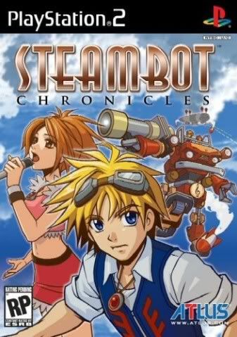 Hahaha, that girl is totally giving a robot a handjob. |
|
|
|
|
Logged
|
|
|
|
|
konjak
|
|
« Reply #17 on: October 12, 2007, 04:04:53 AM » |
|
Europe (dunno about Japan):  America:  I love the European box... but I imported that game so I have the American one.  The Wii version is the slighlty altered European box the way it looked on PS2, but the red is white, not at all as pretty... Something about American boxarts having to show people's faces in great detail. |
|
|
|
« Last Edit: October 12, 2007, 04:06:32 AM by konjak »
|
Logged
|
|
|
|
Al King
Level 1
Nobody expects...
|
|
« Reply #18 on: October 12, 2007, 05:44:45 AM » |
|
  ... What? |
|
|
|
|
Logged
|
|
|
|
rey-o
Level 1
'here i am, rock you like a hurricane'
|
|
« Reply #19 on: October 12, 2007, 07:07:42 AM » |
|
the ico example is a heart breaker. i wonder how many people passed on the game based on the crummy cover alone. while the japanese cover is a work of art! fumito ueda painted it himself, apparently, based onthe works of de Chirico ( http://en.wikipedia.org/wiki/Giorgio_de_Chirico. |
|
|
|
|
Logged
|
|
|
|
|
 Developer
