|
Will Vale
|
 |
« on: May 04, 2009, 02:18:29 AM » |
|
I've been doing some UI artwork for an update of Sublight - I figured some graphical bling would be just the motivation I need (plus I've got a new tablet and I wanted a play). I'm really a coder so be gentle with me! The game is sort of HUD-looking, see the screenshot from my compo thread: 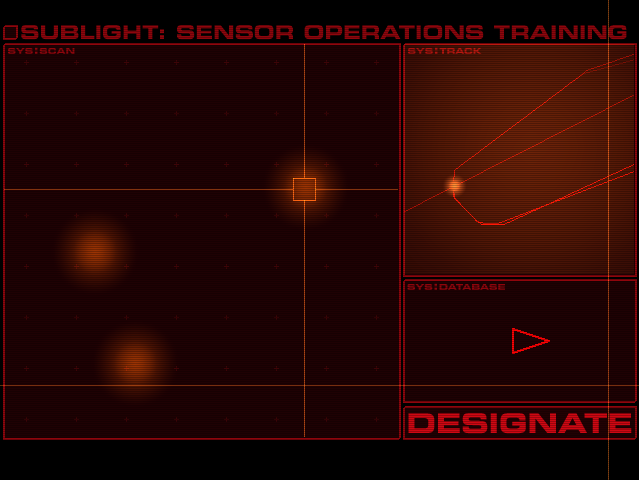 I wanted to put a physical element in there, like a screen frame, and I thought this was OK until I tried it - much too grey next to the game palette:  So I thought about it a bit more and decided to do a black screen with a physical button embedded in it - no border, no grey elements. I haven't done the embedding yet (glass edge + PCB contacts??) but here's a go at the button: 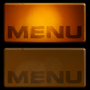 downsized from  in case I want a bigger one! The idea is that when you run the game, this will be the only element, and when you click it all the HUD stuff flickers into being. It should also be the menu/quit button during the game. Cheers, Will PS: I didn't put this in the Art or Pixels threads because it didn't seem to fit - hope that's OK. Feel free to add more UI art here or move this elsewhere  |
|
|
|
|
 Logged
|
|
|
|
|
Important
|
|
« Reply #1 on: May 04, 2009, 02:46:30 AM » |
|
I've also been doing some GUI stuff later and yours is a lot, lot prettier than mine!
The menu button looks good, like it's a plastic shell with an LED that lights it up.
|
|
|
|
|
Logged
|
|
|
|
|
Will Vale
|
|
« Reply #2 on: May 04, 2009, 02:56:31 AM » |
|
Thanks! The plastic is about what I was going for - trying to get a sense that the button was translucent even before you press it. I also found a mockup for an action-shooter hacking game which I didn't get very far with. I did use the bootup sequence and teletype for something else though: 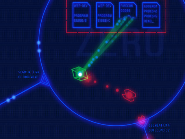 Concept for satellite map - the idea was you get caught doing some hacking on an early mission and blackmailed by evil corporations or the government or someone. And they're able to blackmail you effectively since they have SDI lasers! I'm pretty sure I'd just watched Avalon when I did this 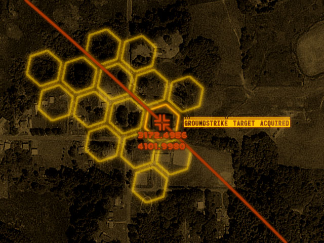 |
|
|
|
|
Logged
|
|
|
|
|
Klaim
|
|
« Reply #3 on: May 04, 2009, 07:47:04 AM » |
|
Awesome Will Vale!  |
|
|
|
|
Logged
|
|
|
|
|
Pishtaco
|
|
« Reply #4 on: May 04, 2009, 09:02:38 AM » |
|
I like the idea of the HUD stuff flickering up. Given the scale and the level of wear on the button, it looks strange that the outline of the text on it is so perfect.
|
|
|
|
|
Logged
|
|
|
|
|
Rishav
|
|
« Reply #5 on: May 04, 2009, 11:39:17 AM » |
|
actually it looks more like the plasticky glass indicators in my school's ancient physics lab. can you have some tangled wires by the main ui which also spark a bit when the light flickers?
btw, love it. good work good work. we will save the princess yet.
|
|
|
|
|
Logged
|
|
|
|
|
JLJac
|
|
« Reply #6 on: May 04, 2009, 11:47:00 AM » |
|
Your stuff is amazing! Please exuse my ignorance, but what does UI stand for? Again, amazing stuff   |
|
|
|
|
Logged
|
|
|
|
|
Xion
|
|
« Reply #7 on: May 04, 2009, 11:55:47 AM » |
|
UI = User Interface
|
|
|
|
|
Logged
|
|
|
|
|
JLJac
|
|
« Reply #8 on: May 04, 2009, 12:10:52 PM » |
|
Ah...
|
|
|
|
|
Logged
|
|
|
|
|
Will Vale
|
|
« Reply #9 on: May 04, 2009, 02:15:40 PM » |
|
Thanks all! Given the scale and the level of wear on the button, it looks strange that the outline of the text on it is so perfect. It is supposed to be worn towards the middle - where you would press it. I don't think it reads well in the glowing version though since the wear and the glow coincide. Oddly, it does read a little better in the small one. I should maybe try some more 'scraped' wear as opposed to 'faded' wear. ...my school's ancient physics lab. can you have some tangled wires by the main ui which also spark a bit when the light flickers? If these are related, I'm concerned for the safety of your school! I figured something like that, but probably wires are a little too analogue, I might go for more of a solid state look with chip legs or contact pads. Perhaps the button should spark and explode when you're about to die, in Wing Commander style - but that would be pretty cheesy :D Will |
|
|
|
|
Logged
|
|
|
|
|
Will Vale
|
|
« Reply #10 on: May 04, 2009, 05:47:35 PM » |
|
I made a couple of changes - Pishtaco's suggestion to fray the mask for the lettering a bit more, and also some changes to emphasise translucency. (I tweaked the gradient fill and added a drop shadow to the text). There's still some work to do in the differences between the glowing and unlit buttons - for example the drop shadow shouldn't be there in the glowing version.  I'm not sure how much I like the frayed lettering in big - it feels overdone - but it reads quite well in small so it can stay for now |
|
|
|
|
Logged
|
|
|
|
|
george
|
|
« Reply #11 on: May 04, 2009, 05:57:58 PM » |
|
I don't care if you think of yourself as a coder first, man that button looks great to me.
|
|
|
|
|
Logged
|
|
|
|
|
Will Vale
|
|
« Reply #12 on: May 06, 2009, 03:20:19 AM » |
|
I've added the PCB substrate and a glass 'magic display' layer over the top. Nearly there, it just remains to draw lighting for the PCB and glass, and then do the up-down-light animations.  After that I have to stop messing about with buttons and do some game stuff  |
|
|
|
|
Logged
|
|
|
|
|
Lynx
|
|
« Reply #13 on: May 06, 2009, 04:54:08 PM » |
|
I'm jealous of your UI artwork skillz! Do you have the button light up gradually or is it a simple image switch? And if you do it gradually, how do you do it? Some kind of fade between the two?
|
|
|
|
|
Logged
|
Currently developing dot sneak - a minimalist stealth game |
|
|
|
Will Vale
|
|
« Reply #14 on: May 07, 2009, 03:36:36 AM » |
|
It's really just a bunch of simple layers, some masks, lots of use of bevel/emboss and drop shadow layer effects, plus some detail painting. I can try and explain in more depth if you're interested, but it probably won't be 'til next week as I'm doing props for a 48 hour film this weekend.
For the button animation I was going to do up and down unlit versions and then an up lit version which I would crossfade to (quickly) as you say. I'm not sure if that'll be enough but it probably will.
|
|
|
|
|
Logged
|
|
|
|
|
Lynx
|
|
« Reply #15 on: May 07, 2009, 03:47:06 PM » |
|
Good luck with the film! The layers/masks/etc. tricks might make a good tutorial for the tutorials forum, but no rush. |
|
|
|
|
Logged
|
Currently developing dot sneak - a minimalist stealth game |
|
|
|
 Developer
