I love the look/feel of this game.
But, I hope you don't mind a bit of constructive critisism: It seems to me you need to work on your saturation & lightness levels in the art. You may need to adjust some of the sprites for contrast. The backgrounds / trees are nice, but could use some differentiation per distance -- and often times I feel they're too saturated in the scene.
See how these goblins are so desaturated they blend into the ground, while the trees feel like they're almost "in front" of the foreground?

Typically you'll want things in the foreground to "pop" more. The character seems OK, but could maybe use a bit more saturation -- just a bit, and desaturate some of those background bushes and such. If you decrease the saturation and/or lightness according to distance from the player (or into the scene), then it could give a nifty effect [perhaps dynamically if this issomething you can correct / adapt in the rendering pipeline].
As a demonstration of depth I've (crudely) modified your foliage & cute shrooms here:

See how the saturation of that bush in the BG seems too much for the lower sat shrooms in front? Instead saturate the foreground, increase contrast, and desaturate / lower contrast the Backgrounds. Below is just a bit overdone to stress the method:
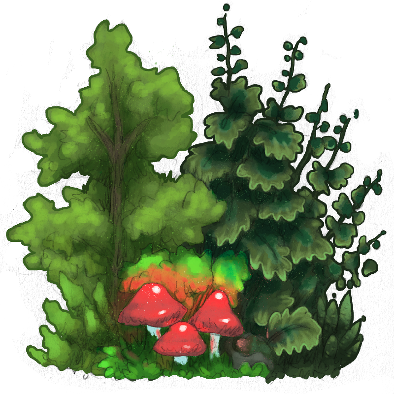
I'm not saying you should modify THIS image, I just quickly modified parts of this image's hue, saturation and lightnes to demonstrate depth. Apply this principle to the entire game, with the game's actors most saturated / visually popping -- Unless your goal is to blend them into certain backgrounds, of course. I blue shifted the background and desaturated just a touch, the middle I shifted a bit more yellow, the front a tad more red and saturated / lightened / contrasted a touch. Those shrooms look like some item you might be able to pick up now.
I'm not saying you should apply a garish amount of such contrast. Just that you could benefit from sorting the levels of contrast and saturation you already have now so that the scenes convey depth a bit better -- the goblins above should be a bit more saturated / higher contrast than the ground they're walking on, IMO.
The GUI can even convey a sense of "depth" if given a bit more pop. Here the plants are higher contrast than the UI elements, causing them to blend into the scene.

With a little bit of contrast and saturation:
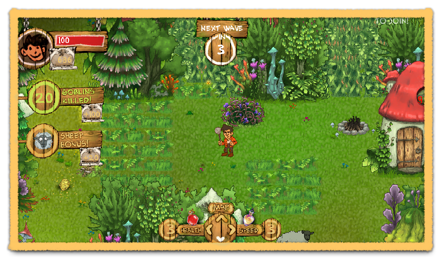
The UI now feels on top of the scene (at least at a level comparable to yon shrubbery), giving the rest of the game world a feeling that it is "deeper" into the screen.
Appologies if you already planned on correcting this. It just seemed the depth of your scenes could use some TLC. With a little bit more tweaking the feeling of depth & readability could be greatly improved.
Cheers!

 Community
