|
JoeInky
|
 |
« Reply #20 on: June 08, 2009, 11:11:25 PM » |
|
Yeah, the antagonist has destroyed the sun and the mang must rebuild it by gathering all the pieces.
|
|
|
|
|
 Logged
|
|
|
|
|
JoeInky
|
|
« Reply #21 on: June 09, 2009, 10:38:44 AM » |
|
Updated with snoooow 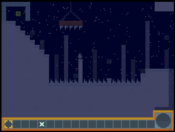 I think it looks good  |
|
|
|
|
Logged
|
|
|
|
|
Inanimate
|
|
« Reply #22 on: June 09, 2009, 04:07:58 PM » |
|
1.) AMAZING plot.
2.) Stylish graphics!
|
|
|
|
|
Logged
|
|
|
|
|
JoeInky
|
|
« Reply #23 on: June 10, 2009, 12:15:22 AM » |
|
Thanks inanimate, it's just a pity this topic doesnt get much love ;3; Anyway I've added these yeti things which bombard you with snowballs, they're a good way of making some of the easy bits, such as that first screen, harder.  Heh. |
|
|
|
|
Logged
|
|
|
|
|
|
|
sereneworx
|
|
« Reply #25 on: June 10, 2009, 04:25:11 AM » |
|
It is still very difficult to see on any monitor I have looked at. It's not so much the colours as the fact that they lack contrast, I suggest bringing out more darks and lights. Right now they are all resting in a slightly neutral zone which makes it difficult to see things as well as they could be seen.
It's okay to have the effect that you have right now if most of the game is in a lighter environment, but if everything is like this it might get annoying.
That said, this is shaping up nicely, and It'll be nice to see what comes out of it.
|
|
|
|
|
Logged
|
|
|
|
|
JoeInky
|
|
« Reply #26 on: June 10, 2009, 07:06:53 AM » |
|
I don't quite get what you mean serene, unless by neutral environment you mean the fact that pretty much everything on this screens is white. If so, yeah, that is the only level that will have really any white on it, because its the only snow/ice themed level. 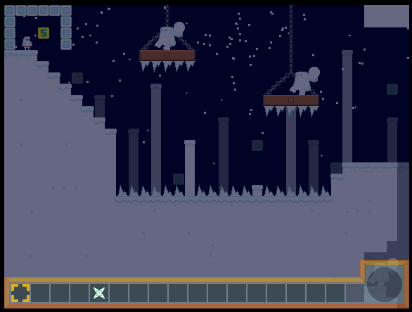 Better? I'll put in an option to adjust the brightness anyway, seen as i like it really dark but it obviously doesnt show up well on others computers, so now more complaints about darkness, there should be an option to suit your needs. |
|
|
|
« Last Edit: June 10, 2009, 07:20:51 AM by JoeInky »
|
Logged
|
|
|
|
|
medieval
Guest
|
|
« Reply #27 on: June 10, 2009, 08:01:34 AM » |
|
The colours need to be more saturated (and perhaps a bit lighter), and the main dude lacks contrast contrast.
|
|
|
|
|
Logged
|
|
|
|
Bennett
Jinky Jonky and the Spell of the Advergamez 3
Level 10


|
|
« Reply #28 on: June 10, 2009, 09:05:37 AM » |
|
This is looking good, mang. Have you considered using blue (and/or low contrast) to represent darkness, and orange (and/or high contrast) to represent lightness? Then you could crank up the overall brightness while still representing light and dark.
|
|
|
|
|
Logged
|
|
|
|
|
JoeInky
|
|
« Reply #29 on: June 10, 2009, 09:16:14 AM » |
|
 I was hoping to have a range of overlays so that you could customise it to your/your monitors needs, right from having it completely dark to no overlay at all. I personally like the 4th one, which will be the default on but idk, alot of others seem to prefer it lighter. @Michael Yamada, I dont have a clue what saturation is, but i know what contrast is and ill have a look at fiking the mang sprite. Edit:  Are those two any better? if so which is best? |
|
|
|
« Last Edit: June 10, 2009, 09:26:08 AM by JoeInky »
|
Logged
|
|
|
|
|
Inanimate
|
|
« Reply #30 on: June 10, 2009, 11:21:29 AM » |
|
Saturation is how bright a color is, simplistically. Adding gray makes something less saturated, adding white makes it more. I also like the fourth one, but that just might be my monitor speaking.
|
|
|
|
|
Logged
|
|
|
|
|
Zaphos
Guest
|
|
« Reply #31 on: July 04, 2009, 11:29:03 PM » |
|
Saturation is how bright a color is, simplistically. Adding gray makes something less saturated, adding white makes it more. I also like the fourth one, but that just might be my monitor speaking.
Fwiw, saturation is not brightness; see http://en.wikipedia.org/wiki/HSB_color_spaceAlso, hope the project is going well! I like the overlays idea  |
|
|
|
|
Logged
|
|
|
|
|
JoeInky
|
|
« Reply #32 on: September 12, 2009, 01:54:45 AM » |
|
|
|
|
|
|
Logged
|
|
|
|
|
Bood_war
|
|
« Reply #33 on: September 12, 2009, 08:29:49 AM » |
|
Downloading now
|
|
|
|
|
Logged
|
|
|
|
|
i wanna be the guy
Guest
|
|
« Reply #34 on: September 12, 2009, 10:06:43 AM » |
|
downloading this now, looks pretty great
|
|
|
|
|
Logged
|
|
|
|
|
i wanna be the guy
Guest
|
|
« Reply #35 on: September 12, 2009, 11:10:04 AM » |
|
it might jsut be because the computer im using is balls
but in the first dungeon, something happened after that second platform(the really low one)
it's like you suddenly lose like half the distance in your jump and it's pretty impossible to go farther
|
|
|
|
|
Logged
|
|
|
|
|
mokesmoe
|
|
« Reply #36 on: September 12, 2009, 11:14:39 AM » |
|
I got past that part fine. Your C button probably stopped working.
|
|
|
|
|
Logged
|
|
|
|
|
JaJitsu
|
|
« Reply #37 on: September 12, 2009, 11:26:14 AM » |
|
This game is rather hard. I falling spikes where cheap, and after two i stopped.
Also you shouldn't have a button to run. Just make the speed faster.
|
|
|
|
|
Logged
|
|
|
|
|
JoeInky
|
|
« Reply #38 on: September 12, 2009, 11:30:38 AM » |
|
i'll be changing the spikes in the next demo, seen as i have had alot of people say that bit was too hard.
|
|
|
|
|
Logged
|
|
|
|
|
mokesmoe
|
|
« Reply #39 on: September 12, 2009, 11:49:52 AM » |
|
The spikes were way too hard. Imagine playing IWBTG and not knowing where the cherries (apples?) are.
|
|
|
|
|
Logged
|
|
|
|
|
 Community
