|
bombjack
|
 |
« on: August 16, 2017, 11:10:47 AM » |
|
Being a programmer, I'm trying to make some art for a game I'm working on. Unfortunately, it feels totally wrong and I don't know why. I could tweak the tiles to have less repetition but that'a all I can found. Any idea that could help ? 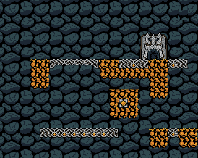 |
|
|
|
|
 Logged
|
|
|
|
|
cynicalsandel
|
|
« Reply #1 on: August 16, 2017, 12:52:24 PM » |
|
Other than making the tiling less noticeable like you already said, I'd say the problem is that the background needs to be more subtle. My eyes keep being drawn to it instead of the foreground. I think the tiling plays a role, but also the size and color of the rocks in my opinion.   I don't know what type of game you're making, so I just grabbed some images of metroidvanias because they were the first to come to mind when trying to find examples. Notice how the background elements are often both desaturated and lower in luminosity. |
|
|
|
|
Logged
|
|
|
|
|
muki
|
|
« Reply #2 on: August 16, 2017, 08:08:48 PM » |
|
Honestly for "programmer art" it's pretty good, a good start at least!
What cynicalsandel said. The background as well as being darker, could use a bit more empty space even.
I think the way you light your sprites could be improved. You haven't defined a "light direction". Your yellow rocks seem to be either lit from the top right or the top left (depending on the rock), your background boulders are lit from straight up, and your door seems to be full brightness, but with a top-left shadow in one place near the bottom.
I would consider what location I'm trying to portray and imagine where the light source is most likely to come from. Then stick with that for all sprites
|
|
|
|
|
Logged
|
|
|
|
|
bombjack
|
|
« Reply #3 on: August 16, 2017, 10:37:05 PM » |
|
Thanks for your answers. I'll try to change it accordingly to your remarks.
|
|
|
|
|
Logged
|
|
|
|
|
Shambrook
|
|
« Reply #4 on: August 17, 2017, 10:35:26 PM » |
|
Try making the background/foreground different shades of the same colour.
Like in the examples from metroid and Axiom Verge, they're both like light grey forergound, dark grey backround, lighter blue foreground, darker blue backgruond, you've got orange foreground/green/grey background so they don't feel like they're the kind of rock at different depths, it feels like completely different kinds of terrain.
|
|
|
|
|
Logged
|
|
|
|
|
JWK5
|
|
« Reply #5 on: August 18, 2017, 11:31:45 PM » |
|
If you want a quick fix you can try the following. It is a quick and sloppy MS Paint edit but hopefully you get the general idea from it:  |
|
|
|
|
Logged
|
My Art Tutorials: Here"Today is victory over yourself of yesterday, tomorrow is victory over lesser men." - Miyamoto Musashi |
|
|
|
bombjack
|
|
« Reply #6 on: August 19, 2017, 08:48:48 AM » |
|
Thanks everyone, it really helped me finding what was wrong. I restarted from scratch and I got this early result. I'm not totally happy with it but it feels better. I'd like to represent an underground dwarven city but it doesn't feel like that at all. Maybe with more blocky tiles... I'll try it and come back. 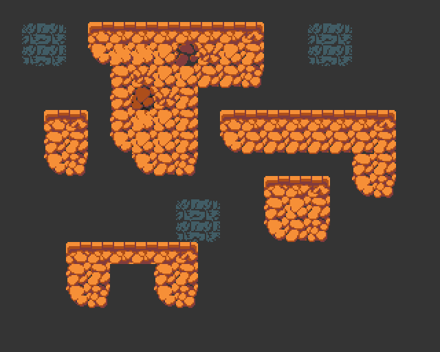 |
|
|
|
|
Logged
|
|
|
|
|
oahda
|
|
« Reply #7 on: August 20, 2017, 12:40:53 AM » |
|
That doesn't just look better, but it looks really good IMO!
|
|
|
|
|
Logged
|
|
|
|
|
bombjack
|
|
« Reply #8 on: August 20, 2017, 01:34:26 AM » |
|
Thanks Princessa  Here the newer version that, I think, give a better feel of an underground city. What do you think of it ?  |
|
|
|
|
Logged
|
|
|
|
|
Mnniska
|
|
« Reply #9 on: August 20, 2017, 03:11:07 AM » |
|
The bits look good, but could you arrange it in a screenshot like in your first post? I find it's really hard to visualize what the complete picture is..without seeing the complete picture  |
|
|
|
|
Logged
|
|
|
|
|
oahda
|
|
« Reply #10 on: August 20, 2017, 04:47:21 AM » |
|
Those look great too! Each is a very different style, so you'll have to pick the one you prefer. But I like both. What Mnniska said tho!
|
|
|
|
|
Logged
|
|
|
|
|
muki
|
|
« Reply #11 on: August 20, 2017, 06:57:15 AM » |
|
For underground kinds of tilesets, I like to shade lighting around the outer edges of the tiles/rocks/slabs/bricks, rather than on the inside with shadow on the edges. Just personal preference.
|
|
|
|
|
Logged
|
|
|
|
|
bombjack
|
|
« Reply #12 on: August 20, 2017, 12:00:48 PM » |
|
Here is a comparison screenshot. I'll maybe add some bridge as in the original later on. 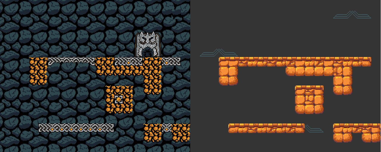 |
|
|
|
|
Logged
|
|
|
|
|
Jad
|
|
« Reply #13 on: August 20, 2017, 04:38:48 PM » |
|
You've got talent for this.
You developed really fast in understanding how to convey light and shadow and pixel line weight. Good hard work, looking forward to seeing more
|
|
|
|
|
Logged
|
|
|
|
|
bombjack
|
|
« Reply #14 on: August 21, 2017, 01:20:11 AM » |
|
You've got talent for this.
You developed really fast in understanding how to convey light and shadow and pixel line weight. Good hard work, looking forward to seeing more
Thanks a lot  Being a programmer, it's hard for me to give objective critics on my personnal 'art'. Your comments are going straight to my heart. It's good to hear that I doesn't suck that much at art |
|
|
|
|
Logged
|
|
|
|
Woseseltops
Level 0

Language technologist by day, gamedev by night

|
|
« Reply #15 on: August 23, 2017, 06:57:30 AM » |
|
I also agree that this looks both professional and very pretty. Also, I think it's completely normal not to get the 'feel' for a particular piece of art right in one go, even for professional artists (!= me, btw). Such things undergo various iterations until the artist gets it right.
|
|
|
|
|
Logged
|
|
|
|
|
diegzumillo
|
|
« Reply #16 on: August 23, 2017, 08:05:48 AM » |
|
Huge improvement! I find the background to be a little too featureless now though. But that is preferable over your first attempt where the background was taking over. Keep experimenting with it.
|
|
|
|
|
Logged
|
|
|
|
|
bombjack
|
|
« Reply #17 on: August 23, 2017, 09:09:14 AM » |
|
I find the background to be a little too featureless now though.
I totally agree with you. As far As I'm the only one working on this game, I try to alternate coding and spriting. I first wrote the random level generator then tried some art to see if it fits. I'm going to implement the combat system then I will come back to some art. |
|
|
|
|
Logged
|
|
|
|
|
eliasfrost
|
|
« Reply #18 on: August 25, 2017, 03:38:13 AM » |
|
There are lots of ways to diminish repition but I always fall back to using variants of the same tile to break up monotony. Like this:  That's four different variants on the back wall, adding completely dark tiles to use as shadows also creates more depth to the image. Other good ways are to add props (like torches) or overlaying different kinds of details like vegetation or waterfalls (depending on what the environment is ofc). You have a good eye for detail and color, I think with knowing some cool tips and tricks to make things more interesting you can make some really good looking backgrounds. |
|
|
|
« Last Edit: August 25, 2017, 03:48:37 AM by eliasfrost »
|
Logged
|
|
|
|
|
bombjack
|
|
« Reply #19 on: August 25, 2017, 03:53:46 AM » |
|
thanks for the tips
|
|
|
|
|
Logged
|
|
|
|
|
 Developer
