Iamthejuggler
Level 6


|
 |
« Reply #140 on: July 27, 2009, 12:29:07 PM » |
|
The thing is, if you do perspective on the planks you need to carry that through to the sizes/positions of the characters or it would just look odd. I agree that the original yellow was too saturated though, the colours you used were certainly better in terms of saturation and contrast levels. It will be very interesting to see the stage fleshed out more, it may change a whole lot.
|
|
|
|
|
 Logged
|
|
|
|
|
Eclipse
|
|
« Reply #141 on: July 27, 2009, 10:05:09 PM » |
|
The thing is, if you do perspective on the planks you need to carry that through to the sizes/positions of the characters or it would just look odd.
i don't think so, not more odd that not doing it at all |
|
|
|
|
Logged
|
<Powergloved_Andy> I once fapped to Dora the Explorer
|
|
|
|
Alec S.
|
|
« Reply #142 on: July 27, 2009, 10:50:25 PM » |
|
The issue is that, as a turn based game, there is a grid. A non-perspective grid on a perspective floor would look strange, and a perspective grid with non perspective characters would also look strange, as well as have issues with collision detection and movement. And re-sized characters to adjust for perspective would look weird as well.
Theo, I think the best thing would be to either just stick with the horizontal lines, or just have a solid color for the floor.
|
|
|
|
|
Logged
|
|
|
|
|
Eclipse
|
|
« Reply #143 on: July 27, 2009, 10:55:17 PM » |
|
you can also do planks like mine without using any perspective as well, anyway there's any collision detection issue using a little fake perspective, and it doesn't look strange at all
|
|
|
|
|
Logged
|
<Powergloved_Andy> I once fapped to Dora the Explorer
|
|
|
|
aeiowu
|
|
« Reply #144 on: July 27, 2009, 10:57:15 PM » |
|
lookin' good Theo!
i'd go with a heart for health. I was confused since it looked a bit like a d-pad. i know it's "cliche" but symbols should be cliche. That's the point of them.
also, i like the more organic approach to the planks. try and render them in the same spirit as you did the set background. More organic and whimsical. The black is an issue, but not as much as them being pure straight lines. There's a lot of black outlines going on everywhere, so I understand why you would want to keep them.
|
|
|
|
|
Logged
|
|
|
|
|
Eclipse
|
|
« Reply #145 on: July 27, 2009, 11:23:14 PM » |
|
the black could be an issue because if there's also a grid over that anyway, a mockup to show that's possible to make a grid that will just work as a square one without any collision problem or whatever, an that the characters looks good even not scaled or anything. Actually some of the blue lines are not spaced correctly, so some cells are a awkard to see, but it already works, basically only the lines on the sides are very perspective oriented, the other ones are just slightly rotated, with the center one being straight, as the sprites are that big, it really doesn't matter at all from the movements\collisions side  |
|
|
|
« Last Edit: July 27, 2009, 11:27:34 PM by Eclipse »
|
Logged
|
<Powergloved_Andy> I once fapped to Dora the Explorer
|
|
|
|
aeiowu
|
|
« Reply #146 on: July 27, 2009, 11:48:08 PM » |
|
the black could be an issue because if there's also a grid over that
ah, i assumed the grid was placeholder. |
|
|
|
|
Logged
|
|
|
|
|
Cagey
|
|
« Reply #147 on: July 28, 2009, 04:14:11 AM » |
|
Maybe if the blue lines instead looked like masking tape?
Also, what Eclipse said/did.
|
|
|
|
|
Logged
|
|
|
|
|
Bree
|
|
« Reply #148 on: July 28, 2009, 06:58:15 AM » |
|
lookin' good Theo!
i'd go with a heart for health. I was confused since it looked a bit like a d-pad. i know it's "cliche" but symbols should be cliche. That's the point of them.
The problem is that I was planning on using a heart for another one of the meters. The Innamorati have a Love meter, which a heart is more readily recognized to represent. I figured that if the heart was anything else it would just be confusing. Are there any other symbols for health that might work besides a red cross? I do like the idea of doing the planks in a whimsical fashion, but I'm worried it's going to distract from the gameplay area. The important thing to remember about the mock-up is that the actual stage area's going to be bigger than the screen- I'm just trying to cram everything together to test it all out at once. The black outlines on the curtains, bottom of the backdrop, and the edge of the stage are all there to reinforce the boundaries of gameplay. The blue grid is to show the individual spaces a character can move in a given turn, and (in the current plan) pop up when a character moves a la Advance Wars, then fade away. I'm gonna try out some of those darker colors, but I personally like the yellow color I came up- I'm just a fan of brighter colors. I definitley am not going to try and put perspective in the planks, for reasons that I mentioned earlier- the stage is bigger than the screen, and designing tiles with perspective is a very tricky thing. Plus, as Malec has said, the perspective wouldn't be congruent with the rest of the game area. Hey Malec, can we actually use spotlights? I know we talked about it a little bit, but I'm not sure if Gamemaker supports it, or if it'd even look good. |
|
|
|
|
Logged
|
|
|
|
|
Eclipse
|
|
« Reply #149 on: July 28, 2009, 08:41:33 AM » |
|
if you're going only for horizontal scrolling, you can still do it and imo it will look A LOT better with perspective, having the floor as topdown while both the scenery and the characters are completely from the side is a bit awkard.
If you're trying to focus the player on the characters you should use less saturated colors from the floor, even if that yellow looked nice.
About the red cross, it looks perfect for an health bar to me
|
|
|
|
|
Logged
|
<Powergloved_Andy> I once fapped to Dora the Explorer
|
|
|
|
aeiowu
|
|
« Reply #150 on: July 28, 2009, 10:32:07 AM » |
|
The problem is that I was planning on using a heart for another one of the meters. The Innamorati have a Love meter, which a heart is more readily recognized to represent. I figured that if the heart was anything else it would just be confusing. Are there any other symbols for health that might work besides a red cross?
I do like the idea of doing the planks in a whimsical fashion, but I'm worried it's going to distract from the gameplay area. The important thing to remember about the mock-up is that the actual stage area's going to be bigger than the screen- I'm just trying to cram everything together to test it all out at once. The black outlines on the curtains, bottom of the backdrop, and the edge of the stage are all there to reinforce the boundaries of gameplay. The blue grid is to show the individual spaces a character can move in a given turn, and (in the current plan) pop up when a character moves a la Advance Wars, then fade away.
I'm gonna try out some of those darker colors, but I personally like the yellow color I came up- I'm just a fan of brighter colors. I definitley am not going to try and put perspective in the planks, for reasons that I mentioned earlier- the stage is bigger than the screen, and designing tiles with perspective is a very tricky thing. Plus, as Malec has said, the perspective wouldn't be congruent with the rest of the game area.
Hey Malec, can we actually use spotlights? I know we talked about it a little bit, but I'm not sure if Gamemaker supports it, or if it'd even look good.
@healthbar - hmmm that's a predicament. You're right to use the cross then. The only other symbols i can think of is either a human profile or a drop of blood. One thing that might help it differentiate from a d-pad is by making the arms thicker. Does that make sense? Basically widen the two rectangles that compose the cross so that there is less open area/space in the four corners of the shape's bounding box. @stage - if you're worried about it being distracting then why render it in a completely different way from the rest of the world? that's distracting. everyone is in a tizzy about it _because_ it's _distracting_. Personally, i like the yellow, i think it fits. I think you know what you're doing with color here. @grid - had an idea, i think this would be killer. use stage marks for teh grid. pieces of white tape in Xs in the center of each grid and then chalk out the lines very faintly. if it's a temporary thing like with Adv. wars that's alright, i'm just thinking along the lines of making it seem less arbitrary which always gets me excited. @lighting - awesome idea, i was thinking the same exact thing. |
|
|
|
|
Logged
|
|
|
|
|
Bree
|
|
« Reply #151 on: July 28, 2009, 12:00:55 PM » |
|
I might do the tape thing, but the funny thing is the color. I've noticed that almost every single person who's suggested the idea thinks it has to be white. Not only would white be very difficult to see (indeed, it's hard to distinguish white from any color other than black), but it's not the only one used in stage work. The theatre that I worked with for several years (where I learned about Commedia in the first place) actually uses blue tape for placement markers. I do like the idea of X's instead of boxes. Maybe instead of always having the grid, the player simply picks a spot and it becomes highlighted by a blue tape X? Another thing I'm thinking about: I think I'll stick with the yellow, but I'll need to do something to break up the monotony. Maybe the reason it's so distracting are the horizontal lines conflicting with the blue grid? Here's a quick test with thinner lines, tell me if this makes any difference, good or bad. 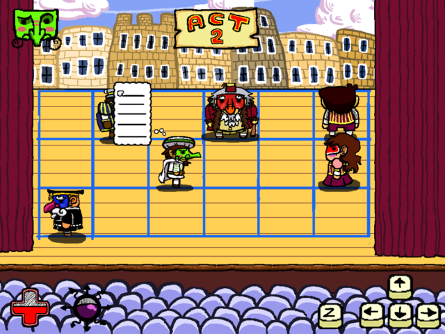 |
|
|
|
« Last Edit: July 28, 2009, 12:06:08 PM by Theo »
|
Logged
|
|
|
|
|
Eclipse
|
|
« Reply #152 on: July 28, 2009, 01:11:43 PM » |
|
yes it's a lot cleaner, but still doesn't look like wood at all, the idea of the X is ace, also you will get rid of that grid in this way and the scene will result cleaner.
Oh, if you're not following a perspective maybe you should space all the lines the same way!
|
|
|
|
|
Logged
|
<Powergloved_Andy> I once fapped to Dora the Explorer
|
|
|
|
Bree
|
|
« Reply #153 on: July 28, 2009, 01:22:18 PM » |
|
Geez, sorry Eclipse, I was just testing the new lines out and eyeballed it- no need to get all huffy over a mock-up. I'll play around with some textures later.
|
|
|
|
|
Logged
|
|
|
|
|
aeiowu
|
|
« Reply #154 on: July 28, 2009, 01:25:41 PM » |
|
haha, alright. just do me one teensy favor please.  try hand painted straight lines. then i'll go away quietly. |
|
|
|
|
Logged
|
|
|
|
|
Bree
|
|
« Reply #155 on: July 28, 2009, 02:29:54 PM » |
|
How about... 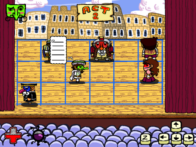 |
|
|
|
|
Logged
|
|
|
|
|
Eclipse
|
|
« Reply #156 on: July 28, 2009, 02:33:57 PM » |
|
 ok nevermind, i think i'm not good at giving crits so i'll just lurk the project, as it still looks interesting 
|
|
|
|
|
Logged
|
<Powergloved_Andy> I once fapped to Dora the Explorer
|
|
|
|
|
|
ChevyRay
Guest
|
|
« Reply #158 on: August 04, 2009, 04:51:37 AM » |
|
I like the latest a lot the wood looks very good, but is soft enough not to be distracting. The perspective like that definitely works the best (rather than having a realistic perspective). I look forward to seeing these audience chairs filled up and in motion  keep up the exceptional work, gentlemen! My PM box and email are always open if you guys need help with any of the programming stuff at all, no questions asked. |
|
|
|
|
Logged
|
|
|
|
|
mcccclean
|
|
« Reply #159 on: August 04, 2009, 07:01:34 PM » |
|
Theo, that wood texture looks awesome. At first I agreed with those who wanted it dark, but the yellowness is really growing on me.
The "hidden grid, only highlight the current square" is a good idea as well.
One suggestion would be to move the character sprites up (or the grid down)... I dunno, about 20 pixels? It looks like they're standing right on the edge of their grid spaces, rather than standing inside them.
|
|
|
|
|
Logged
|
|
|
|
|
 Community
