Everything Gets Better - Roadwarden DevlogIf you don't see an entire picture, click it to make it resize to your window.Greetings, travelers! It’s been a while since the last post, but the game’s development is moving forward, and better than ever! My recent endeavors are split between a few different ventures, the largest of which wouldn’t fit in a devlog -
I now mostly write new content, introducing new areas, characters, quests, and dialogues, as well as reworking some older activities.
It doesn’t mean the game’s overall design is foolproof. As I attempt to avoid repetition and add some new surprises, I expand my toolbox and find ways to improve the shortcomings of the project, removing, adding, and reworking various features. Here is the compilation of the best changes from the last 4 months! (Spoiler-free!)
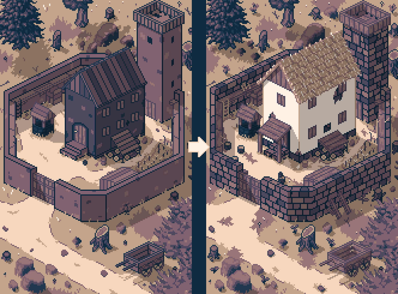
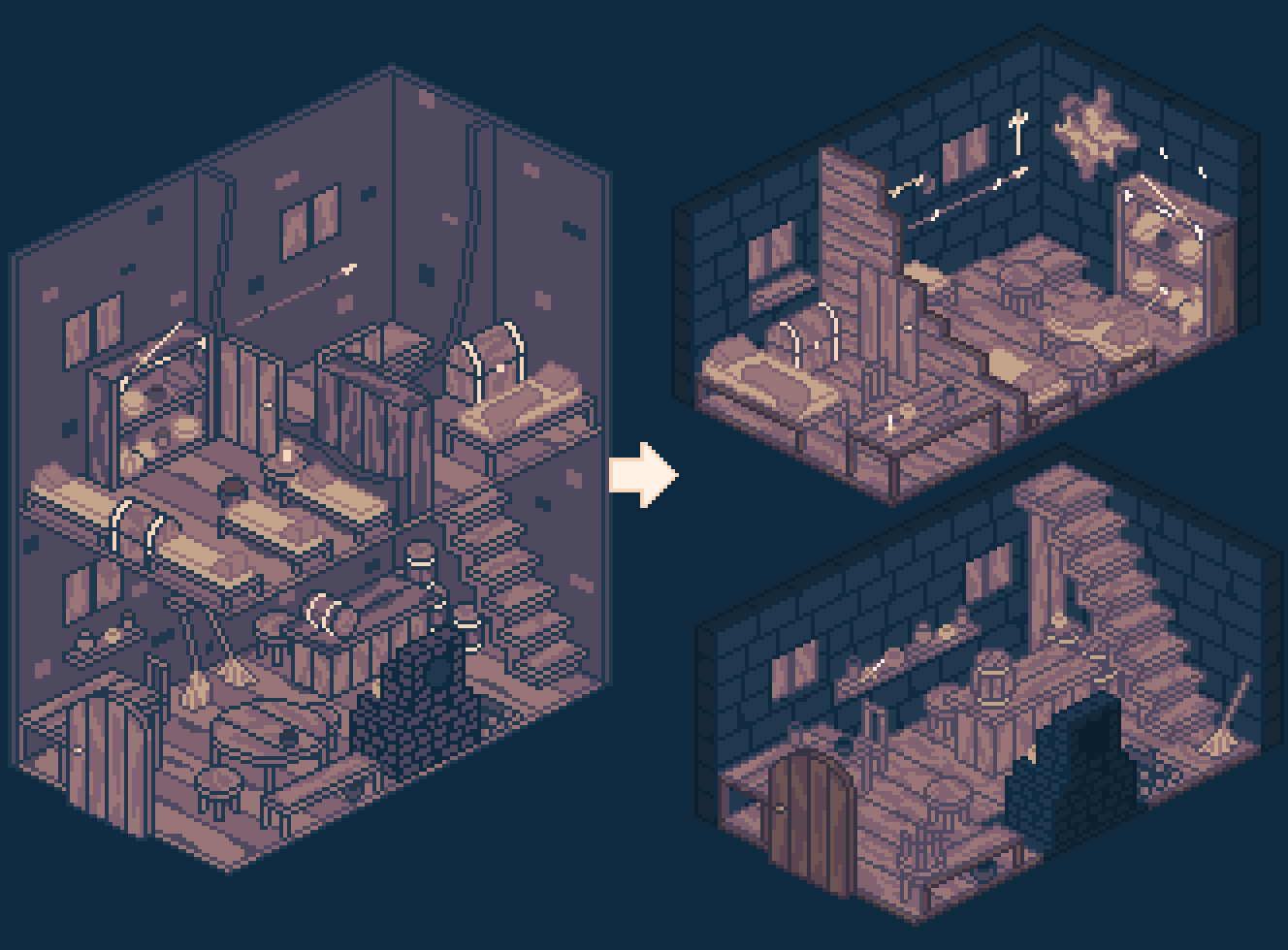
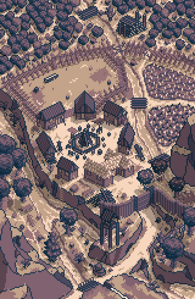 Updated visuals
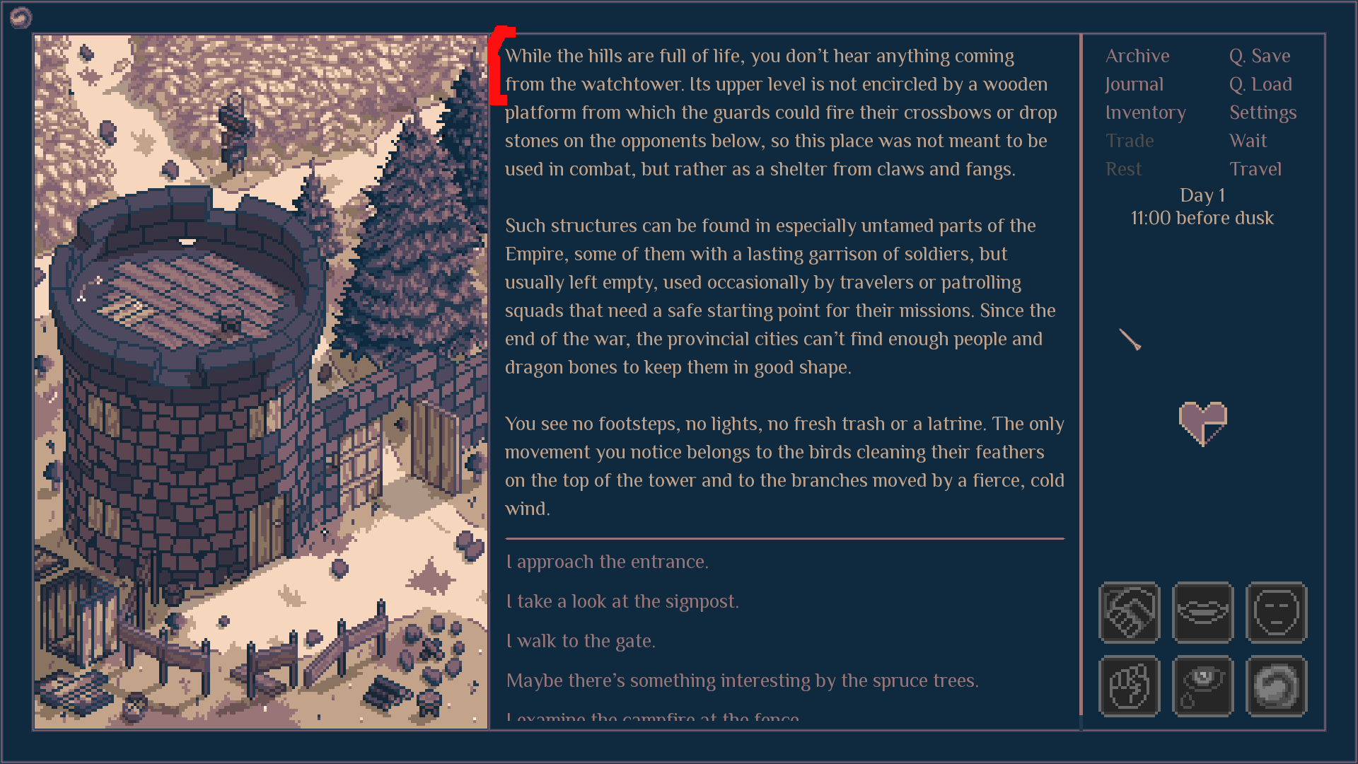
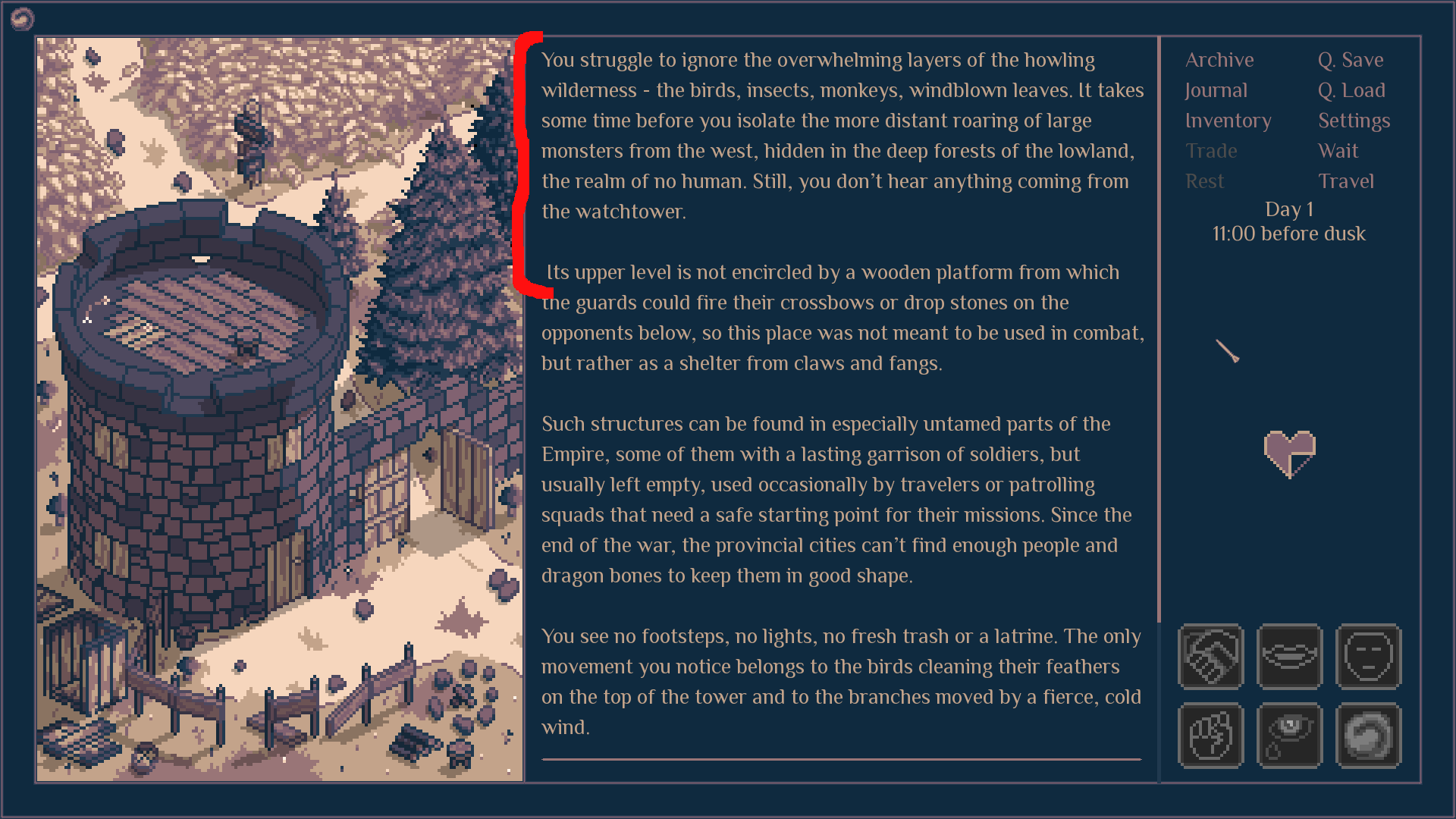
While drawing the final set of illustrations, I realized how much my style and understanding of (basic) geometry has improved. The newest areas had way more interesting designs than the older ones, to the point where they didn’t really match each other.
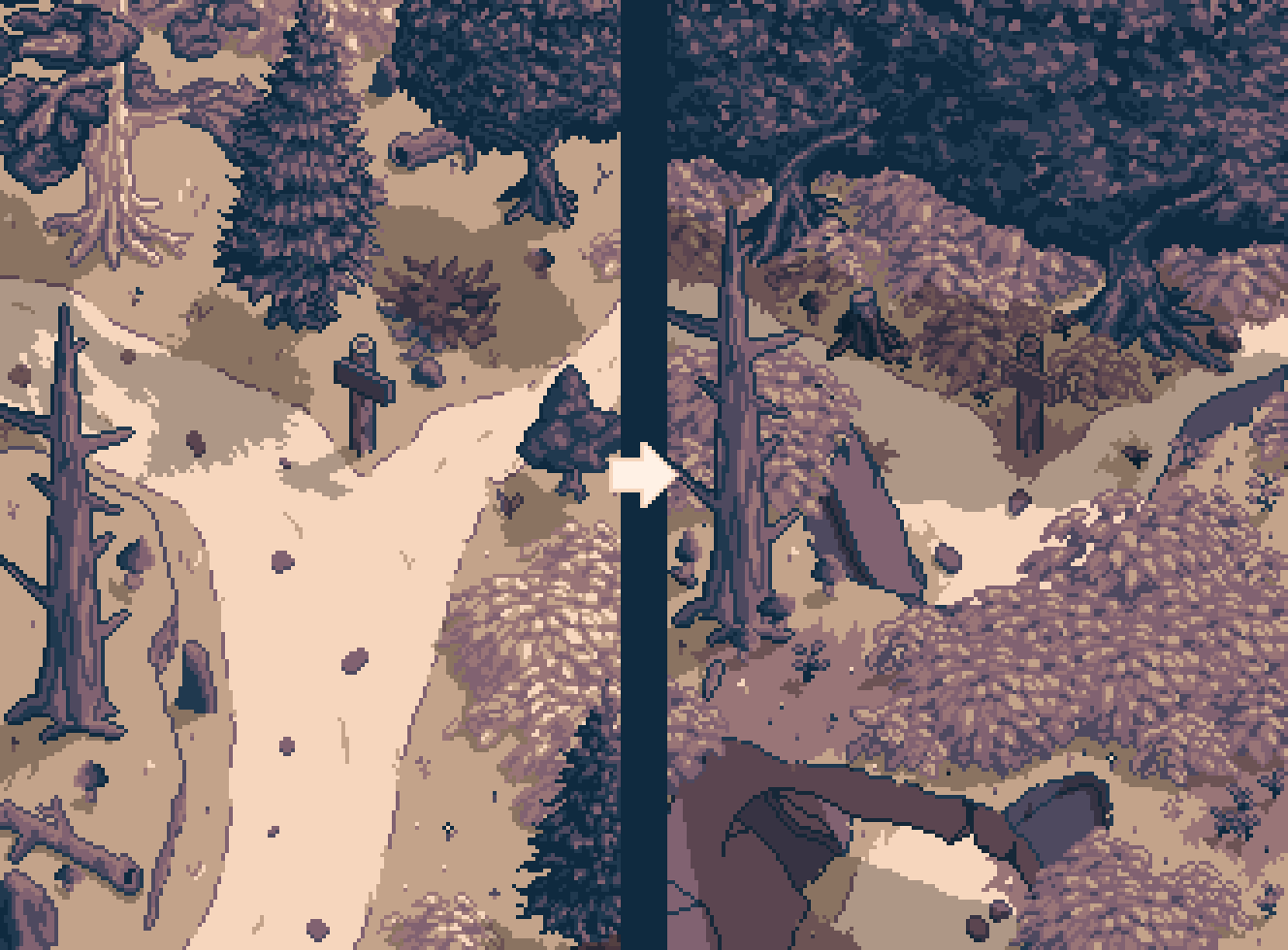
I needed to level up my game and go back... Waaay back. I spent more than a month completely focused on pixel art, updating few dozen of the older areas. In some cases, “updating” meant “making them from scratch”.
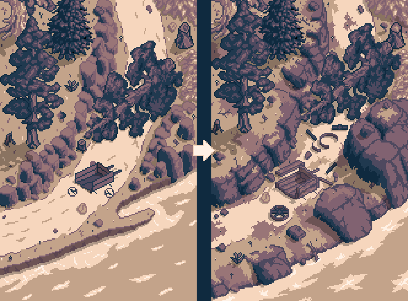
I estimate that about 98% of the game’s visuals is now finished. I must say, I’m as proud as a peacock with the results. It took a lot of learning, but I believe this is IT - this is how Roadwarden is going to look like.
 Updated audioRoadwarden
 is most likely going to be a 30+ hours game, and its 1+ hour of OST (+ a couple other tracks) is just not enough to fill up the game without making it sound too repetitive.
To solve this, I’m adding
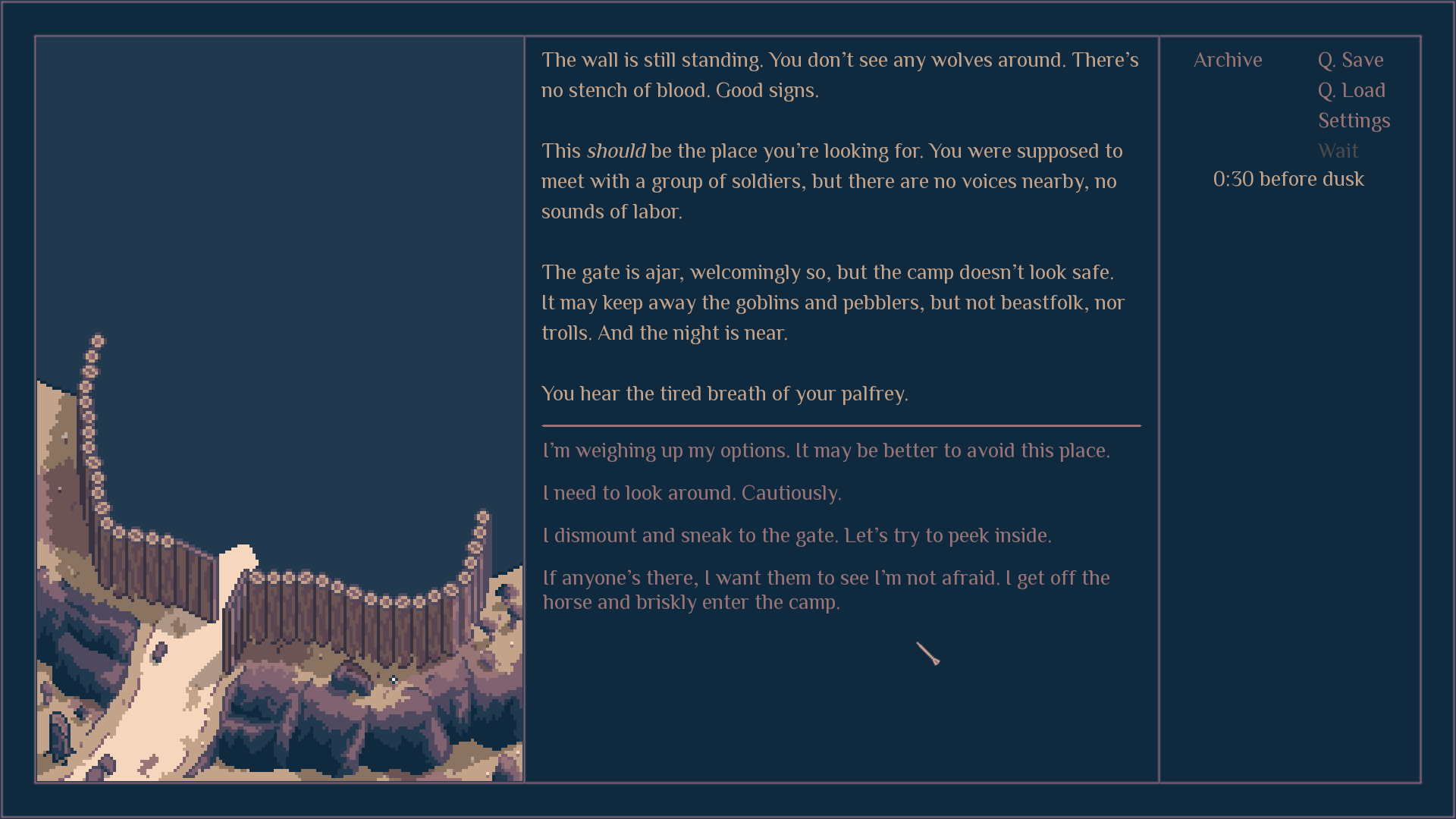
the ambient nature tracks to the areas that are a part of the wilderness. They allow the actual music to stand out a bit more, and introduce a much needed variety.
Soundcloud - Ambient Track 1Soundcloud - Ambient Track 2Some additional details for those interested:
a) Usually, ambient plays without music. It's a bit intense and doesn't combine well with other audio,
b) It usually plays in areas where the player doesn't spend too much time at once. For example, it doesn't appear in settlements,
c) In some cases, ambient goes through soft alterations, responding to player’s actions,
d) Ambient and music have different volume bars in the setting, just in case.
These steps also allowed me to rethink how various music tracks were used in the game, and after moving them around and using them more sparingly their general vibe was improved.
New time-related systemsI try to spice up the the passage of time, adding more variety to the experience and making the world more “alive”.
The game will have a time limit - most likely 30 days - and some quests will be in one way or another related to specific periods and their own restrictions. It’s important to me that the setting feels like it’s outside of the player’s control, allowing a healthy dose of freedom, but also offering some structures to follow, building tension between the two.
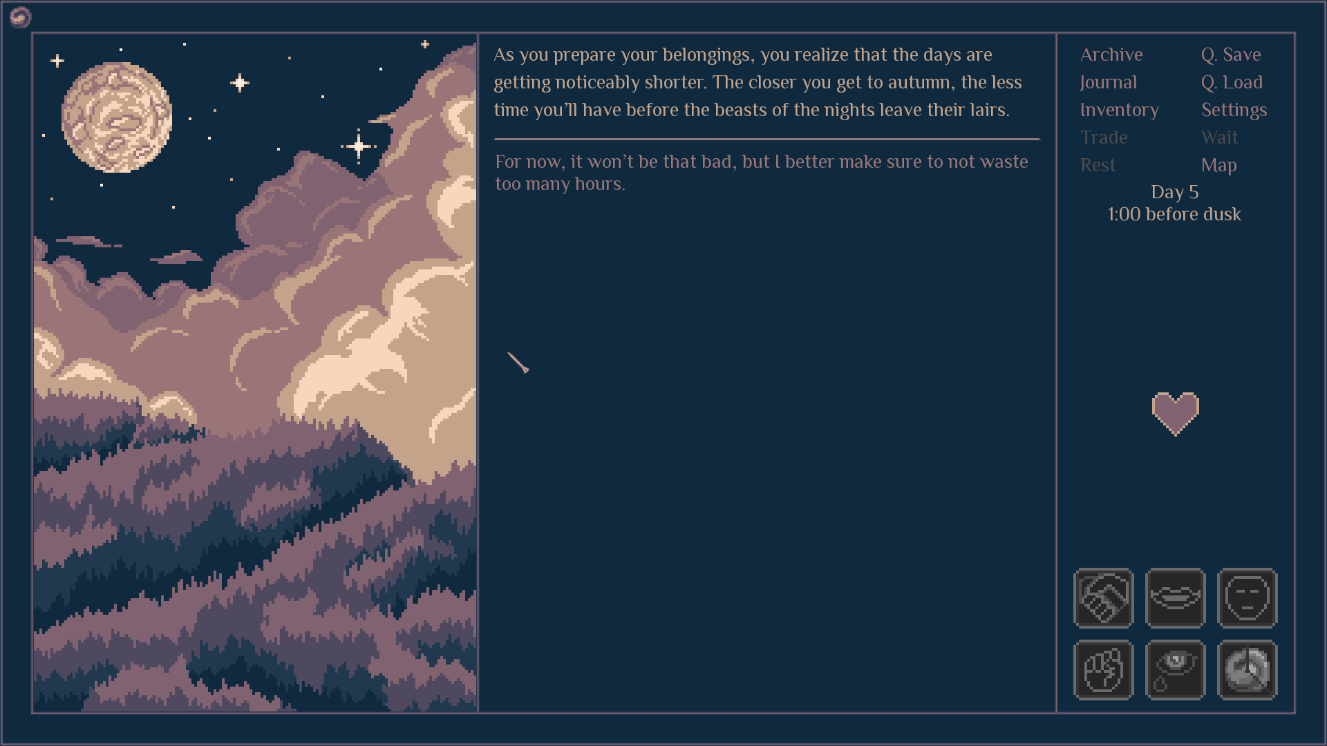
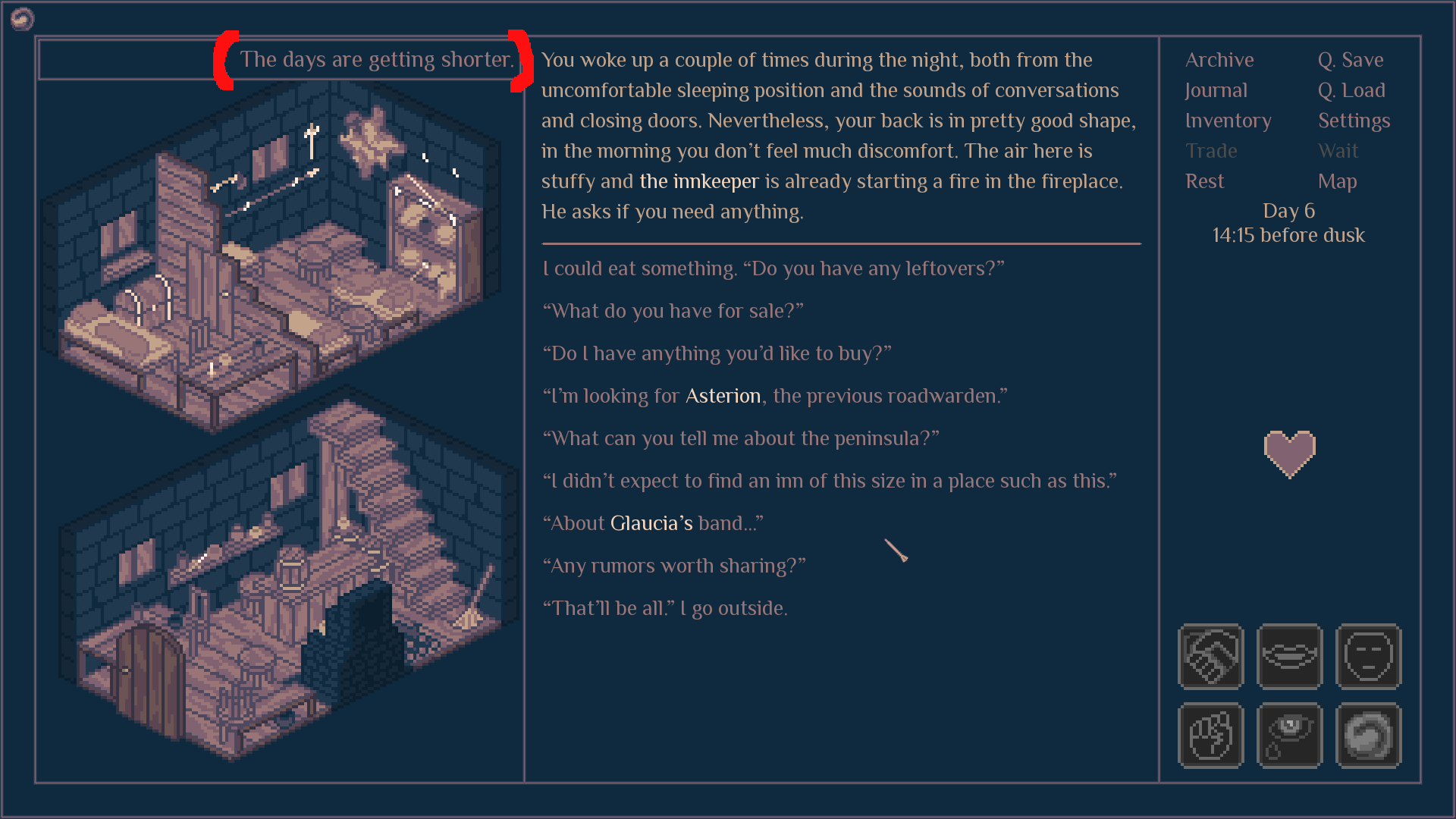
After every few days, daytimes will get slightly shorter, what in the final stage of the game will result in having over one hour less per day, slightly increasing the difficulty level. Still, it’s more about flavor, than challenge.
The in-game interactions that used to be locked or unlocked depending on how late it is are now flexible, and will adjust to the actual "day length", making them more resistant to bugs.
These tools allow to add other systems as well. For example, the bogs are currently more restricting time-wise than the other parts of the realm, forcing the player to leave them earlier.
For now, the game doesn’t have
de facto any weather system, but the skeleton for such is now implemented and works fine. If it turns out the game could benefit from deeper simulative aspects, adding rain and fog (and their mechanical alterations) won’t require a ground-level redesign.
Updating the healing tools for magesIt used to be that some situations allowed the mage to cast a healing spell to recover a hit point lost during an encounter, but I don’t think it worked well. It was a) overpowered b) repetitive c) didn’t involve much planning d) wasn’t always possible, and the exceptions made it quite a jarring mechanic e) required a lot of effort on my part, introducing bugs whenever I made a mistake.
The new system transforms this healing spell into an overnight ritual. It allows the player to spend some of their pneuma (mana) to recover an additional HP point. At first, it happens through a regular narration, but is then replaced by a more convenient button:
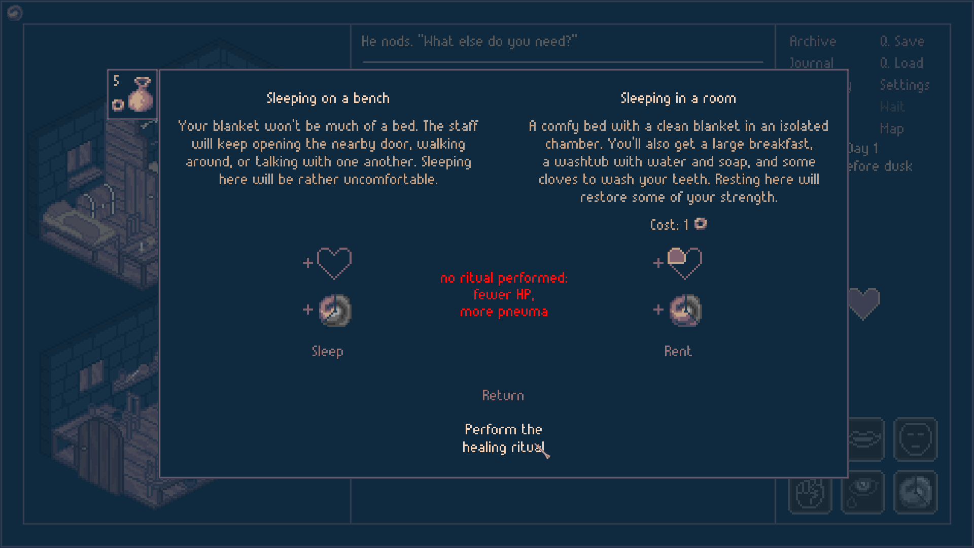

The result takes less time, less repetitive reading, and allows to introduce some strategy through consistency. It will also be easier to balance it by increasing or reducing the pneuma cost.
Working on the vocabularyDidn’t expect this one, did you?
Roadwarden’s fantasy setting,
Viaticum, is over 10 years old, and as I get more experienced, I find that some of its terms, phrases, and details are ready to be replaced with something more interesting and cohesive.
For a long time, I had issues with the names of the three core religions of the Empire, and I’m now ready to give them some more distinguishing labels:
Common Church - >
The United ChurchChurch of Truth ->
Orders of Truthfree churches ->
FellowshipsThese religions also introduce their traditional “parts” of living beings:
shell - the empty, material host of
pneuma. usually used as "body"
pneuma - the breath. the living energy of all beings
soul -
psychê. the unique mind of a human. it can manipulate
pneuma to create magic
And, therefore:
soul carrier - any creature that potentially owns a soul. who this category includes depends on one’s beliefs. (for example: humans, Deity, spirits, goblins, dragons)
heart, will, thought - words to replace
mind and
brainSpirit is no more a synonym of soul. Instead, it specifically references all sorts of hypothetical, invisible beings - deities, demons, forest guardians, ghosts... Think of Japanese
kami.
Some awkward phrases, like
magic crafter, are now replaced with something more elegant, in this case -
enchantress. I think I’m too old to keep running away from some overdone tropes when I don’t have something more interesting to offer. Time to embrace the solutions invented by my predecessors.
It’s all a part of learning how to be a better writer / worldbuilder. These same efforts push me into updating the in-game fictional accents, or rewriting the game’s older dialogues and interactions. I’m more confident with the things I try to express, and therefore the game’s text gets shorter, more precise, with not as many lines of unnecessary clarification.
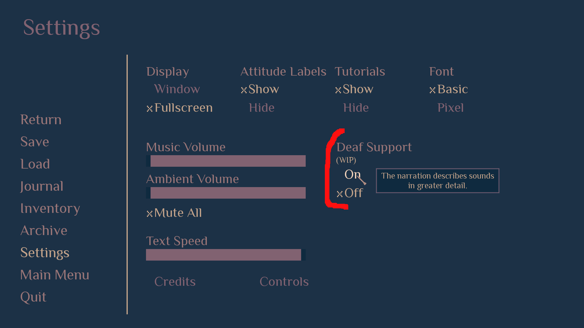
 Deaf support
Step 1. Make a text game, describe sounds instead of using them.
2. Add ambient sounds.
3. Now text repeats them and is pointless.
4. Remove the text.
5. Now people who don’t use sound in games don't know what’s going on.
6. Solution:
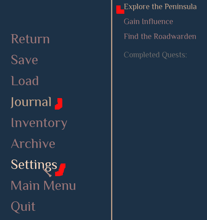
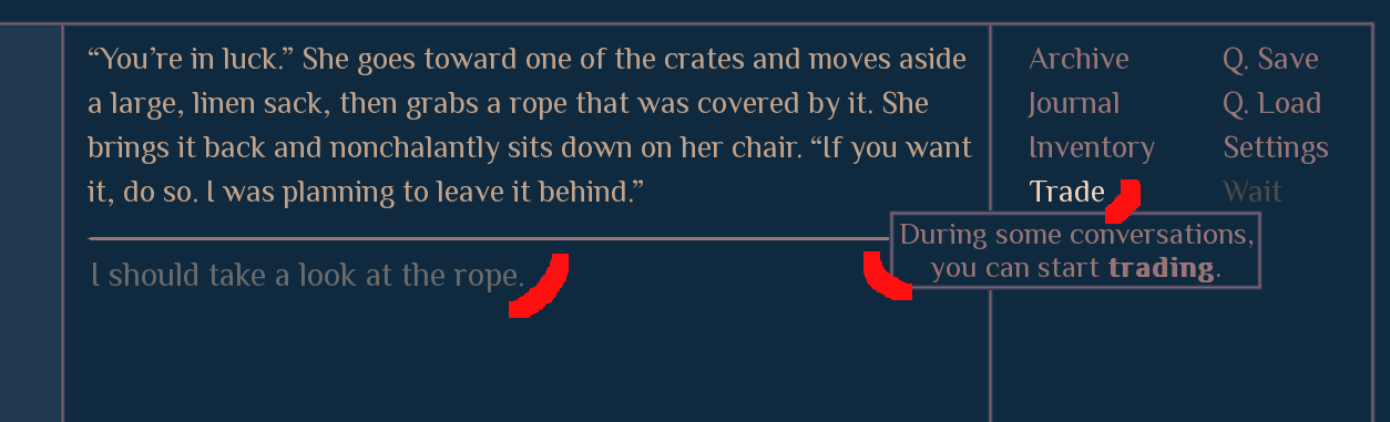
 Cleaner UI
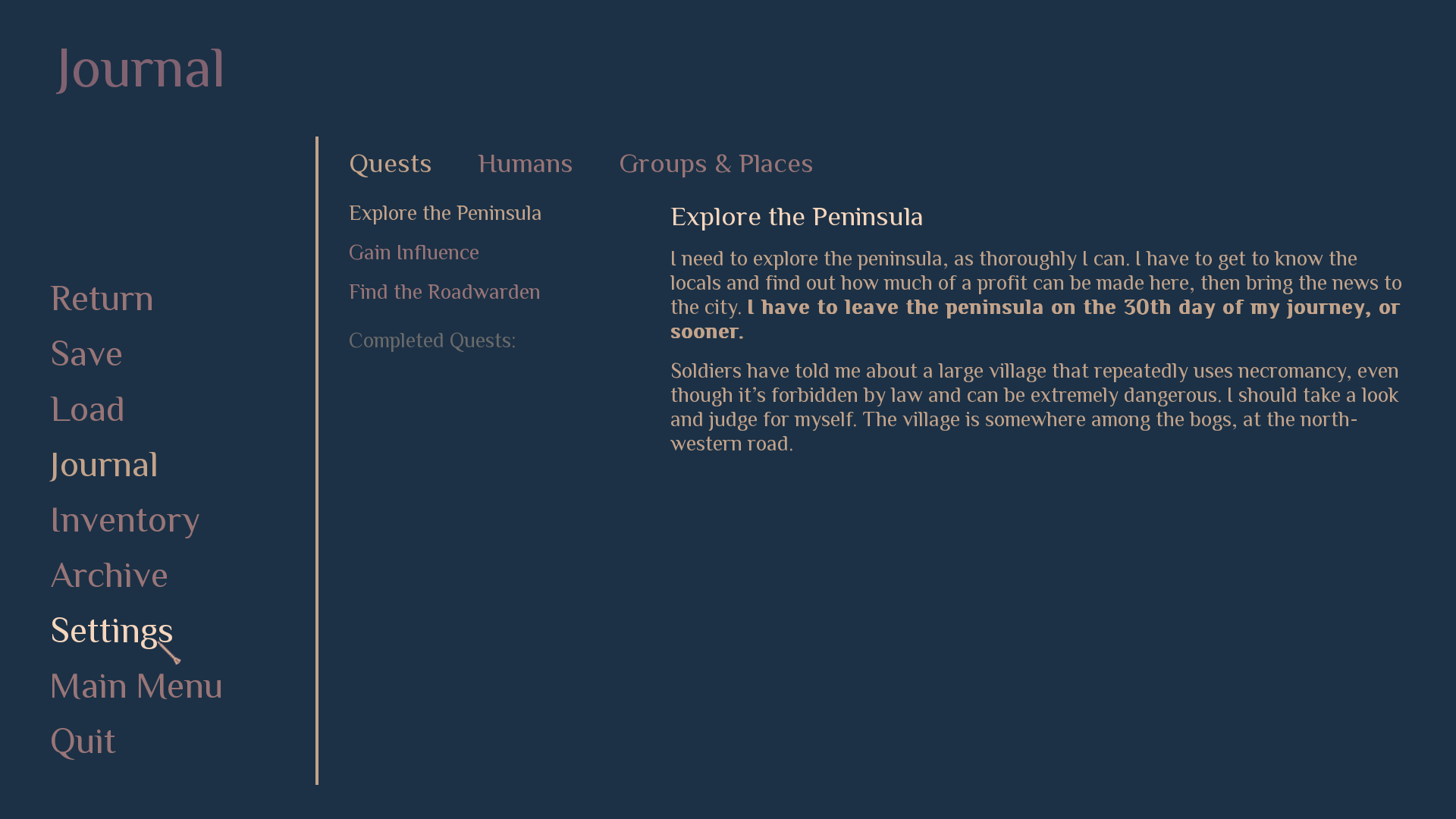
Months of testing helped me realize the small issues were pilling on, forming a bothersome experience. The colors are now easier to read; the main menu buttons respond to being pressed by getting brighter; it’s much more difficult to mistake the save and load screens; the game hides the sections of the inventory that have nothing to show, instead of showing an empty label.
The game now remembers which section of the menu was displayed last, so if you enter the journal, then close it, then enter the menu again, it now returns to the journal instead of switching to the save screen, as it used to.
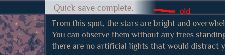
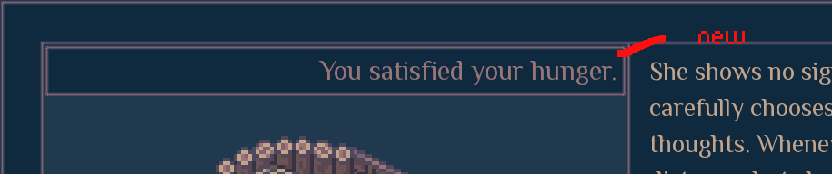
The “notifications” were completely reworked. Different position, colors, frame. They now can be closed prematurely with the left mouse button, and are sensitive to being clicked anywhere, not just on the text. I can’t believe how much work it took, but here we are.
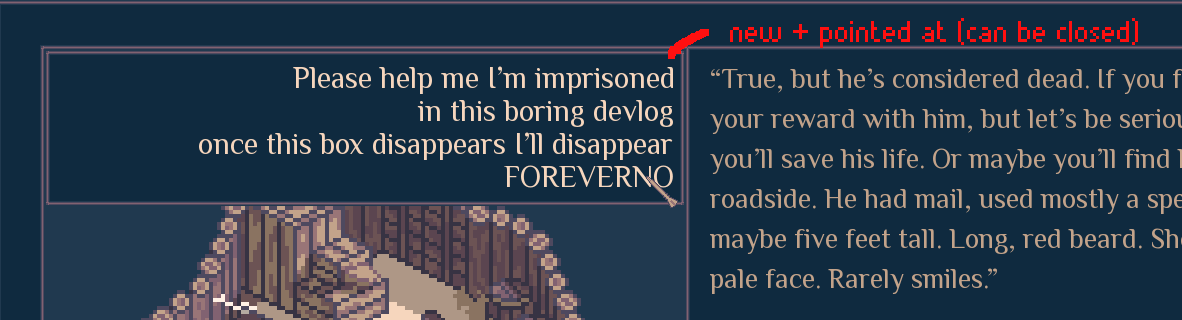
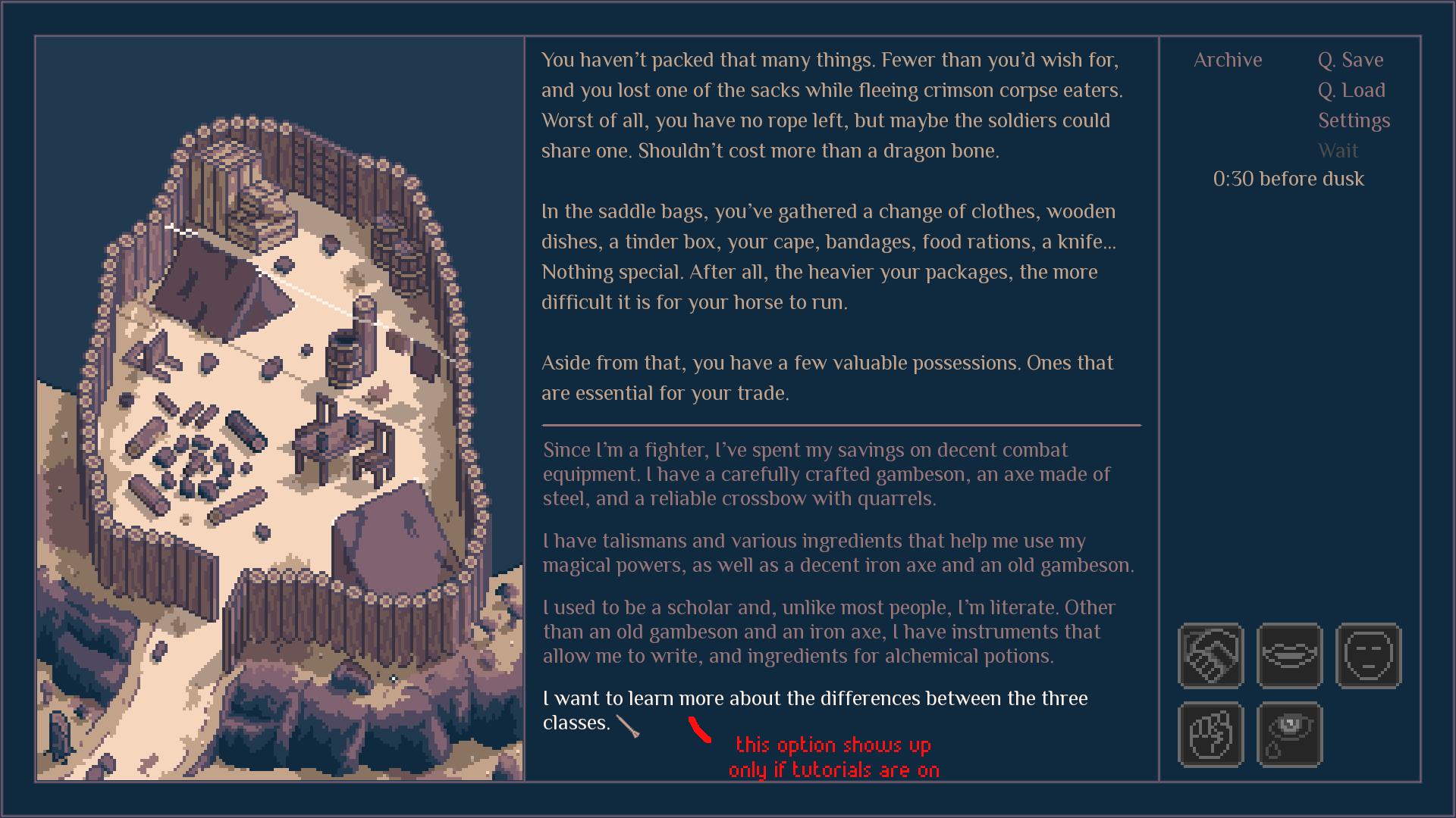
I keep working on the tutorials, explaining more and more rules or finding ways to explain them more clearly. It used to be that the game would hide parts of its UI before introducing them with the relevant bit of the prologue, but from now on, turning off the tutorials will instantly show the entire UI, reducing the awkwardness while replaying this section of the game. It also works better on screenshots. ; )
Another tutorial upgrade: in most situations, a button that’s meant to be pressed by the player to move on during the tutorial sections gets highlighted. Having the text box right beneath it was not enough, having gray text in the center of the screen was not enough, so maybe this will help. ; )
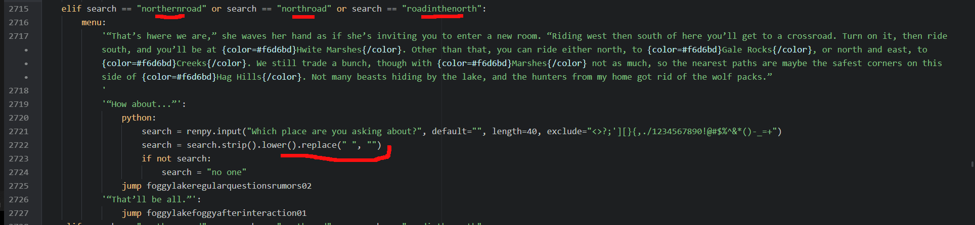
The text parsers, at least those not related to PC’s name, now ignore spaces. The player can still use them while writing, but the game will simplify the result and compare it with the limited scope of positive interactions.
In other words, the game will forgive the players who mistakenly started or ended their parser by pressing the space button, or made a double space in the middle of the phrase. However, the players who are as pedantic as I am, will still have an option to keep the text pretty.
---------------------------------
Thank you for taking a look at this devlog, for your support and kindness. My ambition once again forces me to postpone the game, this time to 2022, what saddens me, but also gives hope that the results will be fantastic. The main reason why it takes so much time is hidden in testing. Some things just don’t work as well as I intended them to, and I’m successfully fixing them... at least I hope so.
You can also find me on
Twitter and
Facebook, and the game has
Steam and
GOG pages on which you can add it to your wishlist. Have a great day!
 Community
