|
Relix
|
 |
« Reply #1020 on: May 04, 2010, 08:50:50 AM » |
|
@Xion
What kind cliffs and where?
@Dugan
I'm not sure if I want to mess arounds with the colors anymore, will see.
|
|
|
|
|
 Logged
|
|
|
|
|
Nate Kling
|
|
« Reply #1021 on: May 04, 2010, 12:07:02 PM » |
|
That look INCREDIBLE Greg!!!!   . I wish I had some pixel stuff to post right now, once my finals are over I will post something! |
|
|
|
|
Logged
|
|
|
|
|
Greg Game Man
|
|
« Reply #1022 on: May 04, 2010, 04:25:49 PM » |
|
That look INCREDIBLE Greg!!!! . I wish I had some pixel stuff to post right now, once my finals are over I will post something! thanks, I checked out your website and the header art is so awesome! |
|
|
|
|
Logged
|
|
|
|
|
thewojnartist
|
|
« Reply #1023 on: May 04, 2010, 07:47:37 PM » |
|
 version 2 I didn't like the first one to be honest, but this one ROCKS! Awesome work! |
|
|
|
|
Logged
|
|
|
|
|
Melly
|
|
« Reply #1024 on: May 05, 2010, 09:52:04 AM » |
|
*badass pic
version 2
That's delicious. Reminds me of Au Sable. |
|
|
|
|
Logged
|
|
|
|
|
Xion
|
|
« Reply #1025 on: May 05, 2010, 02:00:19 PM » |
|
@Xion
What kind cliffs and where?
I mean in the foreground. The play area looks really flat right now. Kind of a minor personal annoyance of mine is when platform games have big, perfectly flat places that aren't boss arenas. I mean, unless that is a boss arena. bah. I dunno. |
|
|
|
|
Logged
|
|
|
|
|
ink.inc
Guest
|
|
« Reply #1026 on: May 05, 2010, 03:40:27 PM » |
|
I'm not sure about this, some colors have different saturations, making it looks like a lot of styles are mixed haha. I think your version 2 looked more coherent. But it was kinda dark and hard to read, this is more light and clearer. I'm still working on it though. Edit:  I've no idea what to do next... I'm assuming you're planning on making this a game, seeing as how you've been editing the piece for a while. I would suggest changing the health bar. It looks a bit messy right now, and I'm not too sure how it fills up. You've got two rows, but only one side is filled. |
|
|
|
|
Logged
|
|
|
|
|
Relix
|
|
« Reply #1027 on: May 06, 2010, 01:57:46 AM » |
|
I mean in the foreground. The play area looks really flat right now. Kind of a minor personal annoyance of mine is when platform games have big, perfectly flat places that aren't boss arenas. I mean, unless that is a boss arena. bah. I dunno.
Ah gotcha, I'll add more variations once I can work on this again. I'm assuming you're planning on making this a game, seeing as how you've been editing the piece for a while. I would suggest changing the health bar. It looks a bit messy right now, and I'm not too sure how it fills up. You've got two rows, but only one side is filled.
Yup, already coded a good deal of it. Anyway, it fills up the left row first, then the right. It's basiclly Zelda healt bar expect vertical. It may look messy on still screen, but it looks fine in action, however someone on pixel joint pointed that I should shade the hearts on the right side row - I will do that later. I've three exams in a short time, so I get back to this once they're over. |
|
|
|
|
Logged
|
|
|
|
|
thewojnartist
|
|
« Reply #1028 on: May 07, 2010, 09:31:37 PM » |
|
I know they're messy, but I just wanted to get a concept out through them:   These are both the same level, except the background is changed. The concept of the game is that there are black blocks,spikes,bad guys, etc. and white blocks, spikes, bad guys, etc. The main character (the grey afro dude), when standing still, can change the background from black to white and vice versa, so as to change which blocks and stuff are visible This doesn't make the ones that are the same color as the background stop existing, they are still there, but blend in with the background. This causes the player to have to utilize some memorization in order to get through parts that require constant movement (such as a wall jumping segment) |
|
|
|
|
Logged
|
|
|
|
|
JoeInky
|
|
« Reply #1029 on: May 08, 2010, 04:45:48 AM » |
|
they look good. Funny that you should post that, I've been making a sequel to my Invert series of games, and was just about to post a mockup for it. 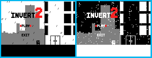  Looking forward to seeing how yours turns out though! I love games with few colours. |
|
|
|
|
Logged
|
|
|
|
|
sereneworx
|
|
« Reply #1030 on: May 08, 2010, 05:03:08 AM » |
|
I thought that in the second title screen, the dot was his penis.
And then I really liked it, because it seemed like when you inverted, he turned naked. Clearly this happened because he inverted from being clothes to not be clothed.
I mean, I still like it. But that would have been nice.
Really nice visual style though. Nice and easy to read. The only thing is that black spike. It having that highlight seems somewhat out of place.
|
|
|
|
|
Logged
|
|
|
|
|
JoeInky
|
|
« Reply #1031 on: May 08, 2010, 05:37:59 AM » |
|
gfdg haha.
Also as for the black spike, the grey highlight is there to make it not seem as much like part of the environment, so you can distinguish it better as a hazard, yet know that it can also be inverted to no longer be a threat.
I might just make it black though idk yet.
|
|
|
|
|
Logged
|
|
|
|
|
BadgerManufactureInc
Guest
|
|
« Reply #1032 on: May 08, 2010, 11:41:31 AM » |
|
I guess I'm 'the programmer that took it upon himself to replicate that mockup' lol, I decided to make a game like this around 16 years ago, and have wanted to ever since playing Chaos Engine and Alien Breed. My engine skeleton that I showed Bones did not look as impressive as his pretty pixels. For a first attempt at this perspective I am impressed :] We're getting a stable frame rate with all 14 weapons and the first few enemy types implemented - with stat upgrades to go in at the end of levels and diagonal walls still to make. Still early days, but we have the basics of the game laid out now: Gameplay Mockup Video  |
|
|
|
« Last Edit: May 10, 2010, 12:49:56 PM by PlayOrDie »
|
Logged
|
|
|
|
|
jwaap
|
|
« Reply #1033 on: May 08, 2010, 11:55:09 AM » |
|
looks very nice, but that font is not very readable! I suggest getting rid of the horizontal lines, or at least the red like that.
|
|
|
|
|
Logged
|
|
|
|
|
BadgerManufactureInc
Guest
|
|
« Reply #1034 on: May 08, 2010, 11:59:15 AM » |
|
Yeah we'd figured lol. One option is to pixel a black outline around the font but we may make it lighter. Thanks for the suggestions, tbh I only put the dialougue in yesterday and we've only been on this for two weeks.
|
|
|
|
|
Logged
|
|
|
|
|
thewojnartist
|
|
« Reply #1035 on: May 08, 2010, 12:11:29 PM » |
|
Looking forward to seeing how yours turns out though! I love games with few colours.
Um...well...I'm already working on a different game (with my brother programming. I'm no good at programming). But if someone wants to make a game out of it, I already have a good amount of the graphics (of which there is not much really needed) done:   Standing:  Walking:  Jumping:  Falling:  |
|
|
|
|
Logged
|
|
|
|
|
Quicksand-T
|
|
« Reply #1036 on: May 08, 2010, 12:30:52 PM » |
|
PlayOrDie, I can't wait to play that. You should add mouse targeting, like Meteor. It might feel smoother. |
|
|
|
|
Logged
|
|
|
|
|
BadgerManufactureInc
Guest
|
|
« Reply #1037 on: May 08, 2010, 12:43:14 PM » |
|
We considered mouse aiming but decided it wasn't true enough to our 8-way concept. Controls like Alien Breed or Chaos Engine with strafe and movement locking seem to work ok. Our system also encourages a more individual playing style to develop: for example you can strafe around corridors or lock view when surrounded. The general theme of 'real time rpg' is probably our main influence from Gauntlet, as the action is definately most like Chaos Engine so far, but we have strafing in our game as well as movement locking.
Dual stick (or mouse on PC/Mac) games like Smash TV/Geometry Wars make for a different gameplay experience. Meteor and other arena shooters are also good games, but obviously have a different pace and are perhaps more linear. Of course Zelda Link to the Past is another game that uses our control method so we're hardly doing anything 100% new.
|
|
|
|
« Last Edit: May 08, 2010, 04:11:13 PM by PlayOrDie »
|
Logged
|
|
|
|
|
|
|
CiroContinisio
|
|
« Reply #1039 on: May 09, 2010, 07:05:15 AM » |
|
I don't like that pink  Too strong... |
|
|
|
|
Logged
|
|
|
|
|
 Developer
