|
Pineapple
|
 |
« Reply #6200 on: February 13, 2013, 11:59:23 AM » |
|
deshori.
kinda more like concept art i guess. maybe i should have put these in art.
you know if you start working on that again you gotta let me know |
|
|
|
|
 Logged
|
|
|
|
|
ClayB
Guest
|
|
« Reply #6201 on: February 13, 2013, 12:26:43 PM » |
|
 Don't ask me to explain, IDK. |
|
|
|
|
Logged
|
|
|
|
|
ChevyRay
|
|
« Reply #6202 on: February 13, 2013, 12:47:55 PM » |
|
Don't ask me to explain, IDK. Very cool! Loving the colors. Some anti-aliasing on some of the outside edges would be nice, and making the inner shadows a bit stronger will give it more depth. Dat background red <3<3<3 EDIT: page quote'd |
|
|
|
|
Logged
|
|
|
|
|
TNERB
|
|
« Reply #6203 on: February 13, 2013, 08:59:45 PM » |
|
@ClayB
I wanna live in there.
|
|
|
|
|
Logged
|
|
|
|
|
AndyNN
|
|
« Reply #6204 on: February 15, 2013, 08:02:54 AM » |
|
Something I've been playing around with - using black as the primary colour. 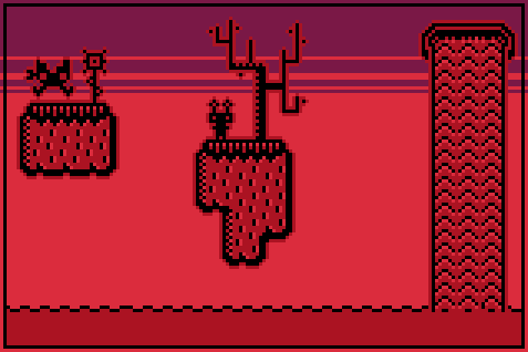 |
|
|
|
|
Logged
|
|
|
|
|
powly
|
|
« Reply #6205 on: February 15, 2013, 08:10:29 AM » |
|
Good idea and execution - gives it a nice silhouette-like feeling. Though I think you could get rid of some of the red outlines.
|
|
|
|
|
Logged
|
|
|
|
|
AndyNN
|
|
« Reply #6206 on: February 15, 2013, 08:18:53 AM » |
|
Good idea and execution - gives it a nice silhouette-like feeling. Though I think you could get rid of some of the red outlines.
My trouble is that I make a set of rules on the style and follow to the tee... I was wondering whether I was over using the outlines. Maybe I should experiment and see which outlines to remove to the mock-up. |
|
|
|
|
Logged
|
|
|
|
|
AndyNN
|
|
« Reply #6207 on: February 15, 2013, 08:39:25 AM » |
|
Here's a version with some outlines removed. It probably looks better for it now - thanks for the input.  |
|
|
|
|
Logged
|
|
|
|
|
JMickle
|
|
« Reply #6208 on: February 15, 2013, 10:08:24 AM » |
|
Intrepid Citizen Escape the city before the cops catch you!
|
|
|
|
|
Logged
|
|
|
|
|
Quarry
|
|
« Reply #6209 on: February 15, 2013, 10:19:32 AM » |
|
He lacks dem' smarts, man
|
|
|
|
|
Logged
|
|
|
|
|
twingloxx
|
|
« Reply #6210 on: February 16, 2013, 12:18:56 AM » |
|
Made another shmup mockup. Reused old assets I made earlier for the background (getting lazy!)  |
|
|
|
|
Logged
|
|
|
|
|
D-TurboKiller
|
|
« Reply #6211 on: February 16, 2013, 02:25:37 AM » |
|
A couple of friends of mine are still trying to make Dracula's Tank Rampage I've been keeping an eye on things, and I've gotta say, shit looks promising!  What, you wanted some mockups of mine? I haven't actually drawn anything seriously yet, so no dice. |
|
|
|
|
Logged
|
|
|
|
|
Schoq
|
|
« Reply #6212 on: February 16, 2013, 09:51:38 AM » |
|
Nice authentic late 80s arcade look, gg  The muted colours contribute to that a lot, although I'm pretty sure they looked like that because the monitors used had higher contrast or something. The muted colours contribute to that a lot, although I'm pretty sure they looked like that because the monitors used had higher contrast or something. |
|
|
|
|
Logged
|
♡ ♥ make games, not money ♥ ♡
|
|
|
|
|
|
poe
Guest
|
|
« Reply #6214 on: February 16, 2013, 06:05:48 PM » |
|
Looks really nice, but the optical illusion of the 3D doesn't work too well for me.
|
|
|
|
|
Logged
|
|
|
|
geepit
Level 1


|
|
« Reply #6215 on: February 16, 2013, 06:45:41 PM » |
|
Cheers  . Yeah it probably could do with some highlights or something to bring out the 3d more, but it was just a quick thing so i wasn't fretting over it too much. |
|
|
|
|
Logged
|
|
|
|
|
cubertron
|
|
« Reply #6216 on: February 17, 2013, 04:28:22 AM » |
|
Three characters I made. Feedback ?  |
|
|
|
|
Logged
|
|
|
|
|
Impmaster
|
|
« Reply #6217 on: February 17, 2013, 04:35:54 AM » |
|
The last one looks like a mayan alien version of the other two.
|
|
|
|
|
Logged
|
|
|
|
|
siskavard
Guest
|
|
« Reply #6218 on: February 17, 2013, 10:34:23 AM » |
|
Three characters I made. Feedback ? Needs more gray |
|
|
|
|
Logged
|
|
|
|
|
siskavard
Guest
|
|
« Reply #6219 on: February 17, 2013, 11:30:13 AM » |
|
needs mor grayme
there.
|
|
|
|
|
Logged
|
|
|
|
|
 Developer
