|
Foolish Mortals
|
 |
« on: January 28, 2021, 02:47:50 PM » |
|
I watched a TON of Godzilla movies as a kid. I also loved Advance Wars (mix in a dash of Into the Breach too). I've combined those passions, and have started working on Kaiju Wars. I look forward to writing and getting feedback from y'all. |
|
|
|
« Last Edit: July 14, 2021, 12:37:55 PM by Foolish Mortals »
|
 Logged
|
|
|
|
andyfromiowa
Level 1


|
 |
« Reply #1 on: January 28, 2021, 04:51:34 PM » |
|
This looks great! Everything looks very well designed and polished. Love the animations and striking color choices.
Is the goal to actually defeat the monsters? I ask because the description makes it sound like a hopeless endeavor.
|
|
|
|
|
Logged
|
|
|
|
|
Foolish Mortals
|
|
« Reply #2 on: January 28, 2021, 11:06:42 PM » |
|
This looks great! Everything looks very well designed and polished. Love the animations and striking color choices.
Is the goal to actually defeat the monsters? I ask because the description makes it sound like a hopeless endeavor.
Thanks! We actually based the colours on old Godzilla movie posters (like this one), and ensured each palette was made of contrasting/opposite colours on the colour wheel. You can't ever kill the monsters, but inflict enough pain or deliver them anti-monster sleep serum, and they'll retreat temporarily. You may have to find what's cuasing the monsters to rampage in the first place... |
|
|
|
|
Logged
|
|
|
|
andyfromiowa
Level 1
|
|
« Reply #3 on: January 30, 2021, 11:39:17 AM » |
|
This looks great! Everything looks very well designed and polished. Love the animations and striking color choices.
Is the goal to actually defeat the monsters? I ask because the description makes it sound like a hopeless endeavor.
Thanks! We actually based the colours on old Godzilla movie posters (like this one), and ensured each palette was made of contrasting/opposite colours on the colour wheel. You can't ever kill the monsters, but inflict enough pain or deliver them anti-monster sleep serum, and they'll retreat temporarily. You may have to find what's cuasing the monsters to rampage in the first place... Oh, cool! Sounds like a neat twist on the genre. I'm eager to see more. Keep up the great work! |
|
|
|
|
Logged
|
|
|
|
|
Ramos
|
|
« Reply #4 on: February 01, 2021, 03:05:00 PM » |
|
WOW
I love every aspect of your project, from gameplay to artwork
I especially like how you integrated the interface into the environment giving it a warm tabletop feel to it, the color palette, art style, tactical gameplay, pure perfection.
Please keep posting updates
|
|
|
|
|
Logged
|
|
|
|
|
Foolish Mortals
|
|
« Reply #5 on: February 02, 2021, 12:24:32 PM » |
|
Haha, thanks! Yes a number of people have told me they like how the UI fits into the board, a bit like a tactical hologram.
Unfortunately, others have told me they don't like having to tilt their head to read the slanted text!
A bit of a pickle - I really do like the style, so I'll have to give it some thought.
|
|
|
|
« Last Edit: February 02, 2021, 01:57:18 PM by Foolish Mortals »
|
Logged
|
|
|
|
|
Ramos
|
|
« Reply #6 on: February 02, 2021, 01:48:58 PM » |
|
Haha, thanks! Yes a number of people have told me they like how the UI fits into the board, a bit like a tactical hologram.
Unfortunately, others have told me they don't like having to tilt their head to read the slanted text!
I really do like the style, but I can't disregard the accessibility complaints of others, so I'll be changing it.
I was giving you feedback from a gamer perspective(aka me as a gamer), not a developer perspective aka I am your target audience, I love this sort of games, if I were to give you feedback strictly from a game dev point of view then sure, it does not look to user friendly at first glance. But who cares, you want to make players happy or other devs? Follow your dreams! Also, the fact that you started your reply with "haha" makes me think you are a bit malefic At least make an option for the player to choose "artistic interface or standard interface" |
|
|
|
|
Logged
|
|
|
|
|
Foolish Mortals
|
|
« Reply #7 on: February 02, 2021, 01:56:24 PM » |
|
Oh apologies - no offense was intended. All feedback is appreciated, and my response came off as aimed at you. I'm really torn on the subject of the UI (I like it too), and I'm actually working on the UI right now, so I just found it humorous.
Adding an option for fancy ui/background art is a great idea!
|
|
|
|
|
Logged
|
|
|
|
|
|
|
JobLeonard
|
|
« Reply #9 on: February 03, 2021, 01:09:41 AM » |
|
I can hear this GIF Also the graphics are really slick (although I do share some of the UI usability concerns) |
|
|
|
|
Logged
|
|
|
|
|
Foolish Mortals
|
|
« Reply #10 on: February 03, 2021, 12:24:20 PM » |
|
It is! My brother (who's our game designer) played it a lot as a kid. All follow-up godzilla games focussed on playing as the monsters (mostly as fighters and beat 'em ups), so he felt it was worth returning to the idea of playing as puny humans. You could consider this a spiritual successor to Godzilla 2. I can hear this GIF Also the graphics are really slick (although I do share some of the UI usability concerns) Thanks! The screen shake helps when there's so sound. |
|
|
|
|
Logged
|
|
|
|
|
Rogod
|
|
« Reply #11 on: February 03, 2021, 12:35:17 PM » |
|
Hah, that's cool - I definitely consider it a spiritual successor to Godzilla 2  |
|
|
|
|
Logged
|
|
|
|
|
Foolish Mortals
|
|
« Reply #12 on: February 09, 2021, 01:20:22 PM » |
|
Goin' out in Art StyleGetting the look and art style of a game right is really important. Like, really important. I'm a programmer by trade, and unfortunately I suck at art. Since I don't have the budget of larger games like Advance Wars or WarGroove I decided to go for a very distinctive, simple and bold art style. But like all things, it's taking more work than you'd think it would. At first we decided to keep it simple. Real simple. I really liked Into the Breach's pxielly isometric art style. However, I've also really liked the look of those comic book dots (Ben-Day dots) to give shading. The pixel art equivalent of this is dithering. The spacing of black dots gives it an appearance of a gradient, even though we're just using two colours - black and white (look at the forests to see what I mean). 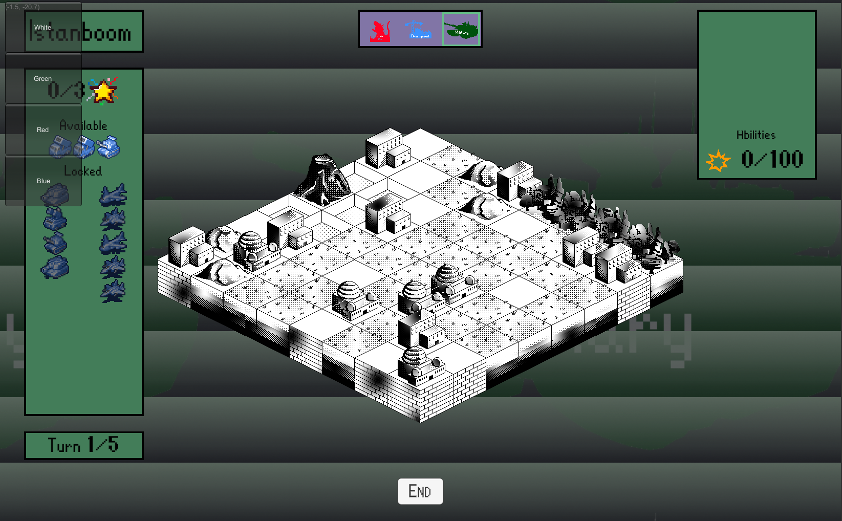 Oof that's some rough UI looking back. Oh well. As for the battlefield, we felt that black and white wasn't enough. What would it look like if we simply coloured each sprite a single colour (with black of course being present)? 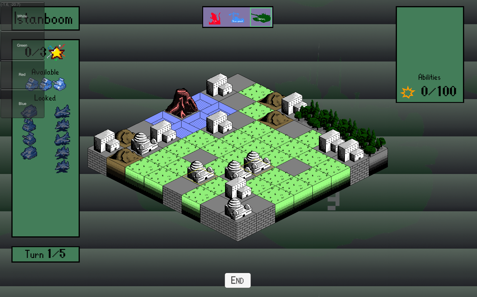 Hmm. Not bad. We worked more on our two-tone sprites, and it's shaping up nicely. 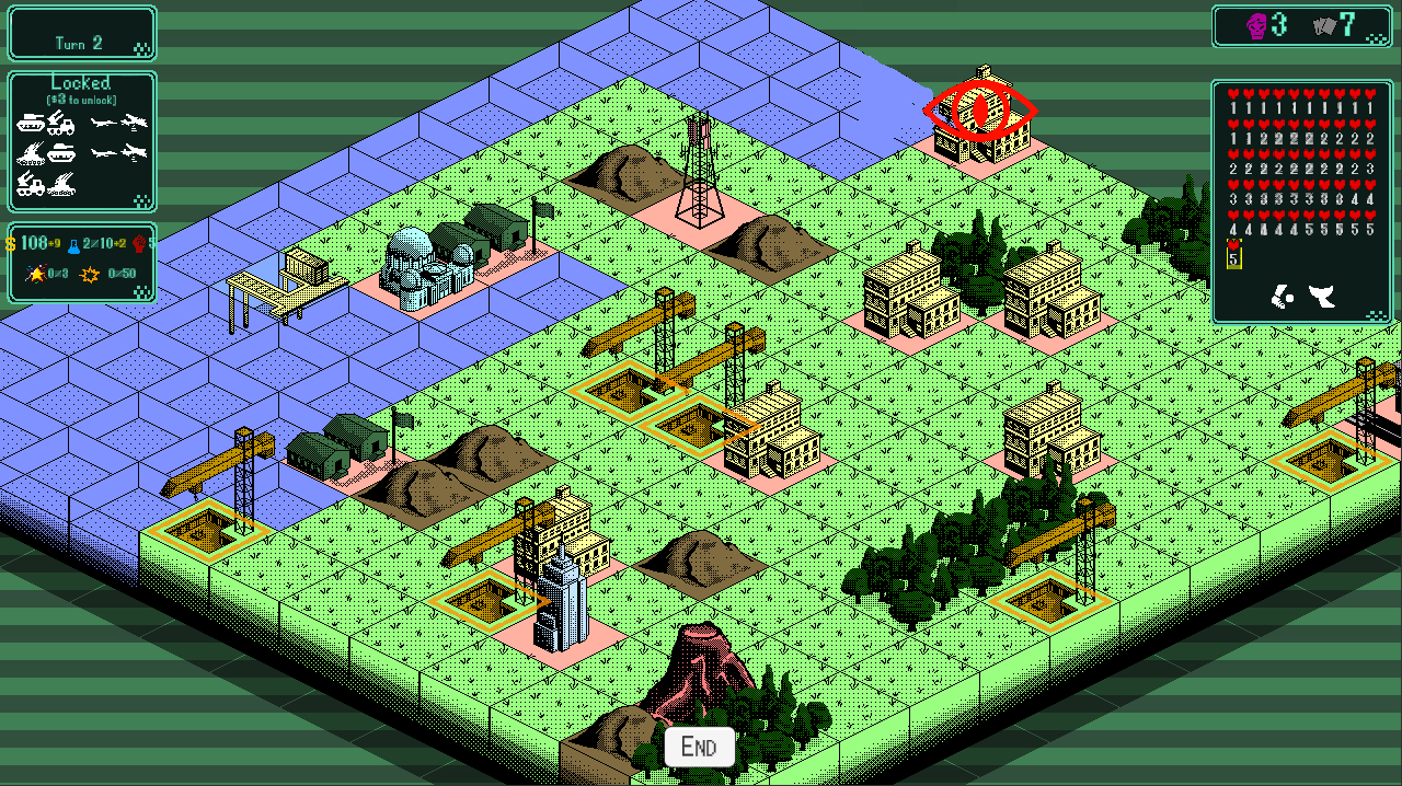 Well, that's not terrible. The colours you'd expect are there - water is blue, trees are green. But the dithering combined with pastel colours still isn't quite there yet. Something's missing. Je ne sais quois. It just wasn't bold or striking enough. If someone walks by me (or hopefully other people) playing the game, I want them to stop and say "Woah, what's that?!" It doesn't have to be technically impressive, but it's gotta be striking, bold and distinctive. My artist friend who I hired for the game suggested looking at the Godzilla movies themselves for inspiration. Well, the movies didn't help for the art style, but their posters sure did! 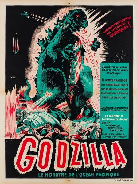 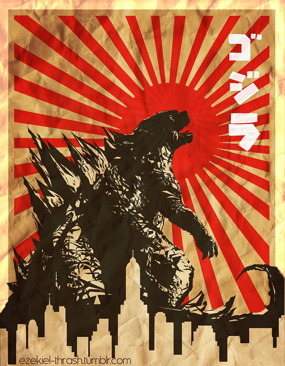 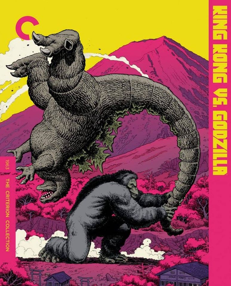 We could use the colour palettes from those! We picked out 5 colours from each poster (with black and gray always being present), and coloured EVERYTHING on the in-game battlefield with those colours. Key interactable items (units, production buildings) got a vibrant bright colour, non-interactable units/buildings got gray, and terrain got shades of our secondary contrasting colours. It had never occurred to me before, but apparently colours on opposite ends of the colour wheel are contrasting (remember I'm a programmer). This revelation really blew my mind. 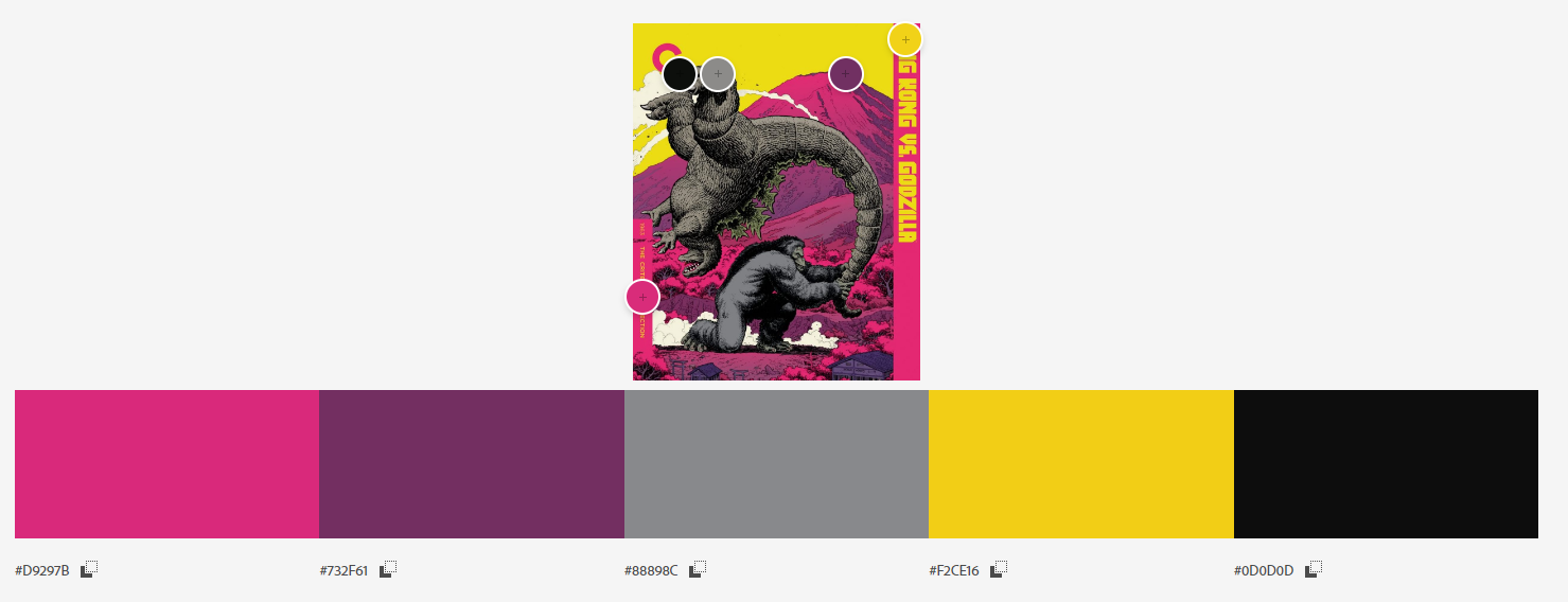  And there you have it. I think it looks striking, bold and distinctive, if I do say so myself. We still have background and UI to work on, but the battlefield itself is looking pretty nice. 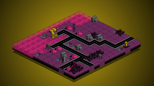
|
|
|
|
« Last Edit: February 23, 2021, 03:08:33 PM by Foolish Mortals »
|
Logged
|
|
|
|
|
|
|
Alain
|
|
« Reply #14 on: February 10, 2021, 12:05:57 AM » |
|
I'm a big fan of Into the Breach, but as much as I love it I always thought the design missed out on giving me the feeling that I am in a giant mech fighting giant aliens. Your game seems to achieve that, which is amazing! The look of Kaiju Wars was great before the overhaul, but now it is even more vibrant, great job. With regards to colors I work exactly the same way and play around with extracting nice palettes from pictures that inspire me. Btw. I can highly recommend a tool called Swatcher to manage your palette.
|
|
|
|
|
Logged
|
|
|
|
|
JobLeonard
|
|
« Reply #15 on: February 10, 2021, 01:28:45 AM » |
|
Taking the bold visual style of the posters as a starting point was a great move
|
|
|
|
|
Logged
|
|
|
|
|
Foolish Mortals
|
|
« Reply #16 on: February 10, 2021, 12:44:47 PM » |
|
This new art direction is super strong, creates a powerful mood. I like it a lot   Strong... strong like a kaiju! I'm a big fan of Into the Breach, but as much as I love it I always thought the design missed out on giving me the feeling that I am in a giant mech fighting giant aliens. Your game seems to achieve that, which is amazing! The look of Kaiju Wars was great before the overhaul, but now it is even more vibrant, great job. With regards to colors I work exactly the same way and play around with extracting nice palettes from pictures that inspire me. Btw. I can highly recommend a tool called Swatcher to manage your palette.
I agree! Into the Breach advertised itself as a mech game, but is really a sliding puzzle. The mechs and enemies were tiny pixel sprites losing the weighty feel of the supposedly giant mechs and enemies. With that being said, I still love Into the Breach! I'll have to check out Swatcher. Taking the bold visual style of the posters as a starting point was a great move
It certainly helps to stand on the shoulders of giants! |
|
|
|
|
Logged
|
|
|
|
|
bkeegan
|
|
« Reply #17 on: February 10, 2021, 01:12:26 PM » |
|
Fantastic colors and design - very thoughtful! Like the tile wave effect with the kaiju attack.
|
|
|
|
|
Logged
|
|
|
|
|
Foolish Mortals
|
|
« Reply #18 on: February 12, 2021, 12:22:16 PM » |
|
Fantastic colors and design - very thoughtful! Like the tile wave effect with the kaiju attack.
Thanks! Making the kaiju feel powerful is very important to us, and we're always looking for more ways to emphasize that |
|
|
|
|
Logged
|
|
|
|
|
Foolish Mortals
|
|
« Reply #19 on: July 13, 2021, 03:26:51 PM » |
|
Making a MonsterWow, it's been a while since I've updated this. Work has been progressing steadily in all departments, but today I'll be talking more about the art of our monsters since I need some feedback. 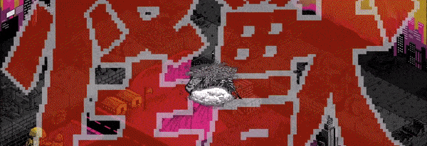 Early on we decided that the human buildings and units should look fundamentally different than the monsters. Humans enforce order onto nature, constructing buildings with straight lines and colours. The kaiju are destruction and chaos incarnate. Anything humans build, they'll knock down.  We gave the monsters a hand-drawn look, whereas human units, buildings and tiles all have a dithered (black dots) pixel art aesthetic. Instead of the colourful yellow or red human tanks, kaiju have no colour. Their gray matches the ruined buildings they leave behind. Every step they take leaves devastation in its wake, changing the tiles to grayscale, allowing the player to visually track their path. 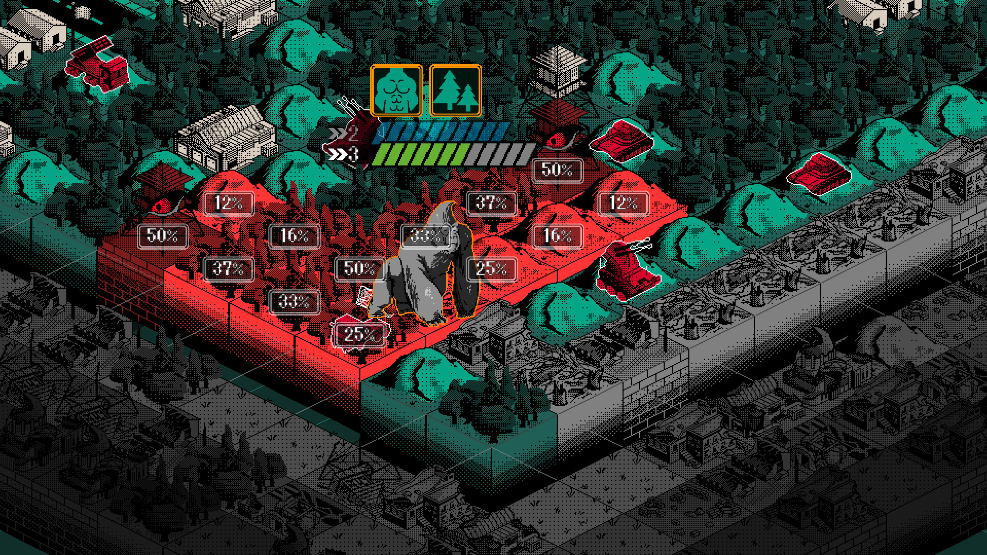 Pictured above, Big Donk left a grayscale path of destruction through the forest. Pictured above, Big Donk left a grayscale path of destruction through the forest.
I like the idea of having a completely different art style for the monsters, but I do worry the art quality of the monsters isn't as high as the tiles or units. Kaiju are the star of the show, so their art needs to be better than simply OK. You can see more monster animations compared to unit and tile art in the trailer below. I could use some honest feedback on the monster art: Is grayscale too boring? Is the animation quality as good as you'd expect? Have any zany suggestions for how monsters could be displayed (claymation, 3D models, rotoscope)?
|
|
|
|
|
Logged
|
|
|
|
|
 Community
