|
DDRKirby(ISQ)
|
 |
« Reply #20 on: October 22, 2021, 01:37:51 PM » |
|
Palette ShadersJust wanted to do a look at a small technical thing today, so here's a post about the shader(s) that are used to render the level graphics in Rhythm Quest. ContextI've used limited color palettes in a lot of my previous games -- in fact, this is one of the defining characteristics of most pixel art. It's also great if you're very unexperienced with color (as I used to be) as it allows you to focus more on values, and establishes a consistent and pleasing style. I started this practice back in 2014 when I made Ripple Runner, which uses 4-color palettes:  Hue Shifting Hue ShiftingIn the past, videogame consoles would only allow for using a certain number of colors at once, so sometimes games would use "palette modulation" to change the colors used in the palette, to provide a different look for different sections of the game, or for transition effects. Nowadays, Game Boy-styled games will often provide a number of different 4-color palettes for use, each with their own look and feel: 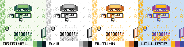 I was inspired by this aspect of old pixel art, and wanted to create color shifts inside my games. However, modern rendering doesn't actually make use of color palettes internally (colors are usually just represented as RGB values), so instead I applied a rendering effect which simply shifts the hue of all of the colors. Here's that in action for Rhythm Quest:  This was actually a built-in effect back when I was using FlashPunk, so it was incredibly easy to put in. It was as simple as this: // (These are built-in FlashPunk classes)
var adjustFx:AdjustFX = new AdjustFX();
var fxScreen:FXImage = new FXImage();
fxScreen.effects.add(adjustFx);
addGraphic(fxScreen, -9000);
adjustFx.hue = 90;
Somehow this type of functionality has gotten =harder= to implement over the years rather than easier, so now you have to actually write a custom shader to do it. =( Yay hardware acceleration...? My first attempt at this (fragment/pixel) shader was a flexible shader that converted each pixel from the RGB color space to the HSV color space, performed whatever shifting was desired, then converted back to RGB. I found that the operations required to do all that were too expensive for some mobile GPUs, so I ended up going with a much simpler algorithm instead that deals with only the hue alone. Problems with Hue ShiftingThat all worked "more or less fine", and I could honestly probably ship with that, but there were a couple of things that I wanted to make better. Most notably, naively shifting hue doesn't lead to the best colors. This is because of two reasons. First, hue shifts (in HSV/HSL space) can change perceived brightness. This is due to human perceptual differences between colors -- green seems much brighter than blue for example. These two rows of colors are identical aside from hue, but look at how much brighter the top row seems: 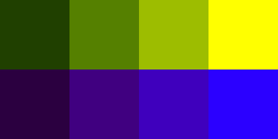 Secondly, good palettes are formed differently depending on their hues. As a general rule, colors look more natural when brighter colors are shifted towards yellow and darker colors are shifted towards blue/purple (this mirrors how many things appear in nature). Doing a straight hue-shift doesn't really take this into account, so you can get messed-up color relations: 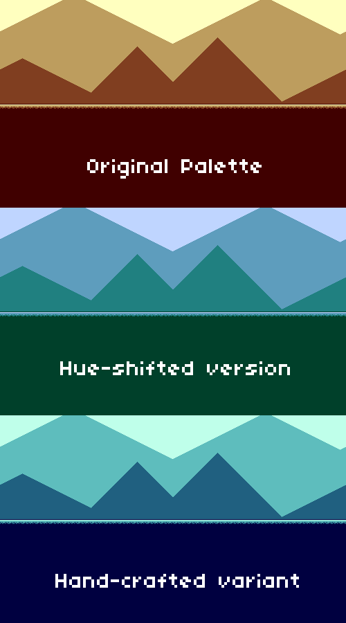 Palette Shader Palette ShaderSo instead of just starting with a set of colors and then shifting the hue, I want to actually handcraft multiple different color palettes and then swap between then. The brute-force approach to this would just be to make separate texture exports for each palette, then just crossfade between them, but that's a huge headache in multiple ways, so I definitely didn't want to do that. Instead I made a fragment/pixel shader that takes the input colors and then clamps them to a given color palette. There's a couple of different ways you could speciy the different color palettes for the shader...for example, you could just have the shader take 4 different color values as inputs, and then modify those programatically whenever you want to switch the palette. However, I chose to be a little more clever and instead have all of the color information for an entire level specified in a "palette lookup texture": 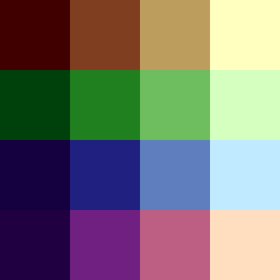 Here, each row represents a different color palette. This texture is super small, and easy to edit using something like Aseprite. And, as another advantage, I can add as many rows or colmuns as I end up needing on a case-by-case basis. For example, I might want to expand beyond 4 colors, so I'd just add some additional columns to the texture. For doing the palette mapping, I'm having the shader just take the average RGB value of the input pixel and then mapping it to each of the 4 output colors based on that. That might be a little awkward if I decide to start having more complicated palettes with lots of colors (I probably won't...), but for now this is fine. I can just have my source graphics be grayscale and then have the shader pull from that. Here's the fragment shader code: fixed4 frag(v2f IN) : SV_Target
{
// Normal texture sampling, to get the input pixel color.
fixed4 texcol = SampleSpriteTexture(IN.texcoord);
// Get the average RGB value (no need to worry about perceptual brightness here)
// We use this as the "U" coordinate in the UV texture mapping.
fixed u = (texcol.r + texcol.g + texcol.b) * 0.333;
// Convert the palette index to a "V" coordinate.
// (_PaletteTex_TexelSize is 1 divided by the texture height)
// Add 0.5 so we're at the "middle" of each pixel, not the edge.
float v = _PaletteTex_TexelSize.y * (_PaletteIndex + 0.5);
// We need to invert since v = 0 is the bottom of the texture, not the top.
v = 1.0 - v;
// Sample from the palette to get the final resulting color.
texcol.rgb = tex2D(_PaletteTex, half2(u, v));
// Apply tint like normal (mostly for alpha effects).
return texcol * IN.color;
}
The cool part about this is that if we set the texture to use bilinear filtering, we can transition between different palettes by using fractional palette indexes! Using a _PaletteIndex of 0.5, for example, will give us colors that are halfway between palette 0 and palette 1. Nifty! Here's the final result, working with the palette texture shown above: 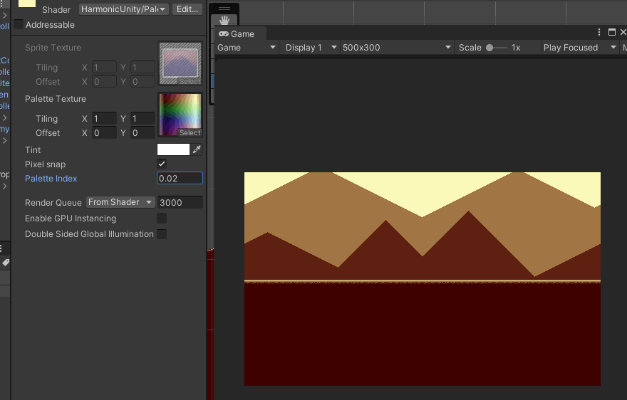 Again, not a huge difference from what I originally had, but it's cleaner in the ways that I mentioned before, and allows me to experiment more with creative palettes, which will probably be important as I look towards giving everything a graphical makeover. (It also ought to be super lightweight in terms of performance)
|
|
|
|
|
 Logged
|
|
|
|
|
DDRKirby(ISQ)
|
|
« Reply #21 on: October 29, 2021, 05:35:25 PM » |
|
Level Graphics ExperimentsI didn't get a ton done this week, but the work I did get around to was mostly focused around revamping the level graphics, which is a still-ongoing task that I'm trying to tackle. This'll probably be a shorter post as I don't have a lot to show yet. Palette Shader NoteBefore I get into it, a few minor follow-up notes on last week's palette shader article. First, I realized that I had done the 0.5 pixel correction in the y (v) direction, but not the x (u) direction, so that needed to be added. Secondly, I talked about how I was able to use bilinear filtering to transition between different palettes. That's working just fine for the levels, which go through a sequential series of palettes, but for the menu screen, I actually need to handle multiple different palette transitions depending on which menu you drill down into, so instead of relying on texture filtering I needed to actually blend between two different palette textures there. Just thought I'd mention it for completeness. Spikes and Spike WallsPart of the work I did this week was to consolidate all of the graphics for each world into a single spritesheet image as opposed to saving them as individual png files. I'm...not actually sure why I didn't do this in the first place, but it makes it much easier to edit the graphics for a world all at once rather than having to open a bunch of different individual files (and having to edit the palette of each one...). This also lets me create a sort of "template" spritesheet layout for each world, which hopefully will reduce the amount of boilerplate work. As I was doing this I decided to make the spike graphics larger: 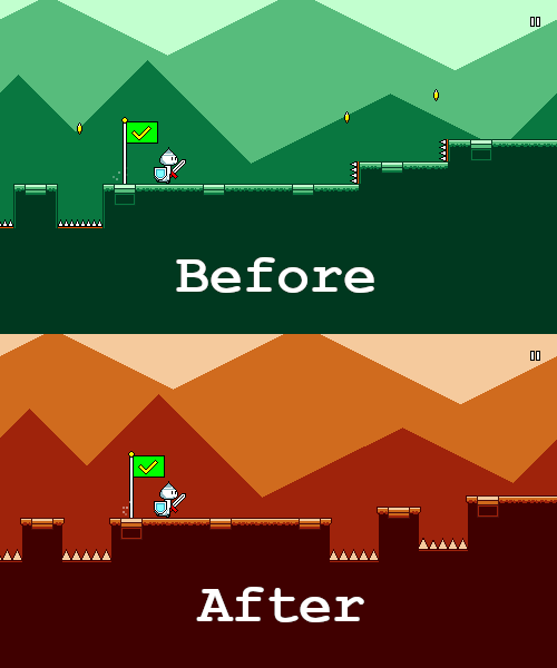 I honestly can't remember why the spikes were so small to begin with, but it may have had something to do with the fact that everything used to be tile-based and thus needed to line up nicely with a 20-pixel grid (?). That's no longer really an issue and I've worked it out so that the spikes can just be clipped off by the edges of jumps, it looks fine. You'll also note that the vertical "spike walls" have been converted to normal spike pit jumps. The spike walls were something that were sort of a legacy carry-over; they're functionally equivalent to a normal jump, and they were only ever used in like one or two levels (and then I sort of forgot about them for the rest of the game). They're intuitive and present a kind of a fun sort of variety, but ultimately they seem unnecessary, so I'm cutting them for now in favor of simplicity and elegance. You might also notice that the coins are gone. I talked about trying this out in an earlier post. The jury is still out on this one -- I sort of have to try it out in action to see how it feels to have them missing. PalettesPart of the whole goal of having the palette shader was to be able to do more interesting things with the color palettes for the levels. Here's an extreme example of a sort of synthwave/outrun-ish color scheme:  Something I really wanted to try was using palettes with more than four colors, to see if that would help the levels look better. Here's a rough attempt at that that I came up with:  It's certainly more...colorful than the monochromatic color themes (d'uh). But in my opinion there's a certain loss of cohesion in the image. The foreground characters also stand out a little less from the background since everything is a little more saturated. Of course, you could argue that this is due to me not choosing a nice palette, but I think that's sort of my point exactly -- sticking to the simplicity of the four-color palette makes it simpler for me to author a pleasing color scheme. Much of the strength of chiptune music and pixel art arguably lies in adhering to restrictions that enforce a uniform style. I'm sure that if I was a more talented artist, I could come up with artwork that takes advantage of more than four colors. You know, something like this:  But part of being a solo gamedev is playing to your strengths. That said, I think this experimentation was still worthwhile, and I'll probably still keep the foreground and background elements as using different sets of four colors (possibly only during certain sections of the song?). But limiting each individual part of the level to four colors seems to work well. Fortunately, even if I decide to later break this rule, my palette shader is flexible enough that it should support that just fine. GrassI figured that grass might be interesting to try out for the first level(s) (sticking to the generic "first level = grass level" videogame trope), so here's my attempt at that:  It's a bit noisy, but overall I don't hate it. I've added two different layers of grass -- one behind the characters and one in front of them, which sort of gives it a subtle (barely noticable) feeling of depth. Unfortunately, drawing grass like this on sloped surfaces is kind of a pain in the butt to get right, so that's something I still need to work on for next week. Each world will probably end up having unique graphical stylings like this, so I'll have to play around with it as I go through them. ParticlesThis was an obvious one that I wanted to try, as particles tend to be a nice way to add some additional motion to scenes to make them feel less static. Still needs more iteration, and these will probably end up being different per world, but here's the first stab at it with a generic leaf sprite:  It already looks pretty nice! Funnily enough, I actually just copied the leaf sprite over from my previous game Melody Muncher, and the idea of using particle effects to accentuate the high points of the song is probably going to be reused as well. Hooray for building up upon previous work! That's it for this week! A lot of this work was more on the experimental side, and I wasn't sure at the beginning what would end up working or not, but I think I've got a better idea of where to go from here now. Sometimes you definitely run into these sort of phases where you just need to go through and try some different things, even if it results in some amount of wasted work.
|
|
|
|
|
Logged
|
|
|
|
|
DDRKirby(ISQ)
|
|
« Reply #22 on: November 05, 2021, 10:06:18 AM » |
|
Coin Collection SystemI mentioned last week that I was still trying to figure out what to do about the coins that I've had floating in the air in the middle of jumps. These things:  I liked having these coins around since they provided visual interest (they're animated, which is nice) as well as a simple way to visualize the path that the player should take across the gap. To a lesser extent, they also serve as a way to visually show the timing of the midpoint of each jump -- which becomes important in later levels when instead of a coin you have an additional mid-air jump or flight path. The IssueHowever it was a bit weird that the coins didn't actually serve any gameplay purpose and didn't actually serve as currency. They weren't really set up to be treated as such, either, as there wasn't really any way to "miss" a coin and the number of coins per stage was pretty arbitrary (the number of jumps that didn't happen to have any other obstacles in the middle of them). But I didn't want players to just be left with a lingering thought of "I got all these coins, how do I use them...?". At the same time, I was also thinking about the level clear UI, which currently just shows the number of times you died during a level. That's working just fine, and sort of serves to suggest the goal of doing perfect clears (which reward you with special medals). But I thought it was kind of weird how when you finally clear a level, the first thing you see is the amount of times you =failed=. That's a feel-good moment if you did it perfectly, but sort of a negative emotional feeling if you happened to die a bunch. I was wondering if I could show something more positive, like a combo count or some sort of score. At the same time, I've been pretty set on not introducing scoring mechanics to the game, as I want to keep away from any extraneous gameplay "baggage" to allow players to just focus on the gameplay and music. Two Birds with One StoneWhen you have questions or problems like these in game design, sometimes you just have to make a list of things to try out and then see what sticks as you iterate on the possibilities. Other times you need to just need to keep the problem around in the back of your head long enough and then come back to it later once you've had a breakthrough or see a new solution. This particular pair of problems fell more into the latter camp. I had both of these problems in my mind at some point, and it occurred to me that I could try to tackle both of them at the same time. One of the problems with using the coins as currency was that they were only tied to empty jumps and not to anything else. Well, I can change that by having enemies also give you coins when you attack them:  So now the number of coins in a stage is more directly tied to the difficulty of that stage. But it still doesn't really make sense to use as a currency because you can't "miss" coins -- going through the entire stage means you've collected all the coins by design. What if we make the player lose a portion of their coins every time they respawn?  Here I'm using a particle emitter attached to the player, with the collision module set to "world" collision, so that the coins collide with the surfaces of the level (which are on their own collision layer). I've also disabled the white flash on respawn so that you can see the coins spilling out, and I've added a flickering effect on the player to represent that you're respawning. To be honest, I always thought that the flash was a little harsh to begin with, but I kept it in because I needed something to cover up the fact that all of the defeated enemies pop back into existence. (I'll probably need to fade them back in gradually instead now...) Okay, so now you can only get all of the coins in the level if you do a perfect clear. That means I can use the coin count as a score to show at the end of the level:  This still isn't quite making sense though, because all of the obstacles reset every time you respawn. So if you die, you lose coins, but then you collect some back as you replay that section...? That's weird. So instead let's make it so that the enemies respawn, but the coins don't. That means you have one shot at each coin, and it's your job to try to hang onto as many of them as possible. ...aaand that's where I'm at right now. There's still some kinks to iron out...for example, the actual number of coins that you lose on respawn is something that I'm still iterating on. And, right now the total number of coins that you're carrying is never actually shown until the end of the level. I could of course just add a numeric UI counter, but again, I'm trying to keep the game screen clean of clutter and distraction. And then I need to deal with how to display the total amount of currency that you've accumulated in the menu screens, ugh... All of this maybe seems very logical in hindsight, but honestly when I started thinking about this I had no idea what I was going to do with it, and it wasn't obvious to me what the way forward was. Hopefully this example illustrates a little bit of how these systems get designed. Again, a lot of it (for me) tends to be about just keeping random issues in the back of my head and then dealing with them once I figure out something I want to try and iterate on.
|
|
|
|
|
Logged
|
|
|
|
|
DDRKirby(ISQ)
|
|
« Reply #23 on: November 19, 2021, 02:45:51 PM » |
|
Character UnlocksTook a week off last week, but I'm back in action for this week. The holiday/end-of-year season is coming up, which means I might be working a bit less than usual, but we'll see if I can keep up some steady progress regardless. Last time I covered the new system for collecting coins across levels. I tried having this coexist with the medal system for a bit, but in the end decided to drop the medals altogether for simplicity so that there's only a single metric for level scoring; the UI was looking too inelegant and messy otherwise.  New Characters New CharactersNow that I have that system in place, I can start actually adding unlockable content to purchase with those coins, such as new characters!  Just a rough draft of the animations (no shading yet), but you get the idea! There aren't any gameplay differences between different characters; it's purely cosmetic at the moment. Shop ButtonOf course, I also needed to implement an entirely new UI flow to allow you to purchase the new characters in the first place. As with many things in game development, this is something that seems extremely straightforward conceptually but actually involves a lot of different moving parts. First we have to add a new button somewhere to allow you to access the shop/unlocks menu:  Seems straightforward enough, but in doing this I had to remove the "Quit" button at the bottom of the main menu -- it was beginning to feel a bit too cluttered otherwise. I ended up changing it to an "X" button at the top-right of the main menu. It's not the prettiest, but I like it better than having 5 buttons in the main menu. Of course, this button doesn't show up on any of the mobile builds. Simple enough, right? Well, no, not really. The X looks really weird if it scrolls to the left with the rest of the other buttons:  So instead I made it fade in and out instead when you transition in and out of the main menu. Simple enough, right? Well, no, not really. It looks nicer if you line up the fade to sync up with the beginning/end of the transition (depending on whether you're navigating to or away from the main menu). And of course...the transition length is variable depending on the position of the music. So I had to add a little bit of extra logic there to expose the transition duration and sync everything up. These are the types of little things that nobody on the outside ever thinks about when a new feature needs to get implemented... Coin DisplayCurrently coins act as "high scores", so they aren't farmable currency (you can only get up to a certain maximum number of coins each level). I wanted to make sure that there was some sort of UI in the shop explaining how many coins you've collected in total across all levels (your total high score), but also showing how many coins you have left to spend. The system definitely isn't 100% intuitive, so I wanted to make sure to give a visual aid for understanding. Right now this is a static box that remains visible at the bottom throughout all of the shop flows (I got to reuse the same fading logic that I had for the X button). 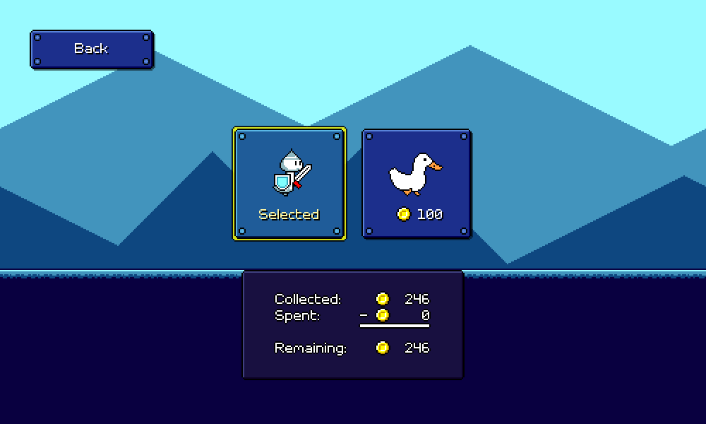 These numbers aren't too hard to show -- the total collected one is just the sum of all your level scores, and then I dynamically calculate the second one based on the sum of the prices of all of the unlocks that you've purchased (I had to set up new data structures for all of that...). Of course, it's never quite that simple. I wanted to have the numbers animate, ticker-style, whenever you made a purchase, so I needed to track the currently-displayed number separately from the actual value and then have it track accordingly. (Little details...) I also wanted some sort of confirmation screen since there are no "take-backs" on purchases. Final FlowAnd with all that, we finally have a flow for unlocking a new character! 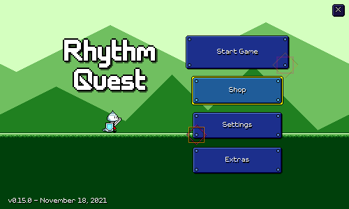 Actually swapping in the new character wasn't too bad! I have a static mapping between string keys (corresponding to each character) and different Animator Controllers. This is stored in a ScriptableObject and then referenced at runtime to load in / switch out to the appropriate set of animations. Next week I'm going to be trying to create the flow for unlocking extra bonus stages via the shop, so it'll probably be more of the same stuff (but probably more complicated). The build is actually still in a pretty shoddy state as I haven't updated most of the levels in accordance with all the visual/shader updates I made a while back, but that can wait until later.
|
|
|
|
|
Logged
|
|
|
|
|
DDRKirby(ISQ)
|
|
« Reply #24 on: December 03, 2021, 01:42:23 PM » |
|
Extra Stage UnlocksThis particular post is going to be more oriented towards coding rather than game design. I did some work on the menu flow for unlocking extra levels this week. Here's what that looks like right now: This is pretty analogous to the flow for unlocking characters, except with some more complicated logic for handling the song previews. I don't (yet?) have song previews for the main levels, but I figured it would be nice to have for the unlockable bonus levels because you're actually spending in-game currency on them -- song titles alone don't really help that much when deciding which songs to buy. (I may end up displaying some sort of difficulty rating as well, but right now I haven't even charted any of these songs, so that's not relevant yet) As always, the exact UI isn't really locked in yet, it's just a rough draft... Song PreviewsThis is the kind of engineering task that is pretty nontrivial yet will probably never show up on any sort of programming interview or anything... In my head this is something that could easily snowball into a pile of weird edge conditions if not handled robustly. In other words, this is the exact sort of thing that gamedev programming is made of... First, let's outline how things =should= work: You can press any of the preview buttons, at any time (except during transitions) The music preview should loop, with a fade at the beginning/end The menu music should fade in/out as the music preview starts/stops Pressing the same preview button again should stop the music Pressing a different button should stop that song and start the new one The preview should automatically stop if you exit that menu Some edge cases and other issues might already be jumping out at you. For example, how do we load and play the preview clips without having to load all of the audio into memory (causes the initial scene load to slow down), and without any sort of stutter when firing off a new one? Ideally you could just specify time segments out of the original audio clips and use those as your previews (adding the volume fades programatically). You could use Unity's new Addressables.LoadAssetAsync functionality, which should allow us to load them in on-demand asynchronously, so that there's no stuttering or hitching. ...except, there's actually still a stutter because the disk load operation blocks the main thread. You could just load all of the clips into memory at the beginning of the scene, but I believe that bogs down scene loading (for similar reasons). I ended up just creating separate preview clips that are set up for streaming (this is also covered in https://exceed7.com/native-audio/rhythm-game-crash-course/import-settings.html), since Unity can't use the same audio clip data for streaming + non-streaming usage. I can then just bake in the beginning/end audio fades for each clip as well, so playing them is a simple matter of looping the entire audio clip. (I do still use the Addressables API to load these separate streaming clips on-demand by name) With that all taken care of, think about how you would handle state management for playing and stopping the audio. One possible approach would be something like this: enum AudioState {
Stopped,
FadingIn
Playing,
FadingOut,
}
AudioSource _audioSource;
AudioState _currentState = AudioState.Stopped;
string _currentClip = "";
Then when a preview button is clicked, you need to check the current state and do the appropriate thing... void PreviewButtonClicked(string clipName) {
if (_currentClip != clipName) {
// We need to transition to the new clip...
// Start loading the new clip asynchronously (?)
AsyncOperationHandle _asyncHandle = Addressables.LoadAssetAsync(clipName);
if (_currentState == AudioState.Playing) {
// Start fading out the current clip...
_currentState = AudioState.FadingOut;
BeginFadeAudioSource(_audioSource, 0.0f);
// Maybe use a coroutine to wait until the volume is 0??
// What if the preview button gets pressed again in the meantime??
...
} else if (_currentState == AudioState.FadingOut) {
...
}
}
...
}
This can get messy really fast since you have to handle so much bookkeeping. Instead I actually just did away with all of the intermediary state. I can use the current volume of the audio source itself to determine whether I need to fade in / fade out / switch clips. The only other state we need to keep around is the AsyncOperationHandle. AudioSource _audioSource;
string _targetClip = "";
AsyncOperationHandle _asyncHandle;
// The button click handler changes _targetClip, but does nothing else.
void PreviewButtonClicked(string clipName) {
if (_targetClip == clipName) {
// Stop playback.
_targetClip = "";
} else {
_targetClip = clipName;
}
}
// Frame-based logic determines at each frame what needs to be done
// with the audio source to match _targetClip.
void Update() {
if (_targetClip == "") {
// We don't want to play anything. Fade volume towards 0.
_audioSource.volume = Mathf.MoveTowards(_audioSource.volume, 0.0f, Time.unscaledDeltaTime);
} else if (_audioSource.clip.name != clipName) {
// We're playing the wrong clip. Fade volume toward 0.
_audioSource.volume = Mathf.MoveTowards(_audioSource.volume, 0.0f, Time.unscaledDeltaTime);
// Start loading the new clip, if we haven't already.
if (!_asyncHandle.IsValid()) {
_asyncHandle = Addressables.LoadAssetAsync(_targetClip);
}
if (_audioSource.volume == 0.0f && _asyncHandle.IsDone) {
// New clip is loaded and fading is done.
// Replace the clip and play.
_audioSource.clip = _asyncHandle.Result;
_audioSource.volume = 1.0f;
_audioSource.Play();
// (This is a struct, not a class)
_asyncHandle = new AsyncOperationHandle();
}
}
}
As always with code examples, I'm handwaving away some details, but hopefully this is illustrative of how this pattern of keeping less intermediary state can help simplify logic. The basic idea is to "recalculate from scratch" what should be done each frame based on the current state of the world rather than maintaining some sort of internal finite state machine. There's often a tradeoff involved here between maintaining less state vs being more performant, but in many simpler cases it's totaly fine to do these sorts of recomputations.
|
|
|
|
|
Logged
|
|
|
|
|
DDRKirby(ISQ)
|
|
« Reply #25 on: December 10, 2021, 02:47:50 PM » |
|
Speed ZonesWater ZonesHalf a year ago (has it already been that long??) I showcased a water mechanic that slowed down the scroll speed and introduced triplet rhythms: 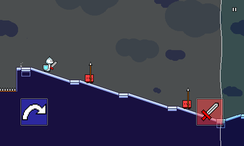 Thematically this works great. I worked out a nice visual representation for it which is probably fairly intuitive as well, and a "water" theme can work well musically without too much trouble. The problem is that the mechanic doesn't function well gameplay-wise. It's a nice changeup in the rhythm of the song, but since the scrolling speed decreases, it makes rhythms harder to read. Overall it's interesting but not exciting. Speed ZonesEnter the reworked mechanic -- speed zones: Instead of reducing the player's speed, I'm now increasing it. The beat grid markers are still spaced the same width apart, but correspond to quarter note triplets instead of quarter notes, so the "beat" is 50% faster. I have to be careful about increasing the scroll rate =too= much with this, but I'm happier with this mechanic since it creates little bursts of higher energy within the song, forcing you to read and execute rhythms more quickly. Here I've only used basic rhythms inside the speed zones, but I could even insert double-hit enemies and flying enemies if I wanted to really go crazy. I also stumbled upon my musical theme for this world while playing around with ideas for this mechanic: pentatonic scales! I'm excited to flesh out this world later on with music written with this theme in mind. Implementation-wise, the cleanest way to get this working would have been to change the tempo or length of a beat during that section. Unfortunately, my code really isn't set up for that sort of thing, so instead I ended up keeping the BPM/beat length the same, and instead increasing the scroll rate. This means that I needed to put the obstacles and beat grid markers on weird fractional beats, like 0.6666, 1.3333...which is a little awkward. I feel like these kinds of "hacks" are more invaluable than people think sometimes -- it's important to see your new mechanic in action as quickly as possible, even if the implementation isn't always ideal. If it ends up causing problems for you, you can always reimplement it once you're sold on the design... Visual RepresentationOne of the nice things about this mechanic is that it doesn't require an icon-based tutorial -- once you run into it, it's pretty obvious how it works. Even if you don't conceptually understand triplet rhythms, listening to the music should make it obvious what the new timing is within the zones. I initially started off with a tinted visual area similar to the water zones, but that just ended up looking like water itself, which didn't make sense (why is it speeding you up?). Then I thought about using an obvious platformer trope -- conveyor belts: 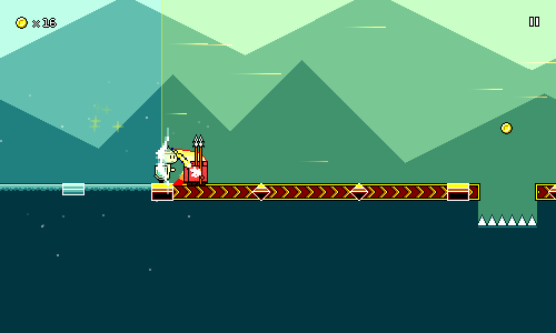 Okay, maybe not literal conveyor belts; I'm using arrows instead to represnt the direction of motion. The animation here is actually pretty simple; it's done by just cycling through this sequence of frames: 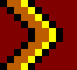 This is then tiled horizontally across arbitrary widths using Unity's SpriteRenderer component. I had to write the logic for figuring out exactly where to add the speed floor tracks within the level, but that wasn't too hard. Replacing the beat grid markers with red-colored versions was pretty simple as well (I adjusted their look slightly to fit better with the conveyor track). I then added a particle system, using a vertical plane to kill off particles as they hit the end of the zone. The particles themselves are actually just single pixels -- I'm using Unity's particle trail system to automatically give them fading trails of variable length. As a final touch, the red tint glows yellow and pulses slightly while you're inside the speed zone. Hopefully this makes it look more like a "field of energy" that you're running through, and less like just an awkward pair of vertical lines. Remaining IssuesThe astute among you will probably already have an important question on their minds: What about sloped ramps? Yeah, that...doesn't work yet, it would actually be a huge headache to try and implement. In theory I could add separate sloped animations for each different ramp steepness (there are 5 right now), as well as both ramp directions (up vs down, I can't just flip the sprite horizontally because the arrow would be backwards). That part is easy enough...the messy part is that there's no easy way to automatically tile this across slopes, so I'd have to construct each ramp segment-by-segment, AND trim off the last part since the total length won't be evenly-divisible. Getting the arrows to line up across different slope heights would be a nightmare, but come to think of it...there should always be beat grids between slop changes, so maybe that's a non-issue. In the end I actually ended up deciding that if I had to, it was acceptable to just put down a restriction to simply disallow slopes across speed zones altogether. The speed zones weren't going to be super long, anyhow, and I probably don't want to make parsing them too difficult. The conveyor belt idea seemed too sensible to discard, even if I had to make a compromise in order to get it to work. I did manage to put grass onto slopes in the end with a similar amount of work, so maybe I'll be able to get sloped conveyors working after all if I try. We'll see!
|
|
|
|
|
Logged
|
|
|
|
|
DDRKirby(ISQ)
|
|
« Reply #26 on: January 14, 2022, 08:16:07 AM » |
|
Level Graphics RevampScreenshot time! I'm back from a long break over the holidays, and I've been doing a ton of work on level graphics for this first week back in action. I've got a lot of juicy gifs to show off as a result! I mentioned in a previous devlog that I had revamped the rendering of the level graphics to use a new palette shader. I've been working on other things, so that has actually gone mostly unutilized until now (more accurately, it made most of the levels graphically broken...), but I finally jumped in and started working out the color palettes for each existing level. I've also been meaning to draw unique backdrops for each level as well as come up with some different particle effects for accentuating chorus sections. Here's a showcase of what I have going on so far. 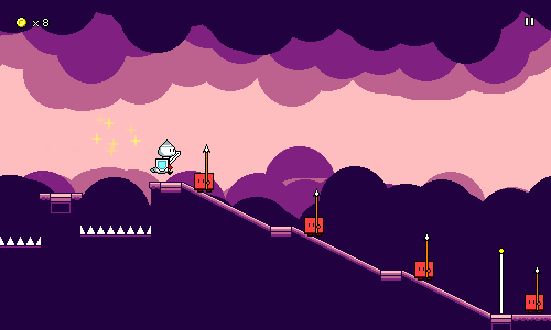 Here's level 1-2 in action. You'll notice that most of the background graphics throughout are very simple, using large brushes, simple shapes and not a lot of detail (these "clouds" are just large blobs drawn with a circle brush). This is mostly because it happens to be way easier for me to do, but it also serves well functionally as to not distract from the foreground as much. I've been learning a lot this week about how to effectively utilize the color palettes to highlight different points in the music. Here, the colors shift to become more vibrant (saturated) and brighter here at the chorus checkpoint, but something else you may not notice at first is that the number of colors also increases. Before the chorus, the background and foreground both share the same 4-color palette, but at the high point of the song, the background and foreground each get their own separate palette, for a total of 8 colors. This helps bring an extra level of visual interest to the scene at that moment, so I've been using this as a consistent pattern throughout all of the levels. As an aside, the main reason I wanted to implement the palette shader by using a lookup texture (as opposed to simply inputting numeric color values) was that I really wanted to be able to edit my palettes visually rather than by typing in numbers. Here's the palette for level 2-3, as an example of what I've been working with: 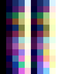 The leftmost 1 column and rightmost 2 columns are currently reserved for black and white, but other than that, you can see on the left half the 4 colors used for the foreground, and on the right side the 4 colors used for the background. You'll notice that these are the same until the bottom part of the texture, which corresponds to the chorus -- this is where the two palettes diverge and we get 8 different colors. Being able to edit my palettes like this not only lets me use my handy-dandy HSV color picker, but also serves as a nice "color graph" of the level at a glance. 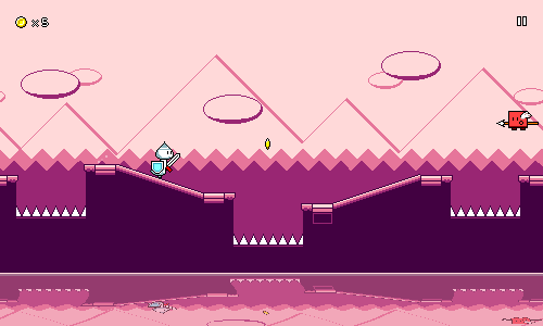 Level 1-3 doesn't really have anything too special going on, aside from the special water shader, which I added in ages ago. A lot of these backgrounds are inspired by Game Boy games -- which, of course, also make use of a 4-color palette. I actually ended up going with less saturated colors in the background for the chorus here, which leads to the foreground being more in focus. Perhaps the oppposite of what you might expect, but I think it still works out. 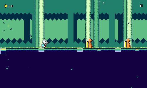 The backgrounds in level 1-4 are also inspired by some backdrops from a Game Boy game (Kirby's Dream Land 2). I had to do a bit of experimenting to come up with a texture for the "trees" that looked right but wasn't too visually distracting. Again, notice that the color set used for the foreground is slightly different than the background (especially the yellow highlights). Of course, all 8 colors still need to work cohesively with each other. It's definitely been an interesting discovery process playing around with the freedom of using 8 colors. There's also a surprising amount that I can play around with for how to distribute the 4 colors across the different backdrop layers -- I remember having to play around with that a bit to get it looking right. I think the parallax scrolling effect really stands out in this particular level due to the complex layering. 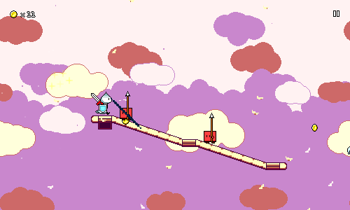 Here's level 2-1. I should mention here that each world now has its own tileset for the ground / ramps / jumps! I decided to see how world 2 would look with no "solid" fill for the ground, and was pretty much sold on that instantly, as it really helps to fit the "cloud/flying" aesthetic of the world. Something else that I discovered while working on this level was that I could have a little bit of vertical parallax scrolling in addition to the horizontal scrolling. You might notice it if you watch how the vertical positions of the cloud layers shift relative to each other. I think this helped add another layer of depth to the otherwise-simple background. I also really like how the "falling petals" particles turned out here. 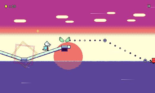 Level 2-2's background is perhaps a bit simplistic, but the cool part here is how the edge of the water has this shimmering effect. There's no lighting or anything going on here, it's literally just two different patterns of coloration that scroll at different rates and then blend together. This is an age-old trick that I used way back in Ripple Runner. Unfortunately the reflection of the sun on the water is static right now, but maybe that'll change later? I've had to keep readability in mind while designing all of these backdrops. Notice that the central horizontal band (where most of the gameplay elements are) is pretty plain here. It also helps to keep most of the primary background colors desaturated, as that lets the foreground stand out more. I wrote a blog post a while back giving some examples of how background saturation can really affect scene readability, so it's important to check and tone down if necessary. 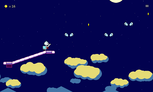 Level 2-3 is focused on combinations of air jumps and flying, so as the level progresses you go up and up. This created a really cool opportunity for me to create a level backdrop that slowly scrolls vertically over time as you go through the level, starting with a nighttime cityscape, going up through the clouds, and ending with a starry sky. There's this fantastic moment where the moon scrolls into view right as you enter the chorus and I'm really proud of how this ends up working. It almost seems like I designed the music and gameplay around this concept, but really it was the other way around, haha. If you look closely, you'll see some of the stars shimmering in and out of view -- this is the particle effect for this level! It's very subdued, but the other things I tried detracted from the main focus of the moon in the starry sky, so this is what I went with instead. 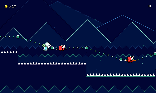 World 3 is the "retro" world, so for level 3-1 I'm trying to evoke old game console imagery with the simple shapes and bright outlines against dark colors. I'm also starting to experiment with having some of the backdrop layers dip into the 4-color foreground palette, which again serves to increase the level of visual interest at the chorus point. The particle effect here is dead simple, just some dots flying through the air. This is a callout to games like Mega Man 2 which used this "starfield" effect. There's actually two different particle systems running here: one is used for larger dots in the foreground, and the other one handles smaller ones in the back which travel less quickly. Just another way to add the illusion of depth to the 2D scene! That's all I've got for now! It's only been a week but the game is looking wayyy better now thanks to all the visual work. Things like this are always super satisfying to work on since you can really see/feel the game coming to life as you add them in. I'm almost done working through the graphics for all of the existing levels, so after that I'll probably move onto something else like more character animations. I'd like to re-emphasize how simple the actual spritework is in all of these backdrops (the last one is literally just a bunch of triangles/zigzag lines...). Most of the appeal comes from good use of layering, as well as careful color selection. Perhaps this can serve as a bit of inspiration to anyone who thinks that they can't make something look good because they're not confident with their artwork. Sometimes, keeping it simple is more than enough!
|
|
|
|
|
Logged
|
|
|
|
|
DDRKirby(ISQ)
|
|
« Reply #27 on: January 21, 2022, 03:49:02 PM » |
|
Character AnimationsThis week I did the backdrops and palettes for level 3-2, took care of some bugfixes, and also worked on some character animations! I've finished the animations for ducky:  And you can also now play as Furball! 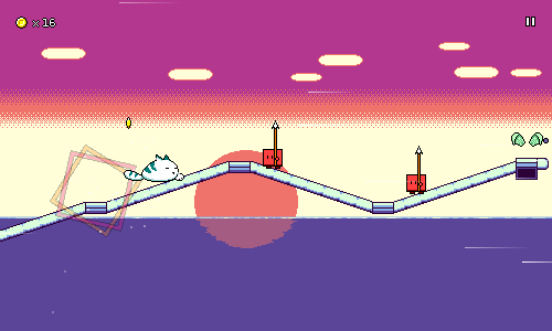 I thought it might be fun to look at some of these animations in a little more detail. I'm by no means very experienced with animation, but maybe it'll be somewhat illustrative to look at anyways. DuckyHaving recently had pet Pekin ducks in my life, I had a lot of reference photos and videos on hand to look at when drawing ducky...  The proportions aren't entirely accurate to life, though -- I went with more of a chibi-styled look where the head is drawn a bit larger, otherwise it wouldn't really show nicely in a sprite of this size. With pixel art it often helps to first decide how the smallest important features -- the eyes -- are going to be drawn, since at this size, even one pixel can change the way it reads entirely. For the run cycle, I really wanted to accentuate two things -- the characteristic head-bobbing of bird movement, and the side-to-side duck waddle motion. This is where thinking about body physics/kinesthetics can help (or just referencing videos). For example, ducky's head goes forward when taking a step, to help maintain the right center of balance. There's some sub-pixel motion involved here, especially with the front of ducky's belly. The shading in the feathers is fairly light here and was only put in after I tested the main silhouette and liked how it looked in motion. I did this by deciding on a few main "lines" to follow to indicate shading of the feathers, then essentially drew those freehand over each frame. A little bit of inconsistency is actually important here to portray motion, otherwise it just looks like a weird decal shape that's shifting around.  I wanted to have minimal wind-up / anticipation frames for the attack animations, since it's important that they feel very responsive (in-game, the enemy actually gets hit immediately, without waiting for the animation to reach the "attack" point). So there's actually only a single "in-between" frame here between the normal running pose and the fully extended attacking pose. Because of this, I'm using smearing on that frame in order to convey the path of the attack motion better. For pretty much all of the attack animations, it looks way better if some sort of full body motion is involved to give some sense of weight to the attack. Here, ducky lunges with their whole body, and I'm using a sort of elastic stretch to enhance the impact.  Ducky's jump animation is the same as the run animation, but without the head bobbing. This is played twice as fast as the running animation, which is really cute; it looks like ducky is paddling their feet in the air, which is actually what can happen if you lift a ducky up in real life...  The flying animation is just the same thing, with the wings overlaid. Although I'm reusing the same green wing graphic, I can't just overlay a shared wing animation on top of each character, because I need to manually position and adjust the wings to line up with wherever makes sense on the character.  This is doubly true for the flying attack animation. Notice how the wings move along with the rest of the body as ducky stretches horizontally. I'm also choosing specific frames of the wing animation to match with the attack animation frames instead of just letting it play out independently. FurballFurball was originally drawn by my friend for Pet Furball and Hyper Furball:   Building the run animation was mostly a matter of just translating that to pixels, but I also had to figure out how to get the stretch and squash to look natural, which involves some subpixel shenanigans. It's tempting to just drag an entire rectangle of pixels and then shift it, and that's indeed what I did to start, but you have to manually adjust things from there otherwise it just looks very weird. My first attempt at Furball's attacking animation really fell flat:  I drew this one based on the graphics from Hyper Furball, but as soon as I put it in the game it was obvious that it lacked the right sort of movement and follow-through. Here's the newer one:  I didn't do as great of a job of it as I did with ducky's animation, but again notice the attempt to introduce some body movement, both with the little hop, and with the body turning slightly from left to right. Really big smear arcs work well for quick slashing motions like this, I think; you see it all the time in other games for sword slashes. It's important that the smears have some contrasting colors (dark blue against white, in this case), otherwise they can fail to show up against certain backgrounds.  Furball's jump animation is really fun as it's a spinning somersault jump. This is actually just two unique frames, which I then copied and rotated in increments of 90 degree angles to form the rest of the frames. You might be asking why I didn't just use one frame and rotate it in increments of 45 degrees, and that's because pixel art genrally doesn't rotate cleanly across those angles. When tweaking these frames I learned that since they go by so quickly, I needed to de-emphasize smaller details since they could just lead to weird-looking afterimages when the animation is played at full-speed. I tried to lighten some of the lines around Furball's tail and smear out the body fur patterns a bit more as a result. 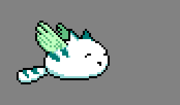 I originally tried having Furball's flying animation be the same as his walk/run animation, but that ended up looking really weird, as the sretch/squash didn't make sense and his tail just sort of floated horizontally in the air awkwardly. The new version tries to have the motion work together with the wing flaps a little better. That's it for this week! I may try to work on one or two more additional characters next week, so stay tuned for more updates!
|
|
|
|
|
Logged
|
|
|
|
|
bayersglassey
|
|
« Reply #28 on: January 21, 2022, 09:17:44 PM » |
|
I like the descriptions of what's going on technically... I don't play or make music-centric games, so it's cool to see what kinds of problems are involved with that and how one might think through them, without having to do it myself.  I also like how the main character seems to hint towards a medieval theme, but the unlockable characters are just cute & whimsical. The duck is really well animated... |
|
|
|
|
Logged
|
|
|
|
|
DDRKirby(ISQ)
|
|
« Reply #29 on: January 28, 2022, 02:41:04 PM » |
|
Samurai ShaverAlong with some more bugfixes and minor improvements, I added Samurai Shaver to the game this week: Samurai Shaver is the titular character from the rhythm game with the same name. This was one of two (!) games our team made for round 40 of Ludum Dare...it ended up taking 1st place overall!  The samurai was a natural fit for Rhythm Quest as it was pretty easy to envision him running, jumping, and slashing at enemies. As an extra touch, I also dropped in the Rhythm Heaven/WarioWare-styled voice sounds, which adds a fun little bit of character-specific flair. (Of course, if you don't like it, you can always just use a different character!) He didn't have any animations in Samurai Shaver, though, so I needed to figure out how the running and attacking should look. I looked at a bunch of Iaido sword moves and the like for reference, and also watched some videos like this one: For the running animation I to have a bit of a stereotypical "leaning run" that's been heavily associated with samurai/ninja (provides a nice dynamic silhouette to the character). Apparently this sort of lean actually had some sort of theoretical merit as a means to sustain forward motion without swinging your arms and hips (?), which I guess maybe seems plausible as an attempt to run without swinging around/bumping against a sword at your waist. 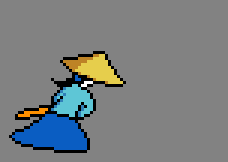 The slashing animation took the most time out of anything to get down. My initial attempts were a bit lackluster. The general idea is there, but the motion is too small as a whole: 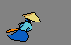 I had to spend a bunch of time reworking things before I landed on something that I was happy with. The new version has a lot more follow-through, and a much larger sword slash trail:  Notice how I'm using the red color for the first frame of the sword arc, before it turns white. This helps provide a quick burst of contrasting color and also helps the animation read better across lighter backgrounds (where the plain white wouldn't stand out by itself). I'm using smearing arcs for the sleeve, and also there's some secondary motion where it takes an extra frame for the clothes to "settle" even after the sword finishes swinging. The flying and jumping animations are just variants on the above two, so I won't bother including them here. One other cute little thing I added this week was the ability to make the character jump and attack on the menu screen: 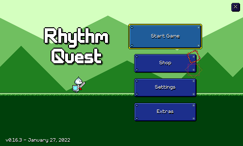 You can do this with the respective keyboard buttons, or by just tapping/clicking on the screen near the character. Super unnecessary, but just one of those small little things that's fun to add just because you can. =)
|
|
|
|
|
Logged
|
|
|
|
|
DDRKirby(ISQ)
|
|
« Reply #30 on: February 04, 2022, 02:34:01 PM » |
|
Level 1-5, Flying DoublehitsI'm hoping to work through a bunch of levels and content this month! I started off this week with the fifth and final level for world 1. It's currently titled "City in the Rain": This is the final level for world 1, so I wanted to make sure it featured a mix of all of the different mechanics introduced so far. This level also starts to "chain" multiple obstacle types together, such as a flying enemy immediately followed by a doublehit enemy: 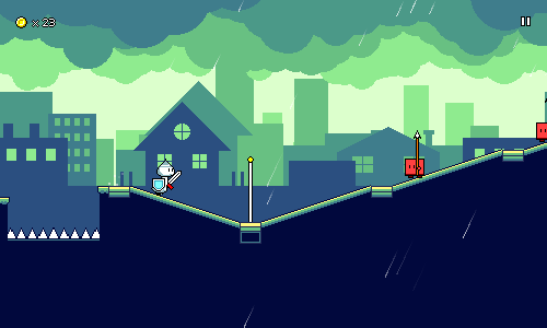 My initial draft of this level was a bit too hard, so I had to find ways to tone it down a little. It's still a noticeable step up from level 1-4 (1.5 actions/sec vs 1.3), and a little higher intensity than level 2-1, but that's okay since it's the last level of the world. In general for the easier songs I'm making an attempt to give more "breathing room" between obstacle sequences. The idea is to ease the player into reading these patterns by giving them some extra time to look ahead for them. It can also help to introduce a basic rhythmic pattern (jump jump slash slash) first, then embelish it with the more complicated sequences on a later repetition. As usual, I finished the music and charting for the song before starting on the visuals. The mood of the song was upbeat, but a little more somber than the other world 1 songs, so I thought rain might work well as a particle effect to try. Most of the other world 1 stages use landscape-based backdrops (hills, mountains, clouds) and I didn't want to just draw yet another variant of some triangles as mountains (I already have a lot of those...), so I thought maybe using a cityscape theme would fit with the rain. The particle effect was super easy to make -- it's just the trail particles from levels 1-2 and 1-3, rotated at a diagonal, and tweaked a little bit. The color palette usage was a little trickier to iron down. In other stages what I've done was have the background start with using the same 4 colors as the foreground, then in the chorus, separate the foreground and background into their own 4-color palettes. This stage works a little differently: 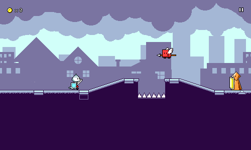 At first, the background only uses the 3 lightest colors in the 4-color palette. I initially tried to use the darkest color as well, but found that it was hurting readability and detracted from the "city in the fog" look. If you look closely at the backdrops, you'll see that there are actually a lot of different parallax layers (10 of them!), so everything scrolls at different rates. Most of these layers actually use different color palette indexes, but right now most of the palette entries are duplicated, so they all end up as the same color. 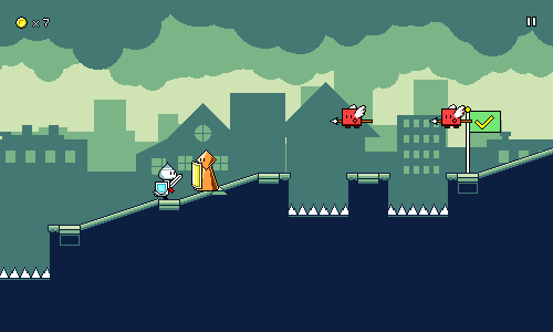 Then when the chorus hits, I separate the colors in the palette, so the background now utilizes 6 different colors (some shared with the foreground, others unique). Combined with the increased vividness of the palette, it really makes the whole scene pop. The colors gradually ramp down in saturation and up in brightness as you layers fade into the distance. Flying Doublehit EnemiesSomething else I did this week was add in a new enemy variant. Say hi to the flying version of the doublehit enemies! 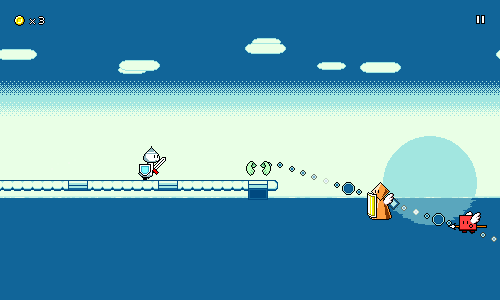 This barely really even counts as a new thing since it's such a natural fusion of existing enemy types, and is perfectly intuitive given that you've already encountered them. On my end, this also barely involved any work at all. Doublehit enemies already needed to reposition themselves based on the player's path, so the only thing I needed to add was the new flying animation -- which also reused the wing graphic from the normal flying enemies. Hooray! I'll probably look to use these in level 2-4... That's it for this week! I'll be a bit busy with other stuff next week, but if I have some spare cycles I'd like to start doing some prototyping of an in-engine trailer. We'll see!
|
|
|
|
|
Logged
|
|
|
|
|
DDRKirby(ISQ)
|
|
« Reply #31 on: February 18, 2022, 01:04:02 PM » |
|
Gameplay TrailerI'm back from a short vacation, with my first stab at making a trailer for the game. Check it out! In-engine TrailerSomething really nice about this trailer is that it's made 100% in-engine -- there's no post-editing or splicing of separate video clips together. This is something I decided to do for multiple reasons... First off, a lot of the game is still subject to change (some of the particle effects are still just white squares...) and it would suck to have to re-record a bunch of footage and re-edit it whenever the game changes. I actually discovered a couple of bugs after rendering the first version of the trailer, so it was great that after fixing them it was trivial to re-record. Doing things this way helped me get over the big mental block of "I shouldn't bother cutting a trailer video until the game is looking perfect". The in-engine trailer also lets me iterate on the trailer in the same way that I iterate on the game itself, and lets me take full advantage of the fact that the engine understands music sync points natively -- I don't have to fuss around with trying to line up different video clips to sync with the beat in a video editor, because that's already handled by my game code. As a neat bonus, the entire trailer "level" is fully playable as well. 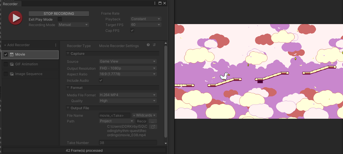 Unity now features built-in video export, which I've been using for most of the other clips that I've shown so far. This is great to have built-in to Unity because it allows for rendering at high-quality (bigger than my 1280x1024 display...) without dropping any frames (the engine slows down automatically to allow for processing). Thankfully, the audio scheduling seems to work just fine while exporting video as well. Last I checked, respawning seems to break, but that hasn't really been an issue as I haven't wanted failures in my trailer (as cool as my rewind mechanic is). Of course, there's downsides to doing a fully in-engine trailer as well. There's probably special effects that are easier to do in post, such as featuring multiple different video clips at the same time. But there's no reason I can't still do the bulk of my work in-engine. Implementation The first thing I needed to get working for this was to be able to switch between different visual scenes, to show off the different backdrops and level graphics. Switching between different sets of backdrops was simple -- I just needed to create a script to toggle the different sets on and off. Switching between different characters was actually trivial as well -- I just tell the player animator to load up a different set of animations. Switching the actual level graphics (the sprites for the ground, ramps, spikes, beat grids, etc) was trickier, as my game isn't really built to handle having multiple "level roots" around in the scene. My first thought was to generate the whole level multiple times -- once for each design -- and then swap between them. I did end up doing that, but the problem with that is that level generation also includes putting down all of the enemies and obstacles, and having multiple copies of those would be problematic. I probably could have added a flag to level generation that made it skip generating all of those, but...instead, I did the hacky thing: after each copy of the level is generated, I just delete all of the enemies and obstacles after-the-fact. Then, I run a final pass of level generation, but this time I delete everything =except= for the enemies and obstacles. ...yeah, I probably should have just added a flag. It works, though! Getting the visual switches to happen at the right time was trivial, since "waiting until a certain beat, then doing something" is already a common pattern all over the place in my code. I use a coroutine in my TrailerController script for this: // ...
yield return new WaitUntil(() => MusicController.CurrentBeat() >= 13 * 4);
Player.Instance.SwitchAnimations("ducky");
SwitchLevels(1);
SwitchBackdrops("2a");
// ...
The same script also handles bringing up the scene at the end of the trailer. It also has an _armed bool, and if that's set to true, it will automatically start and stop Unity's video export at the appropriate time! Rendering the trailer, then, is as simple as setting this flag to true, then hitting play and walking away! Gameplay Trailer BreakdownTechnical implementation aside, the other challenge that I needed to tackle was figuring out how to structure the trailer, level and music-wise. I wanted to have a single track playing throughout rather than cut between different songs, but I also wanted the level to be a sort of medley of different styles to show off the range of stuff in the game. My music production skills are definitely a strength, so I wanted to play to that by constructing a cohesive trailer track that switches styles. Section One The trailer drops straight into gameplay -- no title screen, no text sequence or anything like this. The main strength of my game is the music-driven gameplay, which doesn't need a lot of explanation, so I want to show that off right off the bat. The concept of a music-based runner isn't wholly new so I don't think I need to waste time explaining the concept; it's probably better to just show it directly. This first section features the "tutorial" iconography as a quick way to illustrate the two-button controls of the game. It's just basic jumps and attacks at first, ending off with a flight path to show off the held button mechanic. The patterns are simpler to read here because I want the viewer be able to grasp the basic idea of the game without being overwhelmed. Musically, this section is just a big buildup. The tempo is relatively high -- 140 BPM -- since I want the whole trailer to be pretty high-energy. Section Two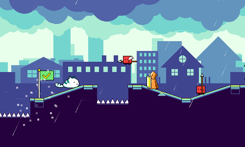 In section two the idea is to show off all of the different mechanics in a short time-span, and provide a really intense section to show what kind of things are possible in the game. I feature the different types of enemies, air jumps, flight paths, and even a triplet speed-zone section at the end. There's a risk in showing such a dense song section in that it might be difficult to understand exactly what is going on, and maybe people might think that the game is too hard in general. But the idea here is mainly to show something high-energy and exciting to hopefully grab your attention. Musically, I'm just going crazy as dictated by the game obstacles. I'm using my standard "world 1" 9-bit style, since that is the primary flavor of music in the game. Section Three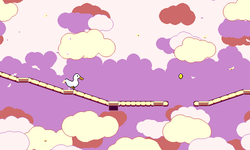 Here I give the viewer a little bit of breathing room after the excitement of the last section. I transition into world 2 graphics, and the "world 2" airy style of music here -- I actually re-use the chords from level 2-1 since I really like them a lot. I briefly showed all of the mechanics, but now I want to take the rest of the trailer to give them a little more space to shine. I'm going through the different mechanics again, but this time allowing them to be seen more clearly by themselves at a slower pace, so that you can now begin to understand how they work. Initially I actually thought to use this space to start showing some lines of text, stuff like "Rhythm platform action!" or "Jump - Slash - Fly" or "Unlock new characters". I got a quick prototype of that working, reusing the pulsing text graphics from the menu scene, but in the end I decided to just leave it as gameplay-only...everything I thought of to say using text ended up feeling really superfluous since everything was already being shown (much better) visually. Section Four We're continuing our little tour through the different worlds, this time jumping into world 3. The music style shifts to reflect that, going into 8-bit mode and using noise drums. Besides the ghost and spike enemies I wanted to make sure to show at least one long flight path, since I think that's something that looks cool and provides a different visual energy. Section Five I don't really have much music designed past world 3 -- all I know so far is that I'm trying to make world 4 have a pentatonic (East Asian?) vibe -- so I was sort of on my own to figure out what I wanted the next section to sound like. I've been getting into some future funk stylings lately, so I just decided to go with that and see if it worked out. I might end up using that genre for world 5 or something (?). Intensity continues to build up, and I make sure to feature the triplet speed-zones here as well. I don't have any graphics done for worlds 4 and 5 yet, so I just threw in some backdrops from the previous worlds here for now. I can always re-record later! Outro I wanted to make sure the outro had something rhythmic going on, as again that's a strength of the game. I also thought it would be nice to faeture all of the different characters here. (This makes me wish that I had a few more...) Here is also where I can put my call to action ("Wishlist on Steam" or whatever). The trailer cuts to the final black slide right in sync with the end of the drum beat, feels very slick and clean. Again, playing to my strengths. I will note, the URL "ddrkirby.com/rhythm-quest" isn't super appealing. This ended up getting me to finally bite the bullet and go ahead and register "rhythmquestgame.com" as a domain. That domain is already mostly set up, but I haven't moved over any of the actual static website yet -- will probably get around to that next week. So there you have it! I'm happy to have finally put together my first trailer, which puts me one giant step closer to having a publishable Steam page, for instance. It seems simple and effective, but I can easily imagine some other alternative trailer designs as well. Maybe one that starts off a little bit more slowly, or one that tries to use fancier visual effects to jazz up the transitions a bit more. Key art of the different characters would also be something great to throw in at some point, but of course nothing like that exists yet. All that is to say, I'll probably try a couple more attempts at different trailer videos in the future. For now, though, I should probably get back to working on more content...
|
|
|
|
|
Logged
|
|
|
|
|
DDRKirby(ISQ)
|
|
« Reply #32 on: February 25, 2022, 02:39:43 PM » |
|
Sayuri AnimationsSpent most of this week doing animations for another new character! I figured if I can put my pet ducky in the game, then maybe I can put "myself" into the game too. Here's Sayuri in action:  Character Background Character BackgroundSayuri is an original character of mine and a "spiritual inner self" of sorts, I guess you could say. You may recognize the character design from my avatar, and various album covers I've done over the years:     Sayuri's basic design was heavily influenced by a friend of mine, but the teal/peach color palette came from the album design I did in March 2020, where I decided to use the Pollen8 palette that I found on Lospec. The colors are modified a little bit in the in-game sprites to be more vivid, but I really enjoyed this color scheme and think it works well. Animation BreakdownSayuri's animation set is probably the nicest-looking one that I've done. There's quite a lot going on and it actually manages to come together pretty well! Let's take a look at each of the animations, slowed down a bit.  The main thing going on in the run animation is the hair motion. Drawing hair like this is always an interesting challenge because it's more about drawing larger "clumps" of hair rather than thinking about individual strands. I tried to imagine waves of motion travelling down a rope or ribbon to get the back and forth effect. It's easy to go overboard and make it look like a tentacle, though... Something else I'll point out is the motion in her dress, particularly the little bit of shading on the bottom hem that suggests little furls. I put a basic shape down first, copied it over for all of the frames, then animated the feet next (the foot motion is similar for other characters I've done). Then I tried to imagine how the fabric would react to wherever the feet are placed... Finally, even though Sayuri's head and face mostly stays static, there's some subpixel motion going on throughout, especially on the upper-right, which I think bring the animation alive a little bit more.  This was a fun one! I wasn't really sure whether my idea for a hair / dress flip attack would work well, but I think it's working nicely! There's a lot of smearing on the frame right before the impact, and then a lot of stretch on impact, which helps it feel more snappy. Again, for the hair I tried to imagine how a whip or rope would behave, where the tip lags behind but also accelerates quickly. There's some secondary motion going on in the dress too -- waves rippling down the length of the fabric. Finally, there's a cloud of dust for some added motion and effect. This also helps convey the actual range of the attack (which extends a bit further than where Sayuri's hand reaches).  The jumping animation is pretty much the same as the running animation, with a few changes -- no side-to-side motion, and her feet stay in the same place. I have her arms reaching upward mostly because I wanted to have them in a different position than when she's running. Sayuri also has a crouching frame before she jumps! I'm experimenting with tossing this in as a way to accentuate the jump, since otherwise there's not really any silhouette change from running to jumping. In-game, there's no "jump squat delay", meaning your character leaves the ground immediately rather than waiting for the crouching frame to play through, so I'm making this crouch frame play relatively quickly to avoid looking weird. You really don't see it on its own, it's more just a quick visual flash to show that an action is happening. I could maybe experiment with a little more horizontal squashing here, but for now this is what I have.  The flying animation is more of the same, except Sayuri's arms stay down this time. For most of the other characters I have both wings facing left (more of a profile view), but since Sayuri is facing forward a little more, her wings face in opposite directions. She has the same little one-pixel bump when her wings flap, like the other characters.  The layering between her hair and wings is a little odd, so for some frames of the flying attack I just don't show the wings. If you think about it closely it probably doesn't make sense physically, but it's such a quick animation in-game that it doesn't matter too much. The outstretched wings here synchronize to the stretch frames of the base animation. I was originally supposed to work on more levels this week, but this was a welcome change of plans! Sayuri's animations turned out well enough that I went ahead and set her as the default character of the game for now, so she shows up on the title screen from the start:  Most of the other characters have color palettes that aren't really as vibrant, so it's nice to have a new set of sprites that's more eye-catching.
|
|
|
|
« Last Edit: February 25, 2022, 02:49:19 PM by DDRKirby(ISQ) »
|
Logged
|
|
|
|
|
DDRKirby(ISQ)
|
|
« Reply #33 on: March 04, 2022, 03:27:48 PM » |
|
Level 2-4, 2-5
This week I managed to crank out two new levels to finish off world 2. Before going into that, though, I've got some exciting news!
Rhythm Quest for Switch
Rhythm Quest has been approved for development on Nintendo Switch! My previous application was rejected (ostensibly because the project was too early in development), but I decided to reapply using my new gameplay trailer, was accepted into the dev program!
I'll be waiting a bit until I can get a devkit, but for the time being I've already managed to get the build compiling for Switch, and have set up another local Jenkins job to run those builds. Of course, whether it actually =runs= properly on the hardware is another question entirely -- and even if it does, I'm not sure controller support will work right out of the gate.
I'll have to sit down at some point and spend a bunch of time working on porting console-specific stuff like saving/loading, controller support, rumble/vibration, etc. Most of the actual Switch SDK and such is under NDA, so I probably won't be delving into too much detail, but I'm sure when the time comes I'll have some more design-oriented thoughts to point out.
Level 2-4: Snowy Peak
Here's a video of level 2-4, currently titled "Snowy Peak":
The only real gameplay conceit for this level is the introduction of double-hit flying enemies, which shouldn't need too much handholding since it's a natural combination of previously-introduced mechanics. Besides that, it's just more of the same standard Rhythm Quest charting that you're familiar with already, though I'm starting to introduce slightly more complex rhythms -- offbeat notes, and flight path sequences. It's a tricky balance -- I want to introduce these gradually to start getting players familiar with them, but if I go overboard with one particular level it could become overwhelming.
I'm using more major 7ths for the music, as I have been with most of the other songs in this world. Now that we're past the earlier levels, I also have a slightly different (more lazy...) approach to melody-writing. With the earlier levels I had more restrictions on what types of rhythms I could and couldn't use -- no syncopation, etc. -- because I needed to work within the constraints of the mechanics that had been presented up until that point, as well as use a sparse note density to ensure the difficulty isn't too high. So it's easier for me to focus on the obstacles first, and then come up with a melody that aligns with that generally.
Now, though, syncopation/off beats are on the table, and I have multiple ways of expressing various eighth-note patterns (doublehit enemies, air jumps, etc.). So I tend to approach it from the other direction more often, where I come from the melody side first, and then think about how to chart it afterwards. Of course, they're still very much intertwined and I always think about both while I'm writing, but I think the biggest difference is that I sprinkle in melodic lines according to a vague guideline in my head, and it's only afterwards that I figure out exactly whether each note is going to be an air jump or a doublehit enemy or what-have-you.
For the backgrounds, I referenced some snowy mountain photos and drew some simple jagged shading. The clouds are filled in with two colors, just using a circle brush at varying sizes. There really isn't a lot of detail, but it works out fine, I think. Towards the end of the stage there's a snow particle effect, and that was pretty trivial to get working -- it's a copy-paste of the falling leaves/petals, but with different sprites and slightly tweaked properties.
Level 2-5: Stratosphere
This is the final level for world 2, so it serves to provide one last challenge using a mix of all of the mechanics used to far. Levels 2-3 and 2-4 were on the slower side -- 100BPM and 110BPM -- so I wanted this one to be a bit faster. It was actually 125 BPM to start, but I bumped it up to 130BPM...and finally down to 128BPM since that seemed a liiiitle too fast.
The graphics for this level mark the first time that I'm expanding the color palette and using a 9th color. I fiddled around for a long while trying to organize the color indices to get it to work with just 8 like the rest of the levels, but in the end I was having a hard time getting the level floor to stand out from the bright strip of clouds in the latter half of the level. In the end, readability and the desire to keep the lush color scheme won out over the elegance of restricting myself to the same color range. I'm still keeping the first half of the level at 4 colors, though, at least.
This level continues the trend of featuring a little more syncopation, and is possibly a liiiitle too difficult at 2.07 actions/second (level 2-4 is 1.75 actions/second), but we'll see. I'm also learning as I go how to give affordances to make charts more readable, especially when syncopation is involved. For example, the rhythm "[pause] [hit] [hit] [hit]" starts on an off-beat and can be written three different ways: with a basic enemy then a doublehit enemy, or with a doublehit then a basic, or alternatively with three basic enemies. Whenever these sorts of rhythms appear I'm forcing doublehit enemies to appear on downbeats, as that's more readable. I also try to start and stop slope changes -- especially for flight paths -- on downbeats to help with this.
Rhythm Quest as-is doesn't have any sort of "beat grid" to help with this sort of thing, and notes aren't color-coded depending on their beat offsets, so this sort of consistent readability is important to me to help make charts easier to sightread. Of course, I could always add in a more explicit beat grid (maybe as an accessibility toggle?), but I do maintain that part of what makes the game cool for me is its ability to leverage the visual language of runner games to allow players to react to rhythms without being shown explicit timings.
Developing the "visual language" of Rhythm Quest charts has been a really interesting emergent property of the mechanics. One more example is that heavily syncopated / off-beat rhythms are much easier to read as jumps as opposed to attacks. This is partly because air jump wings are placed =at= the beat rather than behind the beat (as enemies are), but mostly because air jumps have a built-in way of displaying rhythm based on height differences.
That's it for this week! I'm having a lot of fun putting in these new levels and it's nice to see everything working together smoothly. Making the music and charts is probably the most rewarding part of working on Rhythm Quest, so it's something I look forward to doing a lot more of in coming months. I can really feel my experience as a music producer/composer helping to make this process really smooth as well...I've been able to finish the song and chart for a level in one day, and then spend a second day on backdrops and color palettes, which means I should usually be able to get through two each week, barring having to work on implementing other features.
|
|
|
|
|
Logged
|
|
|
|
|
DDRKirby(ISQ)
|
|
« Reply #34 on: March 11, 2022, 06:57:52 PM » |
|
WebGL Port, Checkpoint GraphicsI was a bit busy with other stuff this week (got a new phone, diagnosed a bug in OBS Studio, etc...), but still managed to do some interesting work on Rhythm Quest anyways. I switched gears a bit and instead of working on more levels I'm starting to do some more polish work in hopes of putting together a more-publicly-facing demo build. Checkpoint AnimationsPart of this polish pass is going through a lot of the older graphics that have been around forever as more placeholders than anything. For example, the checkpoint flag, which is also used as the level end graphic:  It's not =terrible= or anything, but I can probably do better. I thought it would be nice to have the flag waving in the wind as an animation, so I tried that. I started with the level end, which I wanted to try doing as a checkered flag. Here's the first attempt at just laying down the checker pattern and adding a wave motion:  This was kind of nice to work on because it was very pattern-based -- sort of like busywork where you don't need to think about it too hard. It looks pretty unnatural right now, that's because the movement is purely vertical and applies across the entire flag, which doesn't really make sense. However, this was a good base to work off of and adjust. I first took the concave-furled segments and shortened them to portray the correct perspective a little more. Then I fixed the left end of the flag and tried to reduce the amount of waving that happens toward that side (it's attached to the pole, so it shouldn't wiggle up and down...). It looks more natural now, I think:  Still not perfect, but eh, that'll do for me. Next I just copy-pasted the same shape for the checkpoint and tried to work out the movement of the checkmark on the flag. This was a little trickier than the checkerboard pattern, but I guess I managed to make it work:  Flag Raising Flag RaisingWith those new animations in place, I also wanted to make the checkpoint flags actually raise up from the floor instead of simply...instantly appearing out of thin air once you passed them. Here's how that looks: 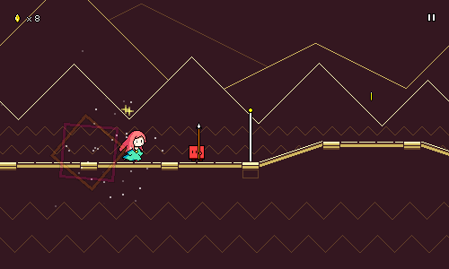 This was pretty simple to implement; I just use LeanTween (the tweening library used in Rhythm Quest) to smoothly change the flag's y position. It's using an EaseOutQuad easing curve on it as well, so that it'll slow down as it reaches the top. (It's also drawn behind the rest of the ground layer) Checkpoint ParticlesThat was all looking good, but the particle effect when you trigger a checkpoint still looked really ugly, just using big white squares: 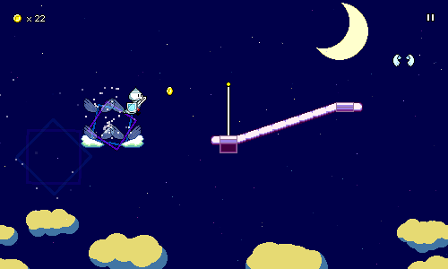 I had the idea of coming up with some sort of colorful confetti effect instead and played around with some particle systems in Unity until I got something that looked nice:  The sprites here are just simple blobs of pixels with minimal shading, using fixed random colors (only 50% saturation to give them a more pastel look). The particles shoot upwards from an arc with high speed, but I'm using the "Limit Velocity over Lifetime" feature to quickly decelerate the confetti to a certain speed, which kills the upward momentum and lets gravity take effect. This also slows down the descent of the particles, so they can float down slowly instead of dropping like rocks. This limit is higher for the smaller point-like particles, since in real life they wouldn't be hampered by the air as much relative to their size. Finally, I add a random horizontal force, which causes their descent to vary side to side a bit. When I drew the pixel blobs for these particles, I was envisioning the "z" shape of the particles used in Chapter 4 of Celeste. I only recently remembered that the entire confetti-checkpoint idea was also used in Celeste as well: 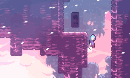 ...so that may have unconsciously inspired me. Great minds think alike...? Anyways, here's how it all looks together now, in-game: 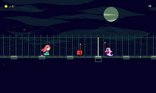 WebGL Port and Demo Build Considerations WebGL Port and Demo Build ConsiderationsSomething else I worked on this week was porting the game to WebGL to get a working web (demo) build. Web isn't one of the final release platforms for Rhythm Quest, so this isn't something that's strictly necessary for me, but I'm well aware of the fact that web builds provide immensely less user friction when trying to get people to try out your game, so it's something that would be nice to have around. At the very least, playable web demos have worked really well for certain other rhythm games out there. I'm not doing anything too crazy in terms of rendering, and I already know that my performance is working fine on mobile, so the main thing I was worried about was precise audio scheduling. I've done a rhythm game with latency calibration before, but never with such heavy use of the AudioSource.PlayScheduled function and trying to synchronize with audio DSP time. Addressables and Resource ManagementThe first thing I wanted to do was to reorganize my release asset management. As usual, Unity has about 4 different ways to load assets, each with their own caveats (sigh)...but anyways, the "Addressables" System is Unity's most modern asset-loading solution and has some nice new functionalities in addition to trying to generally be more sensible and cleaner than what we had before. I had already been using Addressables in my project to provide a nice clean way to load music, palettes, and level data, but I wanted to reorganize those assets into more cleanly-defined groups for a couple reasons. 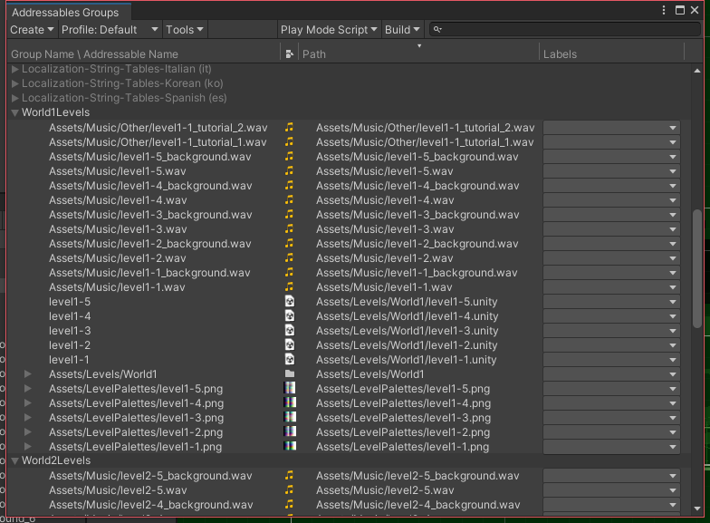 One of those reasons was for demo builds -- I want the demo builds to only include a given subset of levels, so my build scripts should be able to for example exclude all of the assets for worlds past world 2 when making a demo build. Technically, I could just include the entire full game in the demo build and then just lock out the later worlds via code, but that has a number of issues: it increases the build size needlessly, it allows for scraping the unused content, and it may even allow for loading those levels via something like a memory scanner/debugger. Another reason is for patch size considerations. Both Steam and Nintendo will intelligently parse out the deltas between different versions of your builds when doing post-release updates and only update files which have changed in order to require smaller downloads for patches, but obviously this doesn't really work if all of your assets are just in a single massive blob. The Addressables system allows you to chunk apart your assets in a consistent manner. It even contains some static analysis tools for detecting assets duplicated across multiple places, which is nice. So I did all that, only to realize something terrible: synchronous Addressable loading isn't supported on WebGL... Synchronous Addressable Loads See, Addressables by default are loaded asynchronously, so you could do something like this using a coroutine (or even use async/await): IEnumerator SomeCoroutine() {
// Kick off the Addressables load operation
var asyncHandler = Addressables.LoadAssetAsync(pathToAudioClip);
// Wait for completion...
yield return asyncHandler;
// Do something with the result
_myAudioSource.clip = asyncHandler.Result;
}
That's fine, but sometimes for simple things during initialization, it's easier to just use a blocking synchronous call. For example, loading a level's palette data or music when you jump into that level scene. It's more straightforward to just have those calls block instead of having to turn your entire initialization logic into an asynchonous flow and juggle all of the dependencies in a more complicated way. So you can do this instead: void Start() {
var asyncHandler = Addressables.LoadAssetAsync(pathToAudioClip);
// Synchronous blocking call
_myAudioSource.clip = asyncHandler.WaitForCompletion().Result;
// (Rest of initialization)
_myAudioSource.clip.Play();
}
The level's audio clip has to be loaded, for example, before the audio can be scheduled, and various other components assume that that's just done on the first frame of initialization without having to wait for it. Except, this doesn't work at all in Unity WebGL builds, probably due to threading being completely unsupported. For the level audio, I managed to add in some stopgaps that keep most things paused until the audio can be loaded and the music scheduled and initialized properly, but for some other smaller files (level metadata, font mappings, etc), I actually just decided to "downgrade" and use the Resources.Load solution for loading those assets because it would be a pain to add asynchronous handling to my code for all those cases. Bleh. Debugging WebGL AudioSo now my game loaded, but it was still pretty broken, as the audio scheduling seemed to be completely off. To make matters worse, audio clip playback...wasn't stopping. I'd schedule a sound with AudioSource.PlayScheduled(), then stop it with AudioSource.Stop(), except...the sound would just continue playing? Turns out that any audio assets that are imported with the setting "Compressed in Memory" or "Streaming" will behave strangely and fail to stop playing in this way. That's fine, it's probably not a bad idea to load most of my sounds into memory anyways, aside from shop unlock previews -- and even then, those probably won't be in the WebGL build. So that was working, but unfortunately audio scheduling itself still seemed to be broken. After adding some testing logic I determined that calling AudioSource.PlayScheduled() was simply starting the audio clip right away instead of doing any scheduling, despite PlayScheduled theoretically being supported in WebGL. ...scratch that, using PlayScheduled() actually seemed to work.......but only the very first time that the clip is played (and the audiosource's timing was wrong...). Past that, even if you try to unload the audio clip, completely recreate the AudioSource, etc., any future calls won't do the right thing anymore. Turns out that this issue occurs even with the PlayDelayed() function (sheesh), so at this point I gave up and implemented my own simple audio scheduler that simply attempts to trigger audio clips on the appropriate frame. It's far from sample-accurate, but it's the best I can do at the moment and wasn't too much of a pain to conditionally wrap in for WebGL. I'll have to write up and submit an issue for this when I get a chance... Finally, the last thing I had to fix was that mouse input callbacks were giving a completely bogus value for the time of the mouse click for some reason, so I read that from the current game time instead. And with all of that debugging done, I finally have the game working in-browser! Behold:  There's still a bunch of kinks here and there, but for the most part, it's actually not too bad! I'm excited to be able to share the WebGL build with everyone someday once it's more polished up and ready for the light of day.
|
|
|
|
|
Logged
|
|
|
|
|
DDRKirby(ISQ)
|
|
« Reply #35 on: March 24, 2022, 08:46:29 PM » |
|
Level Select ReworkThis past week I've been pretty hard at work redoing the entire level select screen. For reference, here's how the level select menu used to look like: 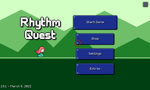 This works just fine and I didn't originally have any plans to rework it. I knew I wanted to implement some sort of visual animation/effect for completing a level and unlocking the next one, but that's about it. For that effect, the first thing that came to mind was having the character jump and have some sort of fanfare. But that made me think about a different way to lay out the levels -- horizontally, like this: 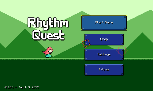 This was the initial prototype I made to explore the general idea. Here, the levels are laid out all in a row horizontally, and you flip between them using the left and right arrows. I mentioned in a previous devlog that a long time ago I wanted to do a sort of "world map" idea for selecting different levels. This isn't quite that, but harkens to a similar idea of having a visual "overworld" for the different levels to all reside within. Right off the bat I liked it, as this allows me to show off the visual aesthetic of the different level backdrops. I think this helps to make the levels more visually distinctive during selection, which is something that the previous design struggled with. While the former vertical list made a lot of sense for a touchscreen layout, the new one is also nice in that it maps overworld progression with the same rightward progression that you do throughout each level. Iterations and ExperimentsI wasn't sure whether crossfading between the different level backdrops was the right idea. The character remains in the center of the screen (something else I wasn't sure about), so it might not look like anything is actually moving (?). Instead of crossfading, I considered doing a transition that didn't have the backdrops blending into each other. Something like a wipe effect. I tried that very briefly: 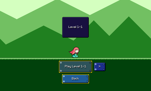 Very unpolished (the backdrops aren't even scrolling during the motion like they should), but this looked janky enough that I didn't choose to explore this further. In my mind I was considering some sort of "fancy wipe" as opposed to just a straight vertical line transition, but in the end I decided maybe the cross-fading was just better. One issue with the new setup was that there was no way to jump to a particular level easily -- you have to flip through the levels one by one. I wasn't sure also whether there would be different transitions between worlds, or whether everything would just be on the same big horizontal line. It was also hard to tell at a glance your coin collection, which was a strength of the old system. I tried an alternative layout where you had a row of buttons, one for each level in the current world: 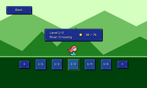 Here, the left and right arrows are for switching the active world -- at which point the entire row of buttons would update for the new world. This was an interesting idea, but had a couple of glaring weaknesses. First, there's no room to fit full level stats for each of the 5 level buttons if they're laid out horizontally, so each button can only show the level number. Secondly, the UI/UX is clunky and non-intuitive and I couldn't figure out any elegant way to make it work across keyboard/mouse/touch uniformly. For keyboard only, it's simple enough -- just use left and right to select a level, and then hit enter to jump into that level. But what about touchscreen? Do you hit a button to scroll to that level, and then hit the same button again to actually start the level? Or is there a separate button that you press to start the selected level? How do I handle that button when you're using keyboard only? In the end I just decided to go back to something simpler. Here's version 2 of the original approach: 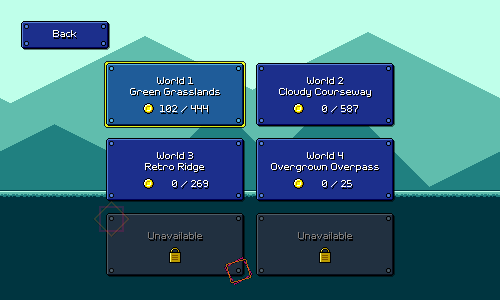 Still keeping the simplicity of the original idea, but a couple things have changed here. First, the buttons no longer scroll, and instead I've placed a banner at the top with the level name and info that scrolls. This is a bit cleaner since it felt a little weird having UI elements scrolling left and right, and this also makes better use of the top half of the screen real estate. Second, I added a simple diamond-fade transition for when you go between worlds, and the character runs off-screen for those. I like that this is pretty quick but still gives a greater sense of progression for changing worlds vs changing levels. The back button is also moved to the bottom center of the screen instead of at the top-left. I like this positioning better as it's still accessible and intuitive, while looking a lot nicer and more consistent across different screen resolutions. I'm starting to change the rest of the menus to use this pattern as well. We're still missing the ability to jump to a given level easily, so I tried adding a row of small buttons at the top of the screen: 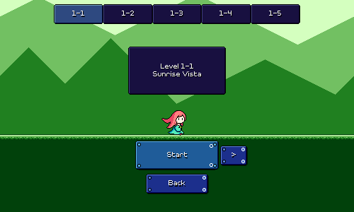 The idea here is that you can tap/click any of these buttons on the top to jump to them, and it also provides a visual indicator of which level in the world that you have selected, and how many levels are in the world. I originally imagined putting coin collection stats in each one of these mini buttons, but realized it would be weird and redundant with what's showing for the currently-selected level in the main banner. This is...okay, but I actually really don't like how much visual attention it draws. It feels like it makes the scene too busy and detracts from the level backdrop graphics. I guess aesthetically it also just makes the scene feel less "open" since the sky area has something blocking it. So I ended up nixing this idea as well. Reintroduction of MedalsOkay, so I was just going to make people flip through levels one by one -- probably not a big deal, since there are only 5 levels in a world, and the game will automatically select the last unlocked level in a world that you're going through. However, the point remained that the new UI was missing a way to judge the completion of many different levels/worlds at a glance. I wanted something to visually incentivize that completionist mindset of clearing / 100%ing all of the levels. I actually already knew how to do that: just go back to the medal system that I used to have before: 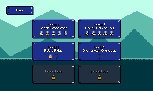 I originally tossed out the medal graphics because they were redundant with coin counts. By looking at the old level select screen, you could already tell how well you did on each level and which ones were cleared perfectly by looking at the coin numbers, so there was no point in also having medals. Now, however, I wanted some way of showing the status of each level in a world in a compact way (e.g. not showing 5 different coin counts crammed into the same space). I'm using the medals as visual iconography for this. Since the medals are now indicative of coin counts (and not just whether you cleared a level / perfectly cleared a level), I added bronze and silver medals. So, now you get a bronze medal for any type of clear, a silver for getting at least 33% of the coins, a gold for at least 66% of coins, and a gold medal with an orbiting star for getting every single coin in the level. These thresholds are a bit arbitrary for now -- nothing about the coin amounts have been tuned, really -- but for now they'll do just fine. I thought it would be nice to add some sort of total count for medals and coins, so I managed to fit that into this screen, as well as move the back button to the bottom: 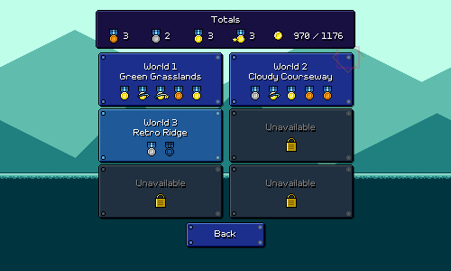 And with all that, we finally have our new and revised flow all working: 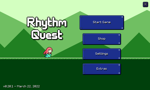 (Notice also that I tweaked the look of the left and right buttons slightly -- they pulse and are less decorative, to hint that they function differently and can't be "selected" via keyboard) It took a lot of iteration, refactoring and reimplementation (more that you might imagine) to get this all working properly, but it's all looking great now and I'm glad I put in the work! This is the kind of refactor/revamp that really couldn't have been gotten right from the beginning, I don't think...at the time when I first designed the level selection UI, I didn't even have different backdrops for each level yet! Demo Promo ScreenOne other thing I threw together is a little promo screen to put into the demo version of the game: 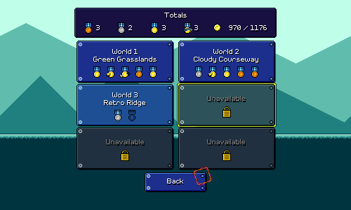 The idea being that this can get shown whenever you reach the end of the demo, or click on a level or feature that's not available. Clicking on the button opens up a browser window or tab taking you to the game website. This kind of thing harkens back to old PC shareware demos...does anybody even remember those...? Switch PortJust a quick update on the Nintendo Switch port of Rhythm Quest -- so far it's going pretty well! I haven't reimplemented save/load functionality (currently disabled), I still have to do a new controls tutorial, and there's other stuff about input handling to rework, but the actual game itself is running great! You can see a little bit of an FPS drop when you transition between different levels in the menu (lots of full-screen layers with transparency all drawn at the same time), which I might have to look at (maybe using an alpha test shader?), but otherwise it's going pretty well so far. I've already done some preliminary easy performance optimizations and load time optimizations which seemed to have help things along. Things are going to be a bit quiet for Rhythm Quest in the coming month, as I've got Ludum Dare coming up to prepare for and participate in, and another trip out of state as well. But I imagine I'll still probably be fitting in some progress here and there when I can.
|
|
|
|
|
Logged
|
|
|
|
|
DDRKirby(ISQ)
|
|
« Reply #36 on: April 15, 2022, 11:53:38 AM » |
|
Enemy Character, More Odds and EndsI've been on vacation, but still been squeezing in some extra progress on Rhythm Quest here and there while I can. Enemy Playable CharacterFirst off, I've added yet another playable character! (bringing the total count to 6) This one was a bit easier to do -- it's just the basic single-hit enemy, repurposed as a player character: 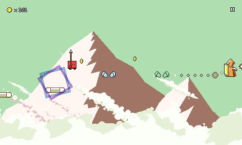  Like the normal basic enemies, its spear has a one-pixel bounce (the normal enemies bounce their spears up and down slightly to the beat), but this time it's due to the whole body shifting up and down due to the running movement. This subtle up-and-down movement is pretty universal to most of the other characters as well. 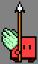 Some of the other characters also have this slight up-and-down bounce during their flying animations, but I tried it out and it felt more awkward here, so I took it out, so the flying animation is really simple here. One interesting thing to note is that the flying and jumping animations are actually offset vertically, so once you get in the air the sprite position actually instantly jumps upwards by a few pixels. This is because the "body" of this character is really short compared to most of the other ones, so it needs a bit of an offset in order to be positioned well relative to the air obstacles. 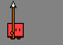 The attack animation was the main nontrivial part for this character, since it obviously doesn't exist for the normal basic enemies (haha). It's a simple spear thrust, but I'm trying to use a great deal of smearing and some "bounceback" to try and make it feel a little more impactful. There's also some red and yellow "effect lines" near the spear tip that are honestly a little janky, but they're working okay for now to make the motion seem a little bigger (since the spear itself is so thin). I added a "spin" frame after the attack since it looked weird to have the spear snap up to being vertical immediately, I think it works alright. In-game Settings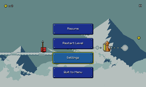 There's now an in-game settings menu! This is just a single screen worth of options for now, and might expand in the future if there are a lot more game-relevant options, but I thought it would be nice to be able to adjust things like audio latency on the fly without having to exit into the menu. This was relatively simple to put together -- there's no fancy sliding menu transition or anything like that. Switch Porting WorkDespite not having access to my Nintendo Switch devkit at the moment, I went ahead and put in some experimental new code for handling some stuff on the Switch platform. The save/load system for Switch needs to be implemented differently than for other platforms because you don't have direct filesystem access -- you need to use specific APIs via the Nintendo Switch Unity plugin. Fortunately some sample code was provided, so I'm basically doing almost exactly the same thing. It's synchronous/blocking right now, and I could potentially improve it by spawning off a separate thread to do the actual saving (same for other platforms), but since Rhythm Quest has very little data to actually write, I'm going to test it first and see whether that's actually needed or not. I've also put in some new code for Joycon button mappings. Before I was simply piggybacking off of Unity's input system, but that only allows you to handle a single joycon configuration. Now I have code that detects whether you have a single joycon, two joycons, etc. and checks button states differently depending on that, so you can for example press the SL and SR buttons with a horizontal single joycon to jump and attack. This is something that I'm pretty sure will need some additional tweaking, but we'll see how it functions as is first. One thing I'm a little uncertain about is whether I'll allow for controller remapping on the Switch. I already have a screen available for button remapping which is working for desktop builds, but that's a lot more awkward for Switch since the default button mappings are different depending on the joycon style. Also, the default mappings are pretty much that anything on the left joycon is assigned to jump, and anything on the right joycon is assigned to attack, so conveying that UI-wise is a little weird. I'd also have to deal with all of the different controller icon mappings...it just might be more of a headache than it's worth. Maybe as a compromise I'll just have a few different control schemes that you can cycle between, as opposed to a completely-configurable mapping, though honestly I can't imagine why you'd want to have both jump and attack be on the same joycon (if you're playing with two). And more...There's also a bunch of other small things I worked on that aren't really demoable or worth showing off in detail: Save operations now happen less frequently, specifically on the settings menus. Previously, changing a game setting value would result in a save immediately being triggered, which wasn't too bad since again, the save files are so small. But it's better practice to just wait until backing out of the menu instead and then write all of the relevant changes. This is especially relevant for console builds (Switch), since there are usually restrictions on how often a game can/should write to the filesystem. This could still be improved a bit -- right now if you change a setting and then revert it, the system still thinks that the state is dirty and does a redundant write -- but I think that's not a big deal. I don't think I mentioned it before, but there's also an animated loading indicator in the lower-right corner of the screen. This shows while data is saving, or during scene transitions:  Right now this just shows Sayuri, though I could easily change the animation based on the currently-selected character if I wanted to. Unity unfortunately does run a lot of blocking logic on its main thread, so during scene loads this will often freeze up for bits at a time (probably worse when I'm running in the editor on my laptop like in the above gif). This is a pretty common issue with Unity games...in order to make it better I'd have to find ways to split up scene loads, for example loading segments of the level at a time, or spreading out a lot of the initialization logic that runs during the first frame that a level is loaded in, but that isn't on my priority list at the moment. Respawn/pause timings now correct account for audio latency. This was barely noticable in most cases because audio latency is usually fairly small, but some of the calculations for respawning and rescheduling music weren't correctly factoring in the amount of audio latency. This is a little tricky to think about...if you have 1 second of audio delay, for example, then during a respawn you actually need to start playing the main level music a whole second =before= giving control back to the player, and make sure that the player's positioning lines up accordingly. My mind spins a little bit every time I dig deep into this code, but I've confirmed that it's all working seamlessly now, so hopefully this is the last of it. I don't have a gamepad with me a the moment, but I've put in some experimental code for triggering controller rumble/vibration when you attack enemies. I have no idea how this will feel or whether it will function on the Switch (could need some platform-specific code instead), but it's there for me to test once I'm back. Future WorkTo be honest, that was a lot more work than I expected to get done considering that I'm still on vacation (ha ha)... The main item looming on my to-do list at the moment is setting up the public Steam store page for the game, which is a bit overdue at this point. I'll need to sit down and actually gather enough assets and animated gifs to make it, as well as write out the actual descriptions and everything. I can't imagine that taking any more than a week; it's just something I've been putting off. On the plus side, I already have the gameplay trailer done... Something else that I'm hoping to do is rebalance the difficulty of some of the existing levels. The levels all play great so far, but right now the difficulty curve is a little steeper than I'd like it to be for the full game, especially given that I'm planning on having 5-6 worlds in total. This is a bit annoying...it can be difficult to adjust the charting of a song after the fact because it's generally so tightly integrated with the music. But there are little things I can get away with here and there, so we'll see how much I can do by examining sections that might be trickier and looking at reducing the amount of syncopation and spacing out note density a little more. Another option I have is to add more levels to each world...making more songs isn't really a problem, but having 5 per world is sort of a satisfying number, so I'm going to try to keep it at that for now. If a song really isn't working out, I can always switch it to being a bonus stage and then write in an easier replacement track.
|
|
|
|
|
Logged
|
|
|
|
|
DDRKirby(ISQ)
|
|
« Reply #37 on: April 29, 2022, 11:30:36 AM » |
|
Steam PageTook another week off, but got right back into things this week and finished putting together the Steam page for Rhythm Quest. Promo ArtThe first thing to knock out was to come up with some new cover art for the game. So far I had just been using this image of the runner character against the green level 1-1 backdrop theme:  The font here, by the way, is taken out of ChevyRay's pixel font pack, which is also where the in-game pixel font comes from. I've applied a simple drop shadow so it doesn't look as flat -- really helps a lot. I have a lot more character designs in the game now, so I could at least make things more interesting by putting all of those in:  Ultimately, though, it seemed a little underwhelming. Also, while the green background is very "classic" (evokes memories of green-tinted game boy screens), it's a little plain, too. The Steam header capsule image is 460x215 pixels large, so I decided that I would try and just suck it up and try and do a detailed pixel artwork at that canvas size. Before starting, I very roughly sketched out a few possible compositions, trying to figure out what elements to put in the image and where to place the game logo. A lot of these ideas starred Sayuri as the main character, but also aimed to throw a bunch of other elements into the scene as well.  Unfortunately, my initial attempt at drawing something at this scale was too terrible for me to even bother saving and I discarded it after attempting to draw just Sayuri's face and eyes. My next idea was to just reference the art that I already had for my avatar, which I had originally drawn two years ago:  This was only a 100x100 image, so it's a bit small for the 460x215 size. I was considering roughly upscaling it as a guide and then re-pixeling it at the higher resolution, but in the end I just decided to keep the smaller size and draw out the bottom half, extending it into a running pose. I threw in some simple particles as well:  Wasn't perfect by any stretch, but this was looking decent at least, and certainly more appealing than what I had originally. I carried over the simple level 1-1 styled background, but gave it pink/purple hues to mesh well with Sayuri's palette as well as the yellow logo. The heavy focus on pink and purple was a bit incongruous with the previous green aesthetic, but I like that it stands out very brightly against the Steam page backgrounds, which are generally dark gray/blue. I was originally thinking of adding in a bunch of other elements to fill out the rest of the scene here -- redrawing Ducky at a larger scale, and having Furball flying around in the background, maybe an enemy on the lower-right as well. That's still a future possibility, but I also tried just upscaling by 2x instead:  And I actually liked this a lot! It happens to fit very snugly into the required resolution, and makes everything very readable and simple. Maybe less is more? I decided to just stick with this, and not make more work for myself. All that was left was to move around the elements and crop out some various different sizes of it for the different required Steam assets:   Having the 2x upscaling isn't "ideal" in my mind -- actually, having a pixel art promo image at all seems to be frowned upon as it can seem low-budget or "cheap" (which, admittedly, this game is...) rather than something more professional. But there is also something to be said about the satisfaction of having created even these promotional images by myself, along with everything else in the entire game. In the end, this is a passion project, after all. I =have= also done non-pixel art work in the past, but I'm pretty sure attempting something of that nature would turn out extremely mediocre in comparison. Animated GifsSomething else I really wanted for the Steam page was to feature some nice animated gifs that visually show what the gameplay is like. There are probably a lot of people who simply skim store pages visually without reading much text, so this is probably (?) going to be important to grab people's attention and communicate what the game is about. To record these I set up new scenes with a fixed camera at a custom resolution, and laid out some obstacle sets to show off different mechanics: 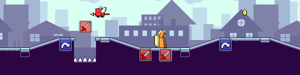 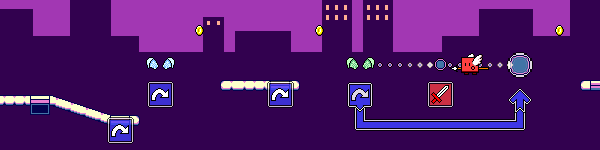 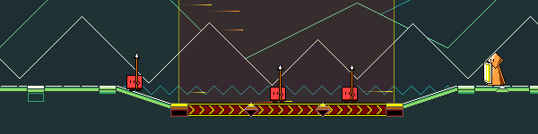 I took a bunch of new in-game screenshots, and re-rendered the gameplay trailer as well. My focus with these screenshots was not only to show different characters, gameplay elements, and backdrop styles, but also to provide variety in color palettes. Again, this is aimed at catering to a favorable first impression -- the idea was to have a row of screenshots thumbnails that look colorful and varied even before you click on them to view them. 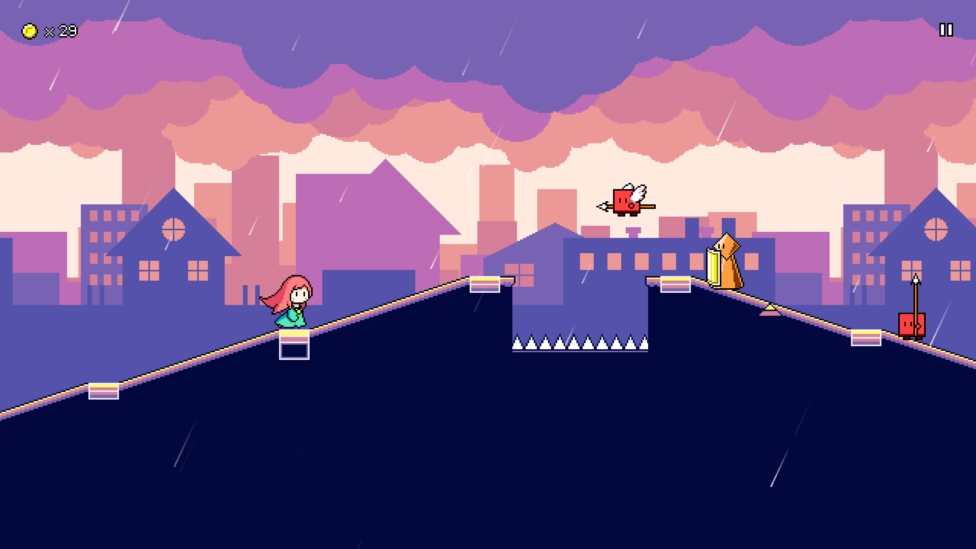 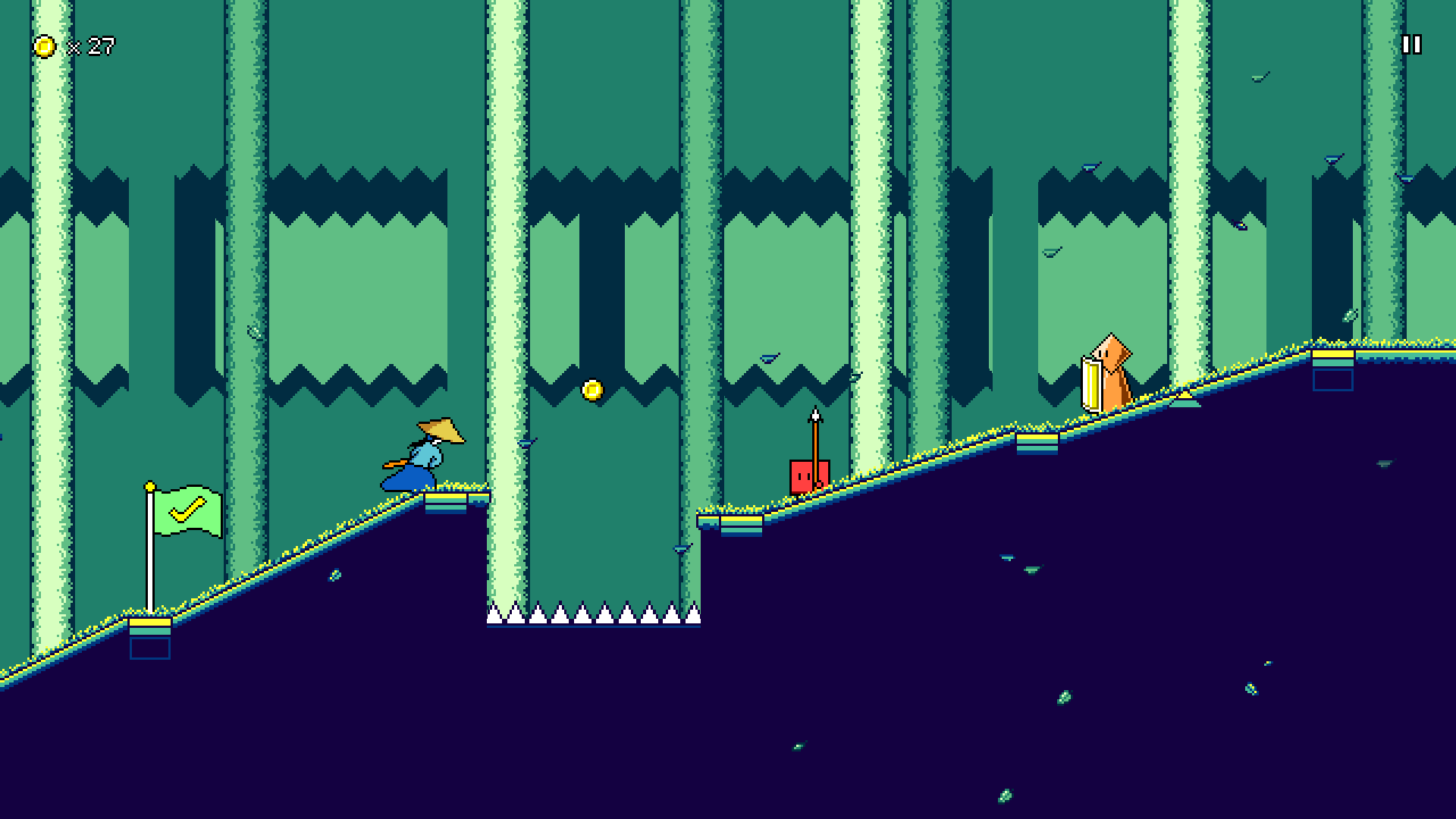  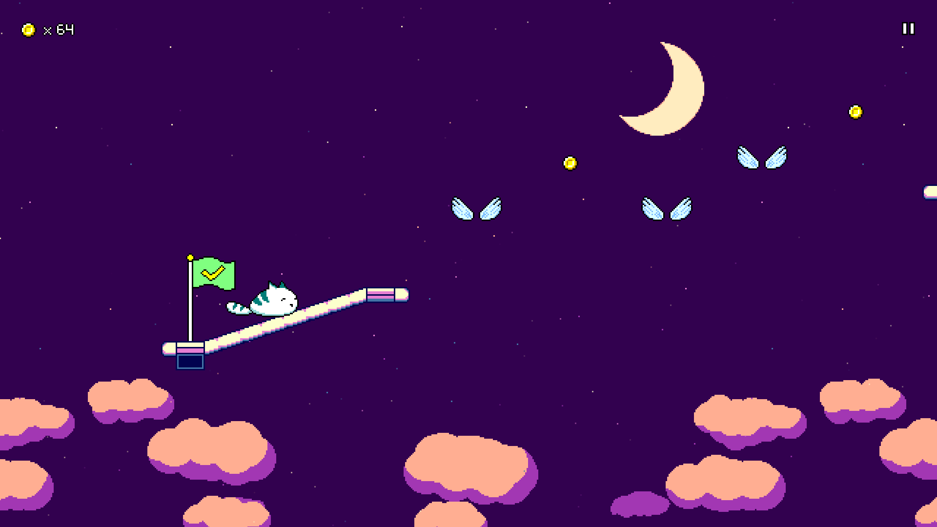 And with that, my Steam page is pretty much ready to publish! I imagine that this will be going live very soon, so please stay tuned so you can wishlist + follow the game!  More Switch Work More Switch WorkBesides that, I've mostly been continuing to work on the Nintendo Switch port of Rhythm Quest, trying to iron out all of the bugs and kinks here and there: Saving/loading now works on Switch, after some fenagling with the Switch filesystem APIs and project settings. Joycon input is also pretty much all done, though I need to tweak the tutorial and maybe look into input rebinding. There was a bug where game timing was completely thrown off when suspending the game (via the home button) due to my code not getting the correct notification to handle this. That's been fixed! The game automatically pauses when this happens as well, now. Level loads take a bit longer on Switch as well, and it turns out that during a level load I wasn't locking the character position so it actually was already going through the first part of the stage (and dying) during the black loading screen. Whoops! That's fixed now... I also put in some code to handle some performance mode settings -- more specifically, the Switch has a "CPU boost" feature that is designed to prioritize CPU over GPU during loading scenes. Might just be placebo effect, but it seems to have helped the loading times a bit! Next week I might attempt to go back to making more levels...
|
|
|
|
« Last Edit: May 03, 2022, 01:33:28 AM by DDRKirby(ISQ) »
|
Logged
|
|
|
|
|
|
|
Alain
|
|
« Reply #39 on: May 03, 2022, 08:49:36 AM » |
|
The Steam page looks great, may many a wishlist fly your way  |
|
|
|
|
Logged
|
|
|
|
|
 Community
