|
derrickfreeland
|
 |
« on: November 08, 2009, 11:30:09 PM » |
|
 This is a mockup from a platformer/rpg I just started working on called 'Collision'. It's very similar to Flashback, but will lean more heavily on story and character development. As it is, the aspect is square, but I think I'm going to widen it. There will also be parallax scrolling as your character moves through areas. I was curious to know what people thought of the perspective, character size and look. I'm in the design/art phase right now, so any of your thoughts would be appreciated. |
|
|
|
« Last Edit: November 11, 2009, 03:02:42 PM by derrickfreeland »
|
 Logged
|
|
|
|
Alex May
...is probably drunk right now.
Level 10

hen hao wan


|
|
« Reply #1 on: November 09, 2009, 10:25:59 AM » |
|
It looks great. I love the clean sci-fi feel. Perhaps the art is a little too clean though, some of the borders look very "standard Photoshop filter" material.
I'd have to see it in motion, as the character looks good as-is but might look a little clumsy in motion. Hope you've got a lot of facial expressions to put on it.
Distinguishing from the backdrop to platforms you can interact with might be hard with art this busy - you might need a bit more colour coding in there.
|
|
|
|
|
Logged
|
|
|
|
|
derrickfreeland
|
|
« Reply #2 on: November 09, 2009, 11:53:19 AM » |
|
Thanks for the feed-back. I definitely need to spend a bit more time 'naturalizing' the backgrounds. As for character animations, my original thought was to take a paper doll style model and animate it using video footage (paper doll rotoscope?  ), but you're right, it'll end up looking very clunky and awkward in the final animation, so I'm going to have to get hard-core and do some actual animation. So much for short-cuts. More mockups to come soon. |
|
|
|
|
Logged
|
|
|
|
|
Triplefox
|
|
« Reply #3 on: November 09, 2009, 08:36:50 PM » |
|
Not digging it yet. None of the individual elements look wrong - the details are all there. I think my quibble is with the overall scene composition - it comes off as "rectangular Monty Python paperdolls" which I suspect isn't the intention for this game. That there are no cues from the lighting or coloring only adds to that effect.
I don't think you're wrong to look for animation shortcuts - both Prince of Persia and Another World used rotoscoped sources. I started using Poser as a mannequin tool to draw over - a sort of "rotoscoping" but more control over the source content. If you want to avoid drawing figures from scratch that sort of process can be really helpful, it's just a matter of getting a good source.
|
|
|
|
|
Logged
|
|
|
|
|
derrickfreeland
|
|
« Reply #4 on: November 09, 2009, 10:59:21 PM » |
|
So, here's attempt numero dos at a mockup: 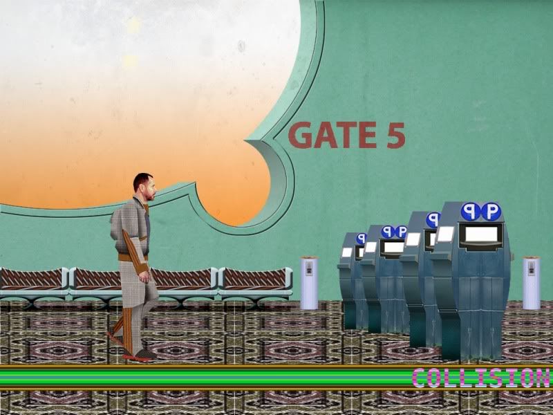 Most of the story takes place in a space port, so here's what the entrance to one of the gates might look like. As for the animation thing, I am still going to use rotoscope. I'll be drawing each frame instead of use a paper doll style model over frames of video footage. Look for a walk cycle in the near future. |
|
|
|
|
Logged
|
|
|
|
|
Xion
|
|
« Reply #5 on: November 09, 2009, 11:17:43 PM » |
|
While I am all for a flasbackesque game, and am looking forward to your character animation, I am not digging the environ.
Things I dig: the benches in the back. The circles cut out of the wall back there, and the far wall itself.
Things I do not dig: The carpet. The booths, those other things back there, the empty orange distant background. The weird inverted "collision" horizontal line thing. The wonky perspective. The flatness. Flatness. Flatness.
Things that would make me dig it: Consistentify the perspective. Add some interest to the far orange bg. Not anything too detailed. Maybe just the faint silhouettes of buildings in the distance. Compose the image. Instead of all these short gates, since I am going to assume that the gates are an important part of a space port, you could make one large iconic one or something. Maybe add some grit to the far wall. Get rid of that nasty carpet. Don't public places usually have hard floors for the most traveled lanes? Light the place. Shadows, highlights, other light-related phenomenon. Everything is so flat right now. Like there's some unseen light source emanating from everywhere but not really lighting anything. Like an overcast day.
|
|
|
|
|
Logged
|
|
|
|
|
derrickfreeland
|
|
« Reply #6 on: November 11, 2009, 01:00:54 PM » |
|
Allrighty, here's attempt number 3. I think the look of the game is starting to gel a bit. In this version, I put a few extra characters in. They're kind of place holders while I work out the painting/animation scheme. Also, I tried to make it more atmospheric. I think this helps the depth issue. 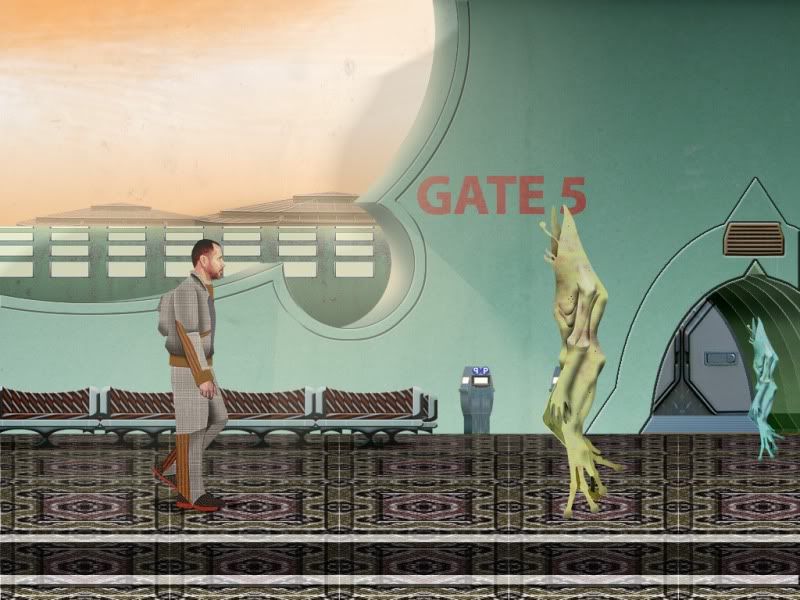 |
|
|
|
|
Logged
|
|
|
|
|
Nate Kling
|
|
« Reply #7 on: November 11, 2009, 07:16:04 PM » |
|
This new one looks better but to be honest the floor is really making this thing ugly. Unfortunately the floor is ruining the rest of the art that looks well done. The tiling thing is not working here, at least not with this tile. It looks like a texture error or something to me. That said, the artwork looks promising especially once you work out how to get the floor right. I really like the style its pretty unique. Nice work so far Im looking forward to your next post  |
|
|
|
|
Logged
|
|
|
|
|
Xion
|
|
« Reply #8 on: November 11, 2009, 07:51:54 PM » |
|
Yes, newest one is much nicer, but I agree with Cal9; that carpet's got to go.
The aliens look freaky-awesome.
|
|
|
|
|
Logged
|
|
|
|
|
Gravious
|
|
« Reply #9 on: November 30, 2009, 11:19:30 PM » |
|
i like the look of this
|
|
|
|
|
Logged
|
One day I'll think about doing something to stop procrastinating.
|
|
|
|
derrickfreeland
|
|
« Reply #10 on: January 07, 2010, 02:46:03 PM » |
|
Back again! For those of you who might have missed me, I have a modest but relatively important update. My computer was down for a couple of weeks, so I've been playing catch-up. At the moment, I have the first area built, and am still working away on character animations. My story is finished, and now that I have a setting, I can start putting things together, so there should some video of a walk-through for the first area very soon. As for now, I have only a few mock-ups to show, but they are made from actual in-game assets. BEHOLD: 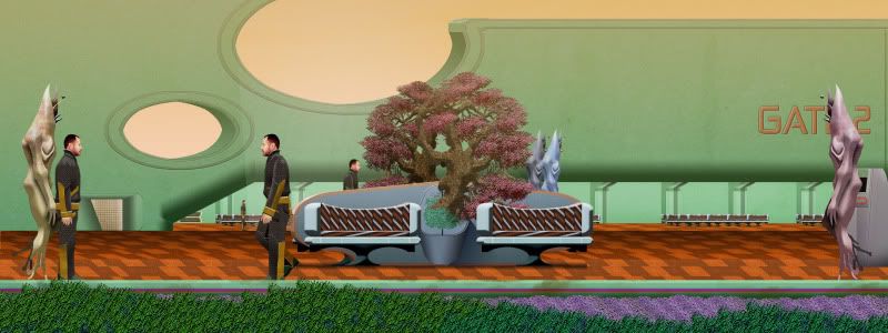 This a bit of a close-up on the first area. Characters are still placeholder until the animations are finished. ...And here's a shot of the whole area: EDIT: New version with a few fixes  So, as you may know, this game is called COLLISION. It's a sci-fi rpg that takes place in a planet-side space port (basically a station that houses elevators that go from planet-side into a station orbiting the planet). The story is a character-based (wow, I use a lot of hyphenated words) drama that revolves around a major catastrophe impacting the station. As for game play, it's mostly character interaction and puzzle solving with a few action sequences. MORE SOON... |
|
|
|
« Last Edit: January 10, 2010, 08:54:08 PM by derrickfreeland »
|
Logged
|
|
|
|
|
Carrie Nation
|
|
« Reply #11 on: January 09, 2010, 07:08:06 PM » |
|
 Tell me I'm not the only one who thought this. |
|
|
|
|
Logged
|
|
|
|
|
derrickfreeland
|
|
« Reply #12 on: January 10, 2010, 09:51:48 AM » |
|
I'm going to guess you're the only person that thought of this. No, it's not one of the guys from Myth Busters. If you are going to post something about the development of this game, please make it a constructive criticism about the game and its development and not some random observation.
For example: Seeing these mock-ups might have made you think "Using photos for sprites is a little weird. It makes me associate what I'm seeing on screen with people I've seen on tv. It's distracting and takes me out of the game experience."
Your post is not helpful, or even an observation about the development of this game. You don't have to like the game to post something about it, but I expect (like every developer on these boards) a small amount of respect towards the game development process and commentary about that process.
|
|
|
|
|
Logged
|
|
|
|
|
Carrie Nation
|
|
« Reply #13 on: January 10, 2010, 10:54:26 AM » |
|
I actually enjoy the use of photographs for the sprites in the game. I was merely pointing out that he looked similar to one of the Mythbusters, which I found to be a bit humorous. This game has a unique look which is ALWAYS a good thing in any indie game, keep it up.
Sorry if it looked like I was insulting your game's graphics, I was just trying to be hip and funny, which never works out well on the internet.
|
|
|
|
|
Logged
|
|
|
|
|
derrickfreeland
|
|
« Reply #14 on: January 10, 2010, 08:12:41 PM » |
|
Sorry for getting snippy, it's my first game, and I guess I'm a little sensitive. Also, it's a bit hard sometimes to tell how posts are supposed to be taken.  |
|
|
|
|
Logged
|
|
|
|
|
fraxcell
|
|
« Reply #15 on: January 11, 2010, 03:48:03 PM » |
|
That last mockup looks a lot better. Only thing I'm not liking about these pictures is the jpeg compression. Upload your pictures as PNGs!
|
|
|
|
|
Logged
|
|
|
|
|
 Community
