|
agj
|
 |
« on: November 10, 2009, 10:31:16 PM » |
|
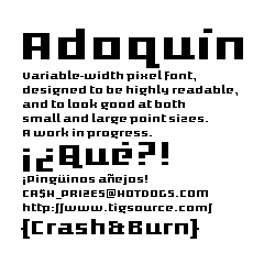 Assembleech-happy link. Assembleech-happy link.Compo version above. For an updated, out-of-deadline version, see a few posts down. |
|
|
|
« Last Edit: December 03, 2009, 04:45:44 PM by agj »
|
 Logged
|
|
|
|
|
agj
|
 |
« Reply #1 on: November 10, 2009, 10:38:11 PM » |
|
Nothing terribly special about this one, but it does have small caps. I wanted it not to have angles or curves, so that it still looks good when blown way up, but I deviated from that in the end in some characters, so I'll probably make some alternates for those. I may also do katakana & hiragana just for the hell of it. 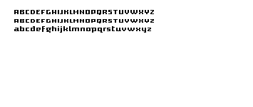 It's not supposed to be monospaced, so what would be the ideal way of formatting this for ease of use? Should I make it a .ttf? |
|
|
|
|
Logged
|
|
|
|
|
György Straub
|
|
« Reply #2 on: November 10, 2009, 11:54:04 PM » |
|
lovely. going to be v useful!
can we has numbers and punctuation please?
|
|
|
|
|
Logged
|
|
|
|
|
agj
|
|
« Reply #3 on: November 11, 2009, 08:42:29 AM » |
|
Of course, those are coming.  |
|
|
|
|
Logged
|
|
|
|
|
agj
|
|
« Reply #4 on: November 15, 2009, 11:29:06 PM » |
|
Alright; I brought it into Fontstruct, as it's the easiest way to make a pixel font that I know. Other than it being usable now, it's much improved and expanded. Here's a sample: Get it here.There's still plenty of characters I'm iffy about. The numbers were a tad problematic, and I'm not sure why I went for text digits. I'll have to give them some more attention later, but at least they're already there. |
|
|
|
|
Logged
|
|
|
|
|
Lon
|
|
« Reply #5 on: November 16, 2009, 09:41:31 AM » |
|
Nice font there agj. Looks like it will be very usable in the compo!
|
|
|
|
|
Logged
|
“We all sorely complain of the shortness of time, and yet have much more than we know what to do with. Our lives are either spent in doing nothing at all, or in doing nothing to the purpose, or in doing nothing that we ought to do..." -Seneca
|
|
|
|
Melly
|
|
« Reply #6 on: November 25, 2009, 08:33:04 AM » |
|
Nice font.
|
|
|
|
|
Logged
|
|
|
|
|
agj
|
|
« Reply #7 on: December 03, 2009, 04:06:49 PM » |
|
I made a few fixes to the most problematic characters, and made the numbers monospaced for them to line up properly more easily. It's available separate from the original version, since I'm releasing it after the deadline. http://fontstruct.fontshop.com/fontstructions/show/adoqu_n_v2 |
|
|
|
|
Logged
|
|
|
|
|
LazyWaffle
Guest
|
|
« Reply #8 on: December 04, 2009, 02:00:18 PM » |
|
Looks like a thicker version of the Edge font. Pretty rad   Yes, the gentleman has 3 arms. One to raise his hat, and the other two to clap. |
|
|
|
|
Logged
|
|
|
|
|
LazyWaffle
Guest
|
|
« Reply #9 on: December 04, 2009, 02:01:22 PM » |
|
Actually, he raises his hat with his penis.
|
|
|
|
|
Logged
|
|
|
|
Kazerad
Level 1

Should really make more games.

|
|
« Reply #10 on: December 04, 2009, 02:15:58 PM » |
|
His prehensile, gloved penis.
|
|
|
|
|
Logged
|
|
|
|
|
György Straub
|
|
« Reply #11 on: December 04, 2009, 08:08:44 PM » |
|
Looks like a thicker version of the Edge font.
That's one sinister name in the world of indie. For anything. Also, that thing seems to sport a thicker version of a prehensile, gloved penis.But I digress! Great font. |
|
|
|
|
Logged
|
|
|
|
|
agj
|
|
« Reply #12 on: December 05, 2009, 10:07:32 AM » |
|
|
|
|
|
|
Logged
|
|
|
|
|
agj
|
|
« Reply #13 on: December 06, 2009, 12:03:21 PM » |
|
Now with rather illegible katakana.  |
|
|
|
|
Logged
|
|
|
|
|

