|
PompiPompi
|
 |
« on: November 19, 2011, 11:05:47 AM » |
|
Since I am not sure I will be able to fund proffessional art for my game(Fatal Wars 2, name will probably change), and since I need to design new characters anyway. I thought to try and make the art on my own, this time try to put more effort into it. So here is the sumerian guy I created and how he looks in-game. What do you think?   |
|
|
|
|
 Logged
|
Master of all trades.
|
|
|
|
ANtY
|
|
« Reply #1 on: November 19, 2011, 11:17:14 AM » |
|
Muuuuuuch better than before
|
|
|
|
|
Logged
|
|
|
|
|
PompiPompi
|
|
« Reply #2 on: November 19, 2011, 11:29:27 AM » |
|
I am not sure how to get rid of the outlines.
Shading for me is a very "analytic" process. I do what make sense first, and then look at the actual size to see how it looks. So most of my work is on a zoomed in of the image.
So, with the outlines, I am not sure how to replace them.
Should I just erase the outer oulines? Should I replace them with dark color? Bright on top dark on bottom(according to the light source)?
I am really not sure.
|
|
|
|
|
Logged
|
Master of all trades.
|
|
|
|
Player 3
|
|
« Reply #3 on: November 19, 2011, 11:37:47 AM » |
|
This is better like you wouldn't believe! No offense, but I doubt that the current art would get Fatal Wars 2 a single sale. Rework them with stuff like that Sumerian, and you're good to go!
|
|
|
|
|
Logged
|
|
|
|
|
ink.inc
Guest
|
|
« Reply #4 on: November 19, 2011, 11:40:39 AM » |
|
 quick rework; just take out the black and replace them with darker shades of the color you're working with |
|
|
|
|
Logged
|
|
|
|
|
ANtY
|
|
« Reply #5 on: November 19, 2011, 11:44:24 AM » |
|
 You can always use darker color as an outline, but John's looks better |
|
|
|
|
Logged
|
|
|
|
|
J. R. Hill
|
|
« Reply #6 on: November 19, 2011, 11:49:07 AM » |
|
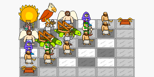
I agree on the fact that you've improved by MILES. So, bravo!   However, I do agree that the outlining is a bit off-putting, though I think the main problem is the use of black inside the sprite. So I did a quick edit to see what it would look like with the black outline removed inside the sprite vs removed completely. Also to see what it would look like if he metamorphosed into a crocodile-man. You're welcome.  |
|
|
|
|
Logged
|
hi
|
|
|
|
PompiPompi
|
|
« Reply #7 on: November 19, 2011, 11:49:11 AM » |
|
It seems to me like Jhon simply erase the "outer" outline. I have made another one with replacing the innerlines. I might get rid of the outlines eventually XD. lol J.R. Hill. And thanks ANTy.  |
|
|
|
|
Logged
|
Master of all trades.
|
|
|
|
ink.inc
Guest
|
|
« Reply #8 on: November 19, 2011, 11:51:13 AM » |
|
thats exactly what i did
|
|
|
|
|
Logged
|
|
|
|
|
J. R. Hill
|
|
« Reply #9 on: November 19, 2011, 11:55:03 AM » |
|
lol J.R. Hill.
I think it's awesome that I only beat you by 4 seconds lol |
|
|
|
|
Logged
|
hi
|
|
|
Ichigo Jam
Level 1


|
|
« Reply #10 on: November 21, 2011, 11:13:23 AM » |
|
Looking good! I hope you don't mind, but I thought the tiles were letting your new nice sprite down a bit, so I tried an edit:  The one on the right is with a more three-quarters sort of a view, which I think looks more interesting. But I don't know whether it makes sense for your game. |
|
|
|
|
Logged
|
|
|
|
|
PompiPompi
|
|
« Reply #11 on: November 21, 2011, 11:24:16 AM » |
|
Thanks, that's a great improvement! I think I will try to reqork my tiles now.  Edit: Attempted making these tiles, don't look so good as yours. I think it's because you gave different hue to different parts and shades of your tiles (in the same tile even).  |
|
|
|
« Last Edit: November 21, 2011, 02:03:40 PM by PompiPompi »
|
Logged
|
Master of all trades.
|
|
|
|
Player 3
|
|
« Reply #12 on: November 21, 2011, 03:50:49 PM » |
|
For some reason, it doesn't look like the tiles fit in the style of the game pieces.
|
|
|
|
|
Logged
|
|
|
|
|
leonelc29
Guest
|
|
« Reply #13 on: November 21, 2011, 07:19:29 PM » |
|
 i think...it's a bad idea to squash down too much...well, a-anyway For some reason, it doesn't look like the tiles fit in the style of the game pieces.
i think it's because the new tile somehow look like a raster painting with no clear outline. feel free to correct me though. |
|
|
|
|
Logged
|
|
|
|
|
PompiPompi
|
|
« Reply #14 on: November 22, 2011, 07:51:55 AM » |
|
Leonelc, Yea, I am not sure what that tile looks like either. Heh. I made a new tile. After many iterations I got a decent result. Each time something else bugged me and I fixed that. The basic concept of the tile though, is that dark areas are affected by ambient lighting(sky, blue tint), and areas with more light have a more yellow tint. This make the tiles look a lot better than just monochormatic grey. Then I tried to make the tile not look so square and clean. So making edges more round and adding "noise". I also added a pattern in the middle, not sure if it's better or worse this way. Please tell me what you think and where I can improve. Edit: Do you think I should add some sort of black outline? To make it more similar to the characters?  |
|
|
|
|
Logged
|
Master of all trades.
|
|
|
|
J. R. Hill
|
|
« Reply #15 on: November 22, 2011, 08:56:11 AM » |
|
Pompi, those tiles are ace. The crack on the top right of them is flawless. (Though putting it on every tile is probably overkill) I'm not sure, however what exactly the insignia on them is.
|
|
|
|
|
Logged
|
hi
|
|
|
|
PompiPompi
|
|
« Reply #16 on: November 22, 2011, 09:02:47 AM » |
|
Yea, currently I am using just one image and change it's color on rendering. So making several versions of the tile will probably make it look better. The symbol in the center of the tile is a sumerian eyes idol(Kind of like ET, there are also alien theories based on it). Edit: And thanks. http://www.collector-antiquities.com/175/p.s., I wonder if in a 1000 years from now they will find Miro's paintings and think that it shows we encoutered aliens. XD |
|
|
|
« Last Edit: November 22, 2011, 09:16:03 AM by PompiPompi »
|
Logged
|
Master of all trades.
|
|
|
Ichigo Jam
Level 1
|
|
« Reply #17 on: November 22, 2011, 10:25:49 AM » |
|
You're getting better quickly!
Adding variations will definitely help, and I'd probably only use the idol symbol sparingly - it's a bit distracting with every tile having a pair of eyes.
I also think it would be better to have different graphics for the different colours of tile, since the yellow shading doesn't work as well when it's darkened.
|
|
|
|
|
Logged
|
|
|
|
|
kamac
|
|
« Reply #18 on: November 22, 2011, 12:13:33 PM » |
|
Well, that looks a lot better |
|
|
|
|
Logged
|
|
|
|
|
|
|
 Developer
