|
Ashkin
Guest
|
 |
« Reply #4940 on: May 30, 2012, 08:52:50 PM » |
|
@Ashkin: I'm making this into a game since you won't.  Ashkin the miner, Krammy the dungeon man, JMickl the dog, Slrlun the whatever his avatar is whoops i thought sprites were 16x16 and he was just being clever with them  edit: KRAMLACK YOU FITTED LAIKA INTO 64 PIXELS totally considering coding this.... This whole time I thought it was some kind of solar boy. Also I pm'd JMickle. yes YES dibs creative director EDIT:  blablalblab Coo' <3 |
|
|
|
« Last Edit: May 30, 2012, 10:55:09 PM by Ashkin »
|
 Logged
|
|
|
|
|
BlueSweatshirt
|
|
« Reply #4941 on: May 30, 2012, 09:44:09 PM » |
|
stupid ideas guy, you contribute nothing to the project. shuttup I didn't ONLY do game design on Kyoto fffuuuuu  That said, I think that HUD could be redesigned to be loads better. You should keep at it if you're really going to make the game. |
|
|
|
|
Logged
|
|
|
|
|
Miko Galvez
|
|
« Reply #4942 on: May 31, 2012, 08:32:46 AM » |
|
|
|
|
|
« Last Edit: May 31, 2012, 08:43:16 AM by Medevenx »
|
Logged
|
|
|
|
|
paste
|
|
« Reply #4943 on: May 31, 2012, 08:39:18 AM » |
|
thing i'm working on now:  |
|
|
|
|
Logged
|
|
|
|
|
rivon
|
|
« Reply #4944 on: May 31, 2012, 10:57:44 AM » |
|
Medevenx: the first is better as it's more subtle. You should try to hide the tiliness a bit though.
|
|
|
|
|
Logged
|
|
|
|
|
Manuel Magalhães
|
|
« Reply #4945 on: May 31, 2012, 11:08:46 AM » |
|
(pics)
I prefer the first one. Nice spriting and color work. |
|
|
|
|
Logged
|
|
|
|
|
pyteo
|
|
« Reply #4946 on: May 31, 2012, 11:10:42 AM » |
|
Because of the background, the character is not clearly readable. Maybe something like this?  |
|
|
|
|
Logged
|
|
|
|
|
Ashkin
Guest
|
|
« Reply #4947 on: May 31, 2012, 11:28:09 AM » |
|
thing i'm working on now: Wizorb. |
|
|
|
|
Logged
|
|
|
|
|
Quarry
|
|
« Reply #4948 on: May 31, 2012, 11:34:28 AM » |
|
Knightorb
|
|
|
|
|
Logged
|
|
|
|
|
Landshark RAWR
|
|
« Reply #4949 on: May 31, 2012, 06:12:00 PM » |
|
squireorb
|
|
|
|
|
Logged
|
|
|
|
|
PsySal
|
|
« Reply #4950 on: May 31, 2012, 06:14:07 PM » |
|
thing i'm working on now: Slimes with curly-cue hair is my awesome thing given to me by this thread for today!! Also: "Wot's WIZORB?" ... OR ... "I can't believe somebody cloned Arkanoid!!</sarc>" =) ... OR ... "Captain ORBious" Which is to say, I find nothing wrong with this =) |
|
|
|
|
Logged
|
|
|
|
|
wademcgillis
Guest
|
|
« Reply #4951 on: May 31, 2012, 06:25:03 PM » |
|
Cucumber Quest: The Game. Never coming to any system or browser near you. 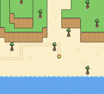 This webcomic is amazing: http://cucumber.gigidigi.com/ |
|
|
|
|
Logged
|
|
|
|
|
Miko Galvez
|
|
« Reply #4952 on: May 31, 2012, 08:23:25 PM » |
|
I can't see the image you posted pyteo  |
|
|
|
|
Logged
|
|
|
|
|
paste
|
|
« Reply #4953 on: May 31, 2012, 10:44:23 PM » |
|
Wizorb.
yeah, i know it resembles wizorb, but the gameplay will be substantially different (aside from the obvious breakout similarity) |
|
|
|
|
Logged
|
|
|
|
|
Miko Galvez
|
|
« Reply #4954 on: June 01, 2012, 04:36:04 AM » |
|
@pyteo  the game is supposed to be played on a 2x scale and here i updated the colors |
|
|
|
|
Logged
|
|
|
|
|
pyteo
|
|
« Reply #4955 on: June 01, 2012, 05:36:12 AM » |
|
@pyteo the game is supposed to be played on a 2x scale and here i updated the colors Do you see it now?  |
|
|
|
|
Logged
|
|
|
|
|
Ashkin
Guest
|
|
« Reply #4956 on: June 01, 2012, 08:16:47 PM » |
|
FINE I'LL FINISH IT  Many thanks to the folks at #poppenkast <3 |
|
|
|
|
Logged
|
|
|
|
|
Quarry
|
|
« Reply #4957 on: June 01, 2012, 09:35:12 PM » |
|
UI don't fit thy game
|
|
|
|
|
Logged
|
|
|
|
|
Ashkin
Guest
|
|
« Reply #4958 on: June 01, 2012, 09:37:42 PM » |
|
UI don't fit thy game
Please be more constructive with your feedback. |
|
|
|
|
Logged
|
|
|
|
|
SolarLune
|
|
« Reply #4959 on: June 01, 2012, 10:24:33 PM » |
|
It's a bit gray to me - maybe make the buttons and the text in the highlighted column for "JMICKL" the same color as the sand? And then consider white text for the buttons? Looks great, still. Nice job!
|
|
|
|
|
Logged
|
|
|
|
|
 Developer
