This is just a copied post of mine from
a previous thread.
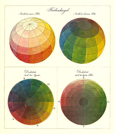
Colour is a strange beast.
Colour theory tutorials are probably your best bet to understand colour.
To know how other colours effect nearby colours is an important knowledge.
Also I'm assuming your looking for pixel art palettes, you can't really just go willy nilly picking colours, I mean it works but it may not be as effective.
http://www.colormatters.com/color-and-design/basic-color-theoryhttp://www.tigercolor.com/color-lab/color-theory/color-theory-intro.htmhttp://www.gamedecor.com/abasworld/Colour%20Theory.htm
ROYGBIV
Just research colour, when working with pixel art obviously keep your palette amount low.
Usually any sprite should only use 3-8 colours at most. But if it's a larger sprite likely 8-12 colours should do it just fine unless you want like a really multi-colour sprite.
Complementary colors, when put together, appear more vivid then when apart.
(Though not all of these are complementary colours, only the first row is.

Green and Red, Blue and Orange, Yellow and Purple: each color is enhanced by the closeness of its “opposite.”
How does this apply to artists? Well, just because they’re called complementary doesn’t mean you should necessarily use them right next to each other at full strength. That can be rather garish.
It's good to understand how colours effect one another.
Also don't forget about colour blending such as anti-alias.

You will need to have a colour that is halfway between the two colours you are picking.

 Developer
