|
HernanZh
|
 |
« on: June 21, 2012, 05:34:52 AM » |
|
Hey guys, I'm working on a mario-like platformer. I've been working on the graphics and suddenly got stuck drawing the background for a couple of days  After I decided to go for random bushes and "mario-like" hills I put everything together in a mockup and it's bothering me... Here it is:  I think it's mainly the colors that's wrong somehow (and being color-blind does not help). I'm not sure how I can separate the background from the foreground better. Do you guys have any tips on improving this? |
|
|
|
|
 Logged
|
|
|
|
|
Kinaetron
|
|
« Reply #1 on: June 21, 2012, 05:39:51 AM » |
|
Looks as pretty cool, although the grey rocks and tree stump looks out of place
|
|
|
|
|
Logged
|
Life sucks and then you die.
|
|
|
|
Quarry
|
|
« Reply #2 on: June 21, 2012, 08:16:15 AM » |
|
Clouds could use some darker outlines
|
|
|
|
|
Logged
|
|
|
|
|
Cobralad
|
|
« Reply #3 on: June 21, 2012, 08:27:28 AM » |
|
It looks even more Mario than Mario and tthts not good thing.
|
|
|
|
|
Logged
|
|
|
|
|
HernanZh
|
|
« Reply #4 on: June 21, 2012, 08:57:11 AM » |
|
Oh ignore the clouds btw, they're terrible and I'll redo them
|
|
|
|
|
Logged
|
|
|
|
|
JWK5
Guest
|
|
« Reply #5 on: June 21, 2012, 09:42:56 AM » |
|
When desaturated (with luminosity still intact) the problems become apparent: 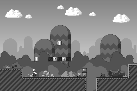 The coin blocks and breakable boxes next to them have are a larger area of contrast than Mario (especially in terms of contrasting with the rest of the scene). Mario should carry the most contrasts in the scene, followed by any dangers (enemies or hazards) or rewards, and then any surfaces he walks on, and then the contrasting should eventually dwindle down into the background (where the least should be). In a game this is so because the player character needs to be identified easily and quickly so that the player is aware of its position at all times. Likewise, dangers and rewards are something the player is constantly on the lookout for and can often require split-second identification. Being able to identify walk-able platforms from the background is crucial to being able to navigate the level quickly and keep a continuous smooth movement. This is an effective arrangement even if it is just meant to be a mockup since Mario is the subject of the scene and the other elements still would follow a solid visual hierarchy. The hierarchy would look something like this:  |
|
|
|
|
Logged
|
|
|
|
|
HernanZh
|
|
« Reply #6 on: June 21, 2012, 09:47:26 AM » |
|
Thanks, that's really helpful!
|
|
|
|
|
Logged
|
|
|
|
|
JWK5
Guest
|
|
« Reply #7 on: June 21, 2012, 10:10:01 AM » |
|
No problem.  A good measure of where the image is at visually is to step back from the monitor several times, each time examining the image to see what stands out the most. From a distance you'll see that Mario pretty much disappears into the midground and eventually the green hills, brown ground, white clouds, blue sky, and yellow of the blocks and bushes are the only identifiable masses in the image. Try to work the image so that as you move back Mario (and other characters or objects of interest) is still visible and identifiable as much as possible. Alternatively, you can just blur it to hell and back to get a similar view:  |
|
|
|
« Last Edit: June 21, 2012, 10:15:25 AM by JWK5 »
|
Logged
|
|
|
|
|
Franklin's Ghost
|
|
« Reply #8 on: June 21, 2012, 10:14:08 AM » |
|
The hierarchy would look something like this: Just read your comment on Replicus and was going to comment on it and say that I'm really impressed in the way you help people and the depth you go to. Then I read this post and just had to say something. JWK5 you're doing an amazing job helping people and anytime I see you comment I carefully read it cause I always seem to learn something from your tips  Also nice to see you're starting a new game HernanZh. You going to start a devlog when you get the look done? |
|
|
|
|
Logged
|
|
|
|
|
joseph ¯\_(ツ)_/¯
|
|
« Reply #9 on: June 21, 2012, 11:26:02 AM » |
|
Rad stuff! Great crits jwk5. I dont know much about pixel art, but wanted to throw in some (maybe unnecessary?) input: This MIGHT be muddying the waters a bit for pixel art but if you really dont want to just de-contrast your backgrounds, there is more than one kind of contrast to consider for defining forms. JWK5 is talking about value contrast -- the range between the lights and the darks -- there's also color contrast (how varied of hues there are) and contrast in terms of sharpness (which is probably totally irrelevant for pixel art) that you could harness to differentiate forms. Varying levels of color contrast will still let the eye clearly seperate the forms... But will look pretty silly unless heavily planned for (say, a very dramatically lit nighttime game)  Owlboy does this quite a bit. Fairly high contrast backgrounds that pick from a very limited palette -- foregrounds with similar contrast but much broader palettes. http://thedreadpirateguy.com/wp-content/uploads/2012/02/Owlboy.pnghttp://i1-games.softpedia-static.com/screenshots/Owlboy_1.jpg |
|
|
|
|
Logged
|
|
|
|
|
HernanZh
|
|
« Reply #10 on: June 21, 2012, 11:56:36 AM » |
|
Wow, this is great. Thanks a lot guys, this is all really helpful. Also nice to see you're starting a new game HernanZh. You going to start a devlog when you get the look done? I'll start one a little later I think. I have to work out some concepts first. |
|
|
|
|
Logged
|
|
|
|
|
JWK5
Guest
|
|
« Reply #11 on: June 21, 2012, 12:51:26 PM » |
|
Contrast comes in many forms (contrast of size, big and small; contrast of line, straight and curve; contrast of saturation, intense and dull; contrast of hue, warm and cold; etc.). In terms of colors, value (brightness) is the basis. Most artists seem to separate hue from value and treat them as separate entities (I did until I learned more about them), but actually hue has value inherently:  By managing your value first you will gain better control over the impact of your colors even before you start adjusting their hue and saturation. A good example of what I mean is the following:  Here I've just adjusted the saturation on the ultramarine (dark blue) hue. As it desaturates (becomes more gray) it actually lightens value-wise. If you just focused on a contrast of saturation you could inadvertently cause a clashing in value. Likewise, just focusing on a contrast of hue could also cause a clashing of value. Value is the crux of saturation and hue, once you've got a pretty good value balance you have a general idea of how you need to adjust the hue and saturation to suit it. Just read your comment on Replicus and...
Thanks a lot! I am glad people are finding some of my posts useful. |
|
|
|
« Last Edit: June 21, 2012, 02:30:32 PM by JWK5 »
|
Logged
|
|
|
|
|
Graham-
|
|
« Reply #12 on: June 23, 2012, 09:43:19 PM » |
|
Just read your comment on Replicus and...
Thanks a lot! I am glad people are finding some of my posts useful. Yeah, like it isn't obvious.... (I mean that people find them useful) |
|
|
|
« Last Edit: June 24, 2012, 05:04:19 AM by toast_trip »
|
Logged
|
|
|
|
beestings
Level 1


|
|
« Reply #13 on: June 24, 2012, 10:26:25 AM » |
|
The rocks, yellow bush, and stump are all too detailed in comparison to the rest of the scene. Also the stripey designs (on the ground and in the background) should be somehow involved in the rest of the picture. Incorporate that feel with everything else. Im not sure how, but I just wanted to offer my opinions. (: good job besides that.
|
|
|
|
|
Logged
|
|
|
|
|
HernanZh
|
|
« Reply #14 on: June 25, 2012, 03:50:40 AM » |
|
Thanks for the comments. I'll try to incorporate all the tips, can't promise I'll be successful on that, haha
|
|
|
|
|
Logged
|
|
|
|
|
 Developer
