|
J. R. Hill
|
 |
« on: September 23, 2011, 10:33:55 AM » |
|
Ok, give me any and all color-choosing advice/tutorials/palettes/etc. that you have. Also information on texturing, shading with hue, consistent light-sourcing, etc. I want to make this the go-to thread for people who have glaring problems as well as people (like myself) who just want to improve their arting abilities. I'll start with my quick-fix, go-to palette resource. Wikipedia's Video Game Console Palette PageAnd I'll even hot-link the most common one: NES
 |
|
|
|
|
 Logged
|
hi
|
|
|
|
Player 3
|
 |
« Reply #1 on: September 23, 2011, 11:00:59 AM » |
|
Common skin/hair color charts. Also contains RGB and hexadecimal values. Also made a Helpful Artist thread a while back.
|
|
|
|
|
 Logged
|
|
|
|
|
im9today
Guest
|
 |
« Reply #2 on: September 23, 2011, 11:49:21 AM » |
|
pick your own palettes.
|
|
|
|
|
 Logged
|
|
|
|
|
rivon
|
 |
« Reply #3 on: September 23, 2011, 12:20:40 PM » |
|
|
|
|
|
|
 Logged
|
|
|
|
|
J. R. Hill
|
 |
« Reply #4 on: September 24, 2011, 10:58:18 AM » |
|
pick your own palettes.
Typically I do, but the idea would be to explain how to pick palettes well. I.e. be helpful plz. |
|
|
|
|
 Logged
|
hi
|
|
|
|
Bones
|
 |
« Reply #5 on: September 24, 2011, 11:06:16 AM » |
|
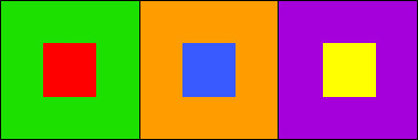
Colour theory tutorials are probably your best bet to understand colour. To know how other colours effect nearby colours is an important knowledge. Also I'm assuming your looking for pixel art palettes, you can't really just go willy nilly picking colours, I mean it works but it may not be as effective. http://www.colormatters.com/color-and-design/basic-color-theoryhttp://www.tigercolor.com/color-lab/color-theory/color-theory-intro.htm ROYGBIV Complementary colors, when put together, appear more vivid then when apart.  Green and Red, Blue and Orange, Yellow and Purple: each color is enhanced by the closeness of its “opposite.” How does this apply to artists? Well, just because they’re called complementary doesn’t mean you should necessarily use them right next to each other at full strength. That can be rather garish. Just research colour, when working with pixel art obviously keep your palette amount low. Usually any sprite should only use 3-8 colours at most. But if it's a larger sprite likely 8-12 colours should do it just fine unless you want like a really multi-colour sprite.   Painting has helped me out with colours since you have to actually create your colors with pigments and other colours. Yes I spell colour with a "u" I'm Canadian. |
|
|
|
« Last Edit: June 07, 2012, 07:14:37 AM by Bones »
|
 Logged
|
Sit down and relax, Keeping focus on your breath, This may take a while.  |
|
|
|
|
|
gimymblert
|
 |
« Reply #7 on: September 24, 2011, 12:22:47 PM » |
|
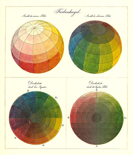
 It's all about choosing the correct color space too, color is pretty complex. Obviously not every light component are good, but knowing basic theory does help artistically. http://en.wikipedia.org/wiki/HSL_and_HSVMyself try to go on a custom HSL to manage color. |
|
|
|
« Last Edit: September 26, 2011, 02:10:39 AM by Gimmy TILBERT »
|
 Logged
|
|
|
|
|
brothers74
|
 |
« Reply #8 on: September 25, 2011, 05:45:43 PM » |
|
heres a neat trick i figured out - all bright colors go well with black. all dark colors go well with white.
|
|
|
|
|
 Logged
|
|
|
|
|
baconman
|
 |
« Reply #9 on: September 26, 2011, 04:51:39 AM » |
|
Bear with me here, I'm far from being a visual-arts genius. Today, I'm forming a 16-to-24 color palette to bust into my (enormous amount of) character/background spriting with. I'd like to keep character design down to 4 colors per character, -maybe- 5 at most to accenuate certain wardrobe options. To give you an idea where I'm at, I understand contrasting and complimentary colors, along with color groups like brights, bolds, flourescents, pastels, earth tones, etc. Since it's character based, I'll probably go with at least 3 various tan/brown flesh tones to begin with... so what's a good way to formulate the rest of the palette?
Should I avoid or embrace absolute black/white? Go with one or two of the aforementioned color groups to remain consistent, or bounce a bit for more "pop" and diversity? Any particular sets of colors that I should avoid, for one reason or another?
Presently, I'm kinda in favor of outlines, because I'm not totally sold on my shaping skills; and I'm guessing that sort of depends on whether I go with one consistent but broad color group (which may need outlines to contrast for gameplay factors) or divide that between two or more of them (in which the self-evident contrast would "pop" them for me - if I understand this right), which may prove more limiting, colorwise...
This is such a good time for this topic to surface!
|
|
|
|
|
 Logged
|
|
|
|
|
|
|
baconman
|
 |
« Reply #11 on: September 26, 2011, 04:43:17 PM » |
|
How exactly is that "good palette" working? o.O I can kinda see a Scrabble-like approach surrounding a few dominant colors where they cross paths, but I'm not entirely sure what's being adjusted in some cases... such as the vertical part of the upper black - or is that two different, unrelated adjustments, that simply stem both directions from it (which would actually make more sense)? And is there a reason the second/third forks to the right look basically identical, or is it an "untrained eye" thing?
I'll be honest here... I saw the "bad palette" on the left, and immediately thought to myself, "GUILTY!" XD That kind of IS what I had in mind... though the Scrabbley way might be a way of simplifying things.
What I DO know is that I'm likely going with 3 grays, 3 blues, 3 browns, and at least 1 of: red, yellow-orange (firey), yellow/blonde, green (probably 2 greens in fact, if I can muster them or simplify a trio somehow, like a light blue/green), purple, pink... although that already brings me up to 15/16 colors.
So for the "1-shade-of" colors, I should try to match them (or many of them) in saturation/value levels, and coincide that with a level within the trios?
Like... (oh, how to illustrate this?)
near-white/unsaturated xx Blue
bright/med-saturated xx Blue
medium/med-saturated xx Blue
deep/med-saturated xx Blue
near-black/super-saturated xx Blue
bright/med-saturated xx Red
bright/med-saturated xx Yellow-Orange
bright/med-saturated xx Yellow/Blonde
bright/med-saturated xx Pink
(~= bright/med-satruated xx Blue)
medium/med-saturated xx Green-Blue
medium/med-saturated xx Purple
(~= medium/med-satruated xx Blue)
light/high-saturated xx Brown
medium/high-saturated xx Brown
deep/high-saturated xx Brown (~= deep/high-saturated xx Blue)
(should the Browns intrisically coincide with the bright Yellow-Orange hue above?)
...and then the 3 shades of gray (complimenting the blue/brown in... saturation/value), but I'm not totally sure how to get that on the hue scale... it is just "any hue/saturation, 0 value?" Or maybe "any hue/value, max saturation?"
Huh! Assuming I'm picturing this correctly, that actually IS a good way to get good versatility in a palette; although it seems like the blue/brown/grays (outside of the off-white/off-black) make something of a "square" - is that normal/useful, or too much "bad palette" influence?
Sorry if I'm asking a lot. I'm learning a lot in this thread, too (or I hope I am!)...
|
|
|
|
|
 Logged
|
|
|
|
|
im9today
Guest
|
 |
« Reply #12 on: September 26, 2011, 04:53:13 PM » |
|
|
|
|
|
|
 Logged
|
|
|
|
|
Hangedman
|
 |
« Reply #13 on: September 26, 2011, 04:57:58 PM » |
|
0to255.comis also pretty handy.
|
|
|
|
|
 Logged
|
|
|
|
|
baconman
|
 |
« Reply #14 on: September 26, 2011, 05:35:09 PM » |
|
Whoops... I think I may have reversed the saturation definition by accident! XD
|
|
|
|
|
 Logged
|
|
|
|
|
baconman
|
 |
« Reply #15 on: September 26, 2011, 07:14:23 PM » |
|
Alright... since this is obviously a visual-spacial thing, let me try this. Aside from the obvious flat-white in the background, would this be along the lines of the "good palette?" Or should there be some adjustments made? I'm not totally sure I'm happy with the red-orange one on the third column... maybe I went too far into the red?  |
|
|
|
« Last Edit: September 26, 2011, 07:21:01 PM by baconman »
|
 Logged
|
|
|
|
|
|
|
1982
|
 |
« Reply #17 on: September 27, 2011, 03:57:38 AM » |
|
Umm.. Why not?
Because that tutorial seems to suggest quite classic garagesale art color usage. It completely ignores sun colours and its relation to shadow colors on different colour surfaces. In that example that wooden shield is completely brown, and the plant completely green. There is nothing lively in those. The worst part is that he is talking about "realistic" colours and completely fails to execute it. And this is not from me, this is just basic color theory they teach at art schools. I'm not saying it is the truth of good colour usage, but when trying to achieve the results which for the color theory has been developed for, then it is worth noting. Also he doesn't seem to know that the medium (pixel art) usually looks much better with different, experimental and unrealistic palettes. Like any visual art really... |
|
|
|
|
 Logged
|
|
|
|
|
|
|
1982
|
 |
« Reply #19 on: September 27, 2011, 04:23:27 AM » |
|
There seems to be awful lot emphasis on actual palette and which colors to use. My approach to pixel art usually is drawing everything either monochrome or grayscale, depending on purpose where different shades of grey represent different amounts of light on that pixel. After that I just replace grey's to whatever colors hit my head, or just try out random combinations and whatever. Actually that is the most fun part. There is so much to do with colors and with this method it is easy to test out all sorts of stuff.
Just screw the palettes - point is to select amount of levels of light, and create the shape.
|
|
|
|
|
 Logged
|
|
|
|
|
 Developer
 Art
Art (Moderator: JWK5)Color Info Dump Thread
 Developer
 Art
Art (Moderator: JWK5)Color Info Dump Thread
