|
unseven
Guest
|
 |
« Reply #27340 on: July 18, 2014, 09:39:25 AM » |
|
I imagined it faster, so the frequency is higher and you don't really notice the displacement. Lots of games do that, just can't remember an example right now.  But maybe just the engine, like you did, fits better! |
|
|
|
|
 Logged
|
|
|
|
|
standardcombo
|
|
« Reply #27341 on: July 18, 2014, 09:51:20 AM » |
|
Looks like he's going even faster now. Its hard to tell which would be better inside the game but my guess is no vehicle vibration. |
|
|
|
|
Logged
|
|
|
|
|
Shawny
|
|
« Reply #27342 on: July 18, 2014, 10:14:28 AM » |
|
 idk what im doing with this i give up |
|
|
|
|
Logged
|
|
|
|
|
Ky.
|
|
« Reply #27343 on: July 18, 2014, 10:44:01 AM » |
|
Of anything, I really wish I as well had pixel art skills of any kind *cries a little, but not too much* so much beautiful work found in these threads..
|
|
|
|
|
Logged
|
|
|
|
|
DoomCube
|
|
« Reply #27344 on: July 18, 2014, 10:51:01 AM » |
|
I imagined it faster, so the frequency is higher and you don't really notice the displacement. Lots of games do that, just can't remember an example right now. But maybe just the engine, like you did, fits better! That's a fantastic edit. Thanks a lot. He looks awesome. It adds so much extra energy to the loop. I think I may have to give this sort of edit a miss for the in-game character, though, as he may already be travelling too fast for how we plan to use him in game. We'll have to test and see, though. Thanks again, man. |
|
|
|
|
Logged
|
|
|
|
|
DoomCube
|
|
« Reply #27345 on: July 18, 2014, 11:07:05 AM » |
|
idk what im doing with this i give up Really nice character, Shawny. I love the clean style. |
|
|
|
|
Logged
|
|
|
|
|
unseven
Guest
|
|
« Reply #27346 on: July 18, 2014, 12:29:56 PM » |
|
Been doing these item icons for Chasm, just a few I can show for now:  |
|
|
|
|
Logged
|
|
|
|
|
tieTYT
|
|
« Reply #27347 on: July 18, 2014, 12:46:09 PM » |
|
Been doing these item icons for Chasm, just a few I can show for now: Nice. I've got no art skills so I'm curious: When you're changing the palette for the shaded colors (eg: the left side vs the right side of the bronze breastplate), are you eyeballing it, or do you have a more scientific method? EG: The V of HSV by 20. |
|
|
|
|
Logged
|
|
|
|
|
surt
|
|
« Reply #27348 on: July 19, 2014, 01:27:04 AM » |
|
SMSish:  |
|
|
|
|
Logged
|
|
|
|
|
mcErik
|
|
« Reply #27349 on: July 19, 2014, 01:38:48 AM » |
|
Pixels everywhere, my favorite part is the dolphin. I can't take full credit for this, this is the combination of me and my best friends work on our game Seaworthy. This is our first time doing pixel art, so keep that in mind, constructive criticism is always appreciated.  Overall I'm pretty happy with how it's looking. This screenshot saturday reddit post has links to all of our art if you're interested http://www.reddit.com/r/gamedev/comments/2b3raf/screenshot_saturday_181_eye_on_the_prize/cj1o73y |
|
|
|
|
Logged
|
|
|
|
|
Raku
|
|
« Reply #27350 on: July 19, 2014, 01:57:00 AM » |
|
  Two of my best friends are now represented as little junk baddies in my game. As for feedback, mcEric I think the cross section is nice, but the water going in front of the ship looks odd to me, when it's not also going in front of the rooms being shown. I would say to just have the whole ship be cross sectioned, even the little internal parts. You could even have fun putting little spider webs or rats nests in the nooks and crannies. That dolphin is really nice, but almost not visible (maybe it's just my monitor though) |
|
|
|
|
Logged
|
|
|
|
|
Sik
|
|
« Reply #27351 on: July 19, 2014, 03:29:27 AM » |
|
SMSish: Bridge zone, anyone? |
|
|
|
|
Logged
|
|
|
|
|
unseven
Guest
|
|
« Reply #27352 on: July 19, 2014, 06:05:16 AM » |
|
Nice. I've got no art skills so I'm curious: When you're changing the palette for the shaded colors (eg: the left side vs the right side of the bronze breastplate), are you eyeballing it, or do you have a more scientific method? EG: The V of HSV by 20.
Eyeballing. I do have my preset palette as a starter, though. |
|
|
|
|
Logged
|
|
|
|
|
Canned Turkey
Guest
|
|
« Reply #27353 on: July 19, 2014, 07:36:32 AM » |
|
Tales From Earthsea 7 colors  |
|
|
|
« Last Edit: July 22, 2014, 06:41:14 PM by Canned Turkey »
|
Logged
|
|
|
|
|
Ingenoire
|
|
« Reply #27354 on: July 19, 2014, 07:54:44 AM » |
|
 WiP of a punching animation. Mostly did the arms' path, still gotta "duplicate" arms, as well as body movement. |
|
|
|
|
Logged
|
|
|
|
|
SolarLune
|
|
« Reply #27355 on: July 19, 2014, 07:59:24 AM » |
|
Cool character. Although, what kind of punch is that? It looks a lot more like she's throwing something from her side, like a throwing knife. If I could offer some CC, Push her posture more to be more "attacking", Lean her body forward, Move her legs and kness, Drop the blurred frames in favor of just one or two to make the motion appear faster. Just some suggestions! @Canned - Wow, that's awesome! I like how you used your colors and limited your "greebles" - that's something I usually screw up when I pixel something larger, haha. @Surt - Awesome tiles, as usual! Not sure if I like the upper, more shaded tree or the bottom left, simpler one. I think I like the simplicity of the bottom one, but the colors of the upper one. EDIT: Guess I might as well post this here though it's kinda crap. I'm getting better, I think! 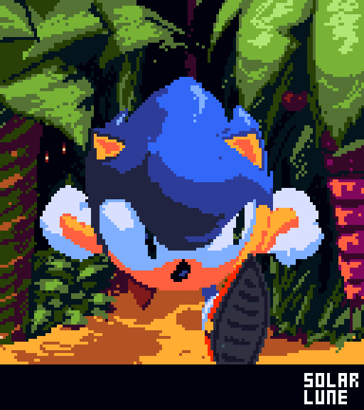 |
|
|
|
|
Logged
|
|
|
|
|
Sik
|
|
« Reply #27356 on: July 19, 2014, 11:39:10 AM » |
|
Cool character. Although, what kind of punch is that? It looks a lot more like she's throwing something from her side, like a throwing knife.
If I could offer some CC,
Push her posture more to be more "attacking",
Lean her body forward,
Move her legs and kness,
Drop the blurred frames in favor of just one or two to make the motion appear faster.
Just some suggestions!
I have the feeling we would need to see that animation with the correct speed before taking a judgement, it seems too slow to me (but GIF is a bitch when it comes to speed accuracy, since the granurality is 1/100th of a second). Hopefully some frames are faster than others (though yeah, leaning forward may be a good idea). That said, it does look like she's attacking using fans. |
|
|
|
|
Logged
|
|
|
|
|
|
|
eigenbom
|
|
« Reply #27358 on: July 19, 2014, 06:50:14 PM » |
|
|
|
|
|
|
Logged
|
|
|
|
|
JobLeonard
|
|
« Reply #27359 on: July 19, 2014, 11:45:37 PM » |
|
@SolarLune: I like it, classic, 90s Sonic best Sonic.
@Thomas Finch: Good stuff! I guess you've used logic that says two adjacent tiles cannot be the same? Some of them come out quite rectangular though, those look a bit weird.
|
|
|
|
|
Logged
|
|
|
|
|
 Developer
