|
|
|
Atnas
|
 |
« Reply #1 on: December 10, 2011, 06:24:03 AM » |
|
Try blue background with inlaid tan boxes?
|
|
|
|
|
 Logged
|
|
|
|
|
vinheim3
|
|
« Reply #2 on: December 10, 2011, 06:32:37 AM » |
|
like this?: 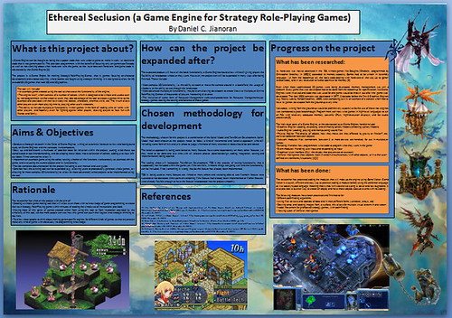 I think it looks good, though I know nothing about good colour mixes.. it reminds me of a Pokemon somehow.. EDIT: I think the orange looks horrible.. imagine it lighter and with a more white-boy skin tone |
|
|
|
« Last Edit: December 10, 2011, 06:41:50 AM by vinheim3 »
|
Logged
|
|
|
|
|
rivon
|
|
« Reply #3 on: December 10, 2011, 08:55:55 AM » |
|
Imho they both don't look really great. Just try different colors. The blue ones just feel dark and unsaturated and the orange one is bland and unsaturated too. Also, on the blue one you use dark text on dark background. Better to use light text on dark background or vice versa.
|
|
|
|
|
Logged
|
|
|
|
|
vinheim3
|
|
« Reply #4 on: December 10, 2011, 10:00:15 AM » |
|
I've tried many different colours and combinations, but I have no sense of colour so I don't know which ones are actually good. I also have this feeling that maybe a texture might be good? But it might be distracting too.
Looking at the background, if you were to make a game with it, what coloured textboxes would you use?
|
|
|
|
|
Logged
|
|
|
|
|
rivon
|
|
« Reply #5 on: December 10, 2011, 10:01:44 AM » |
|
White/black/cyan and semi-transparent probably.
|
|
|
|
|
Logged
|
|
|
|
|
vinheim3
|
|
« Reply #6 on: December 10, 2011, 10:12:31 AM » |
|
Ok, this HAS to be the one.. 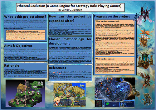 ...don't make me use gradients ...don't make me use gradientsEDIT: btw this poster is on A1 piece of paper, so if it looks bland.. well any hint of gradient/texture could make it look way too cluttered, but if there is anything simple to add, I'll try it out |
|
|
|
« Last Edit: December 10, 2011, 10:18:40 AM by vinheim3 »
|
Logged
|
|
|
|
|
|
|
vinheim3
|
|
« Reply #8 on: December 10, 2011, 11:05:57 AM » |
|
Thanks!  but I had to have it printed already, did the last one, least I have that link for the next time I need to design something, cheers! |
|
|
|
|
Logged
|
|
|
|
|
J. R. Hill
|
|
« Reply #9 on: December 10, 2011, 08:34:09 PM » |
|
Next time make the background of the text boxes more creamy. Black text on darker colors is hard to read and not very eye-catching either.
|
|
|
|
|
Logged
|
hi
|
|
|
|
TaintedFork
|
|
« Reply #10 on: December 13, 2011, 09:16:47 PM » |
|
Also, as a side note, blue and orange are opposite colors on the color wheel.
Generally, colors far apart from each other on the wheel do not mix well. This means opposite colors will appear worse together than colors in proximity on the wheel.
So, in the future, take a look at the wheel. Toning down the orange color to a more tan color did help a lot, but either way, the color scheme is not color wheel-aware.
The poster looks fine but I thought I'd share some color theory with you for future prospects.
|
|
|
|
|
Logged
|
|
|
|
dustin
Level 6


|
|
« Reply #11 on: December 14, 2011, 10:49:27 PM » |
|
Also, as a side note, blue and orange are opposite colors on the color wheel.
Generally, colors far apart from each other on the wheel do not mix well. This means opposite colors will appear worse together than colors in proximity on the wheel.
Wait really? I thought that opposites on the color wheel were generally thought of as complimentary colors and worked well together. |
|
|
|
|
Logged
|
|
|
|
|
Delicious
|
|
« Reply #12 on: December 15, 2011, 10:21:46 PM » |
|
Also, as a side note, blue and orange are opposite colors on the color wheel.
Generally, colors far apart from each other on the wheel do not mix well. This means opposite colors will appear worse together than colors in proximity on the wheel.
Wait really? I thought that opposites on the color wheel were generally thought of as complimentary colors and worked well together. You're correct. They are called complimentary colors for a reason! They both contrast against each other, which'll make the viewer focused on the specific inner object that the surrounding color clashes against. Not always good to do so with big text boxes though, as it'll draw the attention away from the font as it'll appear too bright. |
|
|
|
|
Logged
|
Blah Blah Blah <3
Twitter - Zjdelicious
|
|
|
|
TaintedFork
|
|
« Reply #13 on: December 15, 2011, 10:38:42 PM » |
|
They both contrast against each other, which'll make the viewer focused on the specific inner object that the surrounding color clashes against.
Just to clarify this point, and because I left it out of my original post, complimentary colors can be used as an attention-grabber. They should not be avoided entirely, but the artist should be aware of what he/she is doing. For instance, white on black is a lot easier to read and a lot more eye-catching than gray on black.  |
|
|
|
|
Logged
|
|
|
|
|
 Developer
