|
anselm_eickhoff
|
 |
« Reply #21040 on: January 16, 2013, 08:30:05 AM » |
|
Thanks for all your feedback. If I spam this thread and there is a better place, let me know. I added a little more contrast and finished the missing tiles. My monitor should be calibrated quite accurately (I did it according to a review, they had industrial calibrating devices and I looked at a lot of gamma and color tests).  I am deliberately going for a subtle and 'washed out' pallete, I know that pixel art usually uses very extreme colors. I want to reserve those for more important things than the background, though, for example items, players etc. If everything has a lot of contrast it will be hard to parse and look distracting. The cliffs can have a lot of contrast, because the player won't stand on them. I might try the ideas with different shades for different heights, but I will probably do that procedurally. |
|
|
|
|
 Logged
|
|
|
|
|
gggfhfdh
|
|
« Reply #21041 on: January 16, 2013, 08:53:01 AM » |
|
I added a little more contrast and finished the missing tiles.
not enough not even remotely close to enough I want to reserve those for more important things than the background, though, for example items, players etc. this is a stupid beginner's mistake that you may think sounds good on paper but please do not do this there's better ways to make things stand out If everything has a lot of contrast it will be hard to parse and look distracting. FALSE FALSE F A L SE FALSE stop that unless your character sprite uses the exact same palette as your background that will never be the case, and you need to stop acting like it will be because STOP IT look here  look look at all these ways to make the colors interesting, and a bunch of them even retain the 'washed out' look you want also your textures look really messy and not actually like pixel art i dont have any advice there, you're free to figure out how to fix that one up on your own because learning is fun!!!! |
|
|
|
|
Logged
|
|
|
|
|
JasonPickering
|
|
« Reply #21042 on: January 16, 2013, 08:57:40 AM » |
|
Hey guys. Trying to finish up my game Relic Rush and I need a screen for when you complete all the levels, but after that you can still try to get the highest rank in all the levels. so between each area you get this pop up  so I was trying to create a win screen that had a similar feel  any suggestions on how I can make this better? should I maybe add like falling confetti and stuff too? |
|
|
|
|
Logged
|
|
|
|
|
anselm_eickhoff
|
|
« Reply #21043 on: January 16, 2013, 09:17:04 AM » |
|
epic rant
 Holy shit, ok, thanks. Thanks for the gif as well. |
|
|
|
|
Logged
|
|
|
|
|
Blademasterbobo
|
|
« Reply #21044 on: January 16, 2013, 09:59:59 AM » |
|
can you make the different levels have different brightness or something? sometimes it sorta looks like the cliff is a rock wall separating equal-height portions of grass
|
|
|
|
|
Logged
|
|
|
|
|
Ridley
|
|
« Reply #21045 on: January 16, 2013, 10:01:55 AM » |
|
Very impressive detail, but you misunderstand the sprite's aims. While I agree mine is lacking most detail, and should have more texture, 1) the intense realism that yours conveys is true to a specific character, with defined facial features and emotions. He is meant to be a placeholder for a customizable player avatar in a multiplayer setting. I don't want a lot of detail or character under those circumstances. He should remain simplified to some extent. 2) You used a huge number of shades to draw those details, Whereas I purposefully constrained myself to only 3 of each color, for a style that struck as painted and distinctly lacking in wrinkled texture. Or, y'know, as you put it, blobby. Undefined at any rate, intentionally. This and the banded tones work towards the goal of having a sprite compatible with dynamic lighting, which yours would be hard-pressed to meet. It is at least easier to see some semi-directional lighting with my draft. I'm not saying it's better, but it serves it's purpose more efficiently. I will work on the texture of the clothing, however. Thanks for the feedback. |
|
|
|
« Last Edit: January 16, 2013, 10:23:23 AM by Ridley »
|
Logged
|
|
|
|
|
DustyDrake
|
|
« Reply #21046 on: January 16, 2013, 10:29:54 AM » |
|
He is meant to be a placeholder for a customizable player avatar in a multiplayer setting. I don't want a lot of detail or character under those circumstances. He should remain simplified to some extent.
Understandable, I guess.. 2) You used a huge number of shades to draw those details,
Whereas I purposefully constrained myself to only 3 of each color, for a style that struck as painted and distinctly lacking in wrinkled texture. Or, y'know, as you put it, blobby. Undefined at any rate, intentionally.
This and the banded tones work towards the goal of having a sprite compatible with dynamic lighting, which yours would be hard-pressed to meet. It is at least easier to see some semi-directional lighting with my draft.
I'm not saying it's better, but it serves it's purpose more efficiently. I will work on the texture of the clothing, however.
Thanks for the feedback.
*twitch* Look, I'm not very good at pixeling myself. I'm pretty much in-between you and Geti, skill wise, based on those sprites. You can limit the amount of colors that you use, and still get the same effect as Geti did, in fact it doesn't look like he even used many colors on his, except maybe... 4? for the hair?, and for the most part 3-4 for the rest. And what do you mean "compatible with dynamic lighting"? I'd say Geti's is much more compatible with lighting because his shadows aren't as hard baked onto the sprite. Please at the very least work on the colors and don't just use a linear gradient, that's one thing I've learned. (Especially with those yellows, eugh.) |
|
|
|
|
Logged
|
|
|
|
|
ink.inc
Guest
|
|
« Reply #21047 on: January 16, 2013, 10:39:36 AM » |
|
You used a huge number of shades to draw those details
Whereas I purposefully constrained myself to only 3 of each color
he uses 3 shades for the jeans, 2 for the shoes, and 3 for the hair. the face only had 4 (5 if you count the eyes). his face only actually has 1 more unique shade than yours (if you count the pure white you used for the eyes). and since you used 1 more shade for your shoes, it balances out to an even number of shades. |
|
|
|
|
Logged
|
|
|
|
|
gggfhfdh
|
|
« Reply #21048 on: January 16, 2013, 11:07:39 AM » |
|
This and the banded tones work towards the goal of
for real if you're about to say anything other than "being really bad pixel art techniques that do nothing but detract from overall quality" i'm gonna scream having a sprite compatible with dynamic lighting you did it he did it it was done he did the thing |
|
|
|
|
Logged
|
|
|
|
|
Blademasterbobo
|
|
« Reply #21049 on: January 16, 2013, 11:22:08 AM » |
|
idk if it's ok to post games here or not? but i wanted to show off some of the pixel art in my latest game. it's a wip, so pls no "constructive" criticism  Algae Attack Algae Attack(arrows + z to shot bullet) |
|
|
|
|
Logged
|
|
|
|
|
Udderdude
|
|
« Reply #21050 on: January 16, 2013, 11:23:14 AM » |
|
idk if it's ok to post games here or not? but i wanted to show off some of the pixel art in my latest game. it's a wip, so pls no "constructive" criticism Algae Attack(arrows + z to shot bullet) That script error really needs some better shading. |
|
|
|
|
Logged
|
|
|
|
|
Geti
|
|
« Reply #21051 on: January 16, 2013, 11:51:20 AM » |
|
lol, Stanley. fwiw your animation technique kicks the absolute shit out of mine  He is meant to be a placeholder for a customizable player avatar in a multiplayer setting. I don't want a lot of detail or character under those circumstances. He should remain simplified to some extent. As far as I'm aware, having developed a multiplayer game with customisable characters, players are into customisations because of the character that they imbue. Just something to be aware of. 2) You used a huge number of shades to draw those details, (for dynamic lighting) You uh, might want to count the number of shades I used before saying I basically painted the thing - I grabbed your sprite, colourpicked for the base work (reshaping the hair, rescaling details) so it would be at the same colour restriction level, and brought one of the hair shades down to join in with the skin palette, then pulled the colours around and cleaned things up. The trick is making it look like you've used lots of colours when you haven't  If you want dynamic lighting with any sort of direction, an "unlit" base is also significantly better than one with weak directional lighting that isn't top-lighting (to make the silhouettes pop). If you're just going to add a multiply colour over the sprite (using vertex colours or whatever) then it really doesn't matter, some of the sprites in KAG are top/right lit (if they dont rotate), some are front-lit if they do; the darkening of the sprites doesn't interfere with that information. Thanks for the feedback.
No worries, you might want to take a harder look at it though. Just trying to help you out before you do a heap of rework and then realise "hold on, these sprites are pretty average". |
|
|
|
|
Logged
|
|
|
|
|
Ashkin
Guest
|
|
« Reply #21052 on: January 16, 2013, 12:39:43 PM » |
|
you misunderstand the sprite's aims 'your edit is nice but this is just my STYLE' |
|
|
|
|
Logged
|
|
|
|
|
ANtY
|
|
« Reply #21053 on: January 16, 2013, 01:42:54 PM » |
|
idk if it's ok to post games here or not? but i wanted to show off some of the pixel art in my latest game. it's a wip, so pls no "constructive" criticism Algae Attack(arrows + z to shot bullet) That script error really needs some better shading. idd |
|
|
|
|
Logged
|
|
|
|
|
Ridley
|
|
« Reply #21054 on: January 16, 2013, 02:40:50 PM » |
|
 There we go. Sufficiently detailed textures on the torso and legs. I don't want to spam this thread, so this will be my final draft. I'll likely edit the post with all four after I've done with them. I realize his face is not particularly expressive, and the shading on his hair is indistinct. And I don't think that changing it is necessary for the better, so I'm leaving it that way. He's no more or less expressive than his role model-- 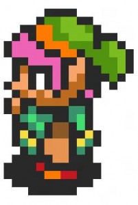 --and yes I realize there are all kinds of things wrong with comparing those two characters as equals. Call it a style, or nag on whatever you want. I'd like to leave his head as such. It isn't detrimental to the character design and has a certain graphic, cartoon-ish appeal to my eyes. Thanks again, Geti. EDITNOTETHING: I would've given him a crotch as well, but I want him to have something resembling legs--and that would require extending his lower body. I want to minimize the overlap between player characters. (The hitbox is the torso region, minus the arms when facing forwards and back.) EDIT: And you're right, you did use the same restraints. Sorry for making that blatant mistake. |
|
|
|
« Last Edit: January 16, 2013, 04:38:25 PM by Ridley »
|
Logged
|
|
|
|
|
s_l_m
|
|
« Reply #21055 on: January 16, 2013, 03:00:26 PM » |
|
I'm just starting to learn pixel art so I can produce less terrible looking jams (I am trying to do the one gam a month thing) So, I would appreciate it if you tear these apart:    |
|
|
|
« Last Edit: January 16, 2013, 03:06:49 PM by s_l_m »
|
Logged
|
Think happy thoughts.
|
|
|
|
gggfhfdh
|
|
« Reply #21056 on: January 16, 2013, 03:09:36 PM » |
|
There we go. Sufficiently detailed textures on the torso and legs.
liar you're lying you are grounded young man |
|
|
|
|
Logged
|
|
|
|
|
siskavard
Guest
|
|
« Reply #21057 on: January 16, 2013, 04:21:38 PM » |
|
My first real attempt at pixel art. Lay it on me.  EDIT: Just animated him a bit:  |
|
|
|
« Last Edit: January 16, 2013, 04:39:02 PM by siskavard »
|
Logged
|
|
|
|
Slow
Level 1

chirp

|
|
« Reply #21058 on: January 16, 2013, 04:30:24 PM » |
|
i think it could benefit from some anti-aliasing
|
|
|
|
|
Logged
|
|
|
|
|
siskavard
Guest
|
|
« Reply #21059 on: January 16, 2013, 04:39:35 PM » |
|
i think it could benefit from some anti-aliasing
Cool, I haven't quite learned that trick yet |
|
|
|
|
Logged
|
|
|
|
|
 Developer
