FawfulBeans
Level 1


|
 |
« Reply #22960 on: May 27, 2013, 11:21:00 AM » |
|
oh shit is some kind of internet sissy fight going down?
|
|
|
|
|
 Logged
|
|
|
|
|
Dr. Cooldude
Guest
|
|
« Reply #22961 on: May 27, 2013, 11:23:47 AM » |
|
Come on! This thread have been free of drama for very long, please don't import it here   that's why we have this smiley, will you kindly stay gentlemen? Quoted for truth, I've been kind of tired of the drama happening lately here on this thread. LETS MAKE PIXEL ART  |
|
|
|
|
Logged
|
|
|
|
|
Cellusious
|
|
« Reply #22962 on: May 27, 2013, 11:31:38 AM » |
|
Guys, give me C&C on this:  I have been looking at it for too long without being able to objectify why i don't like it. C&C as in actual arguments and how to fix , not single line f u claims. com on.edit: fixed centering issue.  |
|
|
|
|
Logged
|
|
|
|
|
ClayB
Guest
|
|
« Reply #22963 on: May 27, 2013, 11:42:28 AM » |
|
the moon looks like it's in the foreground cause it's so bright, and the globs of pixels around the dude don't convey anything, they just hurt the readability. try looking at it in it's native resolution, that usually reveals a lot of problems for me personally when I'm working with such a small piece.
|
|
|
|
|
Logged
|
|
|
|
|
poe
Guest
|
|
« Reply #22964 on: May 27, 2013, 11:43:08 AM » |
|
Not a pixeler so I have no feedback for you Cellusious, but I'd love to see you work at a higher resolution.
|
|
|
|
|
Logged
|
|
|
|
|
andy wolff
|
|
« Reply #22965 on: May 27, 2013, 11:45:25 AM » |
|
Cellusious: you may not like it for any of the following reasons:
-the character has weak focus and contrast. the colors are very similar to the trees in the background. you could move him or recolor the trees
-speaking of those trees, it is unclear whether they are part of the walkway or in the background. if they are part of the background, the area below the bridge being a different color from the trees above the bridge is confusing
-the red stuff at the top and bottom is out of context with the rest of the image, both with respect to color and subject (what is it?). the brighter red serves only to lower the effective contrast of the colors in the middle. i don't know what they are meant to be so i don't have a good suggestion for improving them aside from taking them out
-the clouds feel a bit stamped. they have poor spatial contrast, i guess. you appear to have two different sizes of cloud you have pasted around the image. this is okay but could benefit from more interesting grouping and merging into larger cohesive shapes.
-the gray shapes in the background look like they could be interesting structures, but most of the effect is lost in extraneous dithering and the weakness of the lighter grey clouds. if the grey background clouds were bigger and the structure occluded them more, it would be more visible without being more cluttered
-the overall spatial composition could also be improved. maybe try doing some rule of thirds stuff with the bridge, character, and moon
hope that helps
|
|
|
|
|
Logged
|
|
|
|
|
siskavard
Guest
|
|
« Reply #22966 on: May 27, 2013, 11:48:08 AM » |
|
Great C&C from Andy
on those notes I'd love to see a broader range of colors in your work. The monochromatic approach is cool, but can also be a crutch.
|
|
|
|
|
Logged
|
|
|
|
|
Cellusious
|
|
« Reply #22967 on: May 27, 2013, 11:52:03 AM » |
|
the moon looks like it's in the foreground cause it's so bright, and the globs of pixels around the dude don't convey anything, they just hurt the readability. try looking at it in it's native resolution, that usually reveals a lot of problems for me personally when I'm working with such a small piece.
Ah, yeah. I tend to work at 800% and just zoom it up without looking at it 1:1. The background around the character steals from the clarity of the character i think Not a pixeler so I have no feedback for you Cellusious, but I'd love to see you work at a higher resolution.
The only thing required is eyes. Technical problems are harder tho. Higher res takes more time :3 Cellusious: you may not like it for any of the following reasons:
-the character has weak focus and contrast. the colors are very similar to the trees in the background. you could move him or recolor the trees
-speaking of those trees, it is unclear whether they are part of the walkway or in the background. if they are part of the background, the area below the bridge being a different color from the trees above the bridge is confusing
-the red stuff at the top and bottom is out of context with the rest of the image, both with respect to color and subject (what is it?). the brighter red serves only to lower the effective contrast of the colors in the middle. i don't know what they are meant to be so i don't have a good suggestion for improving them aside from taking them out
-the clouds feel a bit stamped. they have poor spatial contrast, i guess. you appear to have two different sizes of cloud you have pasted around the image. this is okay but could benefit from more interesting grouping and merging into larger cohesive shapes.
-the gray shapes in the background look like they could be interesting structures, but most of the effect is lost in extraneous dithering and the weakness of the lighter grey clouds. if the grey background clouds were bigger and the structure occluded them more, it would be more visible without being more cluttered
-the overall spatial composition could also be improved. maybe try doing some rule of thirds stuff with the bridge, character, and moon
hope that helps
Thanks! The red is supposed to be lava, which from your way of putting it isn't that clear :1 Yeah. I'm trying to improve and experiment with clouds making them more "realistic" and interesting. I'm not familiar with rule of thirds, i only claim to be good at composition regardless of me not knowing anything other than what's drawn on instinct. Back to the point, Rule of thirds is 1/3 of the piece should be N object? How does that help if you're trying to make it have a sense of open space with something more like 3/4 and the character 1/4? If that's what it is. Great C&C from Andy
on those notes I'd love to see a broader range of colors in your work. The monochromatic approach is cool, but can also be a crutch.
Some of my art is very monochromatic and others a bit full of colour. Only a minority is in the "green" zone. (pun intended) |
|
|
|
|
Logged
|
|
|
|
|
andy wolff
|
|
« Reply #22968 on: May 27, 2013, 12:13:09 PM » |
|
ah okay, lava. What's it doing floating up at the top? To make it clearer that it is lava, have it cast light on the stuff in the scene. put some underglow on that bridge. to make it look even better, redraw the lava to give it some volume and show how it flows around and behind the bridge. now it looks a bit flat because of the side-on view as for rule of thirds, basically it's just a trick that helps balance out the points of focus on an image. what you do is you draw two evenly spaced vertical lines and two horizontal ones across the image, then you try to place the important parts of your image somewhere close to the intersections of those lines. I've forgotten why it's supposed to be good, but it does generally help make things look better. it is definitely not the only way to arrange an image. you can also do golden rectangle, or just place stuff randomly if you're good at managing focus for example, if you move the bridge down a bit, the main guy to the right a bit, and the moon up and to the left a bit, they'll align with the rule-of-thirds lines better:  i apologize for the crudity of this edit, i kind of scribbled all over it |
|
|
|
|
Logged
|
|
|
|
|
|
|
andy wolff
|
|
« Reply #22970 on: May 27, 2013, 12:18:08 PM » |
|
oh, neat
|
|
|
|
|
Logged
|
|
|
|
|
|
|
ompuco
|
|
« Reply #22972 on: May 27, 2013, 05:45:10 PM » |
|
Here's a title I made for that 1-bit game project I'm thinking of going ahead with.  I currently don't know what software I should use to make it. It's a simple pixel art platformer with 16x16 tiles and tons of animations. |
|
|
|
|
Logged
|
|
|
|
|
Bandages
Guest
|
|
« Reply #22973 on: May 27, 2013, 05:46:57 PM » |
|
@devi, just started playing it. Neat so far, but the text is a little hard to read! I think it might just be too small I died  Fun game, loved how the background kind of ADVANCED MENACINGLY. I got stuck after finding the gun/axe, and I think I might've missed something due to the font Fun game, loved how the background kind of ADVANCED MENACINGLY. I got stuck after finding the gun/axe, and I think I might've missed something due to the font
Playing again and realized I completely forgot to check the lockers...
Round 2... Almost finished it. Will probably be able to round 3.
VICTORY. Sweet game. Nice puzzle. |
|
|
|
« Last Edit: May 27, 2013, 06:06:01 PM by Castle »
|
Logged
|
|
|
|
|
devi ever
Guest
|
|
« Reply #22974 on: May 27, 2013, 06:26:13 PM » |
|
@devi, just started playing it. Neat so far, but the text is a little hard to read! I think it might just be too small I died Fun game, loved how the background kind of ADVANCED MENACINGLY. I got stuck after finding the gun/axe, and I think I might've missed something due to the font
Playing again and realized I completely forgot to check the lockers...
Round 2... Almost finished it. Will probably be able to round 3.
VICTORY. Sweet game. Nice puzzle.Ha ha! Thank you so much, and ultra-congratulations on finishing it! So far the few friends I have had who played it wanted to kill me because of how "hidden" the ammo was!I'm glad someone else out there is able to solve it! |
|
|
|
|
Logged
|
|
|
|
|
RopeDrink
|
|
« Reply #22975 on: May 28, 2013, 01:38:02 AM » |
|
Hey folks, still new to the site - I'm absolutely useless at all this so if you're going to critique (It's welcome) please try not to use too much mumbo-jumbo a newcomer might not understand ^^ Trying to learn so advise away! I opened up PS and started doodling - All previous attempts at pixel-art ended up semi-finished and promptly deleted so I'm hoping to break the trend. Anyways, after a lot of editing and experimentation I now end up with this monstrosity which, as you can see, was a failed attempt at drawing a sort of "Clock Tower" up-close portrait of a buxom lady. The game I have in mind would have something similar - A basic portrait with a few frames of animation to show certain expressions but ultimately it'd just be part of the HUD and not the actual character.  I don't know what purists would say about it, probably call it a load of junk, but for me it's an accomplishment. If we zoom in it looks like this:  I'm not entirely content with it so threw the palette of used colours in there incase anyone wants to try a few edits for themselves. People will tell me the shading is bad or maybe she's out of proportion - Might say her hair looks like it's just 'stuck' on her head or her actual head is too big/small or not shaped right. As said, I'm not much of an artist so this is all new to me but I'd be curious to see what people think I could do to make her look a bit better? This probably won't be used for anything, other than a template for future possibilities and, well, practice - I would very much like to design my own female character for my upcoming game so I need to learn a lot, and fast - Thanks in advance to anyone who gives some thoughts but again, go easy on me  For the record the portrait by itself is 60x60 in size and uses 12 colours so far, hoping to keep it minimal. |
|
|
|
|
Logged
|
|
|
|
|
surt
|
|
« Reply #22976 on: May 28, 2013, 02:51:15 AM » |
|
Needs contrast badly.  |
|
|
|
|
Logged
|
|
|
|
|
Geti
|
|
« Reply #22977 on: May 28, 2013, 03:10:49 AM » |
|
contrast is way low and its not shaded really and has banding all over. Hasty edit as I'm really meant to be working:  Notes drawn on yours, the boobs and cloth in mine (not to mention arm & forehead) are still shaded jankily. The banding everywhere and the colours are the main thing, everything else is a lack of construction and practice I'd say. I think surts boobs are way too much in the realm of "on a platter" but i guess if you're going for that... I like his colours though, seems more disney. |
|
|
|
|
Logged
|
|
|
|
|
Carrion
|
|
« Reply #22978 on: May 28, 2013, 03:23:22 AM » |
|
I died. 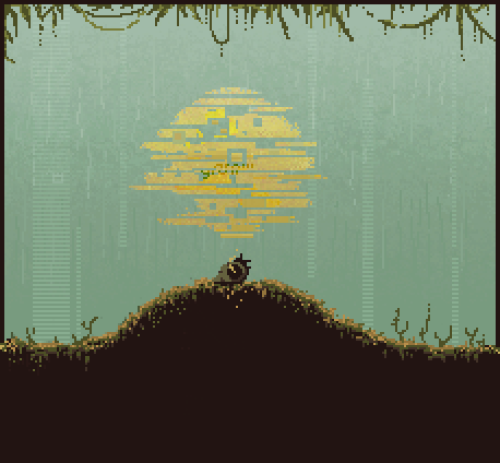 |
|
|
|
|
Logged
|
|
|
|
|
gggfhfdh
|
|
« Reply #22979 on: May 28, 2013, 03:33:01 AM » |
|
People will tell me the shading is bad or maybe she's out of proportion - Might say her hair looks like it's just 'stuck' on her head or her actual head is too big/small or not shaped right.
super cool and rad artist tip: stop just fix those things fix them even if you have no clue you dont learn by having someone fix it for you |
|
|
|
|
Logged
|
|
|
|
|
 Developer
