|
Canned Turkey
Guest
|
 |
« Reply #28800 on: December 22, 2014, 02:10:53 PM » |
|
 This thread needs more dumb fish. |
|
|
|
|
 Logged
|
|
|
|
|
Torchkas
|
|
« Reply #28801 on: December 22, 2014, 02:12:35 PM » |
|
Sascha, that art's pretty cool, but those eyes shouldn't be synced. It looks too unnatural this way.
|
|
|
|
|
Logged
|
|
|
|
|
Rat Casket
|
|
« Reply #28802 on: December 22, 2014, 02:13:53 PM » |
|
Sascha, that art's pretty cool, but those eyes shouldn't be synced. It looks too unnatural this way.
cause the rest looks totes natural |
|
|
|
|
Logged
|
|
|
|
|
Zanhuf
Guest
|
|
« Reply #28803 on: December 22, 2014, 02:18:51 PM » |
|
Haven't done much, but here's some stuff i did recently: Some animations:    Recent progression:  Haven't improved much, but still trying |
|
|
|
|
Logged
|
|
|
|
|
Quarry
|
|
« Reply #28804 on: December 22, 2014, 02:26:59 PM » |
|
 Not even worth fighting over, it is the same thing |
|
|
|
|
Logged
|
|
|
|
|
Canned Turkey
Guest
|
|
« Reply #28805 on: December 22, 2014, 02:28:56 PM » |
|
Sascha, that art's pretty cool, but those eyes shouldn't be synced. It looks too unnatural this way.
 I aint no Sascha. |
|
|
|
|
Logged
|
|
|
|
|
gimymblert
|
|
« Reply #28806 on: December 22, 2014, 02:37:06 PM » |
|
^ey that's pretty damn stylish. I like it.  and my own pixel stuff Disappointed nobody got the blatant gunstar heroes nod  |
|
|
|
|
Logged
|
|
|
|
|
Schoq
|
|
« Reply #28807 on: December 22, 2014, 02:50:44 PM » |
|
Not even worth fighting over, it is the same thing that's not what pixel artists (Pixelation forums) mean by it, if you care you can read the thing I linked instead of deliberately misunderstanding it's not an official term anyway and unfortunately named so whatever, but it's a useful concept to understand when you're learning pixel art |
|
|
|
|
Logged
|
♡ ♥ make games, not money ♥ ♡
|
|
|
|
Cellusious
|
|
« Reply #28808 on: December 22, 2014, 03:23:31 PM » |
|
it's the same thing.  |
|
|
|
|
Logged
|
|
|
|
|
Schoq
|
|
« Reply #28809 on: December 22, 2014, 03:31:01 PM » |
|
dum
|
|
|
|
|
Logged
|
♡ ♥ make games, not money ♥ ♡
|
|
|
|
joseph ¯\_(ツ)_/¯
|
|
« Reply #28810 on: December 22, 2014, 04:56:13 PM » |
|
yea Shoq its the same thing. It's just that 'banding' is a very broad and vague term (since any given set of adjacent pixels can be treated as a gradient, and the level of smoothness we might want is arbitrary) and pixel artists use it to refer to one very specific set of incidents.
cell I've been enjoying this series. this is The Dan Fessler technique (softer brushes + posterize + gradient map + a low opacity grid for dither), right? Or are you achieving some of these results in a different way?
|
|
|
|
|
Logged
|
|
|
|
|
Joh
|
|
« Reply #28811 on: December 22, 2014, 05:16:56 PM » |
|
Yeah, it looks alright. Some CC would be:
- The hair's a bit perspective-less,
- The colors are a bit bright and also low-contrast (on the cloak and the scarf),
- There's not a lot of lighting in general (the only thing that's really shaded is the hair in the back; the rest kinda gives a "pillow-shaded" feel)
- The cloak lacks form (like it's just a "bag" that he's wearing, as opposed to covering things in particular).
Overall, though, it's not bad.
im not sure what you mean by hair being perspective-less but I tried to improve it.   I like the scarf a lot more now, the cloak feels a bit more "something" but at the same time I feel like I added complexity/details for the sake of it. I felt it was hard to shade it when it was a perfect "bag". |
|
|
|
|
Logged
|
|
|
|
|
Schoq
|
|
« Reply #28812 on: December 22, 2014, 05:19:59 PM » |
|
yea Shoq its the same thing. It's just that 'banding' is a very broad and vague term (since any given set of adjacent pixels can be treated as a gradient, and the level of smoothness we might want is arbitrary) and pixel artists use it to refer to one very specific set of incidents.
One refers to an compression artefact and one refers to an unrelated effect of erroneous manual pixel placement. Saying they're the same because they both have to do with adjacent colours is disingenuous. I care because it's an almost universal mistake for people new to the medium and a very useful concept to be aware of. Makes people improve really quickly. |
|
|
|
|
Logged
|
♡ ♥ make games, not money ♥ ♡
|
|
|
|
Jad
|
|
« Reply #28813 on: December 22, 2014, 06:28:53 PM » |
|
WELL we'll just have to rename it then
"AA slicing"
there we go! I did it. no one will ever be confused again
|
|
|
|
|
Logged
|
|
|
|
|
gggfhfdh
|
|
« Reply #28814 on: December 22, 2014, 06:49:07 PM » |
|
 playing the meme game again time to redo these until i get bored |
|
|
|
|
Logged
|
|
|
|
|
joseph ¯\_(ツ)_/¯
|
|
« Reply #28815 on: December 22, 2014, 06:51:55 PM » |
|
dum nerd terminology war. We call it banding because that's what it is, then after the newbie pixel artist has it explained to them, they can later encounter the term used in broader use and go 'oh, I suppose that's the same phenomena with a different cause'
gggfhfdh that's awesome. juicy colors, great highlights, a+. I really like the choices you made with the fucking rad arm design's pose/perspective in the new one.
|
|
|
|
|
Logged
|
|
|
|
|
SolarLune
|
|
« Reply #28816 on: December 22, 2014, 08:02:02 PM » |
|
@Joh - Much better, in my opinion. I see what you mean about the cloak, but I'd say it's still an improvement because no cloak is perfectly straight down like it was. You could try keeping it like that and just adding some wrinkles and lines, with an underlying form under the cloak. It also could use a consistent lighting angle. It's flat in that it just gets darker toward the edges rather than under the shapes that are under the cloak. As for the hair, I meant that it should have more three dimensional shape. It's also a bit flat-looking at the moment, especially toward the right side. Here's an example. I started just tweaking the hair, but then I also tweaked the cloak, since it seemed like you liked it simpler. I might have gone overboard, but I think putting something "under" the cloak is kinda necessary to not have it looks like a bag. I also altered the colors a bit, as some of them were similar. Good job on using the skin color as the cloak color - that was a good use of saving colors. 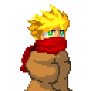  EDIT: Ah, those outlines are inconsistent in my edit. Oh, well. EDIT 2: Looking at it now, it looks more like my version's from the waist up, haha. Oh, well, again. @Zanhuf - Not sure what you're talking about! Those characters are a lot better, and those animations are nice and smooth, while also being detailed. |
|
|
|
« Last Edit: December 22, 2014, 10:46:09 PM by SolarLune »
|
Logged
|
|
|
|
|
vaaasm
|
|
« Reply #28817 on: December 22, 2014, 09:45:53 PM » |
|
 here's a roster of characters and other peeps i made |
|
|
|
|
Logged
|
|
|
|
|
Jared C
|
|
« Reply #28818 on: December 22, 2014, 09:47:41 PM » |
|
|
|
|
|
|
Logged
|
|
|
|
|
JobLeonard
|
|
« Reply #28819 on: December 22, 2014, 10:43:04 PM » |
|
Nice animation, but real fish don't usually float like that... OH NOES, THEY'RE DISGUISED CAMERAS PLANTED BY FIVE DIFFERENT SPY AGENCIES!
|
|
|
|
|
Logged
|
|
|
|
|
 Developer
