|
SeanNoonan
|
 |
« Reply #29140 on: February 16, 2015, 10:14:55 PM » |
|
Nice looking stuff in here  Quick pixel daily...  |
|
|
|
|
 Logged
|
|
|
|
|
|
|
Torchkas
|
|
« Reply #29142 on: February 17, 2015, 02:51:11 PM » |
|
I really love how it manages to be romantic while being pretty rough around the edges. Your color-work is really good as well.
The only thing that drags it down is the splashscreen logo. It's really average-looking. It doesn't really encapsulate anything like the rest of the piece does. I think it would be better off without it.
|
|
|
|
|
Logged
|
|
|
|
FawfulBeans
Level 1


|
|
« Reply #29143 on: February 17, 2015, 02:58:17 PM » |
|
I see what you're getting at, but it seems a little noisy to me.
I've had somebody else say that. I can kind of see what you mean, I think the colours in the grass are too harsh. I did this and the guy in my signature a few days ago:  |
|
|
|
|
Logged
|
|
|
|
|
Irock
|
|
« Reply #29144 on: February 17, 2015, 03:58:21 PM » |
|
dang, why is orange to purple the best gradient
|
|
|
|
|
Logged
|
|
|
|
|
Eigen
|
|
« Reply #29145 on: February 17, 2015, 11:00:55 PM » |
|
I really love how it manages to be romantic while being pretty rough around the edges. Your color-work is really good as well.
The only thing that drags it down is the splashscreen logo. It's really average-looking. It doesn't really encapsulate anything like the rest of the piece does. I think it would be better off without it.
Thanks, I agree. While I do like it, it's just a typeface logo with a few letters modified. When I get a chance I might try something more classic, you know the arcing text and you see the depth of the letters from the bottom. That 3D sort of thing. For now I'm happy with this. Might just remove the noise from the bottoms of P and S. That dithering makes little sense. Cobralad, very interesting dithering pattern you got there. Very atmospheric too. |
|
|
|
|
Logged
|
|
|
|
thekill473
Level 1
|
|
« Reply #29146 on: February 18, 2015, 12:19:22 AM » |
|
Wow  That's amazing work man. I love the title screen. |
|
|
|
|
Logged
|
|
|
|
|
Miguelito
|
|
« Reply #29147 on: February 18, 2015, 11:02:42 AM » |
|
Dear Lord Paleskins, that is some masterful use of contrast! Incredible! FTL fan art! The Engi design has zilch all to do with the in-game sprite I admit. But the baseline direction for this was to emphasize how dangerous/competent each race is in combat, so a unicycle bean with floppy arms was too good to pass up!  Edit: x3 version for people who crave crispness while actually being able to see a damn thing. |
|
|
|
« Last Edit: February 18, 2015, 11:52:02 AM by Miguelito »
|
Logged
|
  (← new art twitter) |
|
|
|
happymonster
|
|
« Reply #29148 on: February 18, 2015, 12:30:10 PM » |
|
Great work! I ran it through Tixel as it's a good test of the image smoothing.  |
|
|
|
|
Logged
|
|
|
|
|
Miguelito
|
|
« Reply #29149 on: February 18, 2015, 12:39:55 PM » |
|
Conclusion: Tixel seems to be absolutely perfect for straight lines as well as sharp and circular curves (which make up 80% of most given images), but doesn't seem to interpret smooth/slight/snaking curves perfectly.
Meaning rock guy, crystal dude and especially energy being were converted very well, while the roller bean, Spindly McScrapbot and pinkyclaws didn't make it quite as well.
On the other hand, I can't help but feel that it's the pixel artist's job to actively avoid these cases - diagonals other than 2:1 or 1:1, snakey patterns, intersecting diagonals - and that Tixel just highlights in an unpleasant way what the brain itself would interpret as unpleasant anyway.
Edit: Actually wait, why does it get glowy greenguy's curves so right while fumbling badly with the lady captain's skirt or rolypoly's antenna?
|
|
|
|
|
Logged
|
(← new art twitter) |
|
|
|
happymonster
|
|
« Reply #29150 on: February 18, 2015, 12:48:11 PM » |
|
Good questions! I think it's struggling on small areas of detail where there are different areas of contrast. But certainly something to look at and see if I can fix or improve a bit. |
|
|
|
|
Logged
|
|
|
|
|
|
|
john sandoval
Guest
|
|
« Reply #29152 on: February 19, 2015, 06:47:06 PM » |
|
|
|
|
|
« Last Edit: February 19, 2015, 08:55:04 PM by sandoval »
|
Logged
|
|
|
|
|
rj
|
|
« Reply #29153 on: February 19, 2015, 06:48:28 PM » |
|
john! jiggidy john
welcome back
+ this looks great, fuck
hope you're doin well
|
|
|
|
|
Logged
|
|
|
|
|
john sandoval
Guest
|
|
« Reply #29154 on: February 19, 2015, 08:55:20 PM » |
|
im ok
|
|
|
|
|
Logged
|
|
|
|
|
rj
|
|
« Reply #29155 on: February 19, 2015, 09:14:46 PM » |
|
rip
|
|
|
|
|
Logged
|
|
|
|
Armageddon
Level 6

|
|
« Reply #29156 on: February 19, 2015, 10:25:07 PM » |
|
Was John Sandoval banned? wat.
|
|
|
|
|
Logged
|
|
|
|
|
Carrion
|
|
« Reply #29157 on: February 19, 2015, 10:34:39 PM » |
|
oops 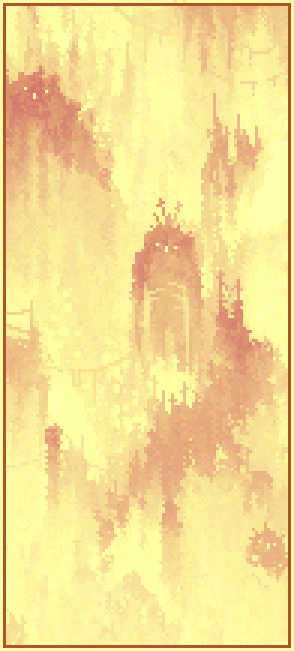 |
|
|
|
|
Logged
|
|
|
|
|
Cobralad
|
|
« Reply #29158 on: February 19, 2015, 11:51:12 PM » |
|
He was ascended.
|
|
|
|
|
Logged
|
|
|
|
|
Rat Casket
|
|
« Reply #29159 on: February 20, 2015, 10:13:15 AM » |
|
john sandoval sucks and deserves the hell he has been banished to
the end
|
|
|
|
|
Logged
|
|
|
|
|
 Developer
