|
BBreakfast
|
 |
« Reply #30400 on: November 18, 2015, 02:14:12 PM » |
|
Heya guys, thank you so much for the thoughtful critiques. I think you're on to something, after having another look at the mockup there could be more done to improve it. I want to try & pick up as much criticism as I can now so I can come back with an improved mockup. So, what exactly isn't working about the shading? I am trying to do the FFTA2 style of shading ( units all have same plain circle shadow directly below them) so I'm wondering what isn't working for me and how can I make it work in a similar way to FFTA2? I'm going to tweak some colors, add more variety to the cliff bottoms & try to emphasize the direction of the sun more since I guess my shading is too unclear & pillowy at the moment? Hopefully next time will be an improvement! |
|
|
|
|
 Logged
|
|
|
|
|
Pineapple
|
|
« Reply #30401 on: November 18, 2015, 02:20:30 PM » |
|
I'd say the biggest issue isn't necessarily the shading - though it could definitely be improved - but the lack of contrast.
|
|
|
|
|
Logged
|
|
|
|
|
DoomCube
|
|
« Reply #30402 on: November 18, 2015, 03:17:08 PM » |
|
Hey folks, here is mock up I did for an imaginary adventure game that might just become a real one. What do you think?  |
|
|
|
|
Logged
|
|
|
|
|
Canned Turkey
Guest
|
|
« Reply #30403 on: November 18, 2015, 03:26:04 PM » |
|
Looks great  Although, one way it could look better would be to have the text and the text's outline be the same resolution as the rest of the game. Also, there's some serious banding going on in the background. You might want to add a bit of dithering. |
|
|
|
|
Logged
|
|
|
|
|
Schoq
|
|
« Reply #30404 on: November 18, 2015, 03:46:53 PM » |
|
Hey folks, here is mock up I did for an imaginary adventure game that might just become a real one. What do you think? Added a way to air-drop enemies in front of the player  Coincidence?? |
|
|
|
|
Logged
|
♡ ♥ make games, not money ♥ ♡
|
|
|
|
gimymblert
|
|
« Reply #30405 on: November 18, 2015, 03:48:18 PM » |
|
Yulluminati confirmed half life 3  |
|
|
|
|
Logged
|
|
|
|
|
DoomCube
|
|
« Reply #30406 on: November 19, 2015, 01:06:55 AM » |
|
Coincidence??
Yes, it was drawn over a week ago  Yulluminati confirmed half life 3 Haha, clearly. Or too many Star Wars teasers!
jk both look great!
Quite possibly. They're unavoidable. Thanks. |
|
|
|
|
Logged
|
|
|
|
|
chriswearly
|
|
« Reply #30407 on: November 19, 2015, 02:10:38 AM » |
|
Hey folks, here is mock up I did for an imaginary adventure game that might just become a real one. What do you think?
-snip-
Looks great Although, one way it could look better would be to have the text and the text's outline be the same resolution as the rest of the game. Also, there's some serious banding going on in the background. You might want to add a bit of dithering. Well I'm bored, and wanted to touch some pixel letters. So to you, but mainly OP (and I don't mean to step on their toes), how's this look? Different readability style, with top line the original font (+minor tweaks to letters), and the bottom one with pixel-perfect letters. Was a quick* thing done in MSPaint   edit: i finished the image editing |
|
|
|
« Last Edit: November 19, 2015, 04:22:44 AM by Chris Early »
|
Logged
|
|
|
|
|
skaz
|
|
« Reply #30408 on: November 19, 2015, 05:45:39 AM » |
|
Heya guys, thank you so much for the thoughtful critiques. I think you're on to something, after having another look at the mockup there could be more done to improve it. I want to try & pick up as much criticism as I can now so I can come back with an improved mockup. So, what exactly isn't working about the shading? I am trying to do the FFTA2 style of shading ( units all have same plain circle shadow directly below them) so I'm wondering what isn't working for me and how can I make it work in a similar way to FFTA2? I'm going to tweak some colors, add more variety to the cliff bottoms & try to emphasize the direction of the sun more since I guess my shading is too unclear & pillowy at the moment? Hopefully next time will be an improvement! I think the colours are the issue, as well as the contrast. The drawing in itself is really great. Throw the contrast through the roof, give some variation of saturation and light between the different tiles, like dirt darker, less saturated than grass for example. When I barely close my eyes and look at the picture, nothing stands out, it's pretty dark overall. Try de-saturating the picture, important stuff should still stand out. Can't wait to see how good it'll go! Keep up!  |
|
|
|
|
Logged
|
LOST FORTRESS site! 2d action adventure exploration in an abandoned Dwarf fortress, overrun by weird slug-like creatures. 
|
|
|
|
Cobralad
|
|
« Reply #30409 on: November 19, 2015, 06:09:02 AM » |
|
i think thats the classic mistake of moving slider up when lightening up colors as they go.
Instead of going from light green to dark green try on a tree, try going from blue to yellow.
|
|
|
|
|
Logged
|
|
|
|
|
JobLeonard
|
|
« Reply #30410 on: November 19, 2015, 06:39:20 AM » |
|
That image makes me think of Indiana Jones & The Fate of Atlantis in all the good ways.
|
|
|
|
|
Logged
|
|
|
|
|
Sonoshee
|
|
« Reply #30411 on: November 19, 2015, 09:13:11 AM » |
|
|
|
|
|
|
Logged
|
|
|
|
Keops
Level 6

Pixellin' and Gamedev'n


|
|
« Reply #30412 on: November 19, 2015, 09:15:35 AM » |
|
Hey folks, here is mock up I did for an imaginary adventure game that might just become a real one. What do you think? Oh this is inspiring, looks great, and the colors are beautiful! |
|
|
|
|
Logged
|
|
|
|
|
sodap
|
|
« Reply #30413 on: November 19, 2015, 12:09:00 PM » |
|
This looks good, but there's room for improvement. The arrangement of pixels/clusters and the shapes are good, but your problem is the lightsource. You need to define it: color, intensity, and position. Your best bet would be daylight: a warm light coming from the top with cool ambient lighting 1) more contrast between top planes and side planes. You can even make side planes the same value, but top planes should be brighter 2) as your planes face the light, they should also shift hue towards yellow, and have more saturation. In opposition, side planes should be *slightly* more blue and have way less saturation Then you also have to add what I'm inclined to call "game perspective", which is similar to atmospheric perspective, but you add more contrast between light and shadow depending on their influence in the gameplay: From less contrast to more contrast 1) Background stuff that is on another plane and is just for decoration 2) Floors that you can walk on 3) Obstacles 4) Movable objects including characters 5) GUI elements |
|
|
|
|
Logged
|
|
|
|
|
Conker
Guest
|
|
« Reply #30414 on: November 19, 2015, 04:29:13 PM » |
|
|
|
|
|
|
Logged
|
|
|
|
|
CyangmouArt
|
|
« Reply #30415 on: November 19, 2015, 06:16:07 PM » |
|
found some time to sketch a bit tonight. I am still alive =D  |
|
|
|
|
Logged
|
|
|
|
|
Conker
Guest
|
|
« Reply #30416 on: November 19, 2015, 07:14:56 PM » |
|
Wow thats really cool
|
|
|
|
|
Logged
|
|
|
|
|
DoomCube
|
|
« Reply #30417 on: November 20, 2015, 03:00:34 AM » |
|
Well I'm bored, and wanted to touch some pixel letters.
Thanks that's a nice solution to it. It looks well. That image makes me think of Indiana Jones & The Fate of Atlantis in all the good ways.
Thanks a lot, that's great to hear. Oh this is inspiring, looks great, and the colors are beautiful!
Thanks very much! |
|
|
|
|
Logged
|
|
|
|
|
Steven
|
|
« Reply #30418 on: November 20, 2015, 01:59:29 PM » |
|
|
|
|
|
|
Logged
|
|
|
|
|
BBreakfast
|
|
« Reply #30419 on: November 20, 2015, 07:12:53 PM » |
|
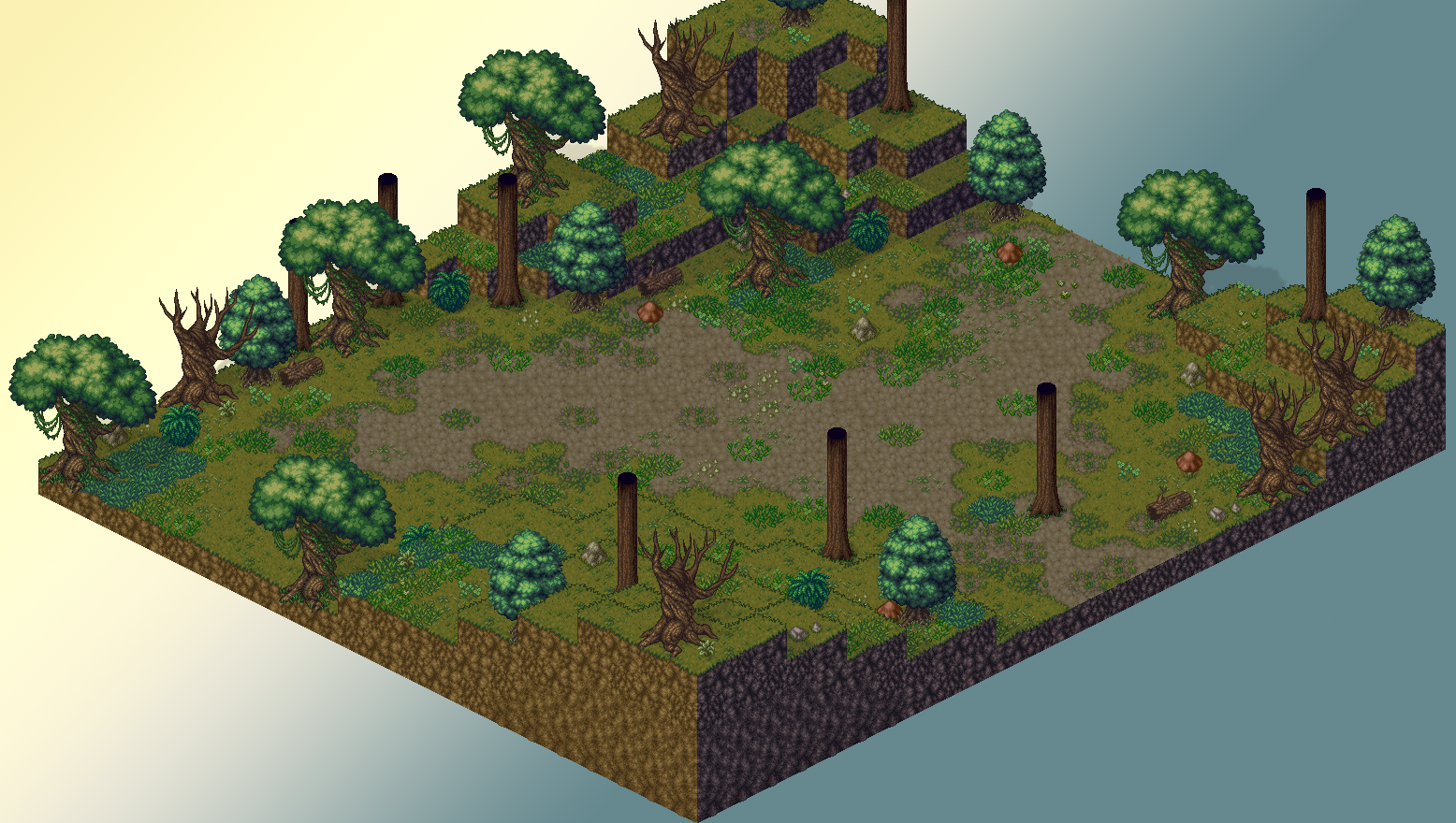 Tried to apply all the tips you guys gave - what do we think about this version? |
|
|
|
|
Logged
|
|
|
|
|
 Developer
