|
beetleking22
|
 |
« Reply #30880 on: February 24, 2016, 04:09:28 AM » |
|
Im so annoyed with these tiles.. It looks TOO flat and maybe too bright?  |
|
|
|
|
 Logged
|
|
|
|
|
de11ed
|
|
« Reply #30881 on: February 24, 2016, 05:24:02 AM » |
|
I love it, but it has more of a "facepalm" feeling than "oh noes I ded" feeling.
Thanks for the quick feedback! We get the idea...  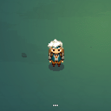 Haha brilliant! I agree with previous post here, the shadow should move as well when he turns, other then that, it looks awesome. |
|
|
|
|
Logged
|
|
|
|
|
Zanhuf
Guest
|
|
« Reply #30882 on: February 24, 2016, 05:46:03 AM » |
|
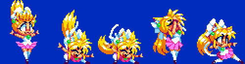
some duelyst 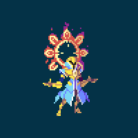 This is probably a really stupid question sorry, but how do you achieve the level of fluidity you have? Is it the number of frames, the speed of said frames? Your stuff is amazing and makes me want to animate yet all of my stuff remains stilted and slowish and whenever i speed it up, it has the problem of looking too fast. |
|
|
|
|
Logged
|
|
|
|
Pinqu!
Level 1

So it has come to this


|
|
« Reply #30883 on: February 24, 2016, 06:32:56 AM » |
|
 Moved from a 2 frame walking animation to 4 frames. Runs much smoother, but still not sure about the eyes :S |
|
|
|
|
Logged
|
|
|
|
|
Scut Fabulous
|
|
« Reply #30884 on: February 24, 2016, 06:35:17 AM » |
|
 smoother attack animation... I'm getting flashbacks of Knight Games on my C64! Great background art too. Nice and chunky clusters. |
|
|
|
|
Logged
|
|
|
|
|
TGHoly
|
|
« Reply #30885 on: February 24, 2016, 06:49:03 AM » |
|
 cameo appearance of a friend in my game. I had a lot of fun making these. @Batowski, that looks fantastic! I really like it! I can't think of anything to criticize on it, I just really like it! great colors, great design, etc kawaii! I love it. XD |
|
|
|
|
Logged
|
|
|
|
|
Canned Turkey
Guest
|
|
« Reply #30886 on: February 24, 2016, 10:17:33 AM » |
|
some duelyst This is probably a really stupid question sorry, but how do you achieve the level of fluidity you have? Is it the number of frames, the speed of said frames? Your stuff is amazing and makes me want to animate yet all of my stuff remains stilted and slowish and whenever i speed it up, it has the problem of looking too fast. It's both. Frames per second. If you animate at a higher fps your work will look smoother and more fluid, but you'll have to draw more frames. Also, gggfhhdh is a pixel God, so all their work looks incredible. Some tips you can pick up just looking at this pic: Don't move what isn't moving. Have you ever seen an idle animation where it looks like their dancing? It's because the artist moved everything each frame and made the animation too cluttered. Look at the legs in this loop. A bit of sub-pixel movement and one pixel moved on the knees. That's it. Also, adding areas of lesser movement naturally focus the viewers attention to the faster moving parts. When something is moving, move it. Don't just copy paste areas every frame, redraw and redraw again. Onion skinning is absolutely necessary. Look at the hands. If I'm seeing it correctly, there's only two moments where the hands are the same frame twice, full open and full closed. Secondary movement. Look at the dress/cloak thing. You'll notice it's animation oscillates twice throughout the entire loop. Slower or faster moving areas of animation really really spice up your work. |
|
|
|
« Last Edit: February 24, 2016, 10:26:59 AM by Canned Turkey »
|
Logged
|
|
|
|
HyMyNameIsMatt
Level 1
Vernal Edge
|
|
« Reply #30887 on: February 24, 2016, 11:34:18 AM » |
|
I forgot I was allowed to post art on the internet for a few years. Here's two Metroid inspired pics.   |
|
|
|
|
Logged
|
|
|
|
|
SolarLune
|
|
« Reply #30888 on: February 24, 2016, 12:38:19 PM » |
|
Pretty cool. I think you could do some stuff to break up the grid lines of the landscape - perhaps add some blocks that stretch over two tiles and break up the visual monotony a bit. Also, adding in some blank (black) space would probably be nice, too.
Anyway, nice work.
|
|
|
|
|
Logged
|
|
|
|
|
Batowski
|
|
« Reply #30889 on: February 24, 2016, 05:21:29 PM » |
|
cameo appearance of a friend in my game. I had a lot of fun making these. @Batowski, that looks fantastic! I really like it! I can't think of anything to criticize on it, I just really like it! great colors, great design, etc Thank you, your 'friend' is also very cute and cheeky. I love the hair especially! |
|
|
|
|
Logged
|
|
|
|
|
Conker
Guest
|
|
« Reply #30890 on: February 24, 2016, 06:15:40 PM » |
|
Everything looks awesome   |
|
|
|
|
Logged
|
|
|
|
|
Ashedragon
|
|
« Reply #30891 on: February 24, 2016, 07:59:45 PM » |
|
Everything looks awesome The perspective here is kind of weird. With the way things are drawn, you would expect to be able to see the side of that house on the left-most side. It's quite jarring to one's mind's eye. Cool style otherwise! I like your bushes, even though they seem to be sitting behind the ground rather than on it. |
|
|
|
|
Logged
|
|
|
|
|
Raku
|
|
« Reply #30892 on: February 24, 2016, 08:06:13 PM » |
|
Thank you, your 'friend' is also very cute and cheeky. I love the hair especially!
Thanks a lot! Meanwhile, a skull  |
|
|
|
|
Logged
|
|
|
|
DigitalSun
Level 1
Making Moonlighter!
|
|
« Reply #30893 on: February 25, 2016, 03:28:12 AM » |
|
I love it, but it has more of a "facepalm" feeling than "oh noes I ded" feeling.
Thanks for the quick feedback! We get the idea... Haha brilliant! I agree with previous post here, the shadow should move as well when he turns, other then that, it looks awesome. Thank you!  |
|
|
|
|
Logged
|
|
|
|
|
sonder
Guest
|
|
« Reply #30894 on: February 26, 2016, 02:27:30 PM » |
|
I'm working on a series of pixel art versions of my coworkers as 16-bit street fighter type characters. First 2 done, 9 to go, with maybe 2 unlockable past employees.  Ashley  Jay I'm trying to get better at pixel art ... these currently take me way too long, 6-7 hours. Hope to get to a point where I'm churning out fighter animations that are as smooth as some of the work I've seen on here! |
|
|
|
|
Logged
|
|
|
|
swordofkings128
Level 6

|
|
« Reply #30895 on: February 26, 2016, 04:11:18 PM » |
|
Oh wow kidfingers that is beautiful! It's so stylish... And that shading is wonderful, everything is so well defined, and the colors are great! Especially those fabric folds on Ashley!
|
|
|
|
|
Logged
|
|
|
|
|
Ishi
|
|
« Reply #30896 on: February 27, 2016, 05:34:49 AM » |
|
Im so annoyed with these tiles.. It looks TOO flat and maybe too bright? I think they look fantastic. Are you planning on combining them with a background? Might be worth adding that, and more tiles generally, before any more edits. |
|
|
|
|
Logged
|
|
|
|
mzn528
Level 2
Dark Souls, Berserk and Vagabond Ultimate Fanboy
|
|
« Reply #30897 on: February 27, 2016, 11:42:48 AM » |
|
smoother attack animation... I'm getting flashbacks of Knight Games on my C64! Great background art too. Nice and chunky clusters. Haha thanks for the good word! |
|
|
|
|
Logged
|
Noob Game Dev and Pixel Artist, twitter @mzn528  Soul Appeaser, a combat focused story rich ARPG DevLog |
|
|
|
Batowski
|
|
« Reply #30898 on: February 27, 2016, 03:13:22 PM » |
|
Meanwhile, a skull May I humbly suggest a different light source that is not so symmetrical? I think it would make the forms more interesting... |
|
|
|
|
Logged
|
|
|
|
|
Raku
|
|
« Reply #30899 on: February 28, 2016, 12:41:57 AM » |
|
May I humbly suggest a different light source that is not so symmetrical? I think it would make the forms more interesting...
Why thank you! I'll take that into account, and maybe try and make a different version! |
|
|
|
|
Logged
|
|
|
|
|
 Developer
