Welcome, Guest. Please login or register.

Login with username, password and session length

 
Advanced search

1411505 Posts in 69374 Topics- by 58429 Members - Latest Member: Alternalo

April 25, 2024, 08:52:03 PM

Need hosting? Check out Digital Ocean
(more details in this thread)
TIGSource ForumsDeveloperArtWorkshopPixel 2 hard.
Pages: [1] 2 3
Print
Author Topic: Pixel 2 hard.  (Read 6237 times)
Rat Casket
Level 10
*****


i can do what i want


View Profile WWW
« on: January 17, 2013, 09:11:17 AM »

After multiple failed attempts at getting a group of people together to make a game, I have decided "to hell with this, I'll fucking do it myself". I'm not much of an artist, and I've never created any pixel artwork of any kind. I have scribbled up a few things here and there, but there are certain things I know I'm missing. I just don't know what those things are or how to improve upon them.

I'm going to post various pieces here that I have been working on to get some pointers. I appreciate any help anyone has to offer.

This first piece is for my current project. A Castlevania ripoff. I want the main character to be stereotypically "heroic". A knight in shining armor that says things like "FIEND!" and "DOTH THOU" or whatever they say. In this first draft, I'm trying to compose his armor. I like the baggy pants and armored upper body. I also really want him to have a helmet of some kind that covers his face.


The current helmet looks more villainous than heroic, but I do want to keep the red tail on top because, well, I want to try and animate it.
« Last Edit: December 12, 2013, 12:40:05 PM by Rabbit » Logged

CVaseTYb!!
Guest
« Reply #1 on: January 17, 2013, 12:46:37 PM »

for a sprite that's going to move in a game my advice would be to work from a silhouette first - if you can't read the silhouette you probably won't be able to read the sprite on the screen either. get your shape, your pose, the way you want it and then work from there, considering the volume of your sprite as if it had 3 dimensions

this is even more helpful for animating the sprite. a good animation should be legible just from the changes in shapes

tl;dr : block shape, flat colors, shades, look, adjust

if you keep posting progress i'll try and keep posting 'advise'
Logged
Rat Casket
Level 10
*****


i can do what i want


View Profile WWW
« Reply #2 on: January 17, 2013, 04:49:37 PM »


A bit of a recolor, and minor tweaks. Still a WIP of course.
Logged

Rat Casket
Level 10
*****


i can do what i want


View Profile WWW
« Reply #3 on: January 17, 2013, 06:29:08 PM »


Checked out some Fire Emblem sprites to see how they handle armor, and they do so beautifully. Sort of stole the shoulder pad and glove. The other arm? Dunno yet. Pointing like the above picture I think.
Logged

Ridley
Level 0
***


View Profile
« Reply #4 on: January 17, 2013, 11:11:17 PM »

You're not getting a lot of response, so ignoring the fact that I apparently suck, and I'm probably going to start my own topic here, here's my two cents:

The black outlines have taken up space in the sprite. Making it stockier to accomodate for that change might be worth looking into. It's noticeable in that you did that with the left leg, but not the right. My eye was drawn to how much thinner/smaller the one on the right was, for a relatively short change in viewer-to-object distance. This is a minor nag, but it could clean up other areas of the sprite. Just toy around to see what proportions and style you want to get out of it.

I really like what it did to the torso, though. In addition to the shine on the left arm. You could try applying a similar disparity in the shading on the legs and boots. Also--and this is changing the character design somewhat, but if you want that consistency in contrast--maybe he could use shinier boots or greaves?

It looks like you're making improvements. The outline has given you an extra value that you do not have to sacrifice to the edge of the sprite anymore--you can really see a nice transition between the torso and head, because the neck is underneath the helmet, casting a shadow in the indented space, whereas before it was harder to seperate the two.

Keep it up. Smiley
Logged
Rat Casket
Level 10
*****


i can do what i want


View Profile WWW
« Reply #5 on: January 18, 2013, 07:02:04 AM »

Thanks for the input! Last night before bed I gave him a breast plate, and added some highlights to his boots and pants.

I'm keeping a gradient on him by putting the darker colors at the bottom. Something I picked up from a Valve design document. If it ends up not working then I will certainly brighten up his greaves. I'd like to try a whole new color palette in general so we will see what happens.

EDIT: I made this last night. Final sprite will probably be the one on the right.

« Last Edit: January 19, 2013, 11:24:57 AM by Rabbit » Logged

Ridley
Level 0
***


View Profile
« Reply #6 on: January 19, 2013, 01:51:08 PM »

Fantastic. The whole thing's really tied together, and he's got definition. I originally hadn't commented on the flatness of the first go, because some games like their characters to be two-dimensional. And I can't argue with the effect:


But cheers. You've done a great job with it. Sir Cristopher, hah.
Logged
Rat Casket
Level 10
*****


i can do what i want


View Profile WWW
« Reply #7 on: January 19, 2013, 02:22:44 PM »

Thanks man! I appreciate the input, as always.

I'm going to try to make his run cycle but I don't know where to start. Here is the sprite in its native size if anybody would like to give it a shot.

Logged

blinkok
Level 1
*


View Profile
« Reply #8 on: January 19, 2013, 03:56:51 PM »

this is a post from another forum which i have found invaluable in understanding walk/run cycles. it was posted by Dan Fessler, a very talented artist on this forum. in this instance he is helping someone refine his character and create a run cycle. if you see this dan, thank you very much for your help!

This will only focus on the main character today - tomorrow (hopefully) i'll get into color theory dealing with your background.

so without further ado....


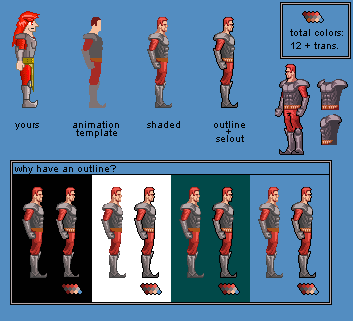
Well, first things first.  Lets talk anatomy.  Now i know that the style you were going for was cartoony, and that's fine.  But since i dont know how intensionally you did everything, I will show you the hard-core correct way, then you can vary off that path as much as you choose to.  In my version i've fixed the following; the head was too big, legs too stubby, pectorial muscels too saggy, you locked all of your limbs so i gave them a little bend, gave him a prince/knight like posture, and a few other minor things.  I'm sure that you catch on pretty quick, so i'm not going to spend any more time dealing with anatomy.  (PS i was just too lazy to draw that crazy hair due you have on that guy)

Alright - now lets talk artsy.  The first thing i noticed about your sprite is the retona burning amount of saturation...almost %100 saturation i think.  Generally speaking, things aren't ever that high in saturation except for controlled situations.  The basic color theory about game design goes as follows; background = low contrast, low saturation.... sprites = high contrast, high saturation.  I'll talk more about that later, but basically its just to make sure the user can always know the difference between his sprite and everything else cluttered around the screen without losing him constantly.  Now although i say sprites are supposed to have high saturation doesn't mean that it can be retna burning and still be okay.  Just lower the hue to be a bit more grey and you'll be fine.  In my version i raised the contrast, lowered the saturation a tad, and added an outline.

The second thing I noticed was your whomping 42 color count.  Thats just crazy.  I lowered the color count to 12 colors plus transparency.  if you notice, even though i have about a fourth the amount of colors you have- mine looks more detailed and shaded.  If you smart with colors, you can achieve this without too much hassle.  Also it makes replacing colors if you need to not nearly as hard.

the last thing that i did to make your character pop out from the background was add an outline.  if you look closely at the outline, its not a continuous black line.  In some areas where light would be hitting, i used a technique called "selout" or "selective outlining".  Learn about it here and any other pixel term you dont understand: (Selective Outlining)  As you can see - sometimes on different colored backgrounds (like you might find throughout various levels in a game) makes it hard to see the sprite distinctly unless it has an outline.  The outline is optional, and not all games use it, but i think you can benifit from it in your case.

Also notice how before i shaded the sprite, i 'blobbed' things in roughly.  This is how i will be animating the whole sprite.  Its generally not a good idea to animate a fully shaded sprite this complex - so instead, you do all of the frames in a simple manner and then shade each one individually.  this will make your animation look more fluid and non-mechanical.  This leads us to our next section - animation.


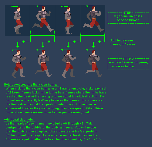
here we have alot of useful information.  Basically there are 3 steps in creating animation cycles. in step 1 you create base frames; or in this case - the 4 generic running poses that we all know.  In step 2 you create the 'tween' frames; or all of the ocward stuff the body does while moving from one generic pose to another.  In the last step you shade it.  I didn't complete step 3, but you'll get the idea.

Usually people get overwhelmed on the mechanics of how a run animation works, but in reality you dont need to know much.  Just by laying out the basic building blocks of base frames, all we have to do is look at the base frames before and after a tween in order to create a good seemless motion.  Alot of useful info is typed up in the pic itself, so i'll just let it do the talking.

Here is what my step 1 looked like when i was done with it, along with my step 2.


Its amazing to note the big difference it makes when you add the tween frames in.  Through the tweens opens the door to adding so much character and even emotion into the animation of your run to help 'define' who the character is.

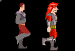
in closing, here is a final comparison to see how much difference these techniques have made in the overall product.  Might be useful for ya.


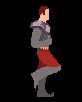
One last thing i'd like to say before i go to bed is just a quick thing about what defines a walk vs a run.  In games its much better to have the character always running because it makes the game feel more fast-pased and dramatic.  But what defines a walk vs run.  Certainly a run is NOT a sped up verson of a walk, right?  Heres a quick answer for you; When you walk, there is always at least 1 foot planted on the ground.  When you run, there are moments when both feet aren't even in contact with the ground.  Study the animation i made to see more clearly what i mean.

I have already started on the second half of my little critique session and i hope to have it up by tomorrow.  I hope this was helpful to you in some way shape or form.
Logged

My 2D Stuff twitter: @blinkok
Rat Casket
Level 10
*****


i can do what i want


View Profile WWW
« Reply #9 on: January 19, 2013, 05:01:50 PM »

Thanks man. This really helps a lot. I'm going to try for a 3/4ths run like Alucard in SOTN. Not as elaborate of course.
Logged

ANtY
Level 10
*****


i accidentally did that on purpose


View Profile WWW
« Reply #10 on: January 20, 2013, 04:41:17 AM »

awesome post u pasted here blinkok, thanks for this Smiley

good luck with ur run animation Rabbit  Hand Thumbs Up Right
Logged

Rat Casket
Level 10
*****


i can do what i want


View Profile WWW
« Reply #11 on: January 20, 2013, 12:43:52 PM »

I'm having trouble with this because the resolution of the sprite is so small. I've sketched our the run cycle and its pretty solid, but once I try to put it into pixels it just fails miserably.

Maybe I should remove the black outline. That may help. Or, increase his overall resolution. I also need some sort of idle animation. Though, I've no idea what to do. Some sort of breathing effect? But I guess it isn't entirely necessary since you're constantly moving in the game.

Animations to make!
  • Jump
  • Fall
  • Run
  • attack
  • hurt
Logged

Ridley
Level 0
***


View Profile
« Reply #12 on: January 20, 2013, 01:02:39 PM »

In regards to a fighter's idle animation, I would think that he should be ready for combat, since he's a knight and everything. What that usually translates to is the legs buckling slightly as the torso moves back and forth, holding a weapon down and forward. It could be two-handed, like a polearm of some kind, or just a sword in one hand. If you want him to look really trigger-happy (figuratively, of course) he could twirl the sword when he moves back, or make feint stabs when he moves forward.

Even simple animations can convey character:

I don't really have any advice for the others. But that characterization bit should at least help somewhat. Oh, and making checklists for yourself is a good thing.

Good luck!  Smiley
« Last Edit: January 20, 2013, 05:19:14 PM by Ridley » Logged
Rat Casket
Level 10
*****


i can do what i want


View Profile WWW
« Reply #13 on: January 20, 2013, 03:35:17 PM »

He actually wont be holding a weapon of any kind until he attacks. I'm doing it this way so I can easily create different weapons for the player to use without doing a lot of extra sprite work.

Basically, when he attacks, he will swing his arm out much like he would if he were holding a sword, and the weapon will appear in front of him. It might be cool to make the weapon sort of floating behind him, gently bobbing up and down when idle. Hmmmmmmm.
Logged

kiddRaddical
Level 0
***

ALT UNIVERSE SEGA SATURN DEV


View Profile WWW
« Reply #14 on: January 20, 2013, 04:32:39 PM »

After multiple failed attempts at getting a group of people together to make a game, I have decided "to hell with this, I'll fucking do it myself". \

This quote is my entire life  Cheesy

I really like your pixelling; keep it up! Suggestion: not sure if you're familiar with color theory, but if not, it's one of the easiest ways to really up the graphical ante without getting uber techical. Basics: http://www.smashingmagazine.com/2010/01/28/color-theory-for-designers-part-1-the-meaning-of-color/
Logged

posting (too) regularly on Twitter: @EthanRedd
EthanRedd.com
Rat Casket
Level 10
*****


i can do what i want


View Profile WWW
« Reply #15 on: January 20, 2013, 11:08:08 PM »

After a full weekend of trying to animate this thing, I have nothing to show for it. Art is hard. I'm going to lay face down on the floor and moan loudly until I pass out.
Logged

blinkok
Level 1
*


View Profile
« Reply #16 on: January 20, 2013, 11:11:54 PM »

Maybe try vector art and then move on the pixel art
Logged

My 2D Stuff twitter: @blinkok
Joshua
Level 5
*****


Be rad to one another!


View Profile WWW
« Reply #17 on: January 21, 2013, 08:01:23 AM »

After a full weekend of trying to animate this thing, I have nothing to show for it. Art is hard. I'm going to lay face down on the floor and moan loudly until I pass out.
This is a normal feeling when learning animation. Don't give up, maybe start with a smaller sprite to animate?
Logged

Rat Casket
Level 10
*****


i can do what i want


View Profile WWW
« Reply #18 on: January 21, 2013, 08:35:34 AM »


I had thought about doing this and animating them sort of like paper dolls. Definitely a possibility.

After a full weekend of trying to animate this thing, I have nothing to show for it. Art is hard. I'm going to lay face down on the floor and moan loudly until I pass out.
This is a normal feeling when learning animation. Don't give up, maybe start with a smaller sprite to animate?

I'm going to start with a whole new sprite I think. One that is much less complex and see where that gets me.
Logged

ANtY
Level 10
*****


i accidentally did that on purpose


View Profile WWW
« Reply #19 on: January 21, 2013, 09:09:29 AM »

When I tried making pixel art for the first time (and I didn't even know that it's pixel art back then in 2009) I just used MS Paint but I restricted the size of sprites to 32x32 and they were simpler to animate (I guess my animations weren't top quality but still)

looked like this


try simpler and smaller sprites me thinks
Logged

Pages: [1] 2 3
Print
Jump to:  

Theme orange-lt created by panic