|
Nix
Guest
|
 |
« Reply #7200 on: March 25, 2012, 02:11:58 PM » |
|
It looks like the clouds are the only example of finer detail in the far background. You could add some photographed trees, add some detail to the mountains, etc. I like the effect of the clouds, and I think you could do more.
|
|
|
|
|
 Logged
|
|
|
|
|
Jared C
|
|
« Reply #7201 on: March 25, 2012, 02:22:20 PM » |
|
Are you sure it isn't the other way around? Why would you be able to see more detail further away rather than close up?
You would think so! I was confused by this too at first, but nay, it is the other way around. I think it has something to do with how we process information; business gets lost when there are bolder forms to draw your attention. I'm sure it's also a product of contrast; when everything is hectic your eye looks for a place to rest, and when everything is simplified or flat your eyes are drawn to the most detailed area. Someone please correct me if I'm wrong! I'm happy to learn something new. Nix@ Yes, you can always push ideas further. I'll keep in mind exaggerating the idea next time, but for now I wanted to keep everything somewhat simple. In this case I think, less is more. |
|
|
|
|
Logged
|
|
|
|
|
Jared C
|
|
« Reply #7202 on: March 25, 2012, 02:45:53 PM » |
|
Ah, cool, thanks Mr.Verdon! I've only taken 1 proper art class so there are lapses in my understanding of theory. More stuff: 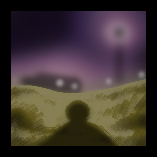 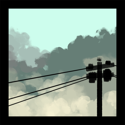 |
|
|
|
|
Logged
|
|
|
|
|
Nix
Guest
|
|
« Reply #7203 on: March 25, 2012, 02:54:37 PM » |
|
Ah, cool, thanks Mr.Verdon! I've only taken 1 proper art class so there are lapses in my understanding of theory.
Oh, I thought you were intentionally doing it backwards for effect |
|
|
|
|
Logged
|
|
|
|
|
Nate Kling
|
|
« Reply #7204 on: March 25, 2012, 05:21:22 PM » |
|
 Illustration for a new game Ill be releasing soon! |
|
|
|
|
Logged
|
|
|
|
|
Franklin's Ghost
|
|
« Reply #7205 on: March 25, 2012, 08:12:09 PM » |
|
That's great Nate. loving the visual vibe it gives out.
|
|
|
|
|
Logged
|
|
|
|
|
cubodegelo
|
|
« Reply #7206 on: March 26, 2012, 01:30:09 PM » |
|
|
|
|
|
|
Logged
|
|
|
|
|
JMickle
|
|
« Reply #7207 on: March 26, 2012, 02:18:14 PM » |
|
|
|
|
|
|
Logged
|
|
|
|
|
mono
|
|
« Reply #7208 on: March 27, 2012, 04:05:49 AM » |
|
Maybe today is the the day that I take on Shadow of the Colossus. I have had it on my shelf for the longest time. |
|
|
|
|
Logged
|
|
|
|
|
|
|
unsilentwill
|
|
« Reply #7210 on: March 27, 2012, 07:50:30 AM » |
|
Welcome to the third dimension. Choose a light source and enjoy your stay.
|
|
|
|
|
Logged
|
|
|
|
|
|
|
:^)
|
|
« Reply #7212 on: March 27, 2012, 11:31:32 AM » |
|
I MADE AN 1920x1080 WALLPEPAR
(click image to get the zip) It's the image I made in blender/photoshop to make this. |
|
|
|
« Last Edit: March 27, 2012, 11:49:10 AM by peanutbuttershoes »
|
Logged
|
|
|
|
Armageddon
Level 6


|
|
« Reply #7213 on: March 27, 2012, 06:53:52 PM » |
|
My failed attempt at drawing an epic vista.  @peanutbuttershoes, I love it!  Can you make one with the text? |
|
|
|
« Last Edit: March 27, 2012, 07:00:10 PM by Armageddon »
|
Logged
|
|
|
|
|
Ishi
|
|
« Reply #7214 on: March 28, 2012, 01:46:36 PM » |
|
This is a bit overworked probably but I like to do multi-day things occasionally.  The pose is a bit silly, the idea being it's a magazine photoshoot.  |
|
|
|
|
Logged
|
|
|
|
|
Gauss Jordan
|
|
« Reply #7215 on: March 28, 2012, 01:51:36 PM » |
|
That's so beautiful Ishi!
|
|
|
|
|
Logged
|
Lefty-concepty, righty-pixley, but bothey programmey.
|
|
|
|
|
|
Geti
|
|
« Reply #7217 on: March 28, 2012, 08:34:31 PM » |
|
 Paintover of a quick sculpt to work on getting facial topology under control rather than winging it more than I should. On that note, the nose is kinda funky and the line of the cheek probably goes back too far. 16 colours, mostly a huge skin ramp with the green-grey in there and 2 blues for the hair-tie thing. Not really pixel work considering the size of the brush I used. Was an excuse to work on painting and sculpting in a study break. |
|
|
|
|
Logged
|
|
|
|
|
petra
Guest
|
|
« Reply #7218 on: March 29, 2012, 01:20:55 AM » |
|
Here is a character I keep drawing a lot lately. This latest rendition is pretty No Face inspired.  I have a tendency to work really fast when drawing on paper which evidently may not be the best technique when using black pen, haha. I tried to make a slightly cleaner version but it still has mistakes. I kind of like the charm that that haphazardness of the first one holds, but I digress!  EDIT: Just gave this another try. My hands are crying.  |
|
|
|
« Last Edit: March 29, 2012, 02:22:46 AM by Rhubarb »
|
Logged
|
|
|
|
|
ANtY
|
|
« Reply #7219 on: March 29, 2012, 01:49:02 AM » |
|
This is a bit overworked probably but I like to do multi-day things occasionally. The pose is a bit silly, the idea being it's a magazine photoshoot. At first sight it looks good, but when u look closely at the face it's really odd. |
|
|
|
|
Logged
|
|
|
|
|
 Developer
