|
wizardfu
|
 |
« Reply #20 on: March 02, 2015, 08:16:11 PM » |
|
Thx!
|
|
|
|
|
 Logged
|
|
|
|
|
|
|
bounds
|
|
« Reply #22 on: March 03, 2015, 11:26:02 PM » |
|
You know what? You got me thinking a little more devil-may-care. I'm at least going to add some rad buzzing noises!
Love it! Here's just hoping I won't end up being the ass who suggested something that ended up with you getting sued ... but I think I can recall a gazillion animes from my younger days where they were swinging buzzing laser sword thingy's. Good luck on GDC! |
|
|
|
|
Logged
|
folks out there might think I'm crazy, but I've got to rescue Daisy!
|
|
|
|
wizardfu
|
|
« Reply #23 on: March 04, 2015, 01:00:21 AM » |
|
No worries. It won't be so light-sabery that Disney would want to do that. GDC is turning out to be pretty fun. Had cake, beer and met a ton of other developers without even having a ticket. Would be nice to see some of the talks tho. Maybe next year.
|
|
|
|
|
Logged
|
|
|
|
|
Juwdah
|
|
« Reply #24 on: March 04, 2015, 05:17:40 AM » |
|
Today Songbringer gets a nifty parallaxed title menu screen. This 256 color GIF doesn't do it justice, but here's sort of how it looks: Looking forward to doing the music for this one...  The intro looks great and then suddenly BAM ugly title, is that going to change? |
|
|
|
|
Logged
|
|
|
|
|
wizardfu
|
|
« Reply #25 on: March 04, 2015, 08:23:58 AM » |
|
Hey Judwah, thanks for sharing your opinion. I'd love to improve the title. Can you tell me how you think it can look better so I can keep that in mind for the next revision? Working on it today.
|
|
|
|
|
Logged
|
|
|
|
|
and
|
|
« Reply #26 on: March 04, 2015, 02:05:37 PM » |
|
Just commenting to follow - and also to mention how awesome it's looking so far!
|
|
|
|
|
Logged
|
|
|
|
|
Zorg
|
|
« Reply #27 on: March 04, 2015, 05:46:19 PM » |
|
[...] I'd love to improve the title. Can you tell me how you think it can look better so I can keep that in mind for the next revision? Working on it today. You could go with a font which looks mediaeval/gothic/celtic/old instead of techo/sci-fi/80s (no offense).  For example:  |
|
|
|
|
Logged
|
|
|
|
|
and
|
|
« Reply #28 on: March 05, 2015, 03:58:58 AM » |
|
[...] I'd love to improve the title. Can you tell me how you think it can look better so I can keep that in mind for the next revision? Working on it today. You could go with a font which looks mediaeval/gothic/celtic/old instead of techo/sci-fi/80s (no offense). For example: 100% agree with this - that looks a lot better I reckon |
|
|
|
|
Logged
|
|
|
|
|
crusty
|
|
« Reply #29 on: March 05, 2015, 02:42:21 PM » |
|
stop drobth shut em down open up shop
|
|
|
|
|
Logged
|
|
|
|
|
wizardfu
|
|
« Reply #30 on: March 05, 2015, 06:47:05 PM » |
|
I'm glad you guys are sharing your opinion on the title. Can you articulate why you like the medieval font better? If you can outline what it is that you like more, it would really help me to draw something better. What are your reasons? As it stands, I really love the sci-fi title and it also fits better with the story and what I have in mind for cutscenes, items, enemies and level art. Here's a better pic of the title for reference: 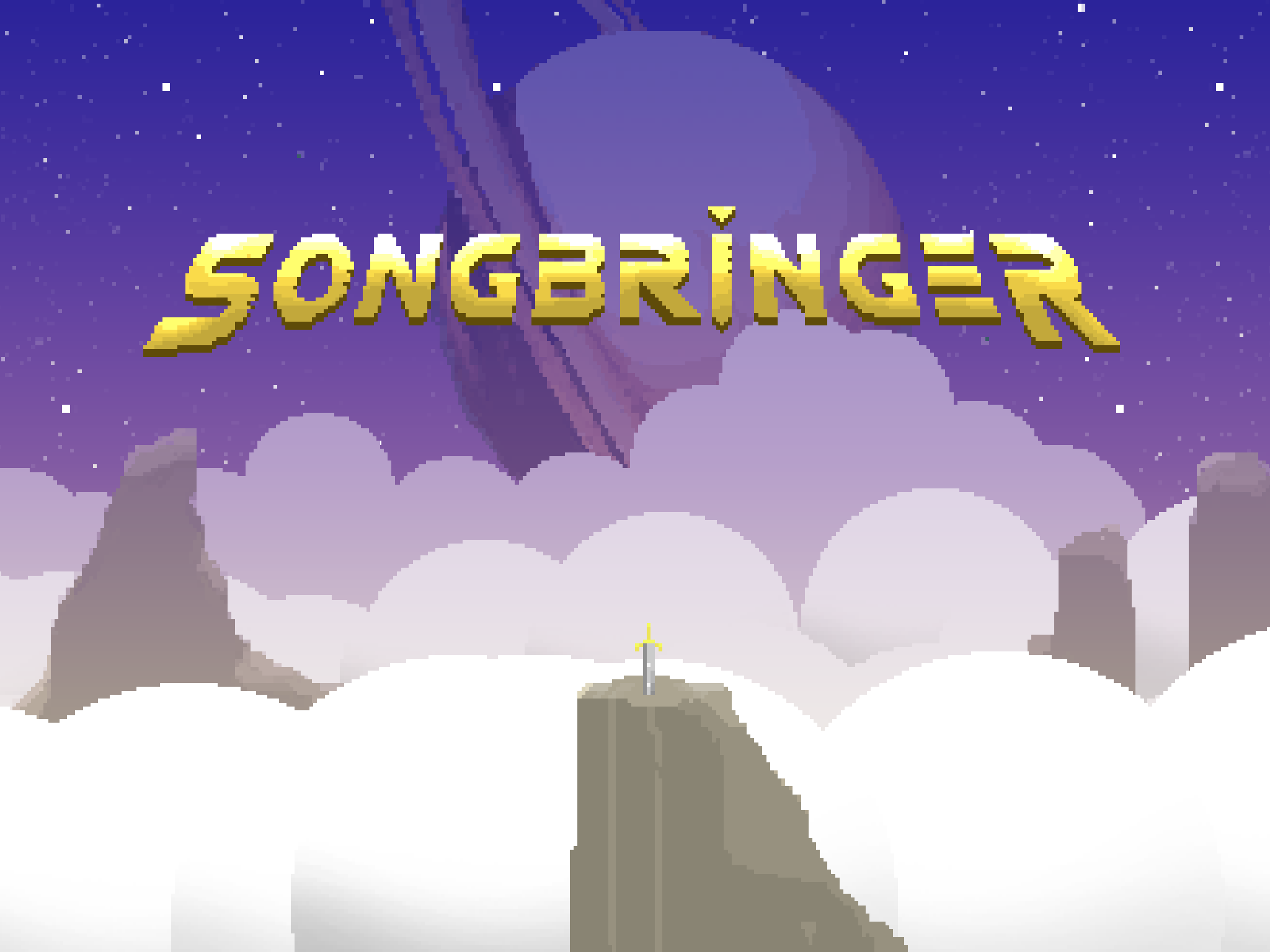 |
|
|
|
|
Logged
|
|
|
|
Octopus Tophat
Level 1


|
|
« Reply #31 on: March 05, 2015, 07:02:53 PM » |
|
I like the style of the title, but I think the shading could be changed. It seems like it's just too dark in places. Like, I don't really understand the shading on the N's. I think you could brighten it up a bit. Use more of that bright yellow! The particular font you're going with is totally fine. And cool. Hope I helped  Edit: The B and the R are brighter than the other letters, but the other letters should be just as bright. |
|
|
|
|
Logged
|
|
|
|
|
wizardfu
|
|
« Reply #32 on: March 05, 2015, 07:40:37 PM » |
|
Ahhh. Cool. Now I get it. Yep. That was intentional to make it look metallic, yet it was drawn originally under different lighting. I will go back and do another revision. Thanks!
|
|
|
|
|
Logged
|
|
|
|
|
Zorg
|
|
« Reply #33 on: March 06, 2015, 02:38:37 AM » |
|
Sorry about that medieval font suggestion, if your game is sci-fi the logo should be sci-fi, too. Like Octopus said, one point is the shading. It looks like the standard photoshop bevel effect with black as shadow color. You should not use pure black, because it will result in a gray-ish, muddy, color. I'm not sure if you really need the bevel shadow, because you already have that 3D shadow. At least it would greatly improve the legibility.  Another point is the typography. The open letter forms of the B, R and E scream (retro) sci-fi (to me), while the other letters look pretty standard sans-serif, without anything special. Except for the I, which is a great detail imho. It would be good if you would not need the exaggerated forms because every letter had fine, subtle details instead. It's a matter of personal taste, of course.  |
|
|
|
|
Logged
|
|
|
|
|
and
|
|
« Reply #34 on: March 06, 2015, 03:33:05 AM » |
|
For me, the font is just personal taste but I can see why you'd want a sci-fi style!
The zoomed in image makes it a lot clearer. I think it's the shading that looks a bit off. It looks quite dark and muddy and it looks a lot less pixelly than the rest of the art (if that makes sense).
|
|
|
|
|
Logged
|
|
|
|
|
wizardfu
|
|
« Reply #35 on: March 06, 2015, 02:40:58 PM » |
|
Ahhh. Very good feedback you guys! Will probably stick with the open letter forms, but after a final shading choice is arrived at I will go back and play with all the pixels again, maybe trying for a more subtle effect. Okay, playing around with a few options here: 1. The top one. Cleaner shading, 16 colors, brighter midtones. 2. The middle one. Cleaner shading, 32-bit color, darker midtones. 3. The bottom one. Less bevel, 32-bit. BTW, is there a way to make images on Tigsource retina friendly? I wish you guys could see the pixel-perfect versions rather than these scaled, slightly fuzzy things.  |
|
|
|
|
Logged
|
|
|
|
Octopus Tophat
Level 1
|
|
« Reply #36 on: March 06, 2015, 03:35:54 PM » |
|
I'm gonna vote for number 1! There's not much to say really.... I just like it It's shiny |
|
|
|
|
Logged
|
|
|
|
|
Zorg
|
|
« Reply #37 on: March 07, 2015, 04:25:41 AM » |
|
Same here. (Because: 2. too hard contrast 3. too saturated) |
|
|
|
|
Logged
|
|
|
|
|
jamesflanaganmusic
|
|
« Reply #38 on: March 07, 2015, 08:23:08 AM » |
|
Perhaps its the somewhat ordinary 'falling animation' to the titles that's the issue? Since they seem to be rendered with the in-game engine, you could make them more dynamic, i.e, slowly rotating characters that fall in from the foreground, etc.
|
|
|
|
|
Logged
|
|
|
|
|
wizardfu
|
|
« Reply #39 on: March 07, 2015, 12:03:35 PM » |
|
Cool. Glad we all agree on the title choice. I like #1 too.  @james: Good suggestion. There is already a new animation going on that I'm pretty happy with. Will post later on. In the meantime, here's a look at a little scene meant to visualize the procedural generation of the world. The game takes a mega seed entered by the player and procedurally generates the overworld and dungeons, tile by tile (true random generation, not just an arranging of rooms). This little visualization takes the mega seed and uses it to generate and animate these squares. This only happens once when the player creates a new save game slot. |
|
|
|
|
Logged
|
|
|
|
|
 Community
