Welcome, Guest. Please login or register.

Login with username, password and session length

 
Advanced search

1411505 Posts in 69374 Topics- by 58429 Members - Latest Member: Alternalo

April 25, 2024, 06:49:09 PM

Need hosting? Check out Digital Ocean
(more details in this thread)
TIGSource ForumsCommunityDevLogsSUPER MEGA BEST CAT ADVENTURES
Pages: 1 2 3 [4] 5 6
Print
Author Topic: SUPER MEGA BEST CAT ADVENTURES  (Read 22731 times)
supermega_peter
Level 1
*


cool


View Profile WWW
« Reply #60 on: April 06, 2016, 11:14:34 AM »

I was asked earlier about how I generate the maps in the game, so I thought I'd share a few notes about how I do it!


The map generator is a little complicated - I use arrays liberally. Firstly, I have a big 2-dimensional array, in each cell there is a single character representing either a wall, or a room, or a corner. It is structured something like this:

Code:
+-+-+-+
|O|O|O|
+-+-+-+
|O|O|O|
+-+-+-+
|O|O|O|
+-+-+-+

So a 'O' character represents a room that the player can enter, '|' is a vertical wall, '+' is a wall corner, and '-' is a horizontal wall. When I'm drawing the maze, or creating the doors to a room, I look at this grid to see where the walls and doors should be.

I chose a quite visual format so that debugging the array would be easier, I can just dump the contents to a text file and see what is there, and it should represent a maze perfectly. I literally couldn't recommend this approach more, it has been extremely helpful being able to just print the output to screen or to a log.

When I make a randomly generated maze, I pick a random length and width of array to use, and fill it full of a maze template like that above. I then pick a random point in the maze to start from, and then work my way around it, adding and removing walls to make an interesting structure that fills the grid.

The end result might look something like this:

Code:
+-+-+-+
|O O|O|
+-+ + +
|O|O O|
+ + +-+
|O O O|
+-+-+-+

So, still perfectly human readable, this time the space characters mean that there's a door there that the player can move through.

Now, the great part of having this all loaded into arrays and generated at runtime, is that if I ever feel like changing the structure of the maze in-game, it's a piece of cake! I can just write a different character to the array and then when I come back to this room it will have remembered the state of the room! So I could knock out a wall at the top left corner to let the player move down, just by changing my array to the below:

Code:
+-+-+-+
|O O|O|
+ + + +
|O|O O|
+ + +-+
|O O O|
+-+-+-+

Interesting!

I use arrays of various kinds for lots of other things too, such as storing the content of each room, and the list of enemies present in each room, and some information about those. These are generated randomly at run-time too, so the player should have a different experience each time. I've not quite nailed down the routines that decide how each room should be populated, but the room save/load mechanisms are there and functional, and there's a placeholder 'fill-the-rooms' function.

Hope that was enlightening!
Logged

supermega_peter
Level 1
*


cool


View Profile WWW
« Reply #61 on: April 09, 2016, 02:25:46 AM »

Just realised I never got round to posting a load of my other psychedelic imagery experiments here!

So... here we go!


I'm planning on layering and experimenting further with these for my trailer to push them even further!
Logged

and
Level 6
*


View Profile WWW
« Reply #62 on: April 19, 2016, 01:37:44 PM »

I love that weird tunnel thing!

There is no way I'll be able to play this on a hangover though will I?
Logged

Cranktrain
Level 4
****


making gams


View Profile WWW
« Reply #63 on: April 19, 2016, 03:35:21 PM »

There is no way I'll be able to play this on a hangover though will I?

Perhaps this is the cure for hangovers?

No, I don't think so either.

Glad the game is still looking mad, psychedelic, and mad again.
Logged

ElkiwyDev
Level 0
***


View Profile
« Reply #64 on: April 19, 2016, 11:55:23 PM »

Holy cow this game looks so rad in a very very silly way... I love it!  Shocked
Logged

Follow me and Project_BuildTutto by clicking any of these links: Discord Server: https://discord.gg/mSCn4BUYouTube channel for Timelapses: https://www.youtube.com/channel/UC2l3kcw6wUn4Z1-cr5UMLMw
Moth
Level 4
****


View Profile WWW
« Reply #65 on: April 20, 2016, 12:06:18 AM »

Love how this game is looking!

You know you can actually draft up a Kickstarter campaign page in Kickstarter itself? You can work on one there and link it here for us to preview without making the campaign go live!
Logged

and
Level 6
*


View Profile WWW
« Reply #66 on: April 20, 2016, 04:00:08 AM »

Love how this game is looking!

You know you can actually draft up a Kickstarter campaign page in Kickstarter itself? You can work on one there and link it here for us to preview without making the campaign go live!

I would second that this is a good idea. My Kickstarter page isn't great, but it's a hell of a lot better than it would have been without all the feedback!
Logged

supermega_peter
Level 1
*


cool


View Profile WWW
« Reply #67 on: April 20, 2016, 09:46:48 PM »

Thanks so much for the lovely comments everyone!

You know you can actually draft up a Kickstarter campaign page in Kickstarter itself? You can work on one there and link it here for us to preview without making the campaign go live!

This is a great idea, I'll get my next draft up soon and then share it here, thanks!

I hit a little milestone last week, and made this little GIF to celebrate.. 100 twitter followers woo!


here is my twitter if you wanna join in with the cool people
Logged

supermega_peter
Level 1
*


cool


View Profile WWW
« Reply #68 on: May 13, 2016, 02:47:35 AM »

update #016 - 13/05/16

Hello again everyone!

I've been working hard on the design, layout, and content of the Kickstarter for the last couple of weeks. This has included a lot of research and a lot of reading. I'm really happy to say that I think I've nailed the reward structure now, I've got 12 planned tiers that are a bit different to my last budget post, I'm excited to share those soon! That will be the content of my next blog post, so stay tuned!

With that simmering away nicely, here's what I've been cooking up recently... (OK, kitchen metaphors for some reason?? i don't know)

In one section of my Kickstarter pitch, I want to talk about various aspects of the gameplay. I thought it would be nice to include some sparkly graphics to represent the various implemented power-ups, and what they do. I decided to re-design them, as the old designs were supposed to be place-holders. They previously were very similar in design to those in Llamatron, which whilst a key inspiration I'd like to make sure I'm distancing myself a little from visually.


Swirl experiments!

After a little play in GIMP I came up with these interesting swirling graphics, I thought they matched the psychedelic feel I'm leaning towards, and the dual colour palette lended itself well to having multiple swirl types, so a consistently readable 'power-up item' base that I could add symbols to to represent different things.

As I said, I was making these with Kickstarter in mind, so here's a sneak preview of the artwork I'm going to use on the Kickstarter page to describe them. The font I use is my custom one that I've designed for this project. I created it to look readable on low resolutions, with a base letter size of 3x5 pixels, though some larger letters (M, W) are 5x5 pixels.


The new 'speed up' power-up design


The new 'damage up' power-up design

I realised that perhaps the scale of the re-designed icons were perhaps a little large for the game, so decided to mix it up a little with the other power-up illustrations, and decided to be a little illustrative, just for the Kickstarter. I think the best design process is one with mixed experimentation and iteration, and so I'm happy to just push things about a little before refining them for the perfect in-game result. I often stumble across more interesting designs this way, so sometimes it's OK to make something that isn't perfect the first time. That said, I think these look pretty good and am very happy with them as assets for the Kickstarter.


bomba bomba bomba


i love u


kittens


ricochet!! oh, yes i drew that bullet animation by hand frame by frame, yes it was probably not the best way to do it, yes i didn't realise how many frames it was going to take (like 60 or something), no i don't mind cause i like it


Whilst planning out and drafting the Kickstarter, I found it difficult to create the text content without the imagery to both inspire me and also frame what I was writing. Instead of spending a lot of time creating high quality image content straight away, I made and used quick sketch versions to pad out my writing. This was great because it meant I could quickly change my mind after seeing that a certain image/text combination wouldn't be that great, and helped me push forward much faster. Plus it was super fun to draw like that. Here's a two examples:


Everything is slowly but surely coming together, I'm starting to get pretty excited about running the Kickstarter soon! I plan to follow this up in the next few days with some more detail about my decisions on the Kickstarter reward structure, and my reasons for changing quite a lot about it. In the meantime, I hope this was an interesting insight into what's going on with the project right now!

As ever, post here or catch me on Twitter if you'd like to message me about anything!
Logged

and
Level 6
*


View Profile WWW
« Reply #69 on: May 13, 2016, 09:37:31 AM »

Looking forward to the Kickstarter and I love the banners! One of my biggest regrets was not making the campaign page as good as it could have been, so I definitely think the more time you can spend on that, the better.

Good luck!
Logged

supermega_peter
Level 1
*


cool


View Profile WWW
« Reply #70 on: May 13, 2016, 09:40:34 PM »

Thanks And! I've been working hard on my campaign page, still a little way to go to get it fully fleshed out.. then it's time to make the video too.. (!)

Whilst it's good to make the project as good as possible, there's a good argument for finding balance if I ever want to actually run the KS!
Logged

and
Level 6
*


View Profile WWW
« Reply #71 on: May 14, 2016, 12:23:41 AM »

True, that's what I ended up doing. Just picking a date once I was happy enough with it
Logged

Gamedragon
Guest
« Reply #72 on: May 14, 2016, 12:54:41 AM »

This is a legitimately awesome game. It might actually become the first Kickstarter I back if you get one up and running.
Logged
supermega_peter
Level 1
*


cool


View Profile WWW
« Reply #73 on: May 17, 2016, 11:47:16 PM »

This is a legitimately awesome game. It might actually become the first Kickstarter I back if you get one up and running.

Wow! Thanks so much for saying so! I'm excited to say that it's not a case of "if I get one up and running", it's now just a "when I get one up and running"!

Things are going well in the preparation, as always everything takes time Smiley

As a tiny progress update, I've continued making some more animated images for the Kickstarter this morning on my fortnightly commute to London.


I'm super pleased with how well this GIF loop turned out!
Logged

supermega_peter
Level 1
*


cool


View Profile WWW
« Reply #74 on: May 26, 2016, 09:21:06 PM »

I spent a little time earlier this week re-designing the logo for the game, as when I was producing assets for the Kickstarter the old version didn't quite look sharp and crisp enough at different resolutions.

Here is the original title:


And here is the new version!


I took the opportunity to also add 2 little details that fit better with the vision I have for the project.

A great suggestion from Phil Duncan of Ghost Town Games (working on the wonderful looking Overcooked) was to let the hanging 'p' in 'super' cut through the border with a little spacing, and Matt Luard (creator of The Cat Machine/) made the eye opening point that "it's a title that needs to be shouted", which made me think of adding the playful three exclamation marks at the end.

And then of course I made it flash and stuff

Logged

and
Level 6
*


View Profile WWW
« Reply #75 on: June 08, 2016, 06:16:22 AM »

How long until the Kickstarter now?
Logged

supermega_peter
Level 1
*


cool


View Profile WWW
« Reply #76 on: June 13, 2016, 09:33:26 PM »

Hey And, sorry to take so long to reply, I kind of avoided it because I didn't want to say that I wasn't sure!

However, I'm replying now to say that anyway, sigh. I'm pushing to do it as soon as possible; not until after the E3 dust has settled but I very much hope at the end of this month. I've been getting up really early to work on stuff every day in the morning, and I've got a good chunk of time set aside this weekend to hopefully make some good progress.

Things are always moving forwards! I am happy with most of the art assets now; the text for the 'story' has come together well, and I'm satisfied with my reward tiers and descriptions.

So looking back on it, I'm a lot closer than I've ever been...! Still the project video to make though!


I'm getting close to having the KS page ready to share if anyone would like an early preview, comments and suggestions will be very, very helpful!
Logged

supermega_peter
Level 1
*


cool


View Profile WWW
« Reply #77 on: June 14, 2016, 09:12:13 PM »

Over the last couple of weeks, I've been continuing to work on the assets for Kickstarter. I've been finalising the banners to go in my 'story' (essentially the project description). These are great for brightening up what might otherwise seem a big chunk of text, and allows me to really inject some life into the page. Here's a flavour of how the look of one graphic evolved from a rough sketch into the final design.

As I was writing my first draft of the Kickstarter, I found it super helpful to put some sketchy placeholder headers into the text to give me a clearer idea of the flow of what I was saying. I'm a visual person, so doing things like that helps keep me focused. I didn't want to spend too much time on these, the idea was just for it to be a visual aid and I wasn't planning on showing it to anyone! (oh)


Maybe I should have just used this

After a while, it came the time to replace the crude but functional design above with a shiny super-mega-best version. The design aesthetic of SMBCA could be summarised as 'All the colours, all the time', so I set about realising the animated rainbow background that I had in mind.


My first design, complete with scrolling background and high contrast black and white text chosen so as to pop-out from the background. A good start, but I wanted to add a bit more pizazz to it, with some nice 'on-brand' strobing effects.


I wanted to try a subtle flashing pale highlight around the black text, as I thought the high contrast in the black text and white out line looked good and I wanted to preserve it. I also took out every other frame of the rainbow animation to reduce the size of the GIF by 50% as it was already over 1.3MB and I don't want the Kickstarter page to load too slowly. My target for images on the page is between 0.5-0.8MB per image maximum. I could have reduced the framerate of the animation by 50% so that it scrolled at the same speed as before, but I preferred the faster movement.


Added a similar, but darker, hue shift on the black text. This was my 'vision' for this graphic, but I felt it didn't pack enough punch.


Following the design principles Super Mega Best Cat Adventures a bit more closely, I pushed the colours to max-saturation and my favourite 6 step palette, with the 'opposite' colours used for the outlines of the text. To explain what I mean about the colour palette, I've made this little diagram..


Max saturation colours, with their complementary partners below

The UI and in game text uses these six colours, rapidly switching between them. It's an old trick, but using the complementary colour opposite in the colour wheel to the chosen colour really makes the text pop out of the screen.


Added a border to frame the image. Lovely! I'm going to make all the headers for the descriptive sections of my project look like this!

I'm slowly but surely making some progress on the Kickstarter front - I can share the draft here soon if people would like an early preview!

Thanks for reading, let me know if you've got any thoughts, comments, or questions!

X
Logged

bittwyst
Level 1
*


Twitter: @bittwyst


View Profile WWW
« Reply #78 on: June 15, 2016, 03:31:15 AM »

^ those last two "controls" gifs are possibly not epilepsy safe tbh.

Otherwise looking very funky!
Logged

supermega_peter
Level 1
*


cool


View Profile WWW
« Reply #79 on: June 16, 2016, 05:51:50 AM »

Hey Bittwyst, thanks for the compliment!

I'd also like to talk about your concerns about the imagery not being epilepsy safe. It's something that comes up a lot when I post things, and it's something I take very seriously, especially with the project being potentially quite dangerous in that regard!

I've done a lot of reading into photo-sensitive epilepsy safe guidelines for web design, most of which seems to be based around established rules for television. I'm following a few rules that are most appropriate for web content, whilst also trying to retain the style and spirit of the game where possible.

First up, anywhere where there is going to be a large amount of flashing colours I'm making sure I add a warning. For example, I've got a message at the top of my IndieDB page, and on my website I've put a nice big epilepsy warning that comes up the first time you visit. It even has the option to disable the flashing effects! That can also be done any time by clicking a button at the top of the page.


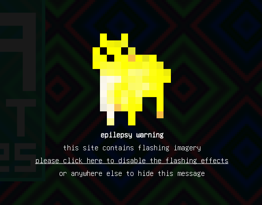
website epilepsy warning


I'm planning to have a similar warning front and centre on any videos that I create that contain flashing effects, or moving or static patterns that have a high contrast ratio. I'm planning on playing it safe, so anything I think could be at least mildly concerning I will add a warning to!


When it comes to the imagery for the Kickstarter, I'm following an established guideline that says that "the area of the flashing stimulus on the screen be not greater than 25 percent of the total area". Here's how this shakes out!

Here's a screenshot of the first part of the Kickstarter that has a large amount of flashing content, there being two of these headers on screen at once:


The outline of the controllers graphic flashes too, but as you'll see, the space taken up in this case is not close to 25%, so I've chosen not to count those pixels as their contribution to screen space would be very low.


I'm being quite careful to work within the suggested guideline thresholds! There's one part of the page that is pushing closer to this limit; and that's towards the end of the page, where I talk about why I am using Kickstarter as a funding platform.


In this part of the page, there is a flashing header visible at the same time as my pie chart. The pie chart also changes colours, so lets see how much screen space these take up together.


As you can see, we're pushing much closer to the guideline maximum of 25% of the screen space - but still under the threshold. I've also overestimated the area in this calculation, for as you can see there's a fair amount of white space within the image that I've not taken into account.

A quick check using GIMP shows that actually the flashing area of that image takes up a safer percentage of the screen.


The flashing area is actually only 80% of the image


The net result is that we're actually around 21% of the screen, much better. This is far further down the page, and the first few flashing elements only usually take up less than 12% of the screen, being 50% safer than the maximum suggested.

All said and done, I expect the game to be unsafe for people with photo-sensitive epilepsy, and as such will (you guessed it) feature very prominent warnings before playing the game.

Hopefully you can see that I'm trying to make sure that my project is presented as safely as possible to people with photo-sensitive epilepsy as I can, balanced with trying not to compromise the way I am presenting my chosen artistic direction.


---

After all of that serious talk - I'd like to share something a little more fun, so I'll post the actual gif of the pie chart shown above! Pie charts might not sound fun, but I think I've managed to make something in the spirit of the playfulness of the project!


Thanks for reading this long post about something that might not be all that exciting, but I'm sure you'll agree it's important - hopefully this advice helps someone else who has similar questions about how to present their project in a way that follows photo-sensitive epilepsy guidelines in a difficult artistic situation.

Thanks as well Bittwyst (and Schrodinger from another forum), I'm really pleased to have put this all down in writing. I feel like it would be a useful bit of info to have in the FAQ of my Kickstarter to reassure others that have similar concerns - and I wouldn't have done so if you didn't mention it!
« Last Edit: June 16, 2016, 06:01:23 AM by supermega_peter » Logged

Pages: 1 2 3 [4] 5 6
Print
Jump to:  

Theme orange-lt created by panic