|
PoV
|
 |
« Reply #160 on: January 23, 2010, 02:10:35 PM » |
|
2010 time 'eh? I still have lots of these.  I went through, maybe half a box of 250. Unfortunately, I bought 500  . I only paid like $35, so it wasn't that bad. I didn't really push them hard at the show, just had them in a card tray at my IGF pavilion. So I'll just keep using these until I change my logo/release a cooler game.  |
|
|
|
|
 Logged
|
|
|
|
|
CiroContinisio
|
|
« Reply #161 on: January 26, 2010, 05:37:35 AM » |
|
[img]IMAGE CUT Mine finally came in today  Moo's service is pretty great! Those are very very nice... I am a bit worried about the unusual size though. I hope they are not longer than the average business card... |
|
|
|
|
Logged
|
|
|
|
|
Pietepiet
|
|
« Reply #162 on: January 28, 2010, 02:55:16 PM » |
|
[img]IMAGE CUT Mine finally came in today Moo's service is pretty great! Those are very very nice... I am a bit worried about the unusual size though. I hope they are not longer than the average business card... They're slightly shorter than the average size, even And thanks! |
|
|
|
|
Logged
|
|
|
|
|
|
|
Richard Kain
|
|
« Reply #164 on: January 29, 2010, 08:40:32 AM » |
|
Part of the challenge of modern branding is %*@*! domain squatters. You can spend a day and a half researching different names, and when you've settled on one, you find out someone else already owns the domain. And heaven help you if research domain availability while you're deciding on names. Domain squatters can check to see which domain names are being looked up, and they will buy the ones that people are showing interest in. So the very process of checking to see if a domain is available can result in it being taken away from you by someone who just wants to overcharge for it.
If you are coming up with branding names, come up with several viable options that you could live with, and when you check to see if they are avaialable, have your credit card ready. (don't wait to purchase, buy your favorite available option immediately)
|
|
|
|
|
Logged
|
|
|
|
|
aeiowu
|
|
« Reply #165 on: January 29, 2010, 10:24:04 AM » |
|
I like the logo a lot (and the simple/small composition) but the front with the info is awkward. I'd stray from solid blocks of color behind text that small (legibility issues) and work for a more balanced composition. An avant garde composition like the one you're going for is much harder to pull of tastefully than something that might feel more balanced. Also... you're logo is centered mechanically on teh back of the card and then to have the text off to the side like that doesn't seem to follow the same system. i'd carry through with the heart in your logo somewhere in place of the cherries and make your name a bit bigger, perhaps to match the size of the typography in the logo. your name is the most important thing on that side. You're probably going to do it from the ground up but maybe that can help with general stuff for the redesign. cheers!  |
|
|
|
|
Logged
|
|
|
|
|
knight
|
|
« Reply #166 on: January 30, 2010, 10:01:44 PM » |
|
nice simple and gets the job done. I like them. |
|
|
|
|
Logged
|
|
|
|
|
Kaelan
|
|
« Reply #167 on: January 31, 2010, 02:54:43 AM » |
|
rayteoactive: I love the design, but it feels like it would be worthwhile to make your name and details much larger on the flipside of the card - all that white space is going to waste. Maybe flip it around and treat it as landscape, so you have more room for the text? The logo seems like it would fit in either orientation. I also agree with aeiowu's suggestion to replace the cherries with the heart to make it a running theme in the design. Of course, in the event that you totally throw out the existing design this feedback might not matter.  I whipped this business card design together a couple weeks before GDC Austin, and I'm fairly content with it, but I'm thinking maybe I should redo it - or at least make improvements - and have some new ones printed before GDC 2010. Any thoughts/suggestions?  (the blur isn't part of the design, it's my email and phone # obscured)
|
|
|
|
|
Logged
|
|
|
|
|
Alexander Bruce
|
|
« Reply #168 on: January 31, 2010, 05:44:27 AM » |
|
You do realize that your email is listed in your profile on TIGSource right? Unless it's a different one...  |
|
|
|
|
Logged
|
|
|
|
phubans
Indier Than Thou
Level 10

TIG Mascot


|
|
« Reply #169 on: February 08, 2010, 05:27:52 PM » |
|
Here's mine, printed on standard copy paper no less: 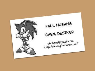 And using my special patented cutting process (scissors) no two cards are alike! *Note the JPEG compression isn't part of the above image; it's actually on the card!! I think this one is subtly awesome. Maybe too subtle for many, but subtly awesome nonetheless! Thanks for getting it I think I'll rock the same ones this year! |
|
|
|
|
Logged
|
|
|
|
|
CiroContinisio
|
|
« Reply #170 on: February 09, 2010, 03:54:20 AM » |
|
Here's mine, printed on standard copy paper no less:
And using my special patented cutting process (scissors) no two cards are alike!
*Note the JPEG compression isn't part of the above image; it's actually on the card!!
I think this one is subtly awesome. Maybe too subtle for many, but subtly awesome nonetheless! Actually, even if you made it by purpose, I think that when you replicate errors people think that they're just errors. I remember some girls in my university that did a video with a character that was blurred at times. They said that it was a nice touch, I think that the audience will only think "they didn't even manage to get a decent looking resolution for that character!!" |
|
|
|
|
Logged
|
|
|
|
|
Hajo
|
|
« Reply #171 on: February 09, 2010, 05:11:16 AM » |
|
One needs to overdo such effects that much, that the audience gets the idea that it's intentional, I guess. Or give other clues ... I had that happening to me, too, that I did things on purpose, and others thought those were mistakes, and I'm just making up excuses  |
|
|
|
|
Logged
|
Per aspera ad astra
|
|
|
phubans
Indier Than Thou
Level 10
TIG Mascot
|
|
« Reply #172 on: February 09, 2010, 11:03:26 AM » |
|
There is a reason for me doing things the way I do them. True, a majority of people may not get it, but those who do are in the know, and those are the kind of people I want to have in my life It's a pretty good filtering system. |
|
|
|
|
Logged
|
|
|
|
|
John Nesky
|
|
« Reply #173 on: February 09, 2010, 11:21:57 AM » |
|
in the know
Are you referring to hipster irony, or is "Gaem Desiner" a reference to something? *googles it* Heh, well, I guess it is memorable enough for someone to blog about it: http://hubpages.com/hub/Memorable-business-cards |
|
|
|
|
Logged
|
|
|
|
phubans
Indier Than Thou
Level 10
TIG Mascot
|
|
« Reply #174 on: February 09, 2010, 11:36:03 AM » |
|
HAHA, oh wow!  I had no idea there was a blog about this :D And yeah, I just mean to say that my whole attitude isn't usually a serious one because I feel that life shouldn't be taken too seriously, that humor is divine, and that I'm confident enough in my self that I can be whatever kind of self I want to be and still succeed. Sure, some might think I'm obtuse or eccentric, but that just denotes their inability to see beyond the obvious. |
|
|
|
|
Logged
|
|
|
|
|
Farbs
|
|
« Reply #175 on: February 11, 2010, 04:12:43 PM » |
|
|
|
|
|
|
Logged
|
|
|
|
|
CiroContinisio
|
|
« Reply #176 on: February 11, 2010, 05:34:29 PM » |
|
Farb's Business Card
I didn't know about Captain Forever until now... it is a wonderful game!! |
|
|
|
|
Logged
|
|
|
|
|
Alexander Bruce
|
|
« Reply #177 on: February 11, 2010, 05:59:25 PM » |
|
That card is awesome Farbs.
|
|
|
|
|
Logged
|
|
|
|
|
Pietepiet
|
|
« Reply #178 on: February 12, 2010, 04:12:01 AM » |
|
Dude, you did Rom Check Fail? Why do I not know these things...
|
|
|
|
|
Logged
|
|
|
|
|
FrostedSentry
|
|
« Reply #179 on: February 13, 2010, 12:02:59 AM » |
|
Right on Farbs! That's tight! I wrote up a little post on my card design process: http://bit.ly/cUPbmBFinal result: |
|
|
|
|
Logged
|
|
|
|
|
 Community
