|
|
|
PixelCows
|
 |
« Reply #41 on: April 28, 2016, 07:29:17 AM » |
|
UPDATE 19
Hello, everyone! How's it going?
In the last update, we showed the beginning of our art production process for levels. We talked about how we start figuring out each level's visuals by doing a specific type of concept art called thumbnails - in our case, really low resolution art that helps us figure out colors, shapes and the level's overall atmosphere.
We also showed one "rendered" image and mentioned it as being not an actual level, but rather a level's Art Kit. Today we'll go a little deeper into what an Art Kit is. Let's get started!
Graphics' Building Blocks
Once we are satisfied with the thumbnail version of a level, we proceed into rendering it at a higher resolution. Then we start breaking down that concept art into useable parts. All of these parts come together to form an Art Kit.
The Art Kit is the group of assets that are provided to the level designer so that he can decorate the levels according to a previously defined art direction.
While the art direction is mostly in the realm of the artist, and the level topography and challenges are mostly in the realm of the level designer, the Art Kit itself stands somewhere in the middle of these two roles and also the programmer's. There is a lot of technical and artistic "negotiation" happening at this stage, specially when the first Art Kit is being built. This is so that the Art Kit ends up containing assets that will fit with that level, work in the game engine and ultimately produce levels that look good.
For Last Dive's Art Kits, we had to decide things such as: should assets be exported with blur, or should they be blurred by the engine? Will the water surface be procedurally generated in realtime, or does it need an animated texture? Should each asset be exported as individual image files, or should they be grouped in spritesheets?
Here's a simplified example of what the base ocean's art kit consists of. Important to mention that all of this is exported separately, we only grouped in this picture to show to you guys:

That's it for now guys, next week we'll continue to talk about the creation of Art Kits for Last Dive, and we'll explain their structure!
If you want more frequent updates be sure to follow us on Twitter and Facebook, links in our signature! Or if you want to receive complete and exclusive updates, sign up for our Golden Chest.
Thanks for stopping by! Cya next time! 
|
|
|
|
|
 Logged
|
|
|
|
|
PixelCows
|
|
« Reply #42 on: May 05, 2016, 02:20:56 PM » |
|
UPDATE 20
Hello, everyone!
In our last update we started to explain what an Art Kit is and why it's important. Today, we'd like to show a bit of how our art kits are structured and explain each one of these layers and how they contribute to an environment's final mood. This update is a direct continuation of the last, so I suggest you read the previous update first in order to fully understand what an art kit is.
The main elements of our Art Kits
Here at Pixel Cows, we like to separate our art kits into different "categories" of assets. Each one of these categories represents a layer in the game view and contributes in a important way to the final outcome. Here are the main categories that we use to build the levels for Last Dive:
Background Gradient: It's simple enough, but this is what defines the level's ambient light and fog. It tells us how dark that area will be and how far we'll be able to see into the horizon. It's also very important because it gives a visual context for all the other assets.

Base Topography and Background Elements: These images are used to create all the landscape up to the horizon. We got a few layers of sand dunes (which are 'tileable', that is, can be placed seamlessly side by side in order to create an infinite landscape), plus big individual rocks and underwater creatures, which can be hand-placed (and programmed to move, in the case of the latter) to add variety and uniqueness to every screen

Platforms: This is used to create the actual game zone (we like to call it the "Game Layer", as this is where 99% of the actual gameplay happens). Before we can use the platforms in our engine, though, we have to convert each of them into a tilemap - a single image containing all combinations of ground, ceiling, walls and its respective edges. Our engine's level editor is then able to use the correct image at every part of the level to create seamless platforms.

Platform Props: These are props that are used to embellish the Game Layer, such as algae, corals, stones, schools of fish, etc. They don't affect gameplay and so they are usually thought of as being slightly behind the Game Layer. They have much less contrast than their gameplay-affecting counterparts (such as collectibles, HP drops, enemies, etc), so that the player intuitively filters them out of his understanding of the gameplay.
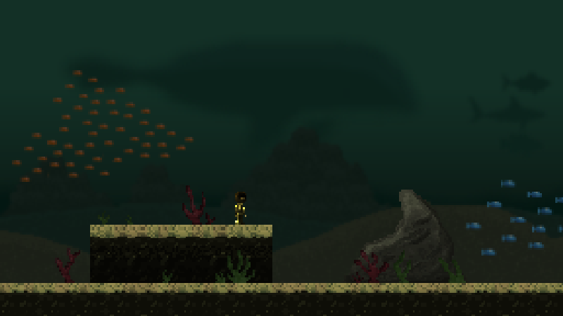
Foreground: At last, we complete the area's decoration by placing more props in the foreground, or the layer closest to the camera. It's important that this doesn't block the player's view, so we have to be careful when placing it. The foreground's main purpose is to "frame" the scene and increase the level's sense of depth and tridimensionality.

Besides the assets that are simply exported as images, there are some other important details that greatly affect visuals, but are more akin to "special effects", and therefore need to be coded through a collaboration between artist and programmer. These include the water surface (which must be animated, have perspective and remain pixel-perfect regardless of depth), animated water particles, light shafts, etc. We also use a color tone filter that affects colouring and contrast (this is what produces the final image's bluish hue). Even though these effects are done inside the engine, we like to draw them into the Art Kit too, in order to give the programmer a clear art direction to follow when coding them.

That's it for today, guys! In the next update we'll show the creation process behind the environment for the tutorial area of the game.
Thanks for stopping by!
|
|
|
|
|
Logged
|
|
|
|
|
PixelCows
|
|
« Reply #43 on: May 12, 2016, 09:57:10 AM » |
|
UPDATE 21: A Design Approach for Creating a Level's Art (Part 1)
Hello, everyone! How's it going?
In the last two updates, we showed how we build Art Kits that allow us to decorate a level, and what goes into it. Today we'll share the challenging process of creating the looks for the very first level that the player sees. Our first approach didn't work and we had to rethink the whole level art. It is interesting, as it illustrates how iteration really is an integral part of pretty much every aspect of game development.
From nice thumbnail to ugly render
Because of the way we planned Last Dive's experience to fold out as you first play the game, we knew from the get go that our first level would have to feel bright and welcoming. We were very attracted to the idea of making it a coral reef, as it is a common scuba diving environment (feels familiar and not too threatening) and also because of all the beautiful colors they have. It was the perfect match for our first level.
The corals started our like any other environment we work on. We created a thumbnail that captured the feeling we wanted that area to have. The colors seemed right and the light made the whole scene look warm and inviting.
By then, we had already rendered a level (the basic deep ocean setting that sets the stage for most of the story's first act), and while doing it we made a decision to use slightly blurry backgrounds, as it contributed a lot with the game's atmosphere. When we tried to render our corals thumbnail and 'port' it to this blurry BG aesthetics, it didn't work at first because the light settings were those of very clear and translucent waters, and because of that, the background wasn't looking like it was blurry because of the water in front of it - instead, it was just looking too blurry, period. We then tried to darken it to justify the blurriness, which basically destroyed our color palette and made the level ugly and unwelcoming. At some point, it became clear that it would be easier to remake it from scratch instead of trying to fix the original idea to make it work. It's part of the job, guys. Sometimes ideas work beautifully from concept to implementation, other times you just need to take a step back to be able to take two steps forward. While working on the version that didn't work, we ended up learning a lot about the task we had - color restrictions, lighting conditions versus desired blurriness, etc - so our next attempt was really straightforward.

Looking from another angle
For our next attempt, we searched for a bunch of scuba diving pictures until we found one that would be just right with some basic adjustments. We wanted the background to be single coloured, to avoid the trap that ruined our first attempt, and decided on a cyan light that should permeate the whole scene and make it feel like a clear day - and later on we would make the composition more interesting by adding colorful elements on the platform and foreground objects.

Despite the crude look of our first montage, we felt that it was going on the right direction. We felt that this color scheme would allow us to remain consistent with our 'blurry background' decision without needing to make it dark to make sense. This is important, as this is an introductory level that aims to contrast with the oppressive darkness of the rest of the game. At this stage we also started playing with different ground tiles to see what would work and find a general idea of the other props that should feel this area.
That's it for today, guys! In the next update we'll show the rest of this creation process, as we work on the remaining rough spots to create a working render and finally put it in game!
If you like our updates and want to be among the first to receive them complete and with exclusive content, sign up for our Golden Chest Newsletter here: http://bit.ly/1MxkyeC. Just one email every 15 days! Good content, interesting articles about gamedev and no spamming. And if you don't like it, feel free to unsubscribe whenever you want.
Thanks for stopping by!
|
|
|
|
|
Logged
|
|
|
|
|
PixelCows
|
|
« Reply #44 on: May 19, 2016, 11:43:44 AM » |
|
UPDATE 22: A Design Approach for Creating a Level's Art (Part 2)
Hello, everyone! How's it going?
In our last update we started working on the art for our tutorial level, which will take place in a bright and warm coral reef. Our first rendering attempt didn't go too well, and we had to rethink our strategy. Today we'll show the rest of the process and the final look for the corals. If you missed the last update, I highly recommend you read it before this one.
The last rough spots
After having set a new direction for our render, the next step was to find the shapes to use with this color scheme. We set for a clear horizon line permeated with some interestingly shaped rocky mounts. Because the resulting color scheme up to this point was very conservative and well controlled (basically just brown and blue), we were now able to add some bright, saturated colors all around the platforms' and foreground's objects without making the whole scene too cluttered.

This final version of the corals looks bright, warm and colorful - and, strangely enough, much closer to the mood of the original thumbnail than what we got when we just tried to render that same thumbnail! It's welcoming and not too deep. Even the surface is visible at all times, which is a comforting visual reassurance that you could just be pulled back to your boat and take a good deep breath of fresh air anytime you want. Oh, Dave, you were SO CLOSE to the surface, weren't you? 
A first look!
To finish this update, here's a first look at how this rendered art looks like in the game! It's not completely implemented yet (still missing water particles, light shafts and even surface, which will be recreated in Unity), but it gives the idea. It's been weeks since we started working and implementing these graphics on the game, and it's very exciting for us to finally be able to show a part of this!

That's it for today! In the next update we'll show how the development of one environment affects and changes other areas of the game.
If you like our updates and want to be among the first to receive them complete and with exclusive content, sign up for our Golden Chest Newsletter. Just one email every 15 days! Good content, interesting articles about gamedev and no spamming. And if you don't like it, feel free to unsubscribe whenever you want.
Thanks for stopping by
|
|
|
|
« Last Edit: May 26, 2016, 12:08:46 PM by PixelCows »
|
Logged
|
|
|
|
|
maruki
|
|
« Reply #45 on: May 23, 2016, 02:36:50 PM » |
|
whoa, what happened to his suit? Looks much cooler now :D
|
|
|
|
|
Logged
|
|
|
|
|
PixelCows
|
|
« Reply #46 on: May 24, 2016, 08:17:08 AM » |
|
whoa, what happened to his suit? Looks much cooler now :D
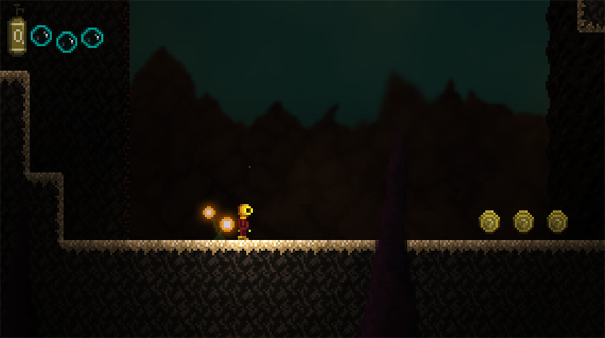
Haha it's the normal map lighting we added to the game! His sprite didn't change at all. But you're right, just with that small change, it already looks better. We're working on a new sprite though, which looks a lot better and more like a diver. Here's a sneak peek for ya!  |
|
|
|
« Last Edit: May 25, 2016, 07:09:56 AM by PixelCows »
|
Logged
|
|
|
|
|
EnragedCoder
|
|
« Reply #47 on: May 26, 2016, 09:25:14 AM » |
|
I like the new sprite, the helmet looks really cool! Some very nice normal mapped lighting effects too for all of the other sprites.
|
|
|
|
|
Logged
|
|
|
|
|
PixelCows
|
|
« Reply #48 on: May 26, 2016, 12:03:11 PM » |
|
I like the new sprite, the helmet looks really cool! Some very nice normal mapped lighting effects too for all of the other sprites.
Thanks man Soon we'll show it in game! |
|
|
|
|
Logged
|
|
|
|
|
PixelCows
|
|
« Reply #49 on: May 26, 2016, 12:07:56 PM » |
|
Last Dive Update 23 - Designing Aspects of an Environment's Mood (Part 1)
Hello, everyone! How's it going?
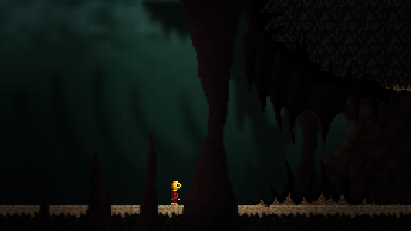
In the last two updates, we showed the creation process behind Last Dive's very first level, the bright and warm coral reefs. Today we will show how we created a completely different environment, Act 1's final level, the caverns. Unlike the corals, which didn't work out on the first try, the caverns art creation was a lot more about nailing an area's mood and fine tuning some aspects. Let's get started!
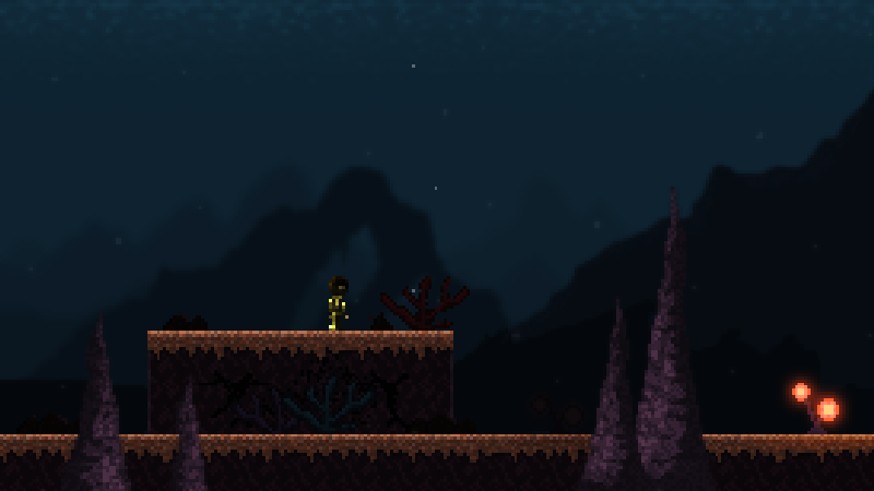
Creating the Caverns
The caverns development started out like any other environment: with a concept thumbnail that tries to capture that level's mood. The caverns are a big part of Act 1. Despite not being too deep into the ocean, it's still pretty gloomy and scary. It's also where Dave will have his first boss encounter. As you can see below, with the thumbnail done and capturing the exact mood we intended for this place, we created a first render for the caverns.

This first render was already pretty spot on. The environment is dark and vast, and our intention is to keep the player constantly under pressure of an imminent attack. To help with that feeling, we wanted this place to have very few light sources. Opposite to the corals or our base ocean, this area has no surface light because of the caves' ceiling, so that pretty much cuts out most of the lighting source for this environment. We decided this area would only have two sources of light: bright coral-like plants, which emit colorful omni lights; and big cracks on the background wall, which lets some of the surface light in. These two movable sources give us a lot of level design possibilites because we can control exactly what we want the player to see.
Even though it looked good, however, we thought it had a bit of a fantasy or mystic feeling to it. The weird bright flowers, the purple walls and columns, the glittering floor tile and the unknown light source lighting the back wall all contributed to this feeling. Last Dive does have a mystical and enigmatic mood to it, but we didn't want it to be this early into the game. This first act is a lot more about being lost at the bottom of the ocean and the survival aspect of the game, so we wanted the environment to feel more realistic and believable.
From Mystic to Realistic

Based on this initial feedback, we worked on a toned down version of the caves, trying to make it match the initial thumbnail as closely as possible. The stones got more 'stone-like' colors, the light distribution got a little more realistic, and the background was adjusted to increase the sense of depth. In the first render, the further back wall had a bright color, and this made it look closer than it actually was. The overall depth of the first render was shallow, background layers didn't seem to be that far from the player. We wanted to fix this in the second render, so we worked on making the second back wall less noticeable, by making it darker and more blurry than the first.
That's it for today! In the next update we'll show the rest of the caverns' development process and it's result in game!
If you like our updates and want to be among the first to receive them complete and with exclusive content, sign up for our Golden Chest Newsletter. Just one email every 15 days! Good content, interesting articles about gamedev and no spamming. And if you don't like it, feel free to unsubscribe whenever you want.
Thanks for stopping by!
|
|
|
|
|
Logged
|
|
|
|
|
PixelCows
|
|
« Reply #50 on: June 05, 2016, 12:28:25 PM » |
|
Last Dive Update 24 - Designing Aspects of an Environment's Mood (Part 2)
Hello, everyone! How's it going?
In the last update we started working on the caverns environment. The caverns are Act 1's final level and it's an area where mood matters a lot. We want it to be dark and gloomy, and have the player feel threatened at all times. Our first render of it, was a bit too mystical, so today we're gonna show the process of toning it down and making it darker and scarier. Let's get going!
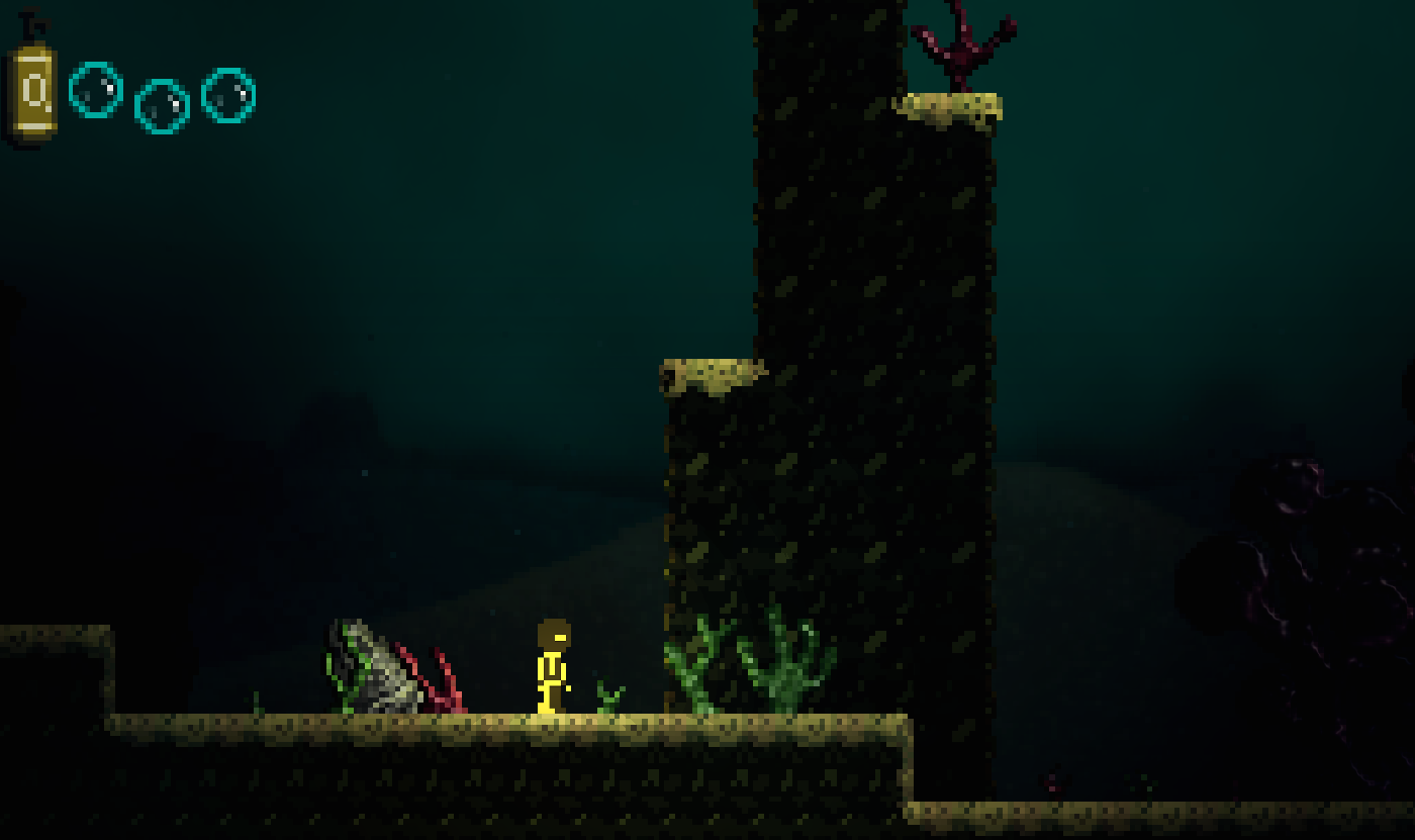
Final Adjustments
With the caves pretty much done, we worked on testing new things with that environment to see if we could further enhance its gloominess and depth sensation. The caverns are our first indoor setting, so it was the right time to experiment a bit and decide how to approach this kind of level. Our first test (left image) was pretty simple, we adjusted blur levels in the background and foreground layers to increase the depth. The second test (right image) was aimed at created a strong, blurry, pale layer in front of everything to simulate an underwater fog.

After those two last tests, we thought the new blur levels worked out fine and we kept it for the final image. The underwater fog however, despite increasing the feeling that the environment is actually underwater, didn't look that good. It killed a lot of the cavern's personality, so we did not apply it.
So that was pretty much it for the caves. The final render still has a lot of the personality the first render had, but with a more realistic approach, the glittering floor and the bright plants, however, were kept, and this adds a bit to the mystical side of the place. The environment feels believable and this enhances the survival aspect of the game. The background and the blur levels contribute a lot to the area's depth, and the 3D camera parallax we have going in the game. We also made some final adjustments to some colors that felt a bit off, like the corals and columns, and called it a day.

Importing to the Game
To wrap it up we'd like to show you guys one last thing, a small part of this environment's art kit. If you can't remember what an art kit is, or what we used it for, we gave an overview of it in updates 19 and 20. The caverns art kit was pretty straightforward: the tileset, a few platform objects like plants and corals, some foreground columns and the background walls. For the back walls we made a bunch of cracks and cuts that were tileable and could fit perfectly with the complete wall or with other cracks. This was done for both the further wall and closer one. This gave us quite a few decoration possibilities and helps so that the level doesn't always feel the same.

That's it for today! In the next update we'll show how developing the caverns helped us create some of the other environments left for Act 1!
If you like our updates and want to be among the first to receive them complete and with exclusive content, sign up for our Golden Chest Newsletter. Just one email every 15 days! Good content, interesting articles about gamedev and no spamming. And if you don't like it, feel free to unsubscribe whenever you want.
Thanks for stopping by!
|
|
|
|
|
Logged
|
|
|
|
|
|
|
PixelCows
|
|
« Reply #52 on: June 09, 2016, 08:46:14 AM » |
|
Last Dive Update 25 - Shaping Act 1's Last Areas
Hello, everyone! How's it going?
In the last update, we showed the results of the cavern's development process, the final level in Act I. Today we share the creation process of the Exterior Caverns, an area that you will be able to explore before the final confrontation of the story's first act.
The Exterior Caverns

The two main areas of Act I are the basic seabed biome and the underwater cave system. These two areas host important events that shape Dave's story as he tries to escape from his dire situation. However, there were demands coming from other aspects of the game design that required us to create another area between these two main spots - namely, we needed to provide some variety to the player as he advanced through a big sequence of challenging areas, and we also felt the need to reward him with some new content after he survived a certain story event that we won't spoil for you
With this in mind we started concepting an environment which would gradually introduce the caverns biome. Our first thought was to combine elements from the two adjacent biomes - regular seabed and cave - to form a whole new biome. Our first try resulted in the dark, gloomy environment you can see below.

However, there were problems with this first approach. First, it just felt too deep, far more than Dave would be at this point in the story. Also, it's a little too dark and spooky, which would kinda ruin the shock of entering the cave system that lies right after this area. Call us crazy, but we are super careful with controlling the shades and contrasts of everything that affects story and mood progression!
Because we also felt our first attempt deviated a little too much from the transition role it was intended to fulfill, for our next iteration we gave a step back and tried something that would be almost like a customization over the previous seabed environment. This way, the transition would feel more realistic, and the mood progression would come more naturally.
This new test worked out a lot better. The light setting and mood felt more in tone with the two adjacent areas and the cave's props didn't feel out of place. For the background, we chose to create big rocky structures that follow the same visual identity that can be seen in the cave's interior walls. This would make the environment feel much more in place. Some light and color adjustments and new prop combinations help the environment feel fresh, therefore fulfilling its role of feeling like an advancement landmark, while the presence of elements from the adjacent biomes (the sand platforms, the stalagmites, corals, walls, etc) make it believable and consistent with the game world. Furthermore, the cave wall patterns allowed us to create some pretty interesting backgrounds, so why not?

That's it for today! In the next update we'll show the final results for the External Caverns in game and show the grand entrance for the Interior Caverns!
If you want more frequent updates be sure to follow us on Twitter and Facebook, links in my signature!
Or, if you want to be among the first to receive them complete and with exclusive content, sign up for our Golden Chest Newsletter. Just one email every 15 days! Good content, interesting articles about gamedev and no spamming. And if you don't like it, feel free to unsubscribe whenever you want.
Thanks for stopping by!
|
|
|
|
|
Logged
|
|
|
|
|
PixelCows
|
|
« Reply #53 on: June 16, 2016, 08:38:16 AM » |
|
UPDATE 26 - A Grand Entrance!
Hello, everyone! How's it going?
In the last update we started working on the external caverns environment. We created this area as a transition from the base ocean to the completely different caverns level. Our intention wasn't to make a completely new environment, but simply to ramp up a certain mood. We also thought the caverns deserved a grand entrance, so we'll be showing how we made that too! Let's get started!
The Simple Solution
As it often happens, our first shot at this level was to create a brand new biome. As it turns out, it kinda broke the mood progression that we so carefully planned. We also had no need for a new biome. The external caverns were a lot more about decorating an area properly to make it feel like you're slowly stepping into a new place. Many times in game development, a complex, development-heavy solution isn't the best one. So we went for a simpler approach and created a mix of the two main levels, with the background cavernous walls being the only new prop. Here's how it worked out in game.
Entering Act I's Final Frontier
If the transition from seabed to exterior caverns is meant to feel like a natural change of scenery, the same can't be said for the moment when the player goes from the exterior to the interior caves. That's a big, dark, unknown place, and Dave is risking a lot if he decides to enter! We needed a big, ominous entrance to the cave that would naturally convey this idea of crossing a point of no return. As usual, we started with some thumbnails just to get a general idea of prop placement and the general size of things.
We liked the idea of the entrance resembling a mouth with sharp stone teeth, as if the player was about to be metaphorically swallowed into a new world. We also liked the stalagmites being placed as pillars or totems leading to the actual entrance in a mostly ritualistic way. And the walls in the back helped convey that this place is big and extends in unknown directions. The mockup below is the result of this effort.
Rendering it into useable assets was a straightforward process, as we maintained all of the things we liked from the concept and worked out some new ones like the whale skeleton in the background (another coherent, appropriate omen of Dave's difficult decision of entering that place). We liked the final result! If feels natural and believable, but there's also something odd about it, as if some of the stones and pillars were just too perfectly placed, like it's some sort of temple or ruins... What is wrong about this place? Well, you'll have to play the game to find out!
That's it for today!
If you want more frequent updates be sure to follow us on Twitter and Facebook, links in the signature!
Or, if you want to be among the first to receive them complete and with exclusive content, sign up for our Golden Chest Newsletter. Just one email every 15 days! Good content, interesting articles about gamedev and no spamming. And if you don't like it, feel free to unsubscribe whenever you want.
Thanks for stopping by!
|
|
|
|
|
Logged
|
|
|
|
|
PixelCows
|
|
« Reply #54 on: June 23, 2016, 08:14:04 AM » |
|
UPDATE 27 - A Much Needed Change
Hello, everyone! How's it going?
For the past few weeks, we've been showing the creation process of Last Dive's environmental art. We showed in detail how the coral reefs, the seabed and the caverns came to life.
Today we'll change the subject a bit: in our newest screenshots, have you noticed that Dave (our main character) has changed quite a bit? Let's talk about this redesign and how it affects the rest of the game!
Why changing?
When we decided to remake Last Dive, we knew a lot of its art and graphics would have to be updated - after all, the original was a jam game. When we started working on the new title we challenged ourselves to expand and deepen the game in all directions, art included. We recreated each and every environment from scratch and implemented a new realtime lighting scheme that made the whole game look better. As an expected side effect, though, our main character's graphics immediately became outdated and subpar with the rest of the experience.
Before redesigning the character altogether, we had to test if simply creating normal and shadow maps for the old character would suffice. For one, Dave looking a bit displaced of the rest of the game could simply be the result of him not being under the same light effects as the scenery. Furthermore, even if a complete redesign was to be made, we first needed to understand what needed to change after seeing him in context - all effects included. So we created all the required lighting maps, applied to Dave and tested how he looked in game.

A lot better, right? Still, not nearly enough, that's for sure. The 2 colors palette obviously didn't fit the new art direction. Also, since we started sharing updates on Last Dive's development, one of the things we heard the most was that Dave, our favorite diver, looked like a caveman! His colors made him look like he was naked, and his helmet was often seen as a dense beard. When the people that will play your game tell you that your deep sea diver looks like a naked, bearded caveman, you know you will need a serious overhaul! It was time to make him look more like the rest of the game's new art.
That's it for today!
Next week, we'll show what inspired us to redraw Dave and the step-by-step transformation of his sprite!
Do you agree Dave looked like a "caveman"and needed a major overhaul?
We'd love to hear you opinion! We are always hanging out on Twitter and Facebook!
Or, if you want to be among the first to receive these updates complete and with exclusive content, sign up for our Golden Chest Newsletter. Just one email every 15 days! Good content, interesting articles about gamedev and no spamming. And if you don't like it, feel free to unsubscribe whenever you want.
Thanks for stopping by!
|
|
|
|
|
Logged
|
|
|
|
|
PixelCows
|
|
« Reply #55 on: June 30, 2016, 01:27:56 PM » |
|
UPDATE 28 - A Hero Arrises!
Hello everyone! How's it going?
In last week's update we showed the beginning of the process of reworking Dave's sprite. After adding the new graphics to Last Dive, along with light and shadow maps, we noticed our hero was a bit outdated and in need of a major overhaul. Today, we'll show the rest of the update process! We highly recommend you read the first part before this one, but if you already have, then let's get started!
The Redesign Process

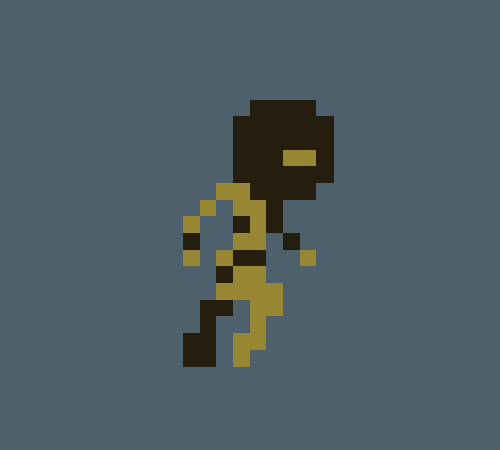
In parallel to all that, we were also creating art to use on our site. The idea of that art was to capture the feeling of playing Last Dive in a single image. While working on them, we had to draw a big version of Dave, which was also an opportunity to define his overall look in detail. We wanted his design to more closely reflect the retro atmospheric diving suits that inspired the game, while also having a color scheme that was compatible with a main character, which resulted in the two iterations seen above.
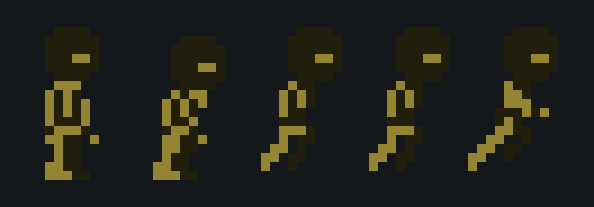
When we were happy with the character's design, we went on to create the actual sprite that is used in the game. At that point in development, Dave already had a full spritesheet with tons of animations created, and even though his graphics were outdated, the animations themselves were actually pretty decent. So we came up with a way to change his appearance without having to draw every frame again. We did this by working with color change filters and lighting adjustments. We then manually "pasted" the helmet in every frame, and the only manual, frame-by-frame work left was to draw his gloves and boots.

We ended up with two versions of the new concept where the only change was the color combinations. Both seemed solid and worked well, however when we tried against the game's actual backgrounds, the blue version blended too much into the environment, while the red one popped out a lot more, which made us decide to stick to the red and gold suit.

Finally, a gif showing Dave's evolution, just for the show
That's it for today!
Did you like Dave's final look? Got any suggestions to further improve him?
We'd love to hear you opinion! We are always hanging out on Twitter and Facebook!
Or, if you want to be among the first to receive these updates complete and with exclusive content, sign up for our Golden Chest Newsletter. Just one email every 15 days! Good content, interesting articles about gamedev and no spamming. And if you don't like it, feel free to unsubscribe whenever you want.
Thanks for stopping by!
|
|
|
|
|
Logged
|
|
|
|
mzn528
Level 2

Dark Souls, Berserk and Vagabond Ultimate Fanboy

|
|
« Reply #56 on: June 30, 2016, 05:01:00 PM » |
|
I love the atmosphere of this.. Keep up the great work!
|
|
|
|
|
Logged
|
Noob Game Dev and Pixel Artist, twitter @mzn528  Soul Appeaser, a combat focused story rich ARPG DevLog |
|
|
|
PixelCows
|
|
« Reply #57 on: July 01, 2016, 11:50:02 AM » |
|
I love the atmosphere of this.. Keep up the great work!
Thanks a lot! Working hard on it |
|
|
|
|
Logged
|
|
|
|
|
PixelCows
|
|
« Reply #58 on: July 07, 2016, 07:14:59 AM » |
|
UPDATE 29 -Designing our First Boss! (Part 1)
Hello, everyone! How's it going?
In our last updates, we showed our main character's updated looks, and the process of reinventing him. Having a character that was able to navigate both in the adventure and in the thriller sides of our world was a big deal for the game.
Today we'll still be talking about graphics and character creation, but this time showing the creation process of the game's first boss! Scared already?
A First Draft
When our story's first act was written and rolled out for graphics production, we had the challenge of creating a monster that clearly looked like a fish, but also had some very subtle human and mechanical characteristics. After looking at references, we started sketching some basic silhouette and linework studies. If you look from the upper left of the image below to the bottom right, you'll see the evolution from rough silhouette all the way to mostly final linework art.

It took quite a bit of iteration to get it just right. The boss had the human/mechanical feeling we wanted, but still looked a lot like a fish. We wanted its horns to be somewhat mixed with its flesh and not made out of bones. It was also important that its face felt threatening but still had human elements (such as the nose-like protuberance above his mouth). With a final sketch in place we went on into detailing a black and white version, with light and shadows.
Detailing and Coloring
The next step was figuring out the boss' volume by determining its internal shading, which also allows us to increase or decrease focus on certain aspects of his design. The main bone structure, for example, was more subtle on the original linework, but we thought it looked cooler after receiving more emphasis from the lighting, while his face ended up being darkened to make him more mysterious and menacing in a non-physical way. The veins or wrinkles around the eye were also intended to make him look a little more evil. Finally, we also wanted him to retain his "fleshy" look, so we made the horns and bonelike structures really integrate with the body. You can't really tell where bone ends or flesh begins.
When we were done with the B&W version, we moved on to coloring him.

Although being still mostly monochromatic, this red version on the right would already allow us to test the design under the game's realtime light engine, which would give us a general idea of how it would look in the game. This step is important because the realtime light already creates shadow and hightlights on its own, so its important to balance that out in the sprite itself.

That's it for today guys! Next week we will show how we further improved the boss and his final look!
Did you like our concepts for the first boss? We'd love to hear you opinion! We are always hanging out on Twitter and Facebook!
Or, if you want to be among the first to receive these updates complete and with exclusive content, sign up for our Golden Chest Newsletter. Just one email every 15 days! Good content, interesting articles about gamedev and no spamming. And if you don't like it, feel free to unsubscribe whenever you want.
Thanks for stopping by!
|
|
|
|
|
Logged
|
|
|
|
|
PixelCows
|
|
« Reply #59 on: July 14, 2016, 11:37:11 AM » |
|
UPDATE 30 - Designing our First Boss! (Part 2)
Hello, everyone! How's it going?
In our last update, we showed the beginning of the process of creating our first boss! After making a bunch of concepts and sticking to a design, we started detailing and coloring a very first version of his design. Today we'll show the rest of the development process and reveal his final design. In case you missed the first part of the creation process, we highly recommend you read it before this one.
One step backwards...

After reaching a first working version of our boss' design (as seen above) we went on into giving him a little more life and interest. We thought he was still too monochromatic. The face wasn't as threatening as we would like. Eyes weren't menacing and it looked too much like he was smiling. The shape of main bone was still a bit off too. So with all this in mind, we went for a second version of it.

In this second try, it changed a lot. The horns were now painted as if they were bones along with that main structure, which now expanded into the tail. But that wasn't really the goal, as it was cool not being able to tell his flesh from the bones. Now it just looked as if he had a carapace all over his body. And even though the face worked a bit better, and he looked more menacing with that new red eye, the teeth just wasn't right. It was too confusing and it still felt like he was forcing that smile.
Two Steps Forward!

So we went for another iteration and mixed up the best points from both versions. This version looked really cool, we managed to fix most things that bothered us and this time he actually had a badass face! Teeth were clearly visible, the face looked aggressive, and the bone / fleshy material all around the character felt more connected and in place. Last step we had to take care of was working out his contrast levels and find a better shading for his skin. And this is what we came up with!
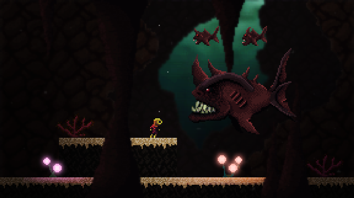
The shading now looks a lot more natural and following the type of pixel art we've been using in our art direction. It also works great with our normal mapping! To finish up we made two smaller fish which will be replicated into a school of fish that follows our boss around. You didn't think he would fight alone, did you?
To finish up, here's the whole development process in a glance! In the gif below, notice how the first iterations require more massive changes, while the latter ones are basically around changing details.


That's it for today guys! Hope you liked our boss' creation process! Got any ideas on how we could further improve him? We'd love to hear you opinion! We are always hanging out on Twitter and Facebook!
Or, if you want to be among the first to receive these updates complete and with exclusive content, sign up for our Golden Chest Newsletter. Just one email every 15 days! Good content, interesting articles about gamedev and no spamming. And if you don't like it, feel free to unsubscribe whenever you want.
Thanks for stopping by!
|
|
|
|
|
Logged
|
|
|
|
|
 Community
