|
J. R. Hill
|
 |
« Reply #1100 on: May 21, 2010, 10:46:43 PM » |
|
That's not blue from the raven, it's from the sky. If you were also showing a raven from hecka far away then you could do a slight blue filter to it, but up close a raven is black or at least very dark gray. If you want to add blue then add it as a tiny highlight that's a reflection of the sky because ravens are actually fairly shiny birds.
|
|
|
|
|
 Logged
|
hi
|
|
|
|
Geti
|
|
« Reply #1101 on: May 21, 2010, 10:47:50 PM » |
|
 Best viewed at 2x or 3x pixels, if you have the time. |
|
|
|
« Last Edit: May 22, 2010, 01:35:38 AM by Geti »
|
Logged
|
|
|
|
|
Ashkin
Guest
|
|
« Reply #1102 on: May 21, 2010, 11:39:28 PM » |
|
Best viewed at 2x or 3x pixels, if you have the time. Cool, I can't wait to play this. |
|
|
|
|
Logged
|
|
|
|
|
Geti
|
|
« Reply #1103 on: May 22, 2010, 01:36:07 AM » |
|
Hahah, good to hear it, Ashkin.
|
|
|
|
|
Logged
|
|
|
|
|
Relix
|
|
« Reply #1104 on: May 22, 2010, 08:12:04 AM » |
|
 I got rid of the clouds and er... I did wronginess to the bird...maybe I'll change it back and say it's a raven wannabe. |
|
|
|
|
Logged
|
|
|
|
|
Noel Berry
|
|
« Reply #1105 on: May 22, 2010, 08:55:34 AM » |
|
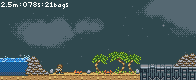
Updated graphics of an older game of mine.  Best viewed at 2x or 3x pixels, if you have the time. That looks pretty cool :D Looking forward to trying it out! |
|
|
|
|
Logged
|
|
|
|
|
Landshark RAWR
|
|
« Reply #1106 on: May 22, 2010, 10:28:47 AM » |
|
i hope you include 6 playable characters
|
|
|
|
|
Logged
|
|
|
|
|
Simon Andersson
|
|
« Reply #1107 on: May 22, 2010, 11:36:03 AM » |
|
And multiplayer!
|
|
|
|
|
Logged
|
|
|
|
JustinGameDesign
Level 1

Sprite artist and indie game dev.


|
|
« Reply #1108 on: May 23, 2010, 10:04:35 PM » |
|
Best viewed at 2x or 3x pixels, if you have the time. This reminds me of Contra. Probably because of the night sky and mix of jungle, water, and machine terrain. I like it. |
|
|
|
|
Logged
|
|
|
|
|
Geti
|
|
« Reply #1109 on: May 23, 2010, 11:26:04 PM » |
|
Well, thank you. Hopefully I don't disappoint with the game itself, hahah.
|
|
|
|
|
Logged
|
|
|
|
|
JoGribbs
Guest
|
|
« Reply #1110 on: May 25, 2010, 10:30:08 AM » |
|
  Did this at college today for an idea I had. I'm still going somewhere with the idea, but I'm not good with detailed water, and I don't think I'm skilled enough as a pixel artist to animate a game in this detail :/ |
|
|
|
|
Logged
|
|
|
|
|
JaJitsu
|
|
« Reply #1111 on: May 25, 2010, 12:40:14 PM » |
|
the water looks great. what was the idea for the project?
|
|
|
|
|
Logged
|
|
|
|
|
JoGribbs
Guest
|
|
« Reply #1112 on: May 25, 2010, 01:36:01 PM » |
|
Hmmm. Well I wanted to make something for the current YoYo Games competition ( http://glog.yoyogames.com/?p=1009), which is themed 'Discovery'. I had this cool idea ages ago about a dude that rode across the seas on a turtle, and you'd go between islands a bit like Wind Waker/ Phantom Houglass. When I saw the competition title this afternoon I figured that would be a good starting point for the game. Since then I've been jotting down notes and things, primarily about what would happen when you'd get off the turtle. The idea that most appeals to me right now is an adventure/ puzzle game. So yeah that was my idea, I just don't think I can finish it if I do everything in the same detail as above. The deadline isn't until august though so I have plenty of time. Hmmm... |
|
|
|
|
Logged
|
|
|
|
|
Bree
|
|
« Reply #1113 on: May 26, 2010, 09:41:37 AM » |
|
Did this at college today for an idea I had. I'm still going somewhere with the idea, but I'm not good with detailed water, and I don't think I'm skilled enough as a pixel artist to animate a game in this detail :/ I really love the character and the colors, but I feel like the little water highlights should be toned down a bit from the image on the right. It's better than simply leaving it blank, but I feel like it's way too busy for the eyes. |
|
|
|
|
Logged
|
|
|
|
|
Stahlkaiser
|
|
« Reply #1114 on: May 26, 2010, 11:52:50 AM » |
|
Small aquarium game mockup  I like your idea and concept very much! |
|
|
|
|
Logged
|
|
|
|
|
CiroContinisio
|
|
« Reply #1115 on: May 29, 2010, 06:16:04 AM » |
|
I really love the character and the colors, but I feel like the little water highlights should be toned down a bit from the image on the right. It's better than simply leaving it blank, but I feel like it's way too busy for the eyes.
I agree with Theo. Also the plain blue water is better than the right one. Try to tone the shines down and see what happens... |
|
|
|
|
Logged
|
|
|
|
|
JoGribbs
Guest
|
|
« Reply #1116 on: May 29, 2010, 05:04:45 PM » |
|
Thanks for the compliments guys, but it's also good to get some criticism on this stuff. Gonna mess around with it some more later.
|
|
|
|
|
Logged
|
|
|
|
siiseli
Level 6

|
|
« Reply #1117 on: May 30, 2010, 04:44:44 AM » |
|
Did this at college today for an idea I had. I'm still going somewhere with the idea, but I'm not good with detailed water, and I don't think I'm skilled enough as a pixel artist to animate a game in this detail :/ This is all very nice, I sorta like them both. The right one is too busy, though, I think you should go for a middle point between the two. |
|
|
|
|
Logged
|
|
|
|
|
One of the Beatles
Guest
|
|
« Reply #1118 on: May 30, 2010, 08:27:04 AM » |
|
lo-res time   |
|
|
|
|
Logged
|
|
|
|
|
Cighton
Guest
|
|
« Reply #1119 on: May 30, 2010, 06:50:53 PM » |
|
Working on my game.  Gabriel, I like the look on that.  |
|
|
|
|
Logged
|
|
|
|
|
 Developer
