|
Quarry
|
 |
« Reply #8820 on: October 15, 2015, 12:17:18 PM » |
|
From what I've seen, 80% percent of the Europeans who apologise for their English at the end of their posts have already typed a post that's more coherent and well-structured than native speakers. I think non-natives end up working harder trying to learn English and put more care into communicating with it, so they end making fewer mistakes. Although C1 is most certainly not the average level of English, especially talking about gaming stuff :D
BUT!
This is a pixel art thread, post your pixel art!
|
|
|
|
|
 Logged
|
|
|
|
|
Schoq
|
|
« Reply #8821 on: October 15, 2015, 12:33:30 PM » |
|
Also it actually helps when you learned a language formally from the start rather than by aping your environment as a baby to only later get a grip of standardized rules and structure! Some old thing so I'm posting mockups in the mockups thread:  |
|
|
|
|
Logged
|
♡ ♥ make games, not money ♥ ♡
|
|
|
|
chriswearly
|
|
« Reply #8822 on: October 15, 2015, 07:46:28 PM » |
|
-snip-
I'm usually a big critic of how well someone's monospace fonts are (at least in my head) but looking at yours, really nice job! Good style, consistency; and creativity in the dual-letter filled blocks!  |
|
|
|
|
Logged
|
|
|
|
|
krostif
|
|
« Reply #8823 on: October 16, 2015, 01:44:02 AM » |
|
BUT!
This is a pixel art thread, post your pixel art!
My bad ! You're right ! So here is what I've done for a project that has never been completed :  The characters with some basic background stuff:  The main interest on this are the characters : The project is about a french TV show named Kaamelott (About king Arthur's legend) And the goal here was to find the good likeness with the actors of the show... Of course it won't tell you anything if you don't know the show (And you obviously don't) but likeness apart, it was a good exercise to practice pixelising for game characters. I think I should post photos of the actors now !!! I come back... |
|
|
|
|
Logged
|
|
|
|
|
Schoq
|
|
« Reply #8824 on: October 16, 2015, 04:55:18 AM » |
|
-snip-
I'm usually a big critic of how well someone's monospace fonts are (at least in my head) but looking at yours, really nice job! Good style, consistency; and creativity in the dual-letter filled blocks! Thanks. I used to find making 8*8 fonts meditational so I spent a lot of time with it! Since you are a connoisseur, I'm submitting these for critique as well (also very old)   |
|
|
|
|
Logged
|
♡ ♥ make games, not money ♥ ♡
|
|
|
|
Quarry
|
|
« Reply #8825 on: October 16, 2015, 10:37:33 AM » |
|
Damn... Crisp, clear and very legible!
|
|
|
|
|
Logged
|
|
|
|
|
chriswearly
|
|
« Reply #8826 on: October 17, 2015, 12:21:41 AM » |
|
-snip-
I'm usually a big critic of how well someone's monospace fonts are (at least in my head) but looking at yours, really nice job! Good style, consistency; and creativity in the dual-letter filled blocks! Thanks. I used to find making 8*8 fonts meditational so I spent a lot of time with it! Since you are a connoisseur, I'm submitting these for critique as well (also very old) -snip- -snip- Wow, yet again, awesome! Interesting that you had the first column and row of each tile in the left image be the blank ones. I usually start my letters at 1x1 and have the separation be formed on the right and bottom of each tile. And cool digital-esque numbering in the second image. Though, by your own rule of thumb, the "7" is rendered wrong. The top-left green pixel should instead be the dark blue. The 7 on the right is the correct one here:  Also pertaining to the right image, though this may be intentional, the capital B and F letters, both 6-wide, are centered differently within their tiles. The B rests against the left edge, while the F is properly centered in the 8x8 tile. Though again, that may be on purpose, but just a curious observation. (Told you I was a stickler.) Oh one last thing. If an 8x8 grid were overlayed on the second piece, I'm pretty sure most tile groups would be out of line, horizontally speaking. Not 24 from the left wall. Not 8 or 16 between numbers and text. At this point I'm being a little uptight, but that's the last thing I'll comment on Again though, the letter forming is ace, and you are quite creative with how and what you decide to make with the limited space. Do hope to see more work from you, and maybe I'll post a few of my monospace pieces (largely not 8x8), at least once I'm actually satisfied with them  |
|
|
|
|
Logged
|
|
|
|
|
chriswearly
|
|
« Reply #8827 on: October 17, 2015, 01:00:51 AM » |
|
BUT!
This is a pixel art thread, post your pixel art!
Er, *cough*, this isn't exactly THE pixel thread XD |
|
|
|
|
Logged
|
|
|
|
|
krostif
|
|
« Reply #8828 on: October 17, 2015, 01:42:03 AM » |
|
Er, *cough*, this isn't exactly THE pixel thread XD
Yes I see it's not the right place to post this kind of stuff !... I've just realized what "mockups" means, sorry :/ See : Dammages of the non-native C1 english !!!  See you guys, I search for the right thread right now  But good job anyway Chris... And I particularly appreciate happymonster's mockups. I love this level of abstraction. Even if it's quite limited |
|
|
|
|
Logged
|
|
|
|
|
chriswearly
|
|
« Reply #8829 on: October 17, 2015, 02:47:22 AM » |
|
Er, *cough*, this isn't exactly THE pixel thread XD
Yes I see it's not the right place to post this kind of stuff !... I've just realized what "mockups" means, sorry :/ See : Dammages of the non-native C1 english !!! See you guys, I search for the right thread right now But good job anyway Chris... And I particularly appreciate happymonster's mockups. I love this level of abstraction. Even if it's quite limited No no, you're fine I was joking with Quarry, because they apparently forgot which thread they were in. You can keep posting here if you like. However, if you want specific feedback on pixel art, then there is a thread for that as well: http://forums.tigsource.com/index.php?topic=167.30400 |
|
|
|
|
Logged
|
|
|
|
|
krostif
|
|
« Reply #8830 on: October 17, 2015, 03:58:44 AM » |
|
Yes I found it. Thank you Chris, I'll continue over there
o/
|
|
|
|
|
Logged
|
|
|
|
|
Schoq
|
|
« Reply #8831 on: October 17, 2015, 05:46:00 AM » |
|
And cool digital-esque numbering in the second image. Though, by your own rule of thumb, the "7" is rendered wrong. The top-left green pixel should instead be the dark blue. The 7 on the right is the correct one here: Also pertaining to the right image, though this may be intentional, the capital B and F letters, both 6-wide, are centered differently within their tiles. The B rests against the left edge, while the F is properly centered in the 8x8 tile. Though again, that may be on purpose, but just a curious observation. (Told you I was a stickler.) That's an amazing catch! Probably a combination of sloppiness and being rushed. As for the F. I can only guess at this point, it was a while ago and I don't remember my thought process. Probably I felt like the gap to the next letter most of the time felt too big because of that lower right void, which B doesn't suffer from. And indeed the digit positioning breaks the 8*8 grid. Thanks to their repetitive nature though this doesn't bump up the tile count much at all, even though it's an ugly solution (also not completely sure local panning like that isn't possible on the NES with some trickery) I have a piece in the same line I'll be able to show off hopefully later this month. Thank you so much for your comments! Edit: Actually since we're on fonts and this is the mockups thread:  more old stuff (lol typo)  (excuse the weird layout. I see I ended up modifying it in use somewhat too) wanted/wanting to use this for an actual game idea but it's never gonna happen |
|
|
|
« Last Edit: October 17, 2015, 06:17:34 AM by Schoq »
|
Logged
|
♡ ♥ make games, not money ♥ ♡
|
|
|
|
Quarry
|
|
« Reply #8832 on: October 17, 2015, 01:38:30 PM » |
|
FOOOOONTS
|
|
|
|
|
Logged
|
|
|
|
|
supajackle
|
|
« Reply #8833 on: October 18, 2015, 06:48:09 PM » |
|
oh man i didnt know there was a mockups thread. so much great stuff in here heres a harvest moon + monster rancher game i would like to get around to makin sometime  |
|
|
|
|
Logged
|
|
|
|
|
|
|
gaarlicbread
|
|
« Reply #8835 on: October 19, 2015, 11:08:24 AM » |
|
Mockup variant number 4:  I really like this style. I prefer variants 3 & 4, with color. It almost feels pre-pixel art in that the colors are so solid -- but nicer than EGA in that the colors work together well I almost want to build a random RPG with this tileset. It reminds me a little of this old old software called Adventure Construction Kit. 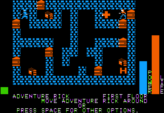 |
|
|
|
|
Logged
|
|
|
|
|
happymonster
|
|
« Reply #8836 on: October 19, 2015, 12:03:24 PM » |
|
Cheers! If you want to use the tiles I don't mind. Mockup 5: - Tried to keep all walk-able tiles using very light colours (perhaps too light, but the background is close to white as it is).
- Removed perspective where I can. (Can't get the open chest right yet without it)
- Added new tiles: keys, doors, lava, slime, shield pendants, crate, four teleporters.
- Changed some old ones to make them cleaner, trying to find a balance between symbolic and realistic while keeping everything clean.. I don't want the tiles to be totally symbolic though.
- Tweaked colours a bit.
 |
|
|
|
« Last Edit: October 21, 2015, 12:27:41 PM by happymonster »
|
Logged
|
|
|
|
|
happymonster
|
|
« Reply #8837 on: October 22, 2015, 09:07:22 AM » |
|
Mockup 6: Tried using 10x10 sized tiles instead of 9x9. This gives me more space to work with and lets me do easier patterns, but it also looks a different style than the old version. Not sure which I like best..  |
|
|
|
|
Logged
|
|
|
|
|
BBreakfast
|
|
« Reply #8838 on: October 24, 2015, 08:36:36 AM » |
|
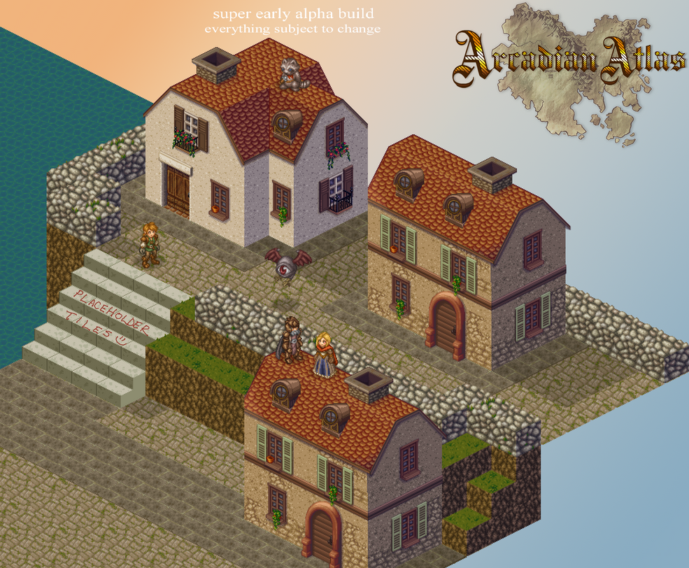 in the final map version there won't be any repeat house styles and there will be crates, stairs, cliffs, barrels, etc to use to get on top of the buildings. lots more work to do! |
|
|
|
|
Logged
|
|
|
|
|
|
|
 Developer
