|
Delicious
|
 |
« Reply #4180 on: January 09, 2012, 04:12:12 PM » |
|
(i couldnt paint very well at the time)
If that is not painting very well then I just give up.  |
|
|
|
|
 Logged
|
Blah Blah Blah <3
Twitter - Zjdelicious
|
|
|
|
nicked
|
|
« Reply #4181 on: January 10, 2012, 01:02:15 AM » |
|
Aww, I was so going to make a game like that! How did you achieve this effect?
Mainly by putting a scrunched paper texture (scan) over photos/drawings with a multiply blend mode. Add some cutouts, edge detailing, drop shadows etc. I doubt this will ever become anything, so you should definitely go with the style! |
|
|
|
|
Logged
|
|
|
|
|
herror
|
|
« Reply #4182 on: January 11, 2012, 05:07:37 AM » |
|
|
|
|
|
|
Logged
|
|
|
|
|
BlackWhite
|
|
« Reply #4183 on: January 11, 2012, 12:50:23 PM » |
|
Hi all New here, first real game attempt. (I did a few flash based ones) Here is a game I am currently working on getting people to participate in. It's Gravity Force meets a tron style universe. Heavy on gravity so the main challenge besides solving the various misions is to make sure your ship doesn't crash due to the pull of gravity.  Full size here http://000fff.org/uploads/Map_Template_Layout.png |
|
|
|
« Last Edit: January 11, 2012, 01:20:07 PM by BlackWhite »
|
Logged
|
|
|
|
|
CiroContinisio
|
|
« Reply #4184 on: January 11, 2012, 12:55:25 PM » |
|
I had a super similar idea a few months back  Sorry :D The idea for me came from a musician friend, he had a different idea from a dream on how to modify our own game (UFHO2) with colours, camouflage stuff... I distilled it into this more basic concept. @TobiasW and Ninja Dodo: We'll see! :D |
|
|
|
|
Logged
|
|
|
|
|
ninto
|
|
« Reply #4185 on: January 11, 2012, 01:40:49 PM » |
|
Wow, this is really splendid. Loving those book cases.  That back wall tile abruptly ends though. :< |
|
|
|
|
Logged
|
|
|
|
|
st0ven
|
|
« Reply #4186 on: January 11, 2012, 07:20:12 PM » |
|
 unfortunately may join the rank of 'please say its not just a mockup' crowd :/ |
|
|
|
|
Logged
|
|
|
|
|
Geti
|
|
« Reply #4187 on: January 12, 2012, 12:39:44 AM » |
|
Nice work on the vegetation. Very evokative.
|
|
|
|
|
Logged
|
|
|
|
|
CK
|
|
« Reply #4188 on: January 12, 2012, 03:52:18 AM » |
|
Ohhhhhhhhhhh  I want this so bad |
|
|
|
|
Logged
|
|
|
|
|
junkboy
|
|
« Reply #4189 on: January 12, 2012, 11:02:05 PM » |
|
unfortunately may join the rank of 'please say its not just a mockup' crowd :/
So lush! |
|
|
|
|
Logged
|
|
|
|
|
Jad
|
|
« Reply #4190 on: January 13, 2012, 04:04:00 AM » |
|
unfortunately may join the rank of 'please say its not just a mockup' crowd :/ IF YOU SOMEHOW MADE THAT ANIMATE SO THE LEAVES WOULD SWAY IN THE WIND :'''C |
|
|
|
|
Logged
|
|
|
|
|
Geti
|
|
« Reply #4191 on: January 13, 2012, 05:22:29 PM » |
|
@Jad assuming you actually had the brushes and shapes he used as separate shapes, simple vertex transforms could be used to make the trees shake in the wind and the grass sway in ripples. Oh the power of single colour silhouettes (+alpha).
|
|
|
|
|
Logged
|
|
|
|
|
threesided
|
|
« Reply #4192 on: January 13, 2012, 09:04:22 PM » |
|
st0ven, great stuff man! It's nice to see you around again, after all these years of following your work at Pixelation! What have you been up to? I would love to know  |
|
|
|
|
Logged
|
|
|
|
|
Ishi
|
|
« Reply #4193 on: January 14, 2012, 09:23:19 AM » |
|
A mockup for Elizabeth Shoots Ghosts with newly revamped graphics. 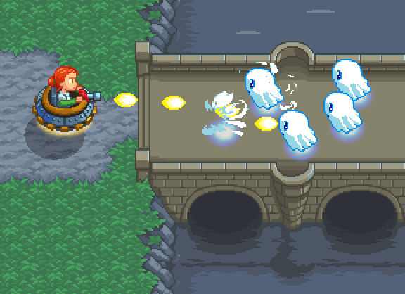 |
|
|
|
|
Logged
|
|
|
|
|
Gauss Jordan
|
|
« Reply #4194 on: January 14, 2012, 09:30:31 AM » |
|
@Ishi: Wonderful grass texture! I also like the sprites, cliffs and water but the bridge needs some more texture.
|
|
|
|
|
Logged
|
Lefty-concepty, righty-pixley, but bothey programmey.
|
|
|
|
st0ven
|
|
« Reply #4195 on: January 14, 2012, 07:11:42 PM » |
|
st0ven, great stuff man! It's nice to see you around again, after all these years of following your work at Pixelation! What have you been up to? I would love to know Thanks threesided - its also nice to see some familiar aliases. Been keeping busy doing work in the mobile field. if/when i get free time i want to get much more involved in the indie scene though. i think my future concepts will have to start off much smaller in scope to prototype. So lush!
omgz junkboy thanks! youve become rather famous over your various demake mockups - aaand i have a secret pixel-crush on you... 0.0 (what? was that awkward?) That would have been neat Jad, i will someday work hard to make that work. PS your avatar's awesome |
|
|
|
|
Logged
|
|
|
|
|
Kramlack
Guest
|
|
« Reply #4196 on: January 14, 2012, 11:25:12 PM » |
|
Hardly a test of skills (perhaps design and layout skills), but a mock-up of a Menu screen for a GBC rpg I'm working on.  The gradient is a neat little trick and I'm surprised almost no one used it during the GBC lifespan. |
|
|
|
|
Logged
|
|
|
|
|
JMickle
|
|
« Reply #4197 on: January 15, 2012, 06:02:29 AM » |
|
whats the trick?
|
|
|
|
|
Logged
|
|
|
|
|
junkboy
|
|
« Reply #4198 on: January 15, 2012, 07:40:16 AM » |
|
omgz junkboy thanks! youve become rather famous over your various demake mockups - aaand i have a secret pixel-crush on you... 0.0 (what? was that awkward?)
You, sir, have no business crushing on my pixels when it is I that has had a crush on yours for years! |
|
|
|
|
Logged
|
|
|
|
|
Kramlack
Guest
|
|
« Reply #4199 on: January 15, 2012, 12:51:05 PM » |
|
whats the trick?
I probably won't do the explanation justice, since I'm not the programmer, but my understanding is you can have, for example, your font/textbox tileset palette, in this case, white, grey, black and another colour. That final colour can be swapped around quickly enough as the screen loads, that you can use gradients without using more than 1 palette. It'll basically load as follows; white, grey, black, light blue
white, grey, black, medium blue
white, grey, black, dark blueI noticed this can be applied to a lot of things and be a really nice trick if you know how to use it, but you can't have two tiles (using the same palette) on the same line with different colours (using this trick) as it only loads vertically. |
|
|
|
|
Logged
|
|
|
|
|
 Developer
