|
ninto
|
 |
« Reply #20180 on: October 23, 2012, 04:54:00 PM » |
|
@Cellusious
I feel like those wolf type dudes in the second picture should have some sort of shadow, they just look pasted on.
|
|
|
|
|
 Logged
|
|
|
|
|
Happy Shabby Games
|
|
« Reply #20181 on: October 23, 2012, 05:37:08 PM » |
|
@Cellusious - You have some cool ambiance and imaginative character concepts, but I think rushing through these, using tons of colors, and making them huge is hurting what could otherwise be pretty neat.
|
|
|
|
|
Logged
|
|
|
|
|
Cellusious
|
|
« Reply #20182 on: October 23, 2012, 09:26:31 PM » |
|
@Cellusious - You have some cool ambiance and imaginative character concepts, but I think rushing through these, using tons of colors, and making them huge is hurting what could otherwise be pretty neat.
//use few colors normally, get shouted at when using two-three more colors// @Cellusious
I feel like those wolf type dudes in the second picture should have some sort of shadow, they just look pasted on.
haha, didn't even realize they needed shadows, fixe'd. |
|
|
|
|
Logged
|
|
|
|
|
Ishi
|
|
« Reply #20183 on: October 24, 2012, 10:52:52 AM » |
|
 Dunno if anyone has done this before, but I had an idea to make a faux-3d interior by looping either side, treating the camera as if it were in the center of a cube.  And then I realized I could do this pretty easily with papercraft and a digital camera, so that's my next experiment. C: Something I haven't seen anyone mention, I think the effect will only work with a less wide-angle camera - i.e. you can see less of the image. If a camera was really panning around a room then you could see three walls at once, but the left and right walls would be pretty much side-on. Since you don't have distortion or changing perspective then I think you need a viewing angle less than one wall wide in order to sell the effect. |
|
|
|
|
Logged
|
|
|
|
|
happymonster
|
|
« Reply #20184 on: October 24, 2012, 12:35:06 PM » |
|
That's a great point Ishi!  |
|
|
|
|
Logged
|
|
|
|
|
JobLeonard
|
|
« Reply #20185 on: October 24, 2012, 11:23:57 PM » |
|
|
|
|
|
|
Logged
|
|
|
|
|
DustyDrake
|
|
« Reply #20186 on: October 25, 2012, 01:23:35 AM » |
|
... My friends and I always wondered what 360 FoV looked like. |
|
|
|
|
Logged
|
|
|
|
|
kamac
|
|
« Reply #20187 on: October 26, 2012, 12:43:43 PM » |
|
I need some mafia characters for my game and tried to go this style: (original pic)  (x10 pic)  Bonus points to anybody who can give me some tips on how to improve this guy  |
|
|
|
|
Logged
|
|
|
|
|
Cellusious
|
|
« Reply #20188 on: October 26, 2012, 01:14:13 PM » |
|
I need some mafia characters for my game and tried to go this style: (original pic) (x10 pic) Bonus points to anybody who can give me some tips on how to improve this guy Well, there is alot of stuff there that is a style issue. /*hard to read the forms/s/looks like it can't work*/ 1 min edit:  Nothing is wrong if it's your /*style*/. But it can be read wrong and look off. |
|
|
|
|
Logged
|
|
|
|
|
rivon
|
|
« Reply #20189 on: October 26, 2012, 01:53:27 PM » |
|
Why is he always staring at me? There should be only one eye or something when viewed from the side.
|
|
|
|
|
Logged
|
|
|
|
|
PompiPompi
|
|
« Reply #20190 on: October 26, 2012, 02:09:29 PM » |
|
Are those black pixels suppose to be eyes? I thought they were head phones or something...
|
|
|
|
|
Logged
|
Master of all trades.
|
|
|
|
caffeine
|
|
« Reply #20191 on: October 26, 2012, 03:07:52 PM » |
|
I need some mafia characters for my game and tried to go this style: (original pic) (x10 pic) Bonus points to anybody who can give me some tips on how to improve this guy Cellulosius was right about the readability of your sprite. But most of this can be solved by exaggerating forms and movements. Increasing the contrast will also help a lot. 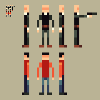 |
|
|
|
|
Logged
|
|
|
|
|
Ego_Shiner
|
|
« Reply #20192 on: October 26, 2012, 04:23:41 PM » |
|
 made for birthday pals |
|
|
|
|
Logged
|
Lo
|
|
|
|
Damian
|
|
« Reply #20193 on: October 26, 2012, 11:02:17 PM » |
|
Lofi   Edit: Added pug. |
|
|
|
« Last Edit: October 26, 2012, 11:27:59 PM by Damian »
|
Logged
|
|
|
|
|
kamac
|
|
« Reply #20194 on: October 27, 2012, 12:30:30 AM » |
|
Cellulosius was right about the readability of your sprite. But most of this can be solved by exaggerating forms and movements. Increasing the contrast will also help a lot.
-snip- Wow! That is a fantastic thing  Thanks a lot for pointing these out, green. |
|
|
|
|
Logged
|
|
|
|
|
Forstride
|
|
« Reply #20195 on: October 27, 2012, 06:20:47 AM » |
|
Updated my island scene from a few days ago:  |
|
|
|
|
Logged
|
|
|
|
|
beetleking22
|
|
« Reply #20196 on: October 27, 2012, 11:43:51 AM » |
|
Updated my island scene from a few days ago: Imo the old one was much better than this. |
|
|
|
|
Logged
|
|
|
|
|
Forstride
|
|
« Reply #20197 on: October 27, 2012, 11:46:37 AM » |
|
Imo the old one was much better than this.
While I liked the "simplistic" style of the original, I like the slightly detailed style a lot more. Also, the old palette was a bit too low contrast. Here's a side-by-side comparison of the two:  |
|
|
|
|
Logged
|
|
|
|
|
Quarry
|
|
« Reply #20198 on: October 27, 2012, 11:47:29 AM » |
|
Color use for the second one is absolutely terrible (water, grass/trees, dirt...) and it lacks the fancy simplicity of the older one
|
|
|
|
|
Logged
|
|
|
|
|
andy wolff
|
|
« Reply #20199 on: October 27, 2012, 11:51:57 AM » |
|
Really? I think overall the second one looks better at a glance. The contrast is much better
|
|
|
|
|
Logged
|
|
|
|
|
 Developer
